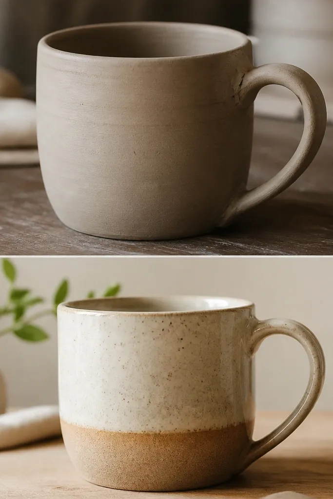
1. Before mug: faded speckle + coffee-ring haze
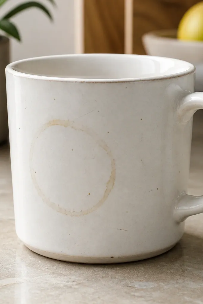
The thrift mug starts with a slightly uneven glaze that catches light but still looks tired — especially around the stain ring. Those scratches also make paint-and-primer layers look blotchy if you rush the prep.
Good to knowBefore you do anything creative, scrub for 2 full minutes with dish soap, then dry completely so the texture and color layers adhere evenly.
2. Prep step: matte sanding to stop peeling

A quick, gentle sanding creates micro-texture so your base coat grips instead of sliding. This matters most for color washes, because they soak and then lock into the toothy surface.
Use 220-400 grit sandpaper and stop once the shine dulls — don’t sand through the glaze.
3. Texture base: sponge-dot over primer
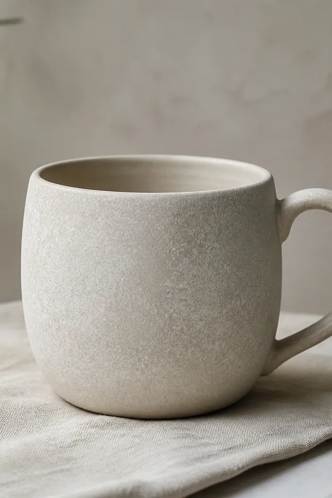
The transformation starts with texture you can feel. I dab on a thin base layer using a sponge, focusing on the mid-body area where the eye lands first.
Good to knowDo 2 thin dabs instead of one thick coat — thick texture can crack when it dries.
4. Reactive color wash: blue-violet with watery pooling
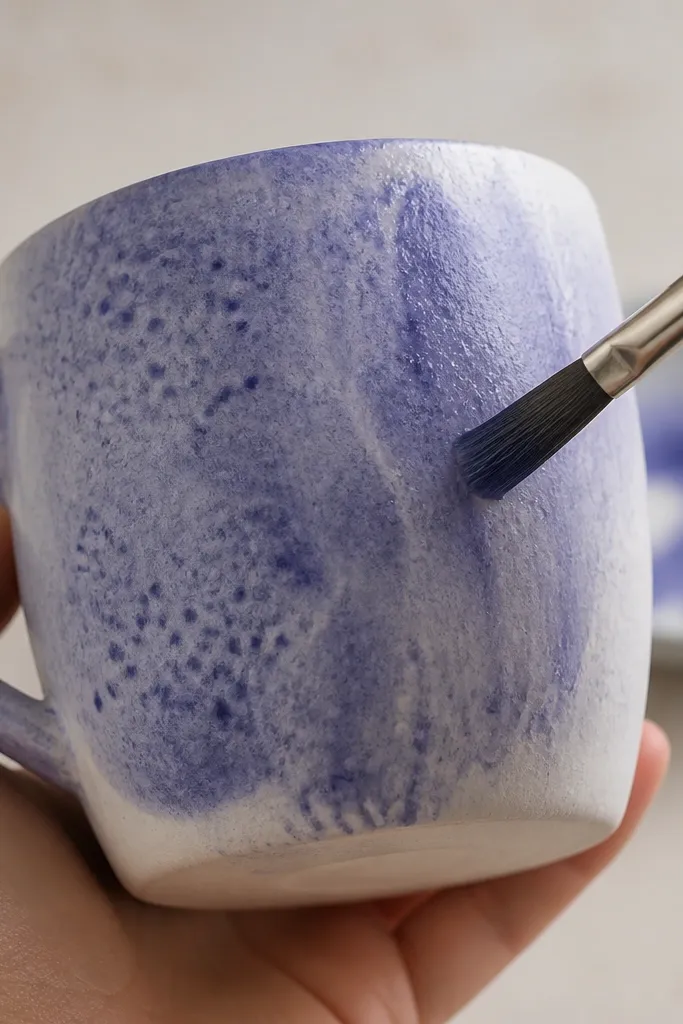
This is the key “after” look: the wash seeps into the sponge dots and creates natural variation. The lighter streaks happen when you pull the brush upward and stop before it fully levels.
Good to knowMix your wash thinner than you think (about the consistency of tinted water) and apply in vertical strokes.
5. Heat-map gradients: second wash for depth
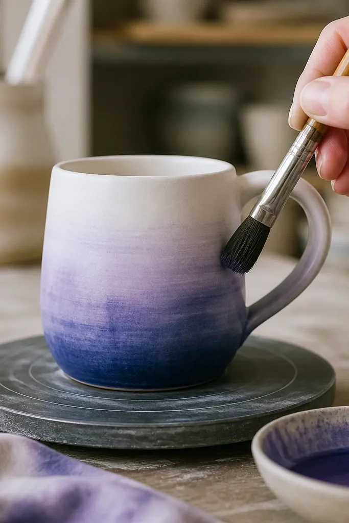
Layering a second wash builds depth without turning the texture muddy. I keep the darkest area near the bottom because it mimics how mugs naturally darken with use.
Let each wash dry fully before the next — otherwise the colors blend into one flat tone.
6. Accent line: thin gold edge at the rim
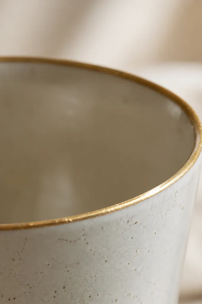
A simple gold accent makes the texture feel intentional instead of accidental. Because the rim already draws attention, a thin line gives a polished finish even if the body is playful.
Use a fine liner brush and steady your hand by resting your pinky lightly on the counter.
7. Seal test: matte vs glossy contrast panel
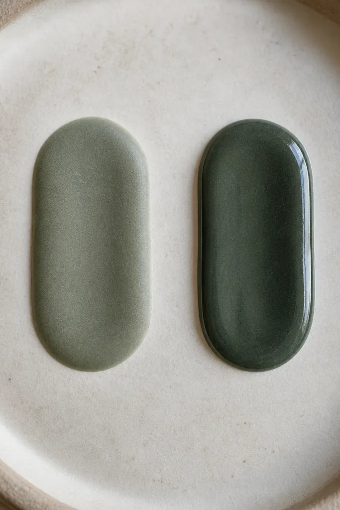
Sealer choice changes the whole vibe. Matte keeps the textured dots soft and tactile, while gloss makes the color wash look richer and more “ceramic glaze-like.”
Good to knowIf you want the texture to feel handmade, go matte on the body and gloss only on the gold accents.
8. After result: textured color that reads from across the room
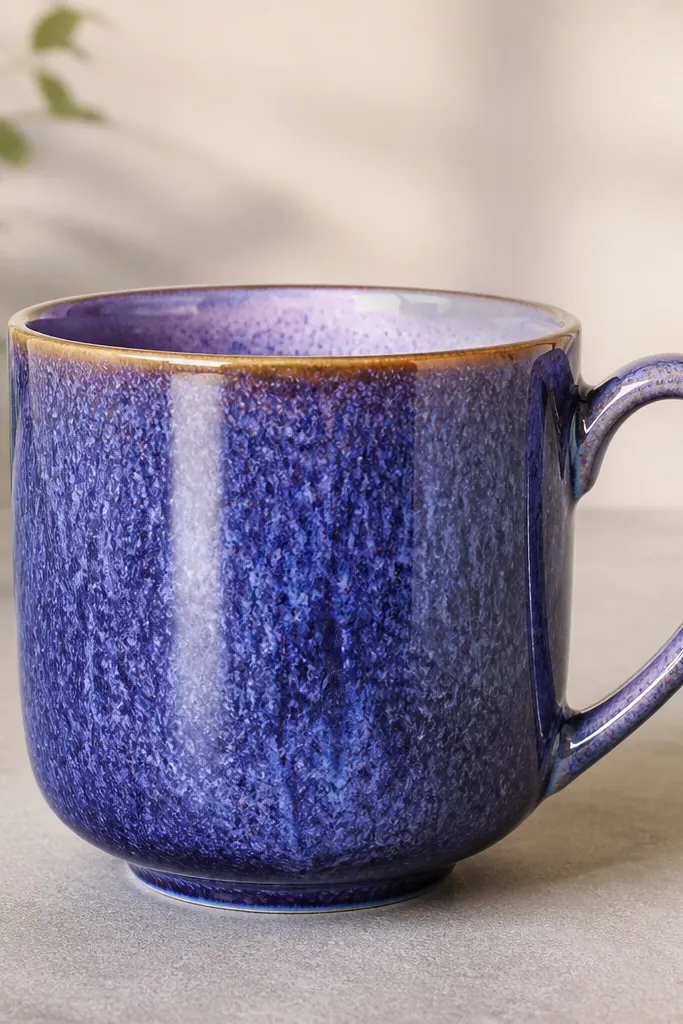
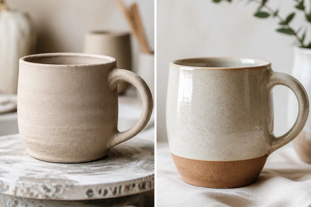
The finished mug shows clear before/after contrast: the stain area disappears under the color wash, and the sponge texture turns into a deliberate pattern. The gold rim frames everything so it looks like a custom studio piece.
Good to knowPhotograph your after with a single directional light (like a desk lamp) so the texture shadows show off.
9. Optional transfer: tiny botanical stamp on the lower third
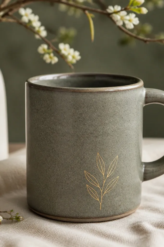
If you want extra charm, a small stamp adds a focal detail without covering the whole texture. Keep it on the lower third so the gradient wash still does the main work.
Stamp lightly and test on paper first — too much ink will bleed into the texture.
10. Care cue: “hand-wash only” label and dry time
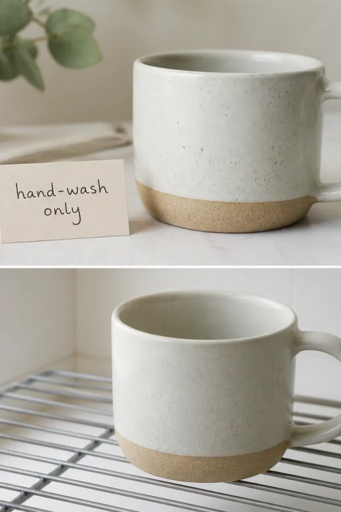
Even with good sealing, painted mugs are best treated gently. The biggest durability win is letting everything cure fully before the first rinse.
Good to knowAfter baking or curing, wait at least 24-48 hours before washing, then hand-wash with a soft sponge.