
1. Soft Pastel Laundry-Day Goals
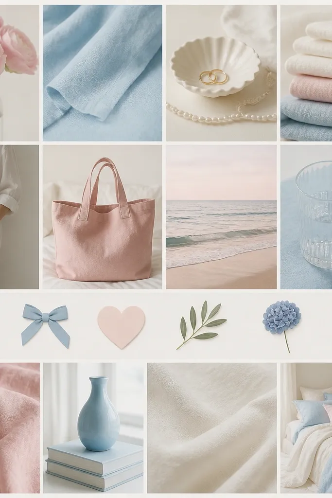
This look works because the photos all share a light, airy color temperature. Use close-up textures (fabric, paper, ceramic) and keep the icons tiny so the board feels calm instead of crowded. Print the photos slightly smaller than the spacing so there’s a consistent “breathing” margin.
Good to knowPick 3 pastel colors and only use images that match one of them; add tiny icons (like a star or heart) to connect themes without adding noise.
2. Moody Black-and-White New Chapter
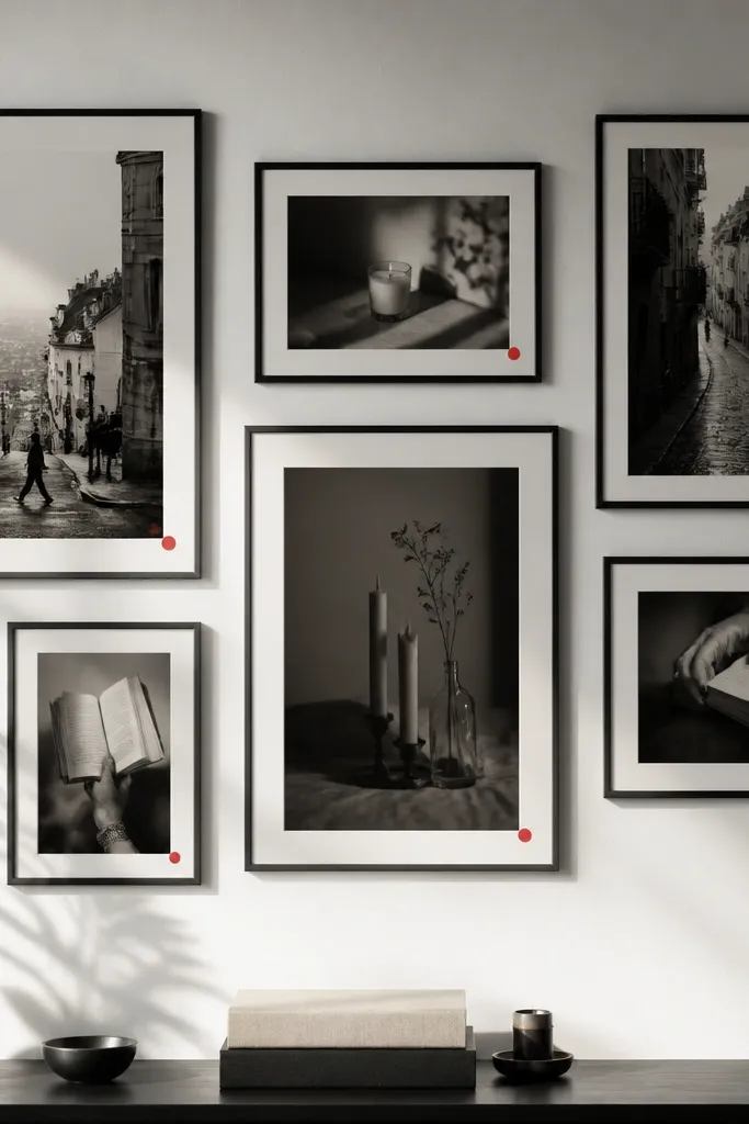
Monochrome boards feel instantly “designed” because the eye isn’t distracted by too many hues. Add one accent color sparingly (like red sticker dots or a thin red line) to guide attention to your top goals. Use grayscale photos of similar contrast levels to avoid a patchwork look.
Good to knowEdit your images to grayscale, then add one accent color using a thin pen line or a single sticker color.
3. Sunflower Yellow Gratitude Board
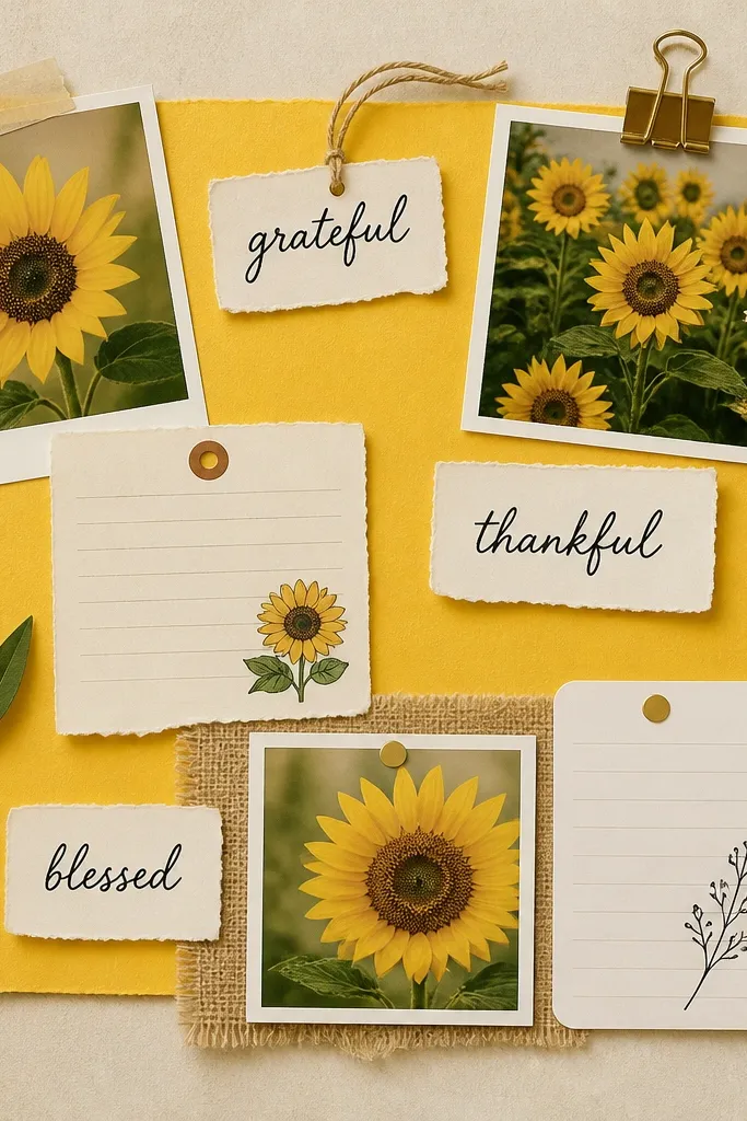
Yellow reads as optimistic, so it’s perfect for gratitude and habit goals. Layering small journaling cards over photo corners adds depth without making the board messy. Keep your text blocks short (one phrase per card) so the board remains readable from a distance.
Good to knowUse yellow paper strips or washi tape to frame each photo corner; keep the text to 2-4 words per card.
4. Neutral Linen + Gold Foil Luxury
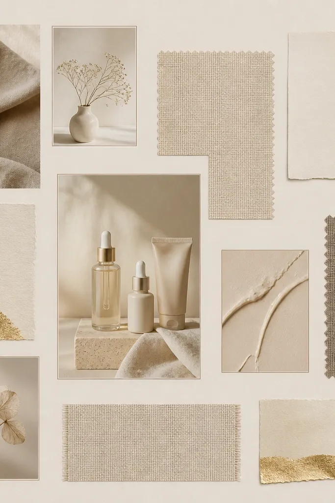
Neutral boards look expensive when they use consistent materials. Print photos on matte paper and add gold foil elements using sticker sheets or thin gold tape. Thin borders (like a 1-2 mm line) create structure even when the board is minimal.
Add a “border system” — either thin lines or consistent corner frames — so every image looks part of the same set.
5. Pastel Polaroid Stack on Cork
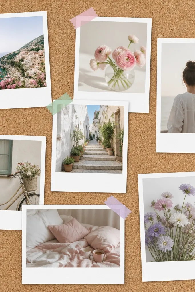
Polaroid stacks are aesthetic because they mimic real memory photos. Use 6-10 polaroid prints and overlap them so the center feels intentional. The washi tape corners add color while still keeping the board unified.
Good to knowBefore taping, arrange on the floor and measure the spacing between “tape corners” so your stack doesn’t drift.
6. Gallery Wall Frames for Goals
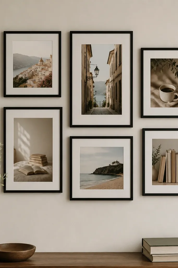
Frame-based boards feel curated and tidy. Use photos with similar lighting (either warm or cool) so the frames don’t make everything look mismatched. Leave a consistent gap between frames so the spacing looks intentional.
Good to knowUse a ruler to keep the gap identical (even 1 cm makes a big difference).
7. Ocean Blue Calm + Waves
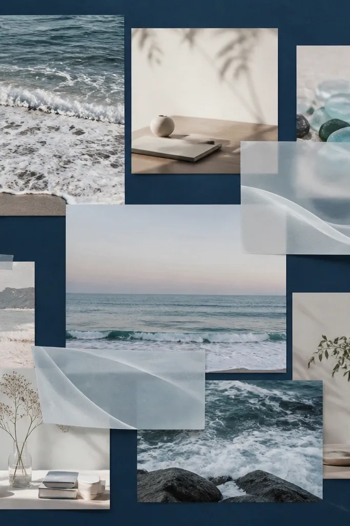
Blue tones naturally signal calm, making this great for stress-reduction goals and self-care routines. Vellum overlays create a gentle texture layer that looks like “light through water.” Keep the font simple and place it near the bottom of each cluster.
Good to knowPrint wave-shaped images at a slightly larger size and trim them into translucent layers using vellum or clear sticker paper.
8. Earthy Clay + Terracotta Vision Map
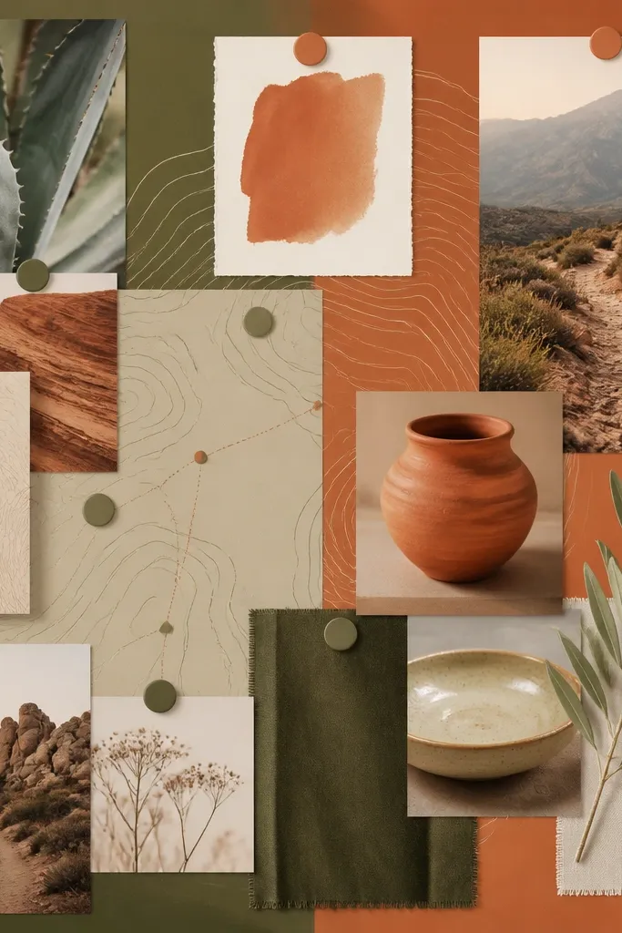
Terracotta and olive create a grounded, outdoorsy vibe. Topographic lines add movement and “destination energy” even if your photos are mostly still-life. Use tiny map icons (pins, routes) to connect goals like travel, fitness, and learning.
Add one “route line” that snakes across the board (drawn or printed) to visually connect your themes.
9. Pink Ribbon Dream Board
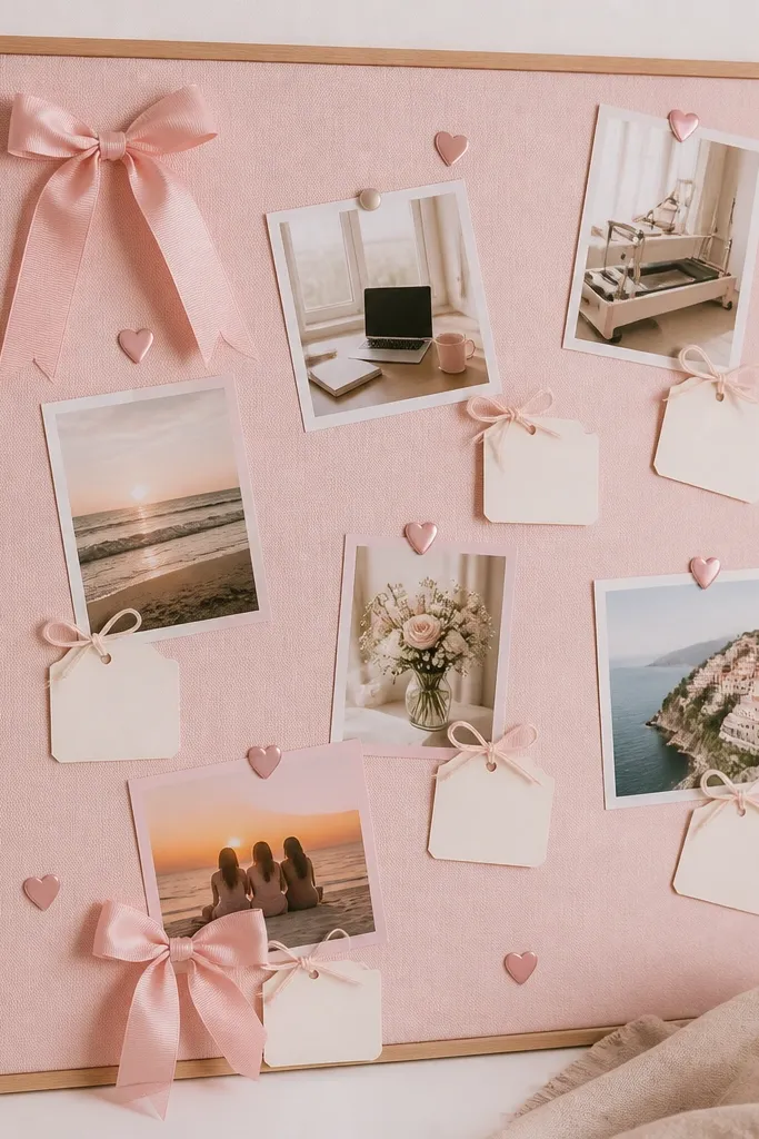
This is the sweetest aesthetic for relationship, confidence, and celebration goals. The key is repeating the same ribbon style and label card size so it doesn’t look random. Diagonal placement creates energy while still staying cohesive.
Use the same string color for every tied label (like pale pink or cream) to keep it uniform.
10. Green Plant-Themed Growth Layout
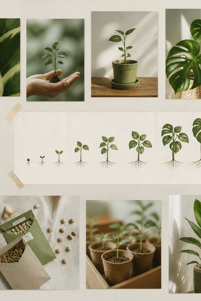
Plant imagery naturally supports growth goals, habits, and “level up” milestones. A timeline layout makes it feel realistic because your goals progress visually. Add small growth chart elements to anchor the theme beyond just pictures.
Good to knowSort your photos by “before/after” or size and place them along a left-to-right timeline.
11. Balletcore Pink Tulle Aesthetic
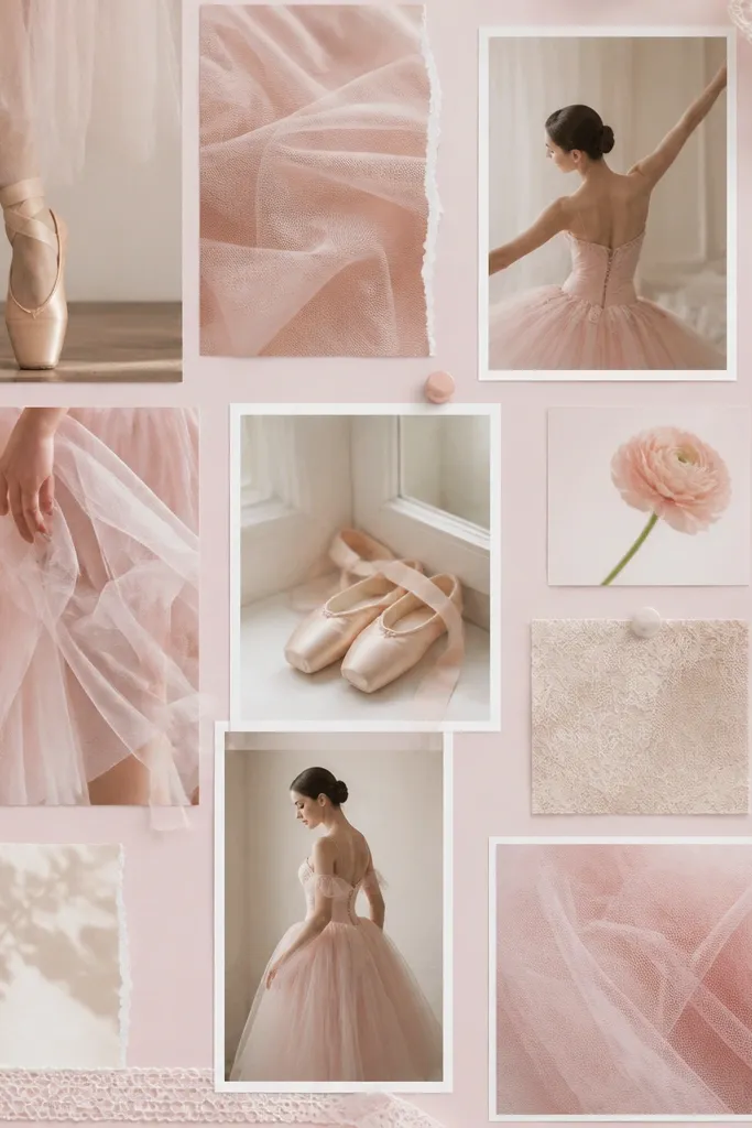
Balletcore looks dreamy when you combine soft photography with fabric texture. Use tulle or lace trim along the edges of key photo clusters to create a “framed” feel. Keep the color palette tight: blush, cream, and soft gray.
Good to knowAdd one fabric texture element per cluster, not everywhere, so it reads intentional.
12. Cozy Cafe Corner Goals
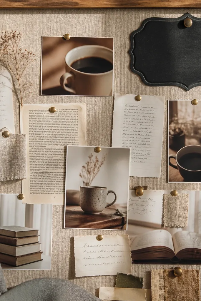
Cozy cafe vibes are perfect for creativity, learning, and productivity goals. Warm lighting photos (brown, cream, caramel) make the board feel inviting. Use a chalkboard-style label or printed “menu” card to organize goals into categories like “Write,” “Study,” “Plan.”
Good to knowCreate 3 category labels and place them consistently in the same corners of each photo cluster.