1. Cream + Espresso “French Café” Luxe
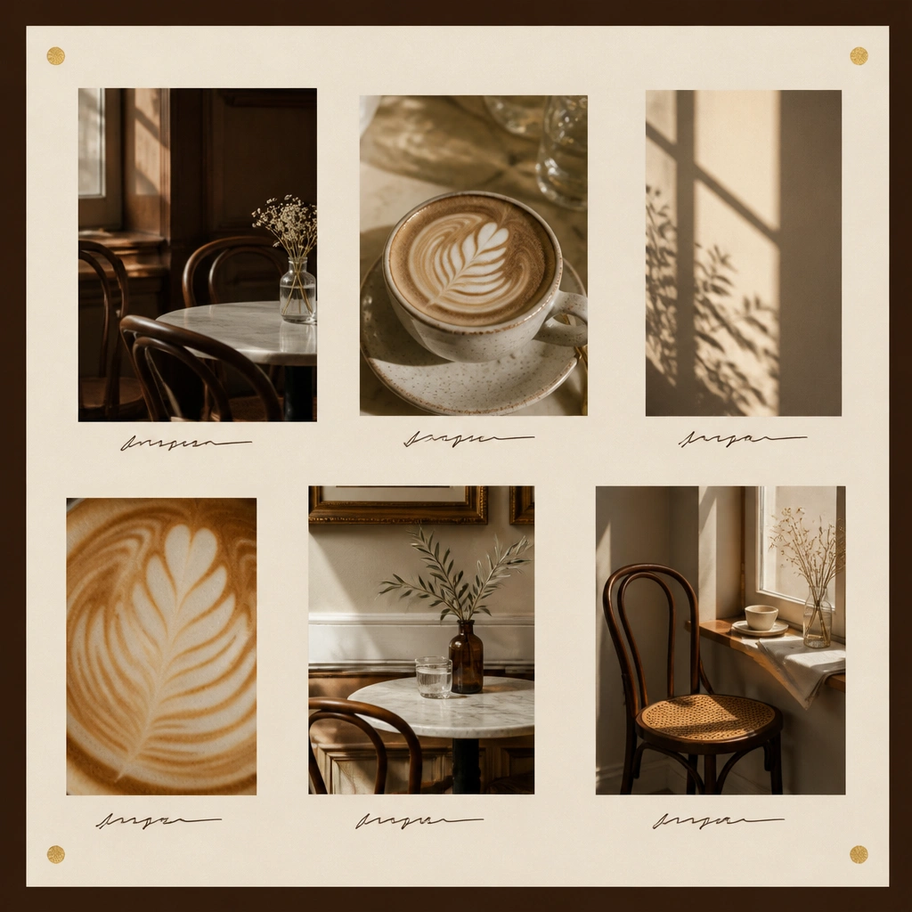
Use a cream base (cardstock or linen-texture paper) and frame the whole board with espresso-brown tape or a printed border. Add tiny gold foil dots only at corners or edges so it reads intentional, not sparkly everywhere. Choose images with warm window light and neutral tones for that “boutique café” vibe.
Good to knowBefore gluing, lay everything out and leave a 1 cm margin between images so the board breathes like a magazine spread.
2. Black-Tie Marble Moodboard (No-Print Method)
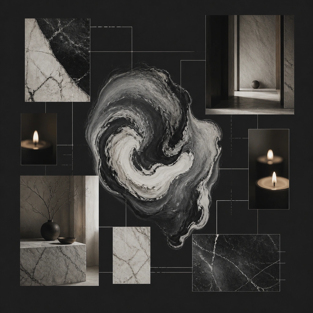
Instead of buying marble printables, paint a simple marble swoosh using white and light-gray acrylic paint with a sponge. Keep photos monochrome and add only one “hero” marble section so the board feels styled. The thin white acrylic lines make it look like a high-end editorial layout.
Practice the marble swipe on scrap paper first — marble looks expensive when the movement is imperfect but controlled.
3. Dusty Rose + Blush Acrylic Label Luxe
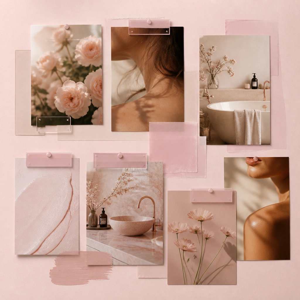
Create a luxe effect by layering translucent vellum over the photos and adding small acrylic label blocks. Use a limited palette: dusty rose, blush, and cream. The acrylic labels look sleek and intentional when they’re consistent in size and placement.
Good to knowStick labels using removable double-sided tape so you can adjust alignment without ripping paper.
4. Olive + Terracotta “Mediterranean Balcony”
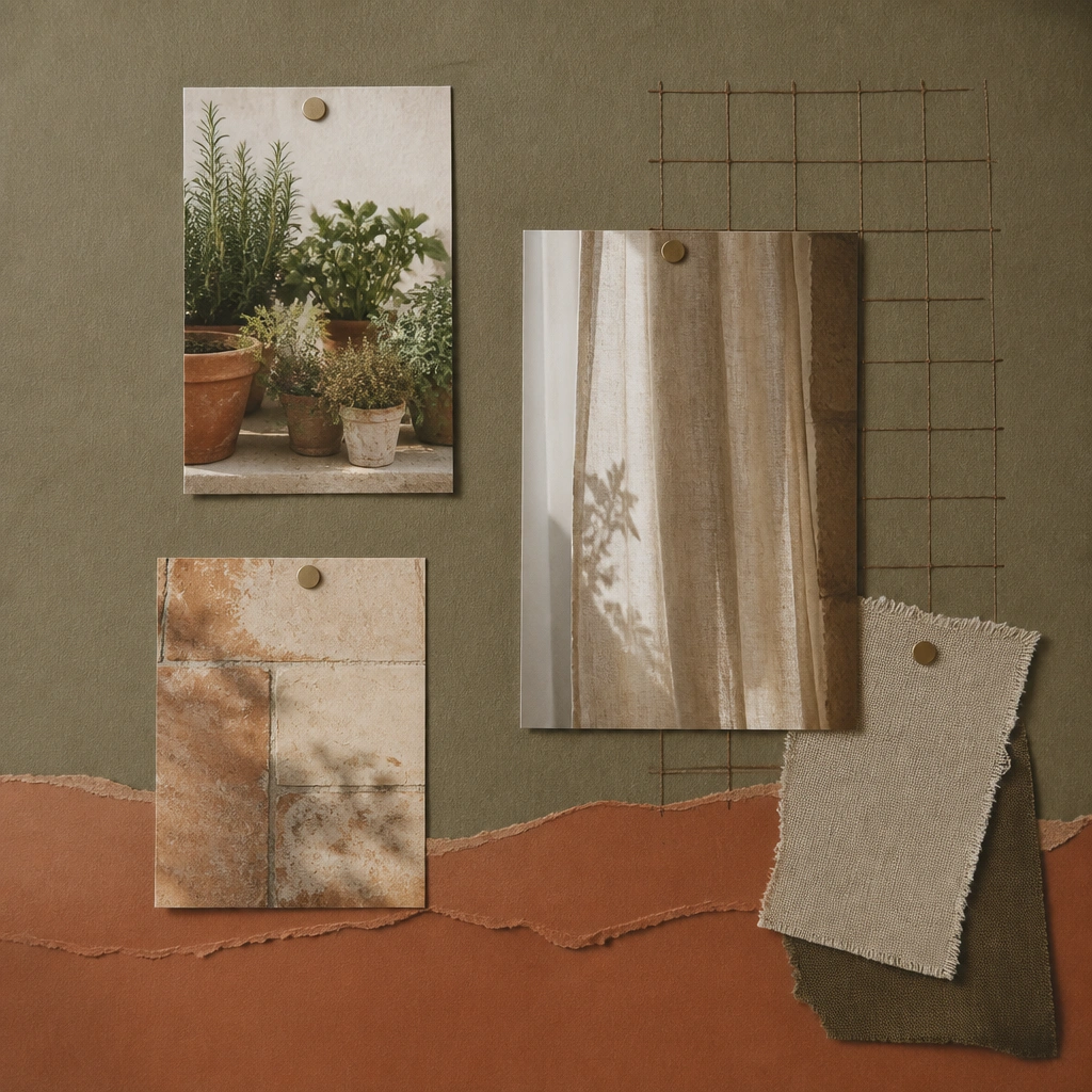
Use textured olive cardstock (or paint olive craft paper with a dry brush). Add terracotta accents using torn paper strips or matte terracotta paint. Mediterranean boards feel luxe when they include natural textures like linen and ceramics, plus a subtle grid or mapping line.
Draw a light grid with pencil and erase lightly after gluing so the layout looks design-led, not DIY-chaotic.
5. Matte Black + Chrome Cutout Glam
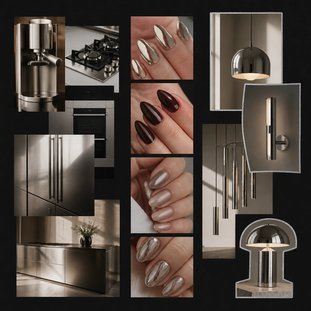
Choose a matte black base and add chrome accents using foil cardstock or shiny magazine pages. Outlining select elements with a silver paint pen makes the board look “edited,” like a fashion lookbook. Keep spacing uniform so the board photographs crisp.
Use a craft knife to trim chrome cutouts cleanly so edges look factory-precise.
6. Sage Green + White “Calm Spa” Minimal Luxe
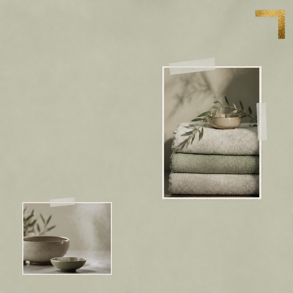
Minimal luxe is all about negative space. Use sage paper, add white tape frames around images, and limit to 2-3 photo categories. A single gold corner accent gives a premium finish without making it look like a craft store project.
Aim for 40% blank area — if your board feels full, remove 1/3 of the photos.
7. Royal Blue + Gold “Library Night”
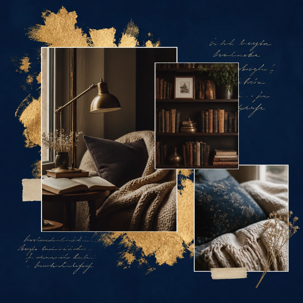
Use royal blue cardstock or paint craft paper with matte acrylic for depth. Apply gold leaf (or gold foil tape) behind your biggest image to create a halo effect. Choose night-light imagery and warm wood tones to amplify that library-at-9pm feeling.
Good to knowUse cream ink (or a white gel pen) for quotes so the contrast stays luxe on dark backgrounds.
8. Warm Beige + Texture Collage (Linen, Paper, Fiber)
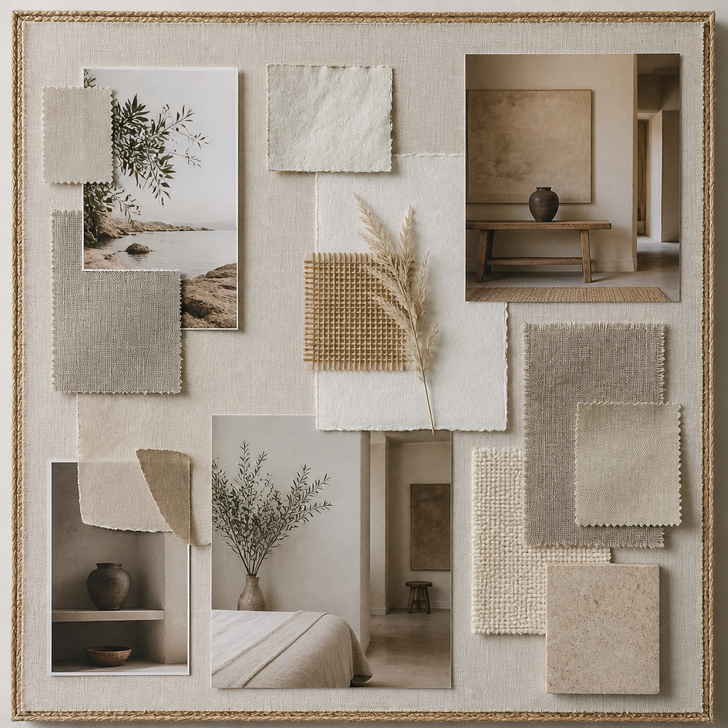
Texture is the cheat code for expensive-looking boards. Add linen-like fabric swatches, jute string borders, and layered torn paper beneath photos. Keep the palette warm: beige, oat, cream, and soft taupe. This works especially well for lifestyle goals because it feels tactile and curated.
Dry-brush a thin layer of matte glue on the back of fabric so it lays flat without bubbles.
9. White + Pastel “Gallery Wall” Luxe Grid
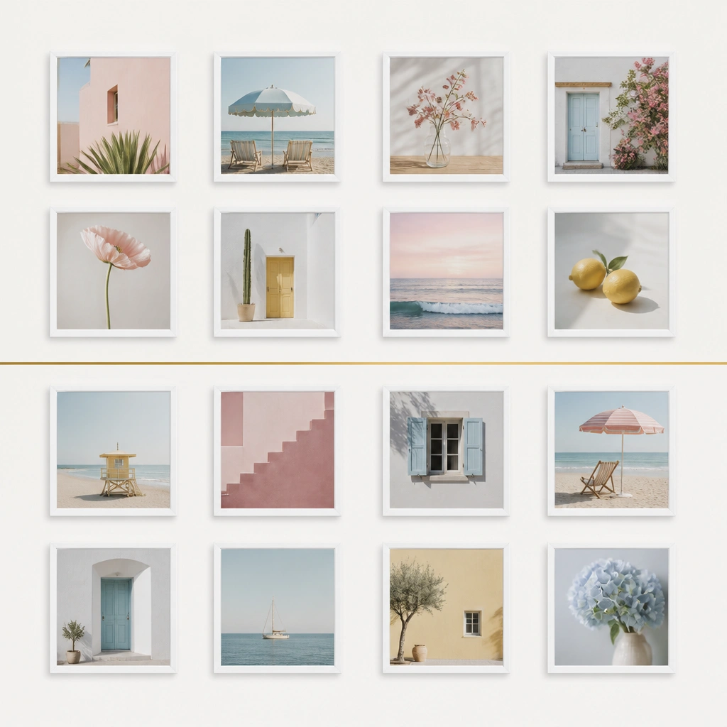
A gallery grid looks luxe because it’s ordered. Print or select small photos and place them evenly with consistent margins. Add a single thin gold line (gold gel pen or foil tape) to unify the layout. This style is perfect for aesthetic vision board ideas pictures luxe because it reads like interior design.
Good to knowUse a ruler and mark dots lightly first — alignment is everything for “expensive” visuals.
10. Terracotta + Black Ink “Ceramic Studio”
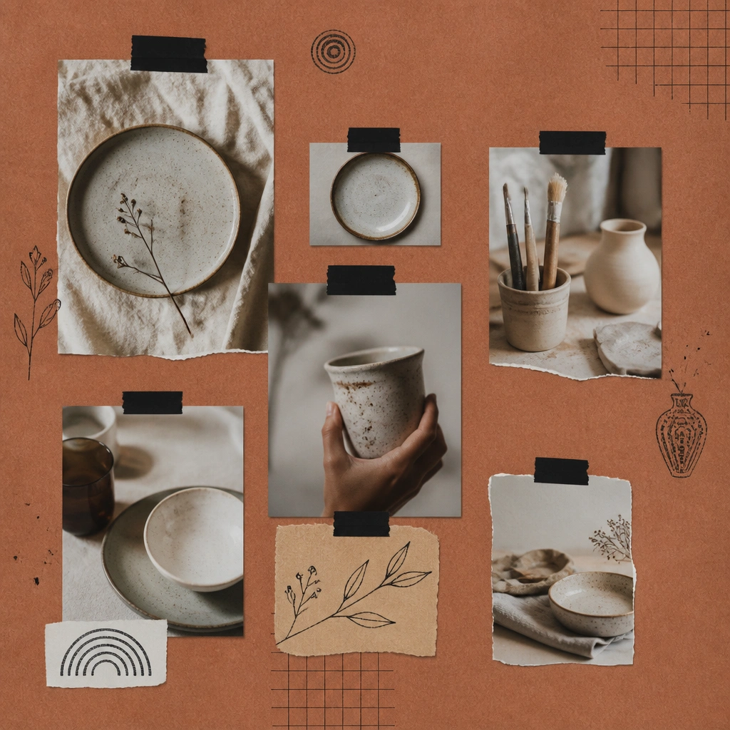
Paint or buy terracotta paper and pair it with black ink details for a studio feel. Use torn edges sparingly and add thin black tape strips as separators. Ceramic photos look extra premium when the board includes table styling shots and a consistent color temperature.
Good to knowStamp or doodle lightly near labels — don’t overdo it or it stops reading “gallery” and starts reading “crafty.”
11. Gold Foil Frame “Luxury Hotel Suite”
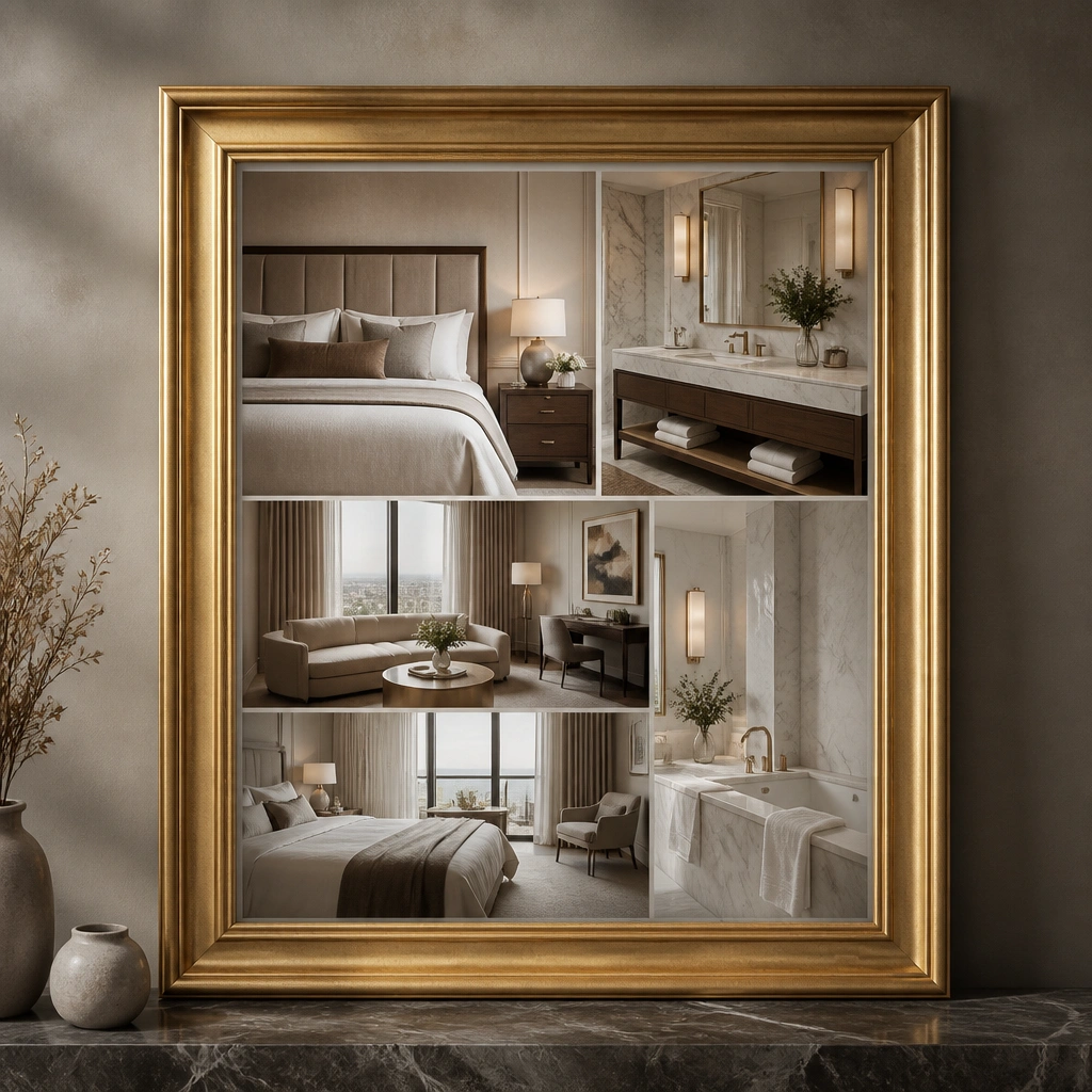
Make a gold-foil “window” by using a gold foil sheet or gold foil tape frame around your hero section. Keep the outer background neutral gray so the interior photos pop. Typed labels in a clean font (print on cream paper) make the whole board feel hotel-brochure polished.
Good to knowPrint labels at the same width and align them to the left edge of each photo for a designer look.