1. 2-Column Neutrals Grid (Print-Only, No Frames)
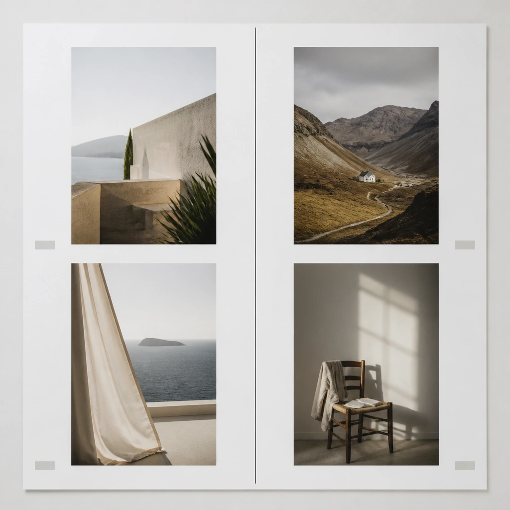
This layout works because your eye reads left-to-right without bouncing. Use white or cream paper, grayscale images, and tiny captions in a consistent font weight. Add one thin divider line (black or charcoal) to give structure without visual noise.
Print your photos at the same height and leave a 1/4 inch gap between them for that crisp, gallery feel.
2. Floating Polaroid Stack on Soft Beige Felt
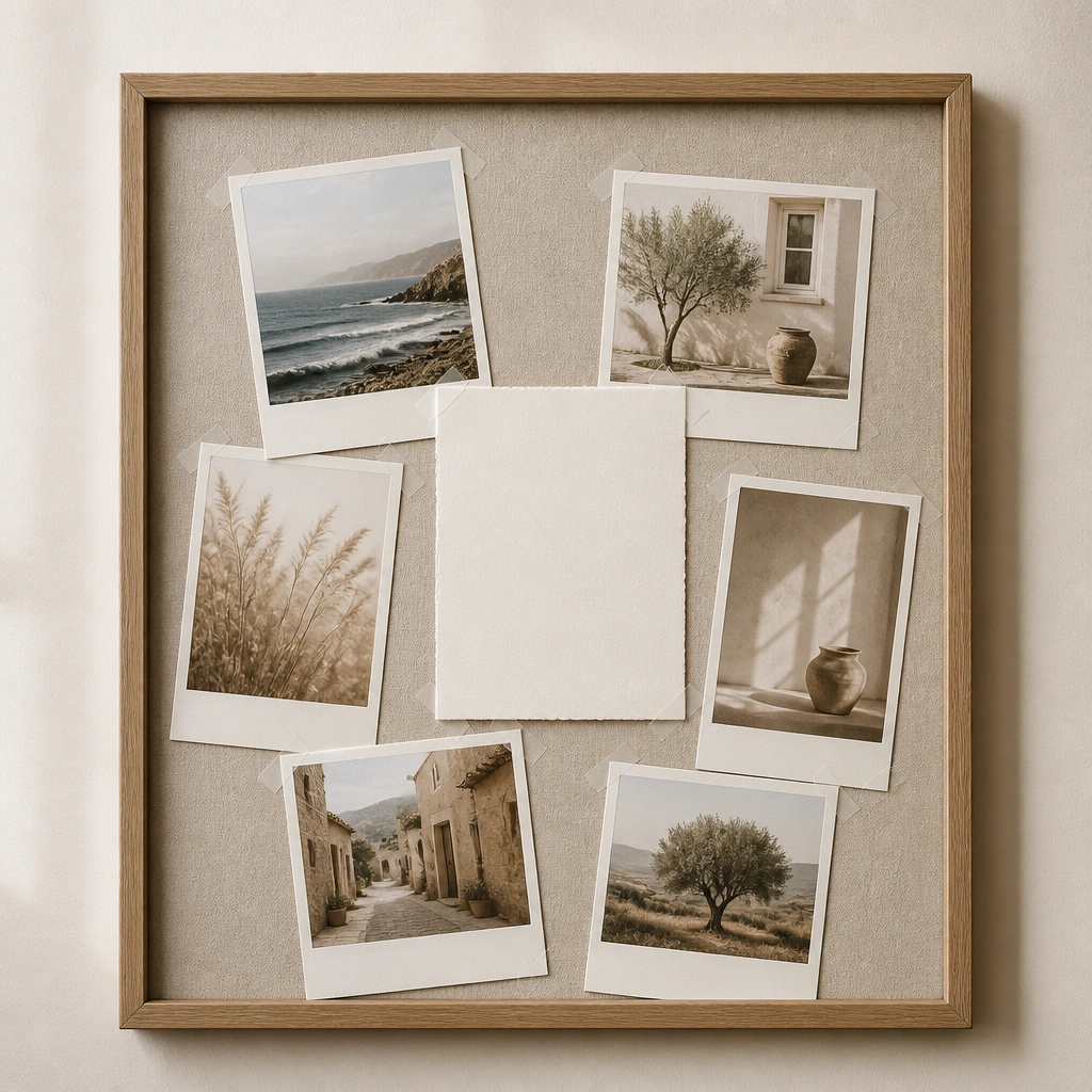
Felt adds warmth and hides small tape bumps, so the board looks clean even with layering. Keep the Polaroid borders consistent and avoid too many colors. This is ideal for vision boards that include lifestyle photos and daily habits.
Good to knowUse clear corner tape (not glue dots) so you can swap photos later without damaging the felt.
3. Single Accent Color Stripe (Top Header)
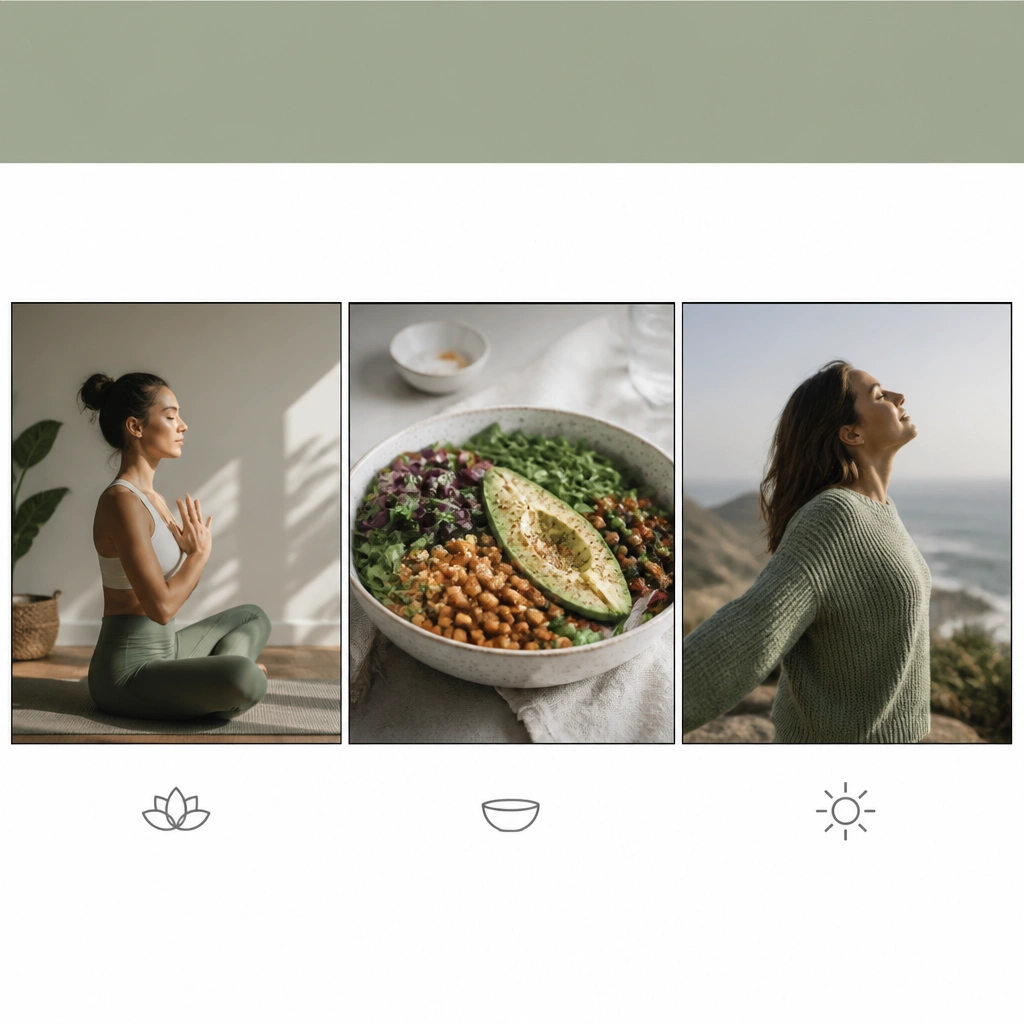
A single accent stripe anchors the whole board and makes it instantly modern. Choose one calming accent (sage, terracotta, or muted navy) and repeat it only in small text or one icon. Keep everything under the stripe aligned.
Good to knowMeasure the stripe height as 1/12 of your board height so it looks intentional, not accidental.
4. Matte Black Frame Museum Layout
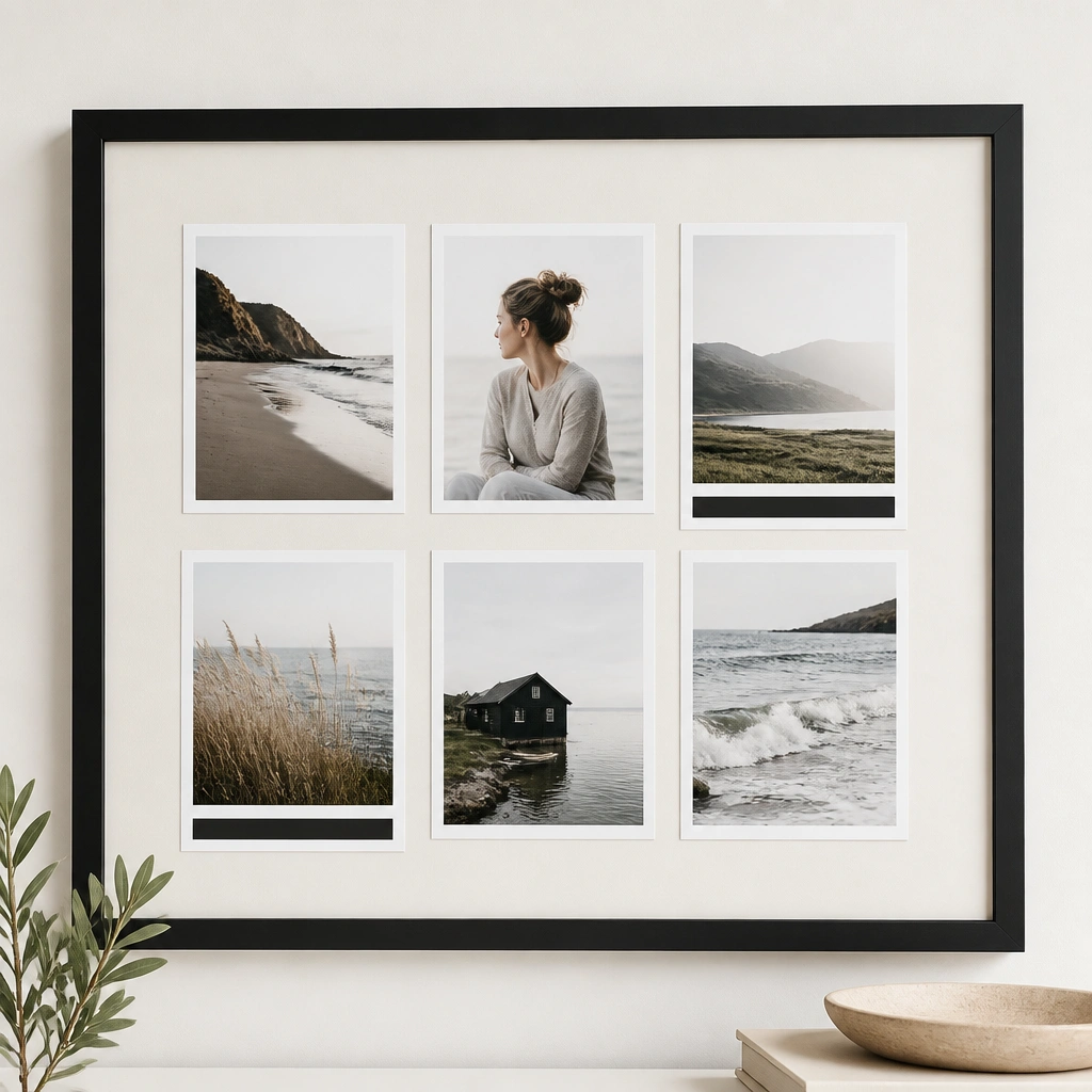
Wide mat borders make the images feel curated, like a gallery wall. Matte black frames add contrast against light backgrounds, which is a big part of modern minimalism. Use cream mat board to soften the look and prevent harsh glare.
Good to knowLeave at least 1 inch of mat border around the outer edges for a finished, high-end look.
5. Timeline Strip Left-to-Right (Now to Later)
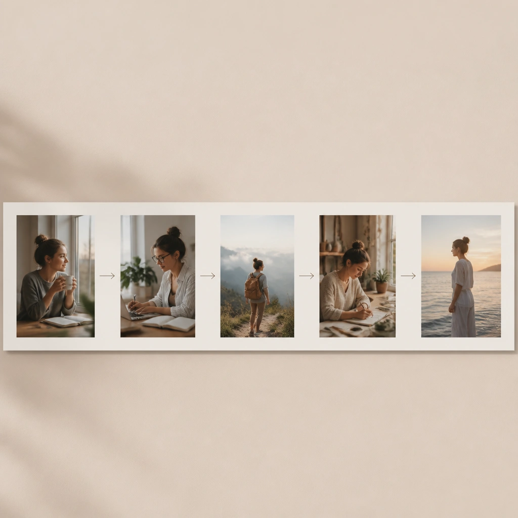
Timelines reduce decision fatigue because you’re not just picking images, you’re arranging progress. Use consistent photo aspect ratios (like 3:2) so the strip stays tidy. Keep labels small and aligned to the same baseline.
Write phases in a single column using a ruler so the text lines up perfectly.
6. Minimal Corner Collage (Rule of One)
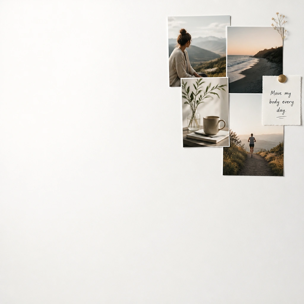
Leaving negative space is the secret sauce. A small corner collage feels modern because it’s intentional and balanced with empty room. Use only 4-5 images max so the cluster doesn’t turn into clutter.
Good to knowStart by taping just the corner cluster first, then step back and only add if the empty space still feels calm.
7. Linen Texture Board with Centered Icons
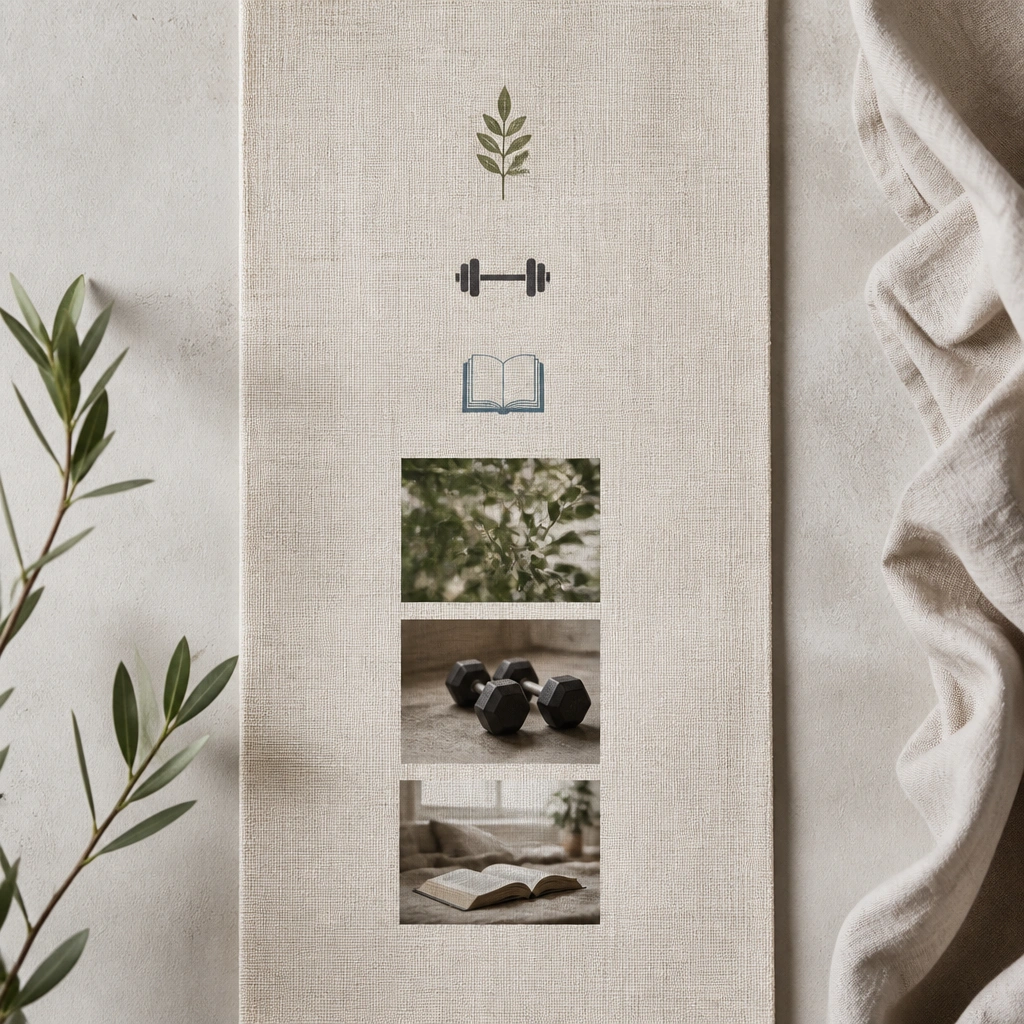
Linen texture instantly makes a DIY board look elevated and cohesive. Centered icons create a clean visual hierarchy and work well for goals that are categories (health, learning, home). Pair icons with small, consistent photo thumbnails.
Print icons in black (or one dark charcoal tone) so they match the minimalist palette.
8. Grid + Word Blocks (Two Fonts Max)
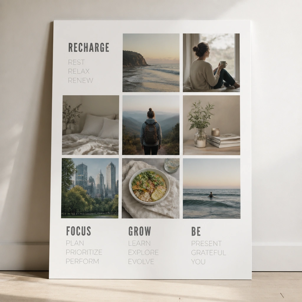
Mixing photos with typographic word blocks keeps your board motivational without overcrowding. Use only two fonts: one bold for key words and one lighter for supporting phrases. Keep the word blocks the same width and align them to the grid edges.
Good to knowSet your word block sizes to match the grid cell width so everything looks measured.
9. Kraft Paper Backdrop with Black Tape Borders
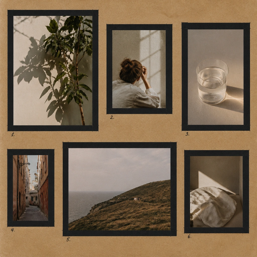
Kraft paper brings warmth while black tape creates a modern, graphic boundary. This works especially well for goal boards focused on creativity, decluttering, and home projects. Keep tape borders uniform and avoid stacking too many layers.
Good to knowUse a ruler and cut tape edges cleanly so the rectangles look like intentional frames.
10. Glass-Front Clipboard with Color-Coordinated Tabs
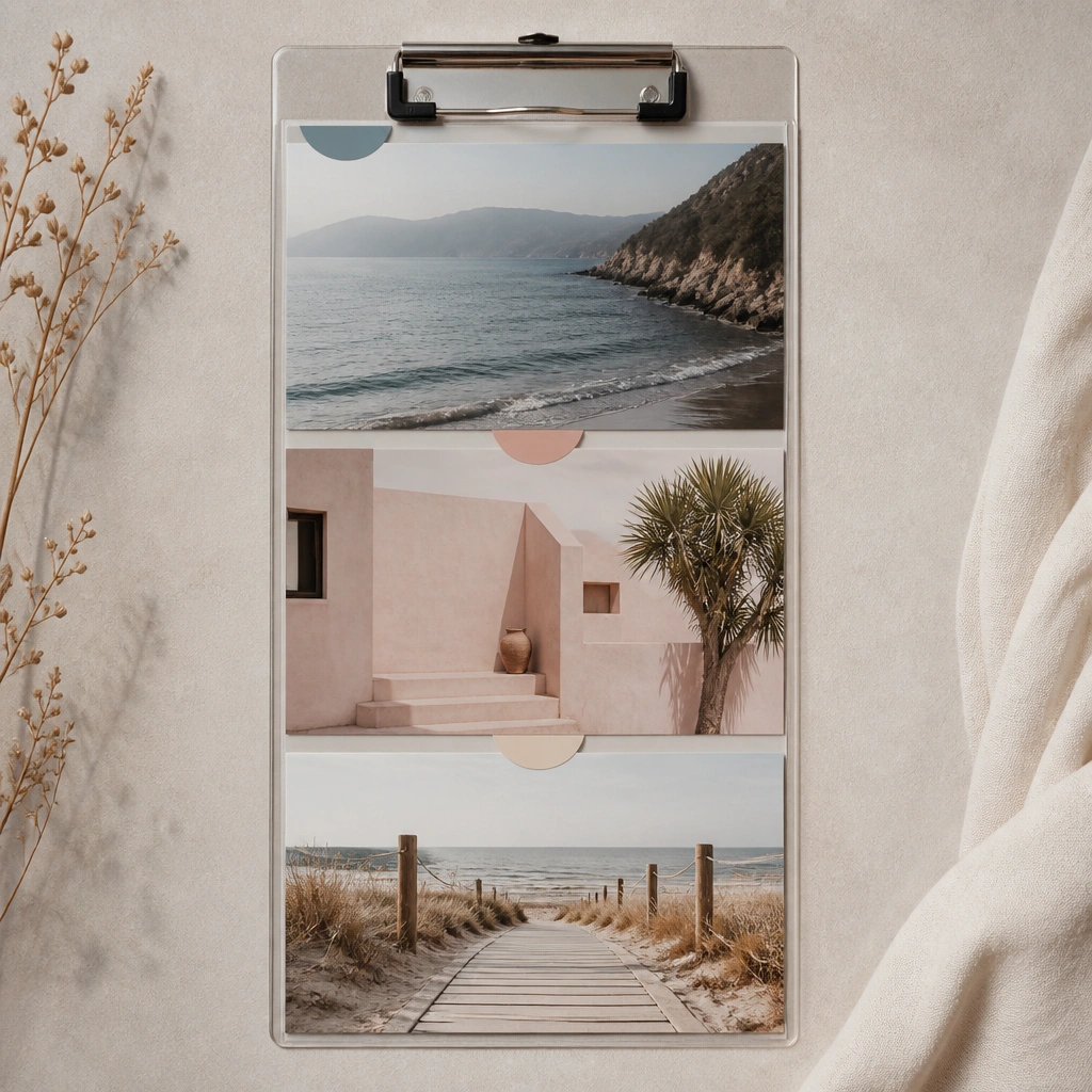
A clipboard is underrated for minimalist vision boards because it’s functional and easy to update. Tabs add structure without full frames. Stick to muted tones so the tabs look like design elements, not random highlights.
Write each tab label in the same spot (like center-top) for a consistent, modern rhythm.
11. Monochrome Photo Strip with One Handwritten Accent
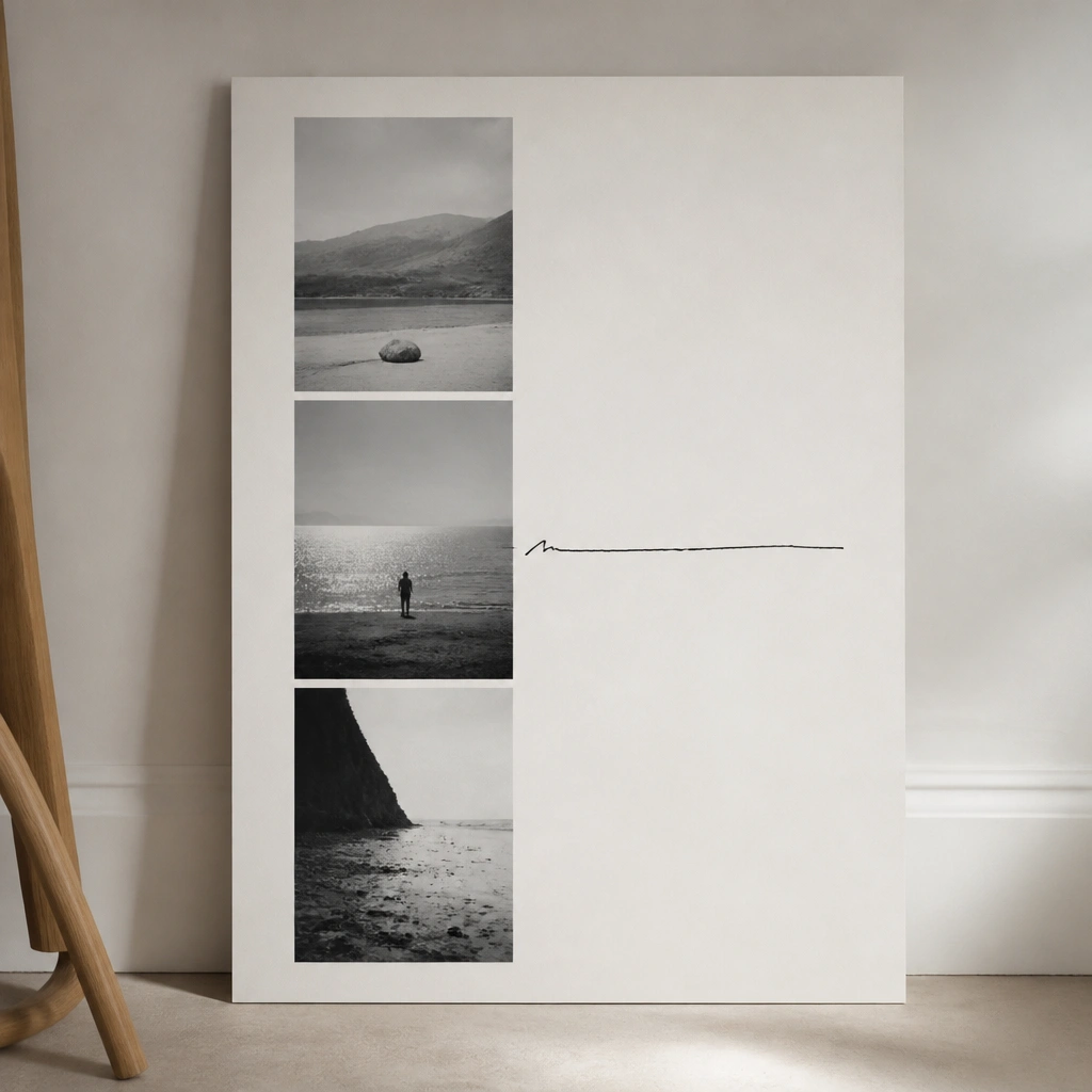
Monochrome photos keep everything calm, and one handwritten accent adds personality. This layout is great for people who want fewer goals but stronger focus. Keep handwriting short, like a mantra or one measurable promise.
Good to knowUse a black gel pen and write on a small label so the ink doesn’t bleed into the photo.
12. Floating Frame Wall: One Large Center Photo + Surrounding Minis
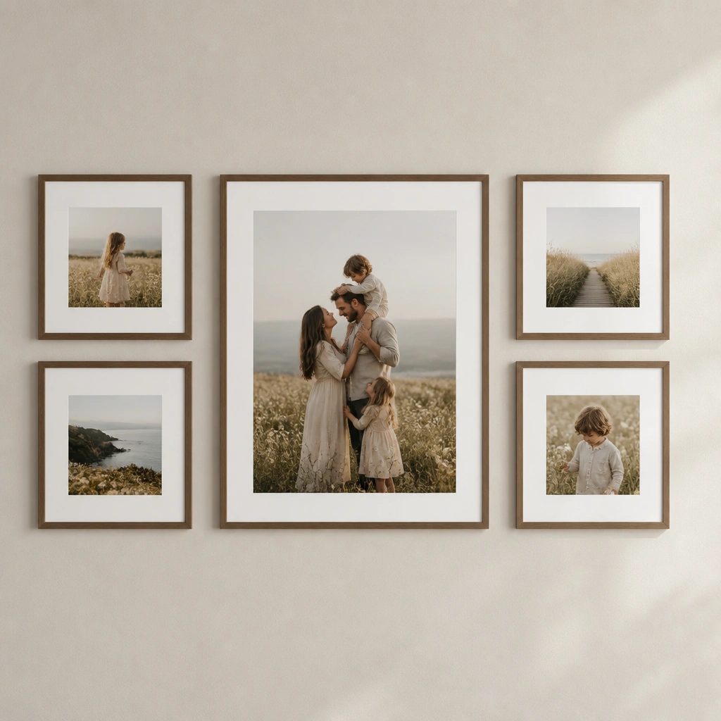
This creates a focal point so your board doesn’t feel busy. Choose one “anchor” image that represents the overall direction, then use mini frames for supporting goals. Match frame colors to keep the look modern and cohesive.
Use painter’s tape to mark spacing before you hang anything — it prevents uneven gaps.