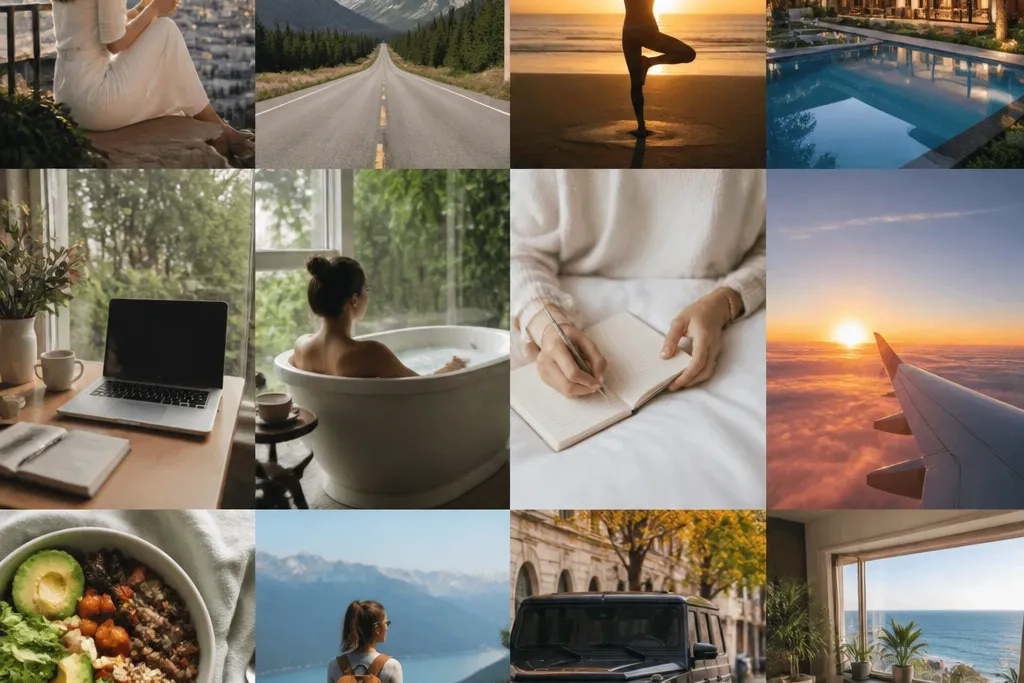
1. Sunset Travel Collage with Layered Map Strips
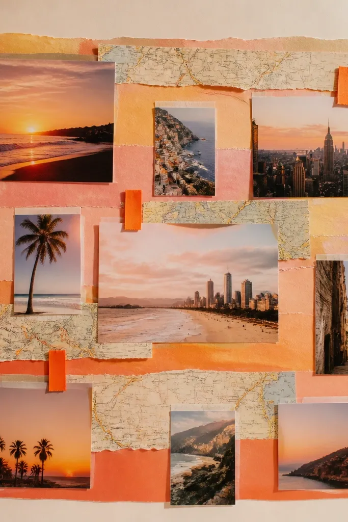
This look works because the torn map strips add texture and a “journey” feel without needing a ton of photos. Use a peach-to-amber paper gradient or colored cardstock, then layer map scraps behind your destination images for depth. Add tiny ribbon tabs so your eye can “scan” the board like a travel itinerary.
Print destination photos in small sizes and back them with colored cardstock scraps before gluing — it makes every cutout look intentional.
2. Minimal White Frame Board with Black Script Goals
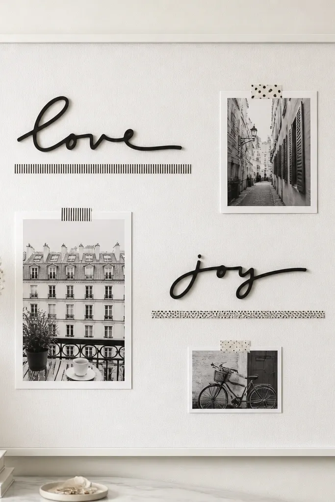
If you love calm aesthetics, this layout lets your goals breathe. Stick to black-and-white imagery (or desaturate photos) and use one font style for the text so the board doesn’t feel busy. The wide spacing makes it look like gallery art, not a craft project.
Use a single washi tape color (like matte black or white) to underline sections instead of covering everything.
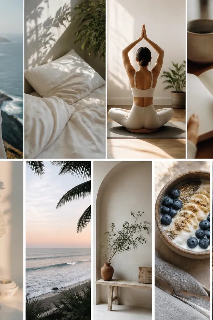
3. Soft Sage + Linen Lifestyle Board
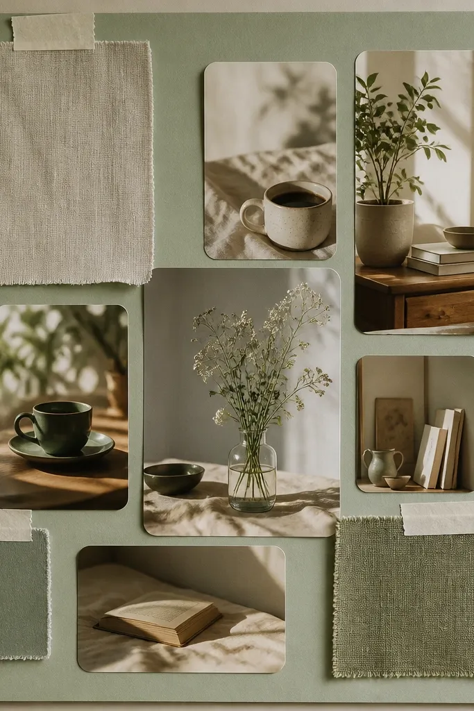
Sage and linen tones instantly feel cozy and grown-up. Add fabric swatches to create a tactile “anchor” area, then place muted photos on top so the texture shows without overwhelming. This is perfect for home projects, routines, or wellness goals.
Cut fabric swatches slightly larger than your photo clusters, then trim after pasting so the edges look clean.
4. Bold Pink Moodboard with Sticker Typography
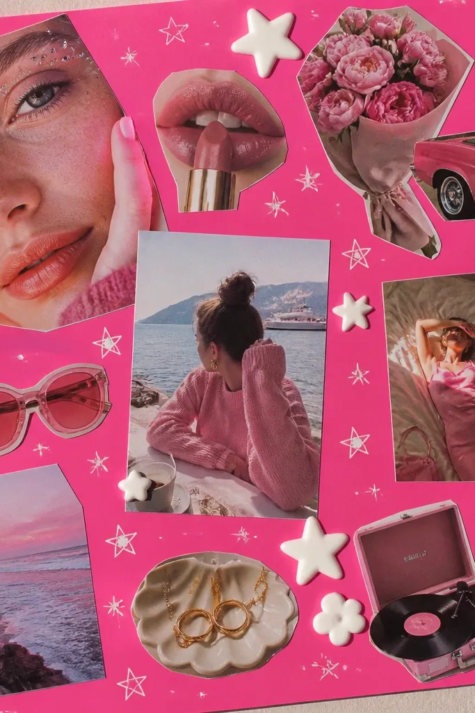
This is the “energize me” style — glossy photos + high-contrast text keeps it punchy. Choose one accent color (white) for typography and doodles, so the board stays cohesive. Sticker typography makes it fast and gives that modern, curated look.
Good to knowGroup your stickers into 2-3 big word clusters instead of scattering words everywhere.
5. Gold-and-Cream Dream Board with Washi Borders
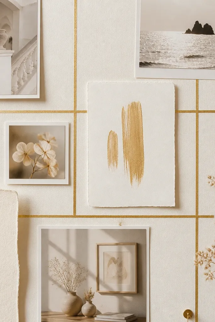
Gold accents look luxe even on a budget. Use gold washi tape to frame sections like “Career,” “Health,” and “Home,” then keep photos small and consistent in tone. Foil quotes on textured cardstock add shine without clutter.
Good to knowCreate borders first, then place images inside — it prevents the board from turning into random layers.
6. Ocean Blue Vision Board with Faux Sea Glass Texture
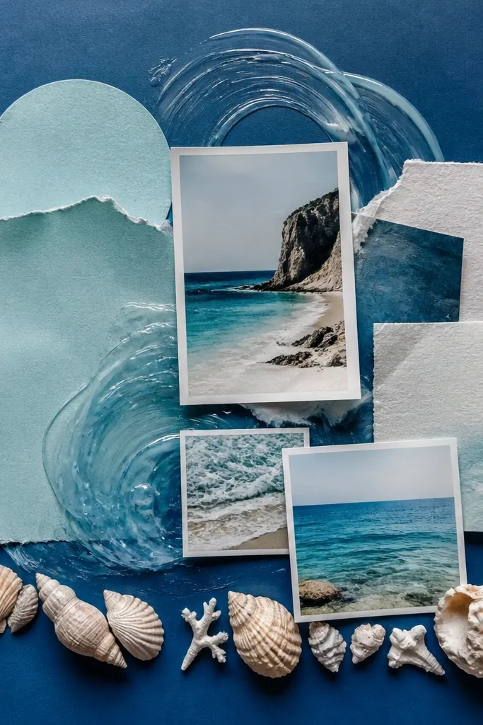
Sea-glass vibes are gorgeous and easy to mimic. Layer pale turquoise paper shapes and add translucent highlights using clear gel medium or glossy craft varnish on top of select areas. The result looks watery and dimensional while staying clean.
Good to knowUse a sponge to dab gel medium in thin layers — thick coats look cloudy.
7. Earthy Terracotta Goals with Hand-Drawn Icons
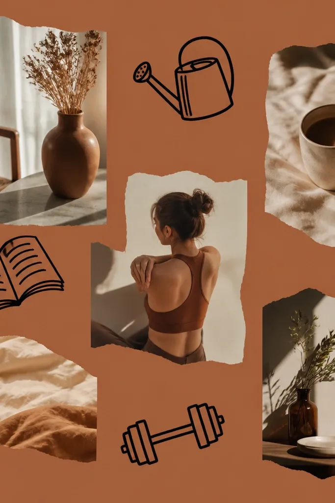
Terracotta is warm, grounded, and perfect for “slow progress” goals. Hand-drawn icons tie the whole board together because they’re consistent and personal. Pair with warm photo tones and minimal black line accents for clarity.
Sketch your icons on scrap paper first — then trace lightly onto your board with a pencil before inking.
8. Pastel Rainbow Routine Board with Color-Coded Sections
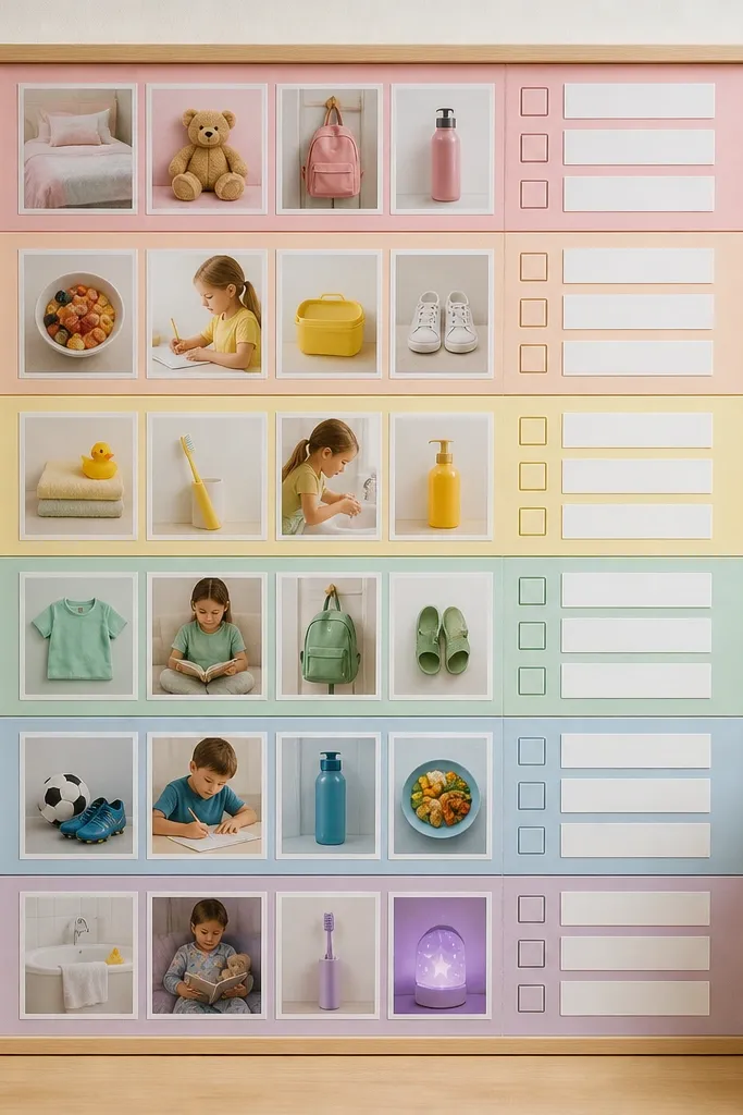
Color coding makes your routines instantly scannable. Keep each section to one theme (morning, work, movement, night) and use pastel labels that match the band. This look is great for habit tracking goals without needing a planner page.
Good to knowWrite one “daily anchor” phrase per color band — like “Move first” or “Read 10 minutes.”
9. Blackboard-Style Board with Chalk Font Printouts
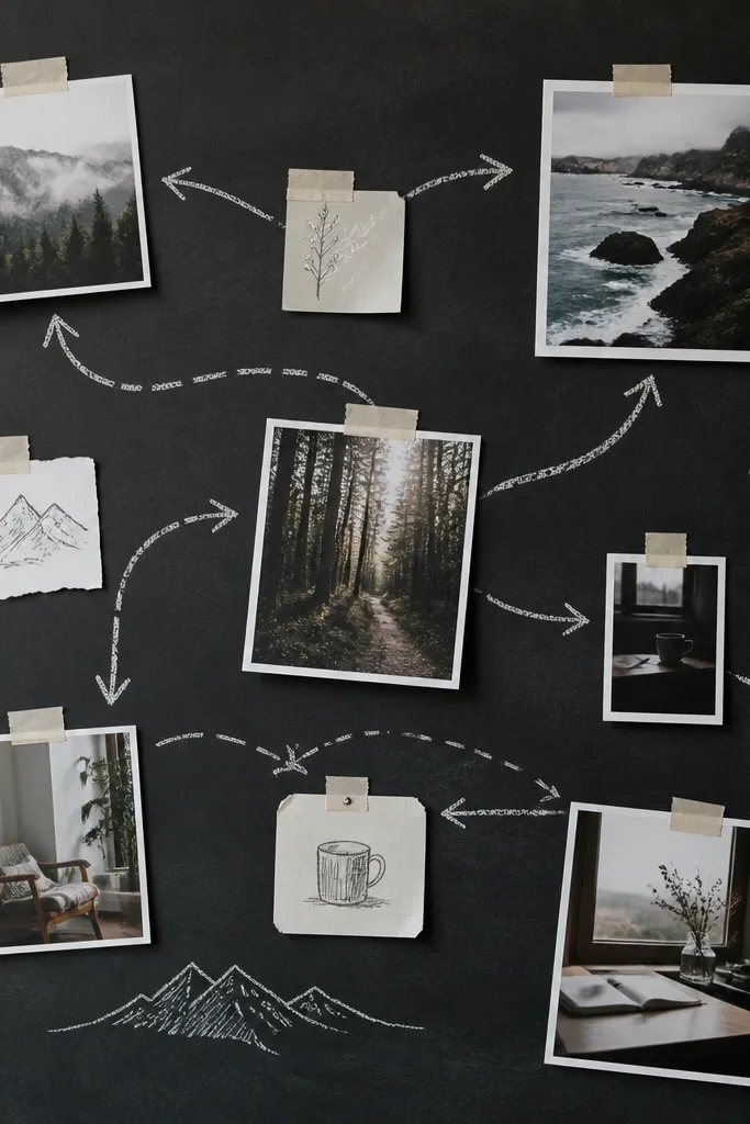
Chalk-style text feels like a living plan. Use a dark base (charcoal paper or paint) and place white chalk-font quotes or printed words. Add arrows and circles to guide the eye from “Now” to “Next.”
Good to knowLightly outline photos with a white gel pen so they pop against the dark background.
10. Cozy Reading Nook Board with Bookmark Collage Strips
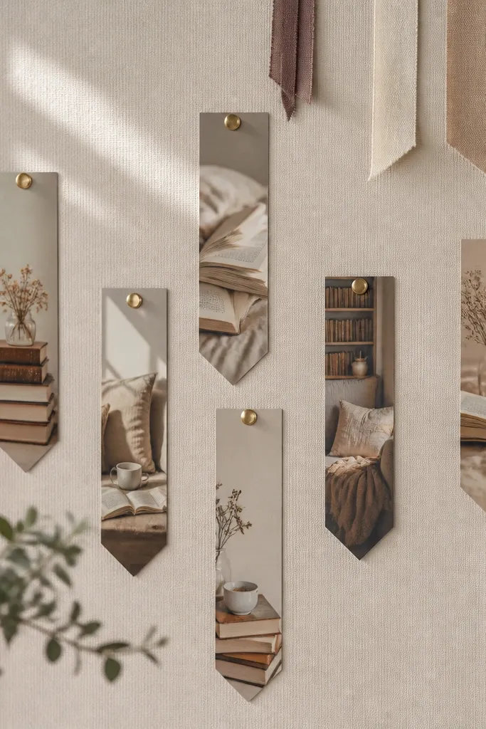
Bookmarks create an easy vertical rhythm that looks intentional. Add photo cutouts of reading corners, then layer “bookmark strips” behind them like a mini gallery. Fabric ribbons make it feel tactile and personal.
Good to knowUse a paper cutter to make uniform bookmark shapes — the alignment makes the board look polished.
11. Gallery-Wall Board with Thrift Frames and Photo Mats
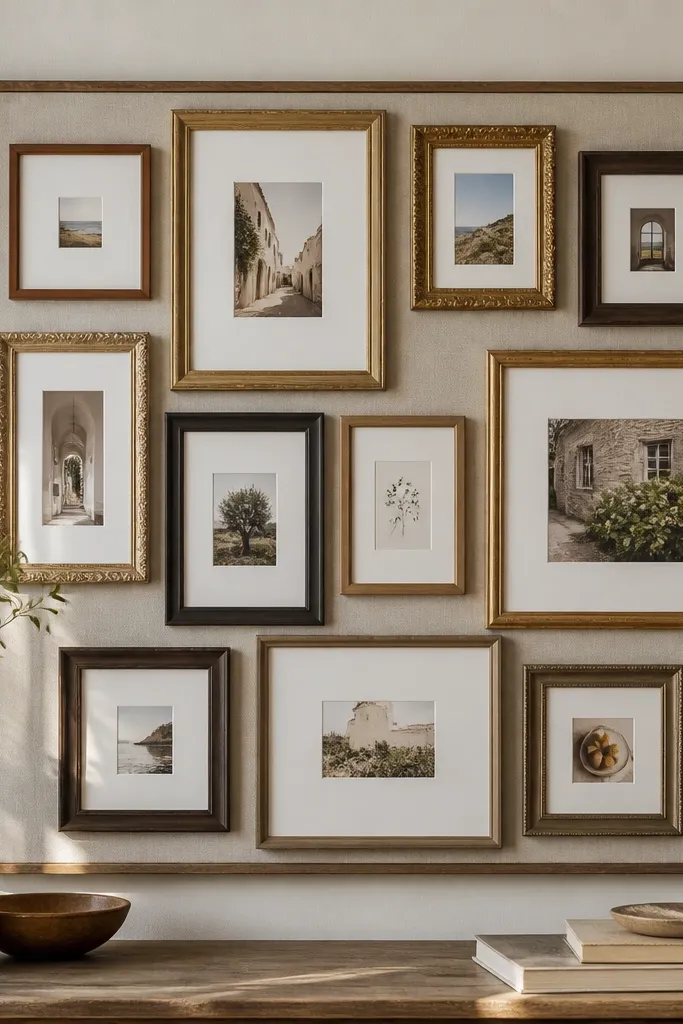
Frames instantly elevate your vision board from “craft” to “decor.” Use photo mats (or colored cardstock) inside each frame so your images look crisp and consistent. Mix sizes for a gallery vibe, but keep the mat color uniform for cohesion.
Good to knowSpray frames with the same paint finish (matte white, satin black, or antique gold) for a unified look.
12. Greenhouse Garden Board with Seed Packet Cutouts
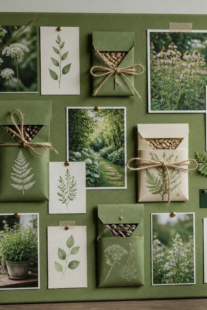
Seed packet textures and typography look naturally “vision-board ready.” Arrange packets like a catalog, then add small plant photos beside them for visual variety. Twine and leaf doodles bring in that greenhouse charm without cluttering.
Seal paper cutouts with a clear matte spray to protect against smudging if you plan to handle the board often.