1. The “Too-Tiny Photos” Readability Trap
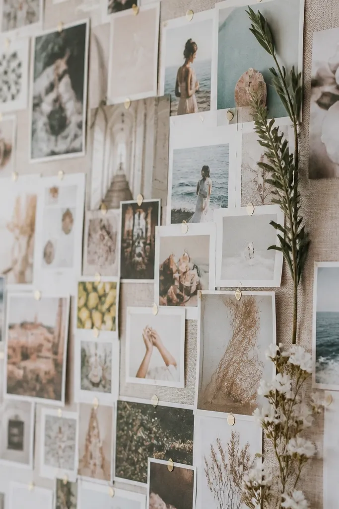
This happens when you treat your board like a scrapbook instead of a daily reference. When photos are too small, you can’t scan your goals during a busy morning, so the board becomes decoration instead of a reminder. Use larger images for your top 3 goals and smaller supporting images around them, not the other way around.
Pick a “main goal” photo that’s at least 4x the width of your supporting images so it’s readable from across the room.
2. Low-Contrast Color Collage That Feels Draining
When everything is the same lightness (all creams, all pastels, all grays), your brain can’t quickly find what matters. The board looks “soft,” but it doesn’t guide your attention. A simple fix is to add contrast: darker photo borders, a bold title card, or one saturated accent color that ties the board together.
Good to knowLimit your palette to 2 neutrals plus 1 accent color, then put a dark border behind any light image you want to stand out.
3. Glossy Photo Glare From the Wrong Print Finish
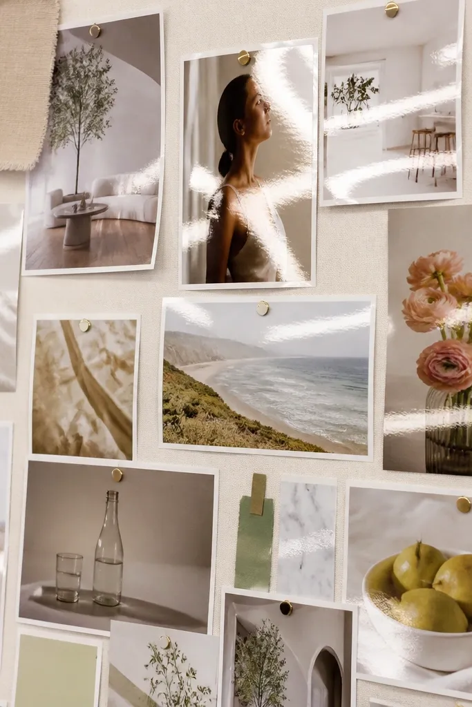
Glossy prints can look amazing at first, then become hard to read in real life. The reflection washes out small captions and makes your board feel less personal. Matte prints (or lightly textured paper) reduce glare and keep colors truer.
If you’re printing at home, choose matte photo paper or disable “glossy” settings; test one print before printing the whole board.
4. Borders Missing: The “Photos Look Like They’re Floating” Problem
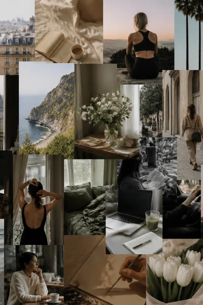
Without consistent borders, your board can look random even if the images are meaningful. Borders also hide minor print-cut imperfections and make the collage look intentional. A thin white or black margin works like a visual frame and helps different photo styles feel cohesive.
Add a 1/4 inch border (paper or digital) around every image so the whole board has one consistent “language.”
5. The Glue Bubble Mistake (Heat + Wet Adhesive)
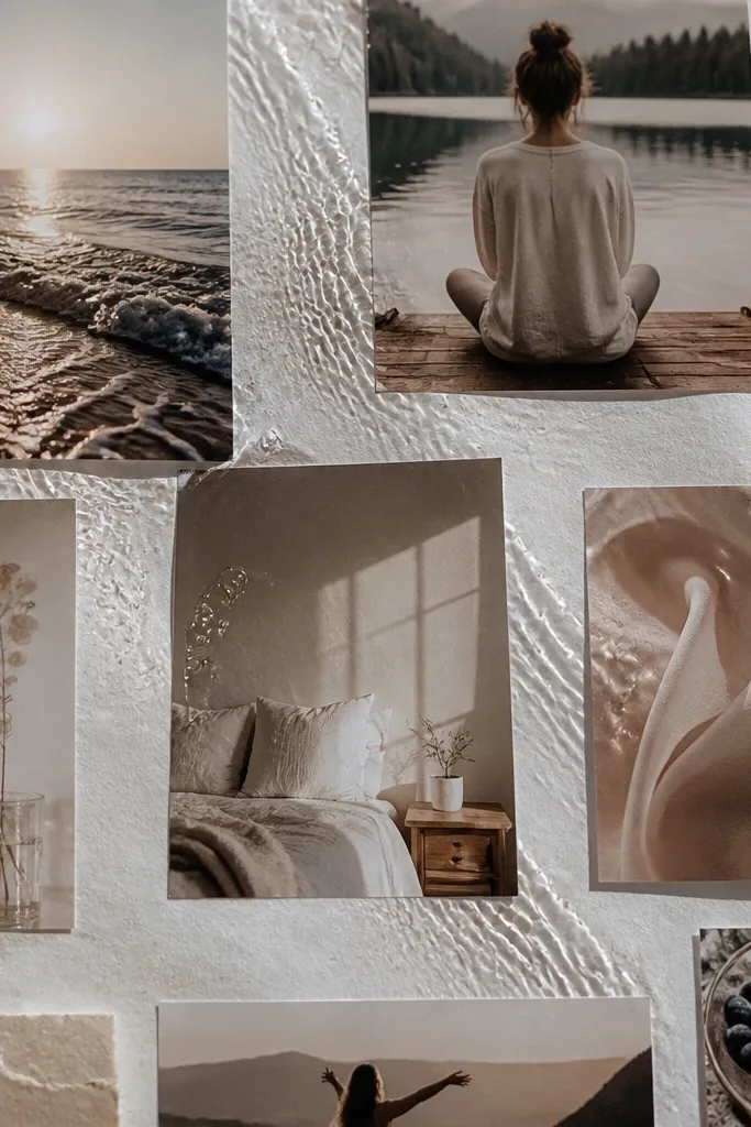
Bubbles happen when wet glue sits too long before it’s pressed flat, or when the surface warms while drying. This is common on cork tiles and foam board. It also makes your board look less “finished,” even if your images are perfect.
Good to knowUse a glue stick for paper-to-paper and apply in thin sections, then press with a brayer or clean credit card from center outward.
6. Using the Wrong Adhesive for Cork vs. Poster Board
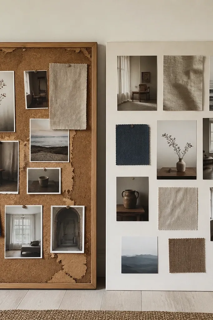
Cork has texture and tiny pores, so some adhesives don’t grip well and can peel later. Poster board is smoother and tolerates more types of adhesive. If you’re mounting on cork, you’ll want pressure-based or tacky options that grab the texture without soaking the paper.
Match adhesive to surface: cork = glue dots or tacky repositionable adhesive; poster board = glue stick or craft glue applied lightly.
7. Forgetting to Seal the Board (Smudges + Dust)
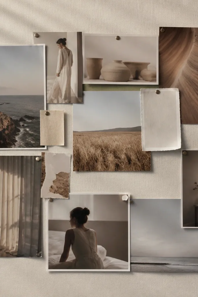
Open-collage boards collect dust where edges are exposed, and fingerprints can show if you touch it often. Over time, loose edges also invite curling. A light seal protects your prints and makes the board easier to wipe gently.
Good to knowAfter everything dries, apply a clear matte spray seal in thin coats from 12 inches away; do it in a ventilated area.
8. No “Next Step” Captions = Pretty But Passive
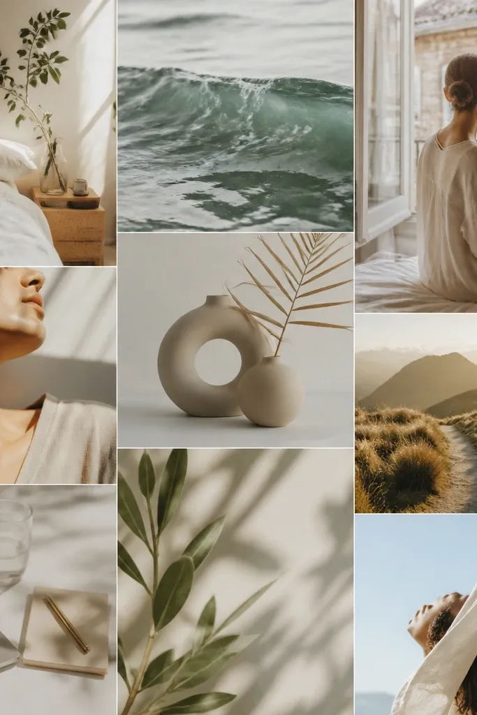
A board that shows outcomes only can feel overwhelming. When you don’t include a visible next step, you’re left guessing what “working toward it” means today. Adding short captions turns your board into a daily action prompt.
Good to knowUnder each main photo, add a 3-6 word caption like “Apply to 1 role today” or “Plan one meal this week.”
9. Overstuffed Layout That Makes Your Brain Tune Out
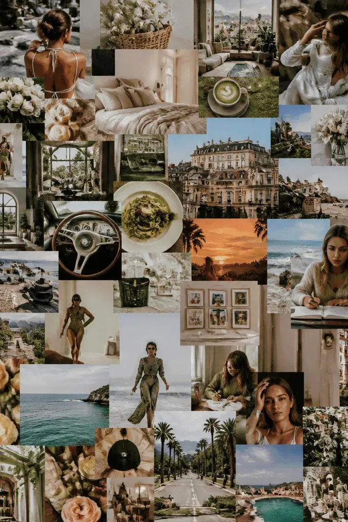
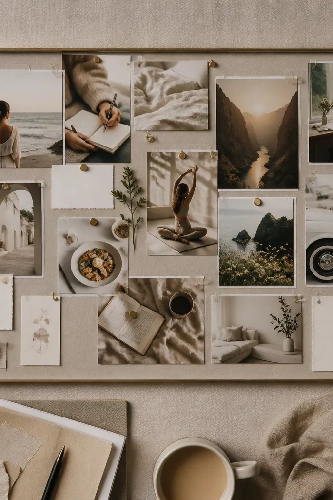
When every area is busy, your eyes can’t prioritize. The board becomes a visual wall instead of a guide. Negative space helps your chosen images feel like they’re “speaking” to you.
Good to knowLeave 15-25% of the board open or use a clean background panel so your main images have focus.
10. Not Anchoring Goals by Theme (Just Random Images)
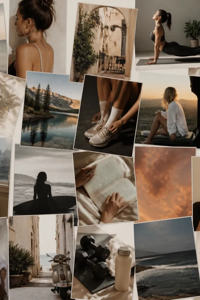
Random collage can feel exciting while you’re making it, then confusing when you revisit it. The board should tell a story across time: health, home, career, relationships. Grouping by theme makes it easier to choose what to work on this week.
Create 3-4 sections with headings (like Health, Home, Money, Joy) and keep most images inside their section.
11. Using Old or Outdated Photos That Don’t Match Your Now
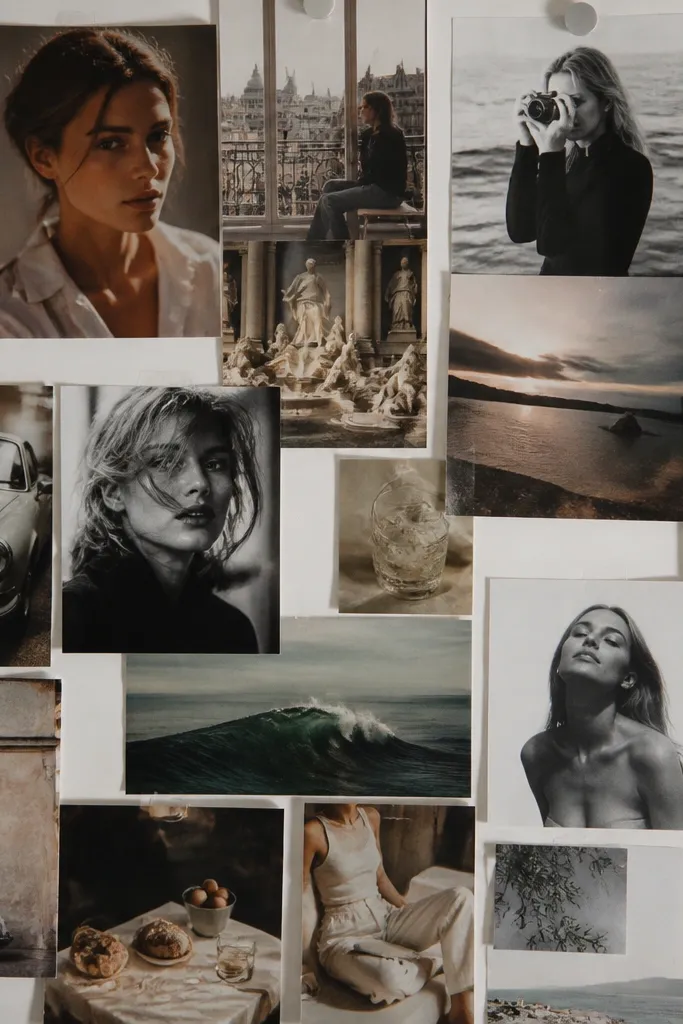
Outdated imagery can quietly sabotage motivation because it doesn’t reflect your current season. You end up chasing a version of yourself that doesn’t fit anymore. Replacing a few key images can refresh the entire board’s energy.
Good to knowIf a photo doesn’t feel like your life in the next 3-6 months, swap it for a current-style image.
12. Copy-Pasting Generic Quotes Without Personal Meaning
Generic quotes can make your board feel like everyone else’s. Even if the quote is positive, it might not connect to your actual goals. Instead of copying what you’ve seen online, write a line that ties to your images.
Rewrite one quote in your own words so it references a specific goal, place, or habit you’re working on.