1. Morning-Spot Desk Board (3-Photo Strip)
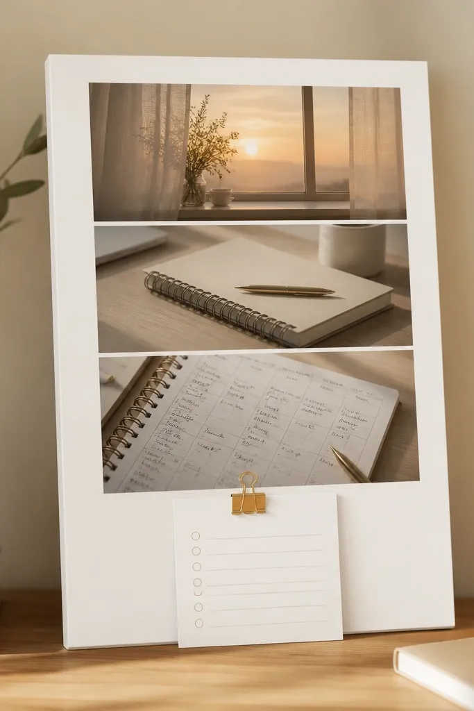
This layout works because it limits choices: only three images are visible, so your brain reads it instantly each morning. Use matte white cardstock and a beige or cream background to keep it calm and “serious,” not scrapbook-y. Add one small checklist clip photo or print so the motivation feels actionable.
Print the three photos at 4x6 each, then mount them with even spacing on an 8x10 sheet — finish with one small checklist card pinned at the bottom.
2. Semester Calendar + Goal Collage (Top-Heavy Layout)
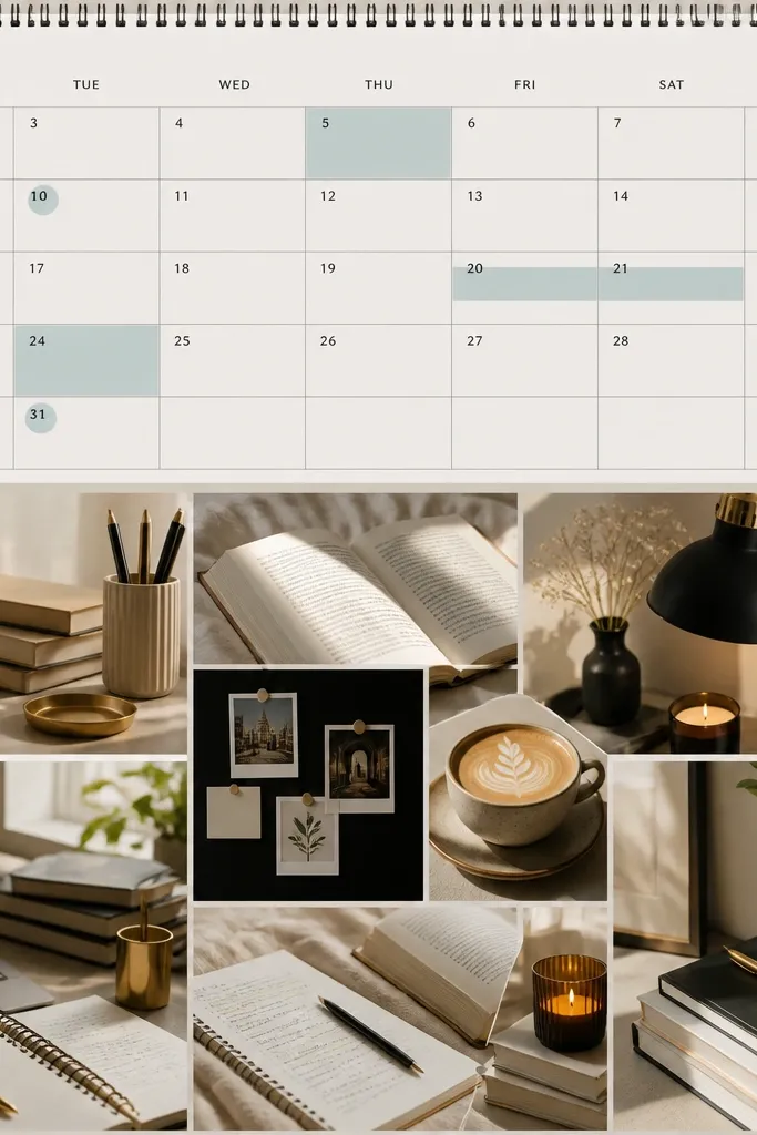
Top-heavy boards feel motivating because your eyes land on time first — deadlines become visual, not abstract. Pair a printed calendar spread with a few consistent textures like kraft paper, neutral notebooks, and plain desk photos. Limit accent colors (teal, black, gold) so it stays cohesive.
Good to knowPick one highlight color for the semester calendar and repeat it in tiny accents (sticker dots, pen color, or photo borders) to unify the whole board.
3. Flashcard Aesthetic Wall (Grid of Study Tools)
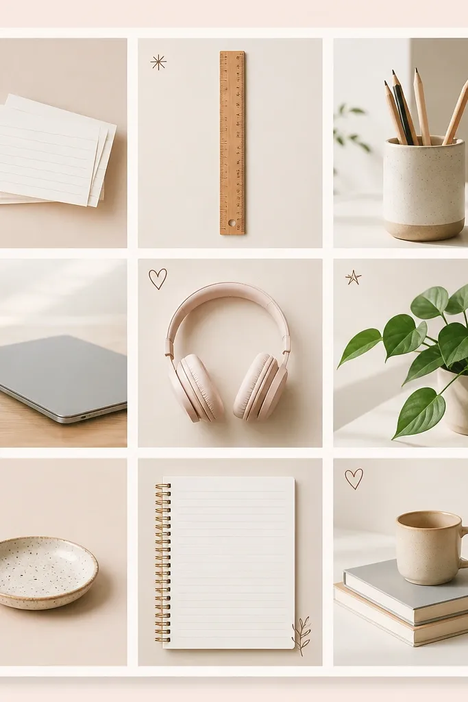
A tool grid is perfect if you get overwhelmed by “big goals.” Instead of one inspirational quote, you’re building a visual system: cards, tools, and routines. Keep the images similar in lighting (bright, neutral, no harsh shadows) so the board looks intentional.
Search for or take photos in the same lighting (near a window), then crop them to equal aspect ratios so the grid lines up cleanly.
4. Focus Hour Theme Board (Clock + Headphones Visuals)
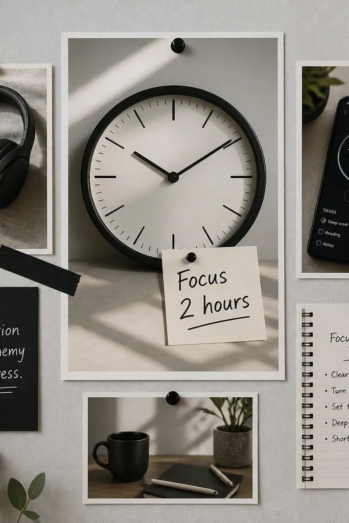
This is motivation through rhythm — it reminds you to start with a timed block rather than waiting for inspiration. Use one bold central element (clock or timer) and surround it with small supporting images. Black-and-white plus one accent color (lime or teal) keeps it sleek for any major.
Good to knowPut the timer image in the center and add a tiny “Start at 10:00” date note so you link the board to a real routine.
5. Library Quiet Vibes (Neutral Photo Strip)
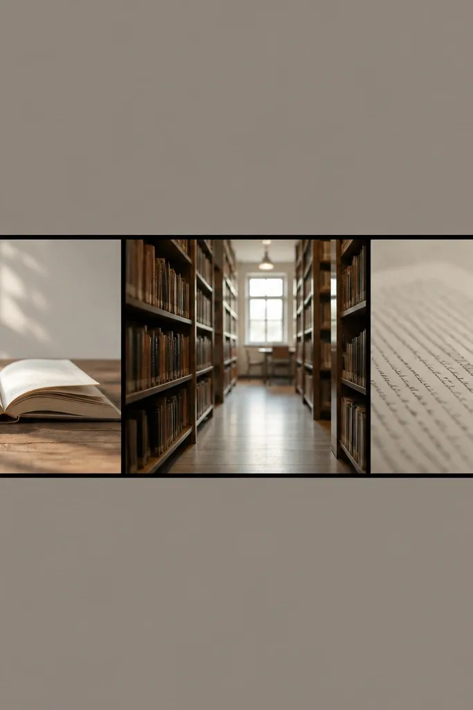
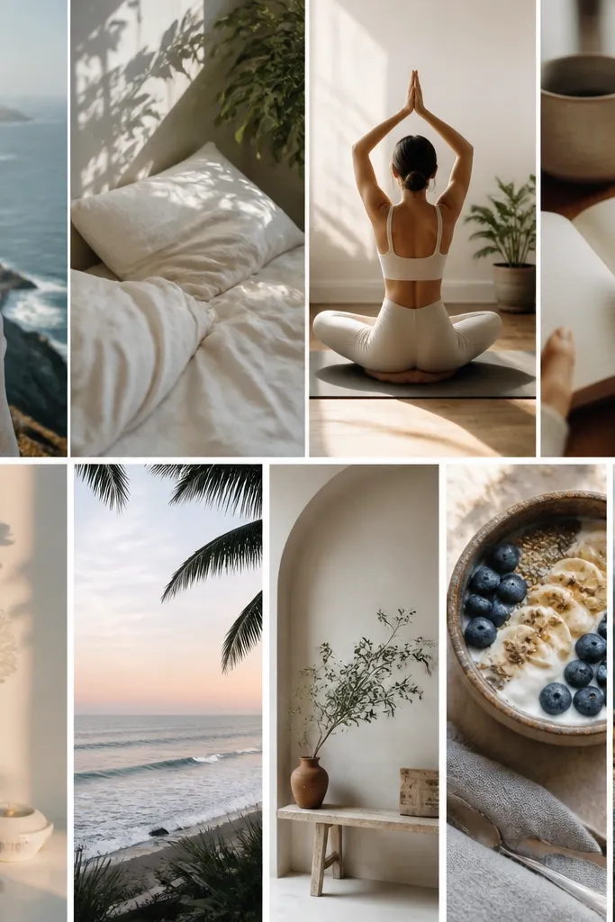
If you’re distracted easily, this kind of board works by recreating the environment you want. Choose neutral, low-saturation images so your brain associates the board with calm focus. Add one small “study checklist” block (three icons only) to keep it grounded.
Good to knowCrop your photos wide (16:9-ish) and keep margins consistent so the strip looks like a designed photo banner.
6. Pastel Progress Board (Before/After Page Corner)
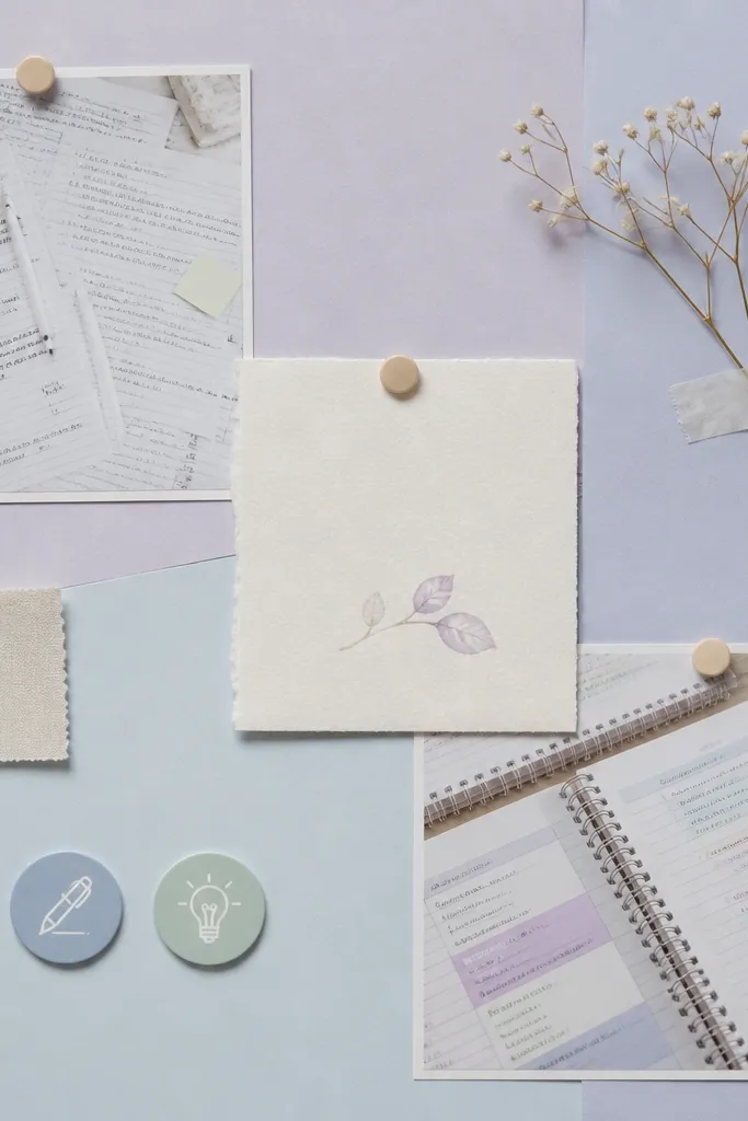
Progress visuals are motivating because they prove change is possible. The before/after corner makes the board feel personal and realistic — not just “dream mode.” Keep it aesthetic by using only two pastels plus white, and avoid too many bright stickers.
Good to knowPrint your before/after images at 4x6 and place them in opposite corners so the transformation is instantly readable.
7. Color-Coded Class Board (Subject Blocks)
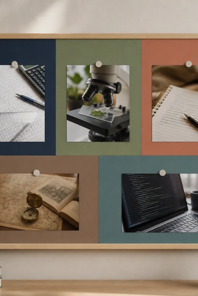
This layout is great for semester motivation because it turns classes into a system. Use subject colors consistently across your notes and the board so you get a mental “shortcut.” The blocks also help you avoid random collage clutter.
Good to knowCreate a simple key: write the class name and color in the same spot on your board and on your planner tabs.
8. Quote + Action Card Stack (Layered Aesthetic)
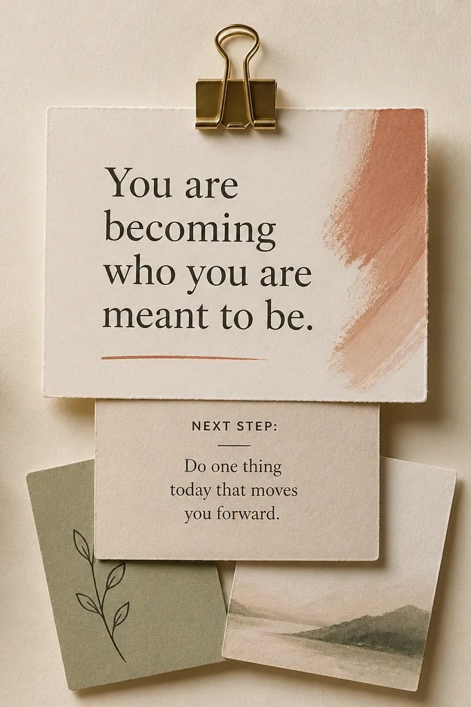
This works because it combines inspiration with the exact next step. The layered stack prevents “quote-only” boards from feeling passive. Choose typography-style fonts and keep card sizes consistent (like 4x6 and 3x5) for a polished look.
Good to knowWrite one action card that matches your routine (e.g., “Open notes + write 3 questions”) and place it where you’ll pick it up daily.
9. Goal Map Mini Board (Sticky Note Path)
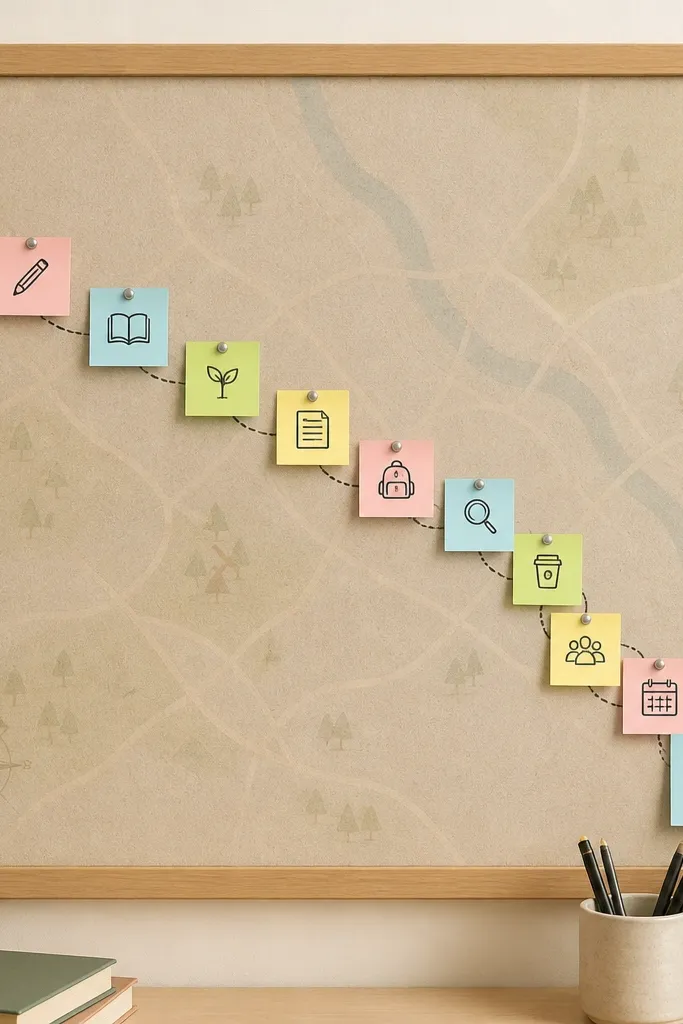
A path visual makes long-term goals feel like a sequence, not a mountain. Sticky notes add a tactile vibe and let you swap images mid-semester without redoing everything. Keep the sticky notes in one color family so it still feels designed.
Good to knowUse only 5-7 sticky notes for the whole semester so the board stays readable from a distance.
10. Notebook Cover Board (Texture-First Aesthetic)
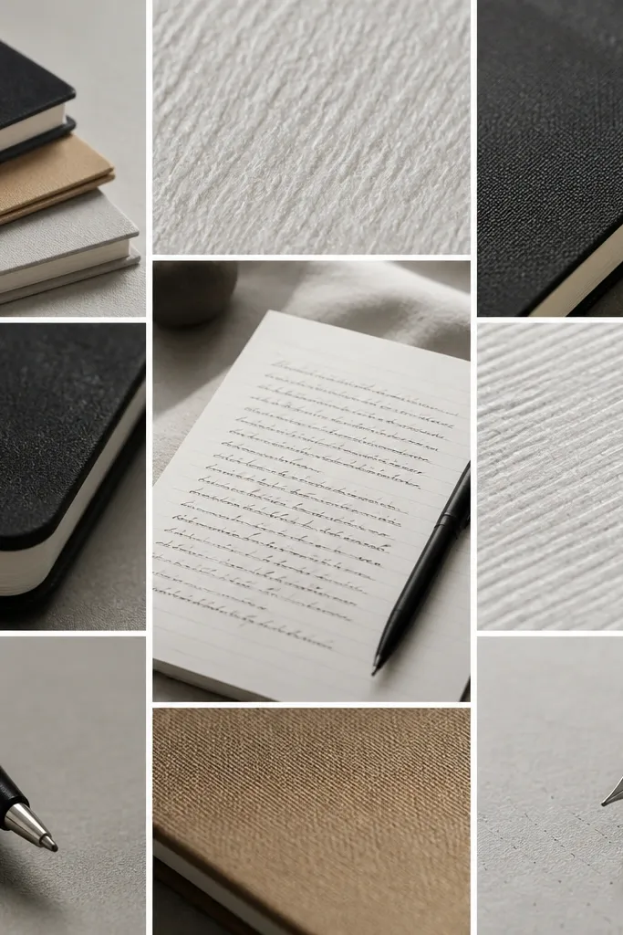
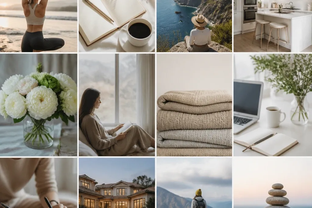
Texture-first boards are surprisingly motivating because they reduce decision fatigue. When your board looks like the materials you’ll use, you feel “ready” to start. Use close-up shots and keep them evenly spaced so it reads like a curated design.
Good to knowTake 5 close-up photos of your own supplies (notebooks, pens, tabs) and print them for a board that feels uniquely yours.