1. Linen + Gold “Quiet Luxury” Board
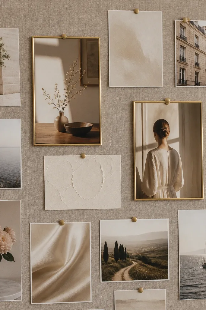
This look uses a neutral base (taupe or oatmeal linen) and small, shiny gold accents to make every picture feel polished. Print your photos slightly warm (cream/peach tones) so skin and landscapes blend into the fabric. Keep the images mostly landscape and close-cropped for an elevated, cohesive vibe.
Print 2-inch square photo crops and use gold pushpins in a consistent pattern (same angle and spacing) for that “curated” feel.
2. Polaroid Grid With “Film Date” Captions
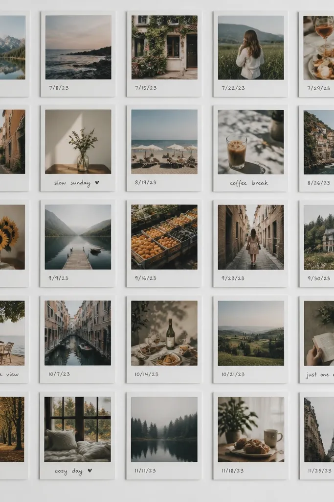
Polaroid-style images instantly make a vision board feel tangible. Add “film date” captions like “Jan 2026 — booked the trip” or “Mar 2026 — first client” to connect your visuals to a timeline. Use a consistent black caption font so the board stays aesthetic, not messy.
Crop your photos to portrait or square only, then print with a polaroid border template so every image matches size.
3. Magazine Cutout Collage With Tear-Edge Texture

Tear-edge paper adds movement and a vintage-collage feel that looks artsy without being random. Choose 2 magazine categories (ex: home decor + wellness) so the colors and lighting stay consistent. Layer clippings with a slight offset and leave tiny gaps for a breathable aesthetic.
Good to knowUse a glue stick for flat layers and a glue pen only on corners so the torn edges look naturally lifted.
4. Moody Night Sky Goals (Deep Navy + Star Highlights)
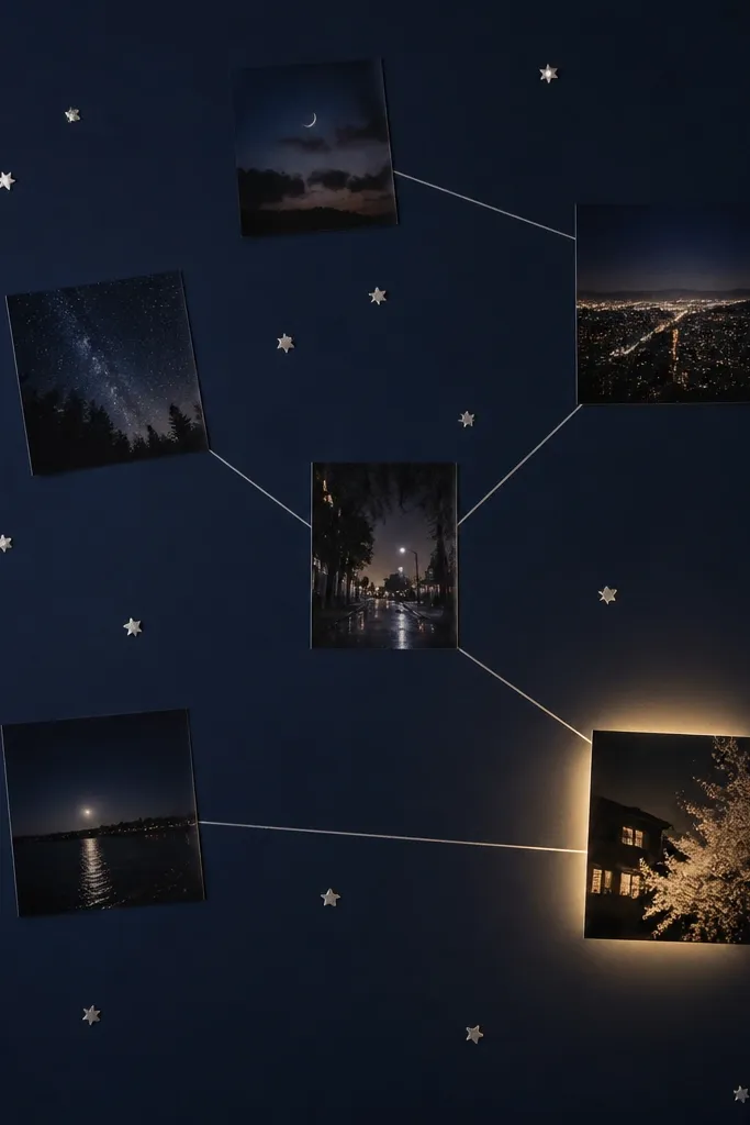
Deep navy makes bright photos pop and creates a “future is coming” mood. Add star stickers in small clusters so you’re not covering everything. For the highlight effect, print one hero image with increased brightness and contrast, then place it near your center.
Draw 3-5 thin silver line connections using a metallic gel pen to visually link your top goals.
5. Pastel Watercolor Wash Board
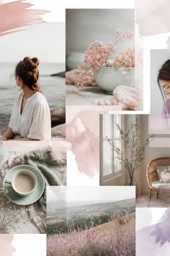
Watercolor washes make your photos look like they belong together even if they’re from different sources. Keep photo lighting consistent by choosing images with similar saturation levels. Use pastel accents for goals like self-care, creativity, and home refreshes.
Lightly paint behind photos first, let dry fully, then glue only the photo edges so the center looks airy.
6. Minimal Whiteboard With One “Hero Photo”
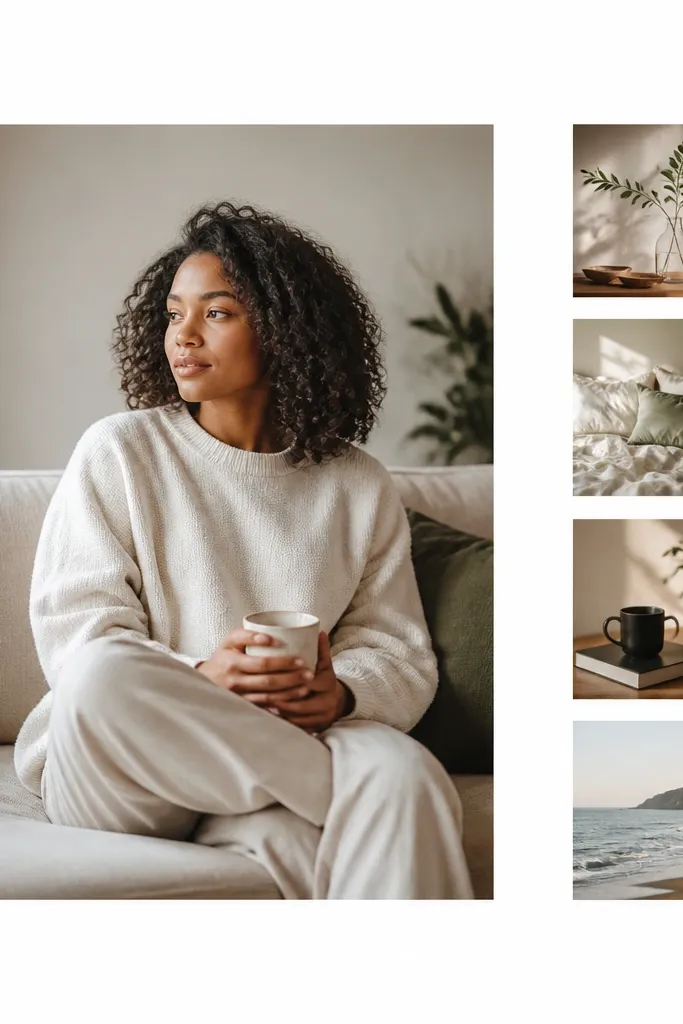
If you hate clutter, this layout keeps your brain calm and your goals clear. The hero photo anchors the vision, while 4-6 smaller images act like evidence. Use black labels with short phrases (ex: “Move-in date”, “Skill practice”, “Savings milestone”) instead of long paragraphs.
Good to knowLimit yourself to 1 hero photo + 6 supporting photos — anything more starts to feel busy with this style.
7. Warm Earth Tone “Home Sweet Future” Board
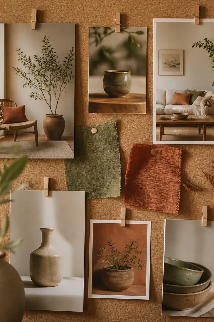
Earth tones are perfect for home projects because they match real materials — wood, clay, linen, and greenery. Use cork or faux cork backing for texture, then clip photos so you can swap them later. Include at least one plant-related image to reinforce “growth” goals.
Good to knowGroup photos by room theme (kitchen, living room, bedroom) and keep each group in a consistent color range.
8. Neon Accent Vision Board (Black Base + Color Pop)
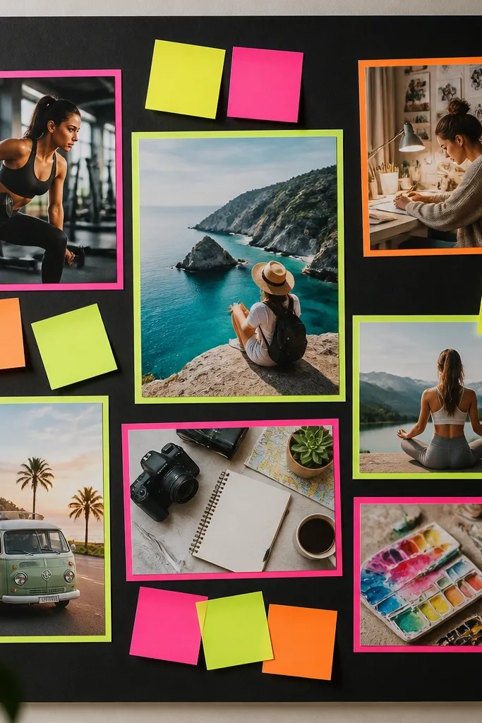
A black base makes neon accents look intentional instead of childish. Use color pop only in small doses — outline a few photo corners, add one neon title strip, and keep the rest clean. This style works great for bold goals like fitness, career leaps, and creative challenges.
Pick one neon color (lime, hot pink, or electric blue) and use it for every accent so the board stays cohesive.
9. Transparent Film Overlay With “Layered Manifesting”
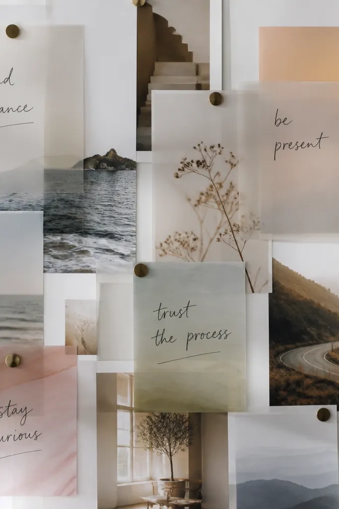
Acetate overlays create depth and make your board look like a design project, not just a collage. Print your photos normally, then place acetate sheets on top with taped edges. Add handwritten goals in marker on acetate for a floating, ethereal effect.
Good to knowUse painter’s tape to hold acetate corners so you can reposition without damaging paper.
10. Board + Frame Duo for “Rotate Your Goals”
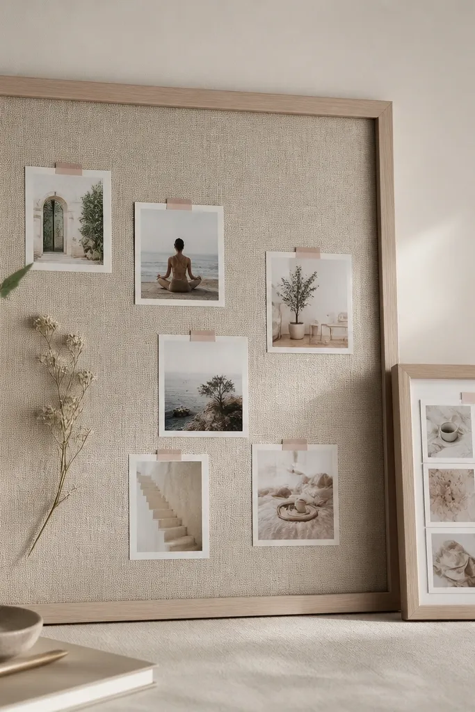
This setup keeps your aesthetic while letting you update goals as the year progresses. Put your evergreen goals on the main board and rotate monthly milestones in the frame. Choose a frame color that matches your board accents (gold, black, or wood) for a cohesive look.
Good to knowCreate 12 mini cards ahead of time, then swap one each month using the same print size for consistency.