
1. Closet-Door Vision Board with Magnetic Photo Strips
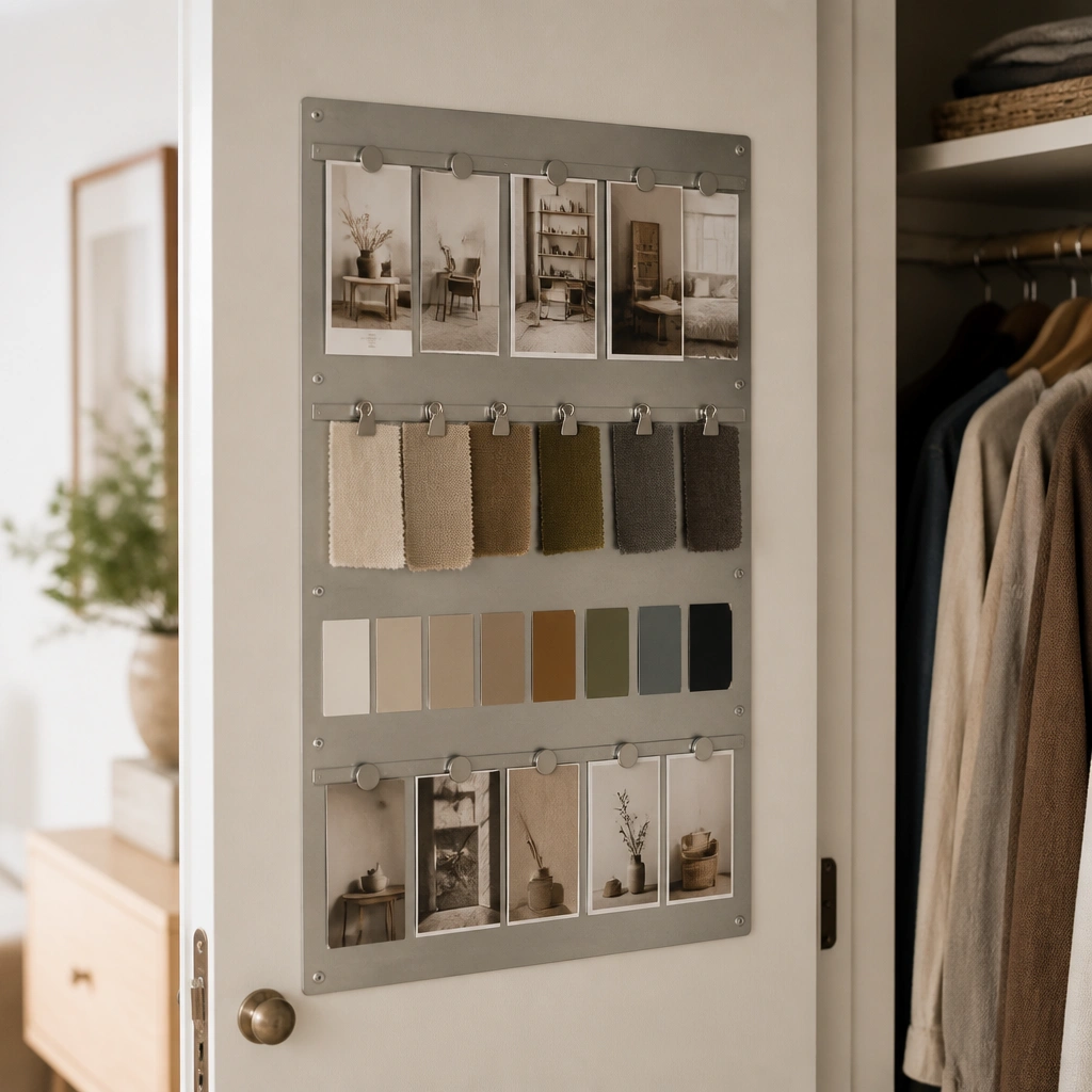
This layout uses a magnetic backing so you can swap pictures without pushing pins into the door. Keep the palette tight (2 neutrals + 1 accent) and use vertical strips so your eyes move up and down, not across a messy grid. It’s perfect for apartments where walls are already packed with shelves.
Search for a peel-and-stick magnetic sheet or a thin metal panel, then add magnets to the back of your printed photos for easy swapping.
2. 18x24 Photo Grid on a Command-Hook Rail
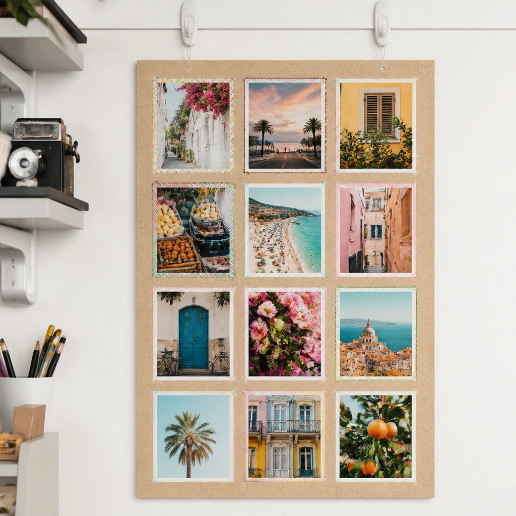
A compact 18x24 board is a sweet spot for small spaces because it’s big enough to read but not overwhelming. Use a 3x4 grid for clarity — each photo becomes a decision point (paint tone, furniture shape, storage solution). Border each image with consistent tape widths so the board looks cohesive.
Good to knowBefore mounting, lay the grid on the floor and measure spacing so every photo aligns, then print with the same aspect ratio.
3. Renter-Friendly Removable Fabric Board with Clip Corners
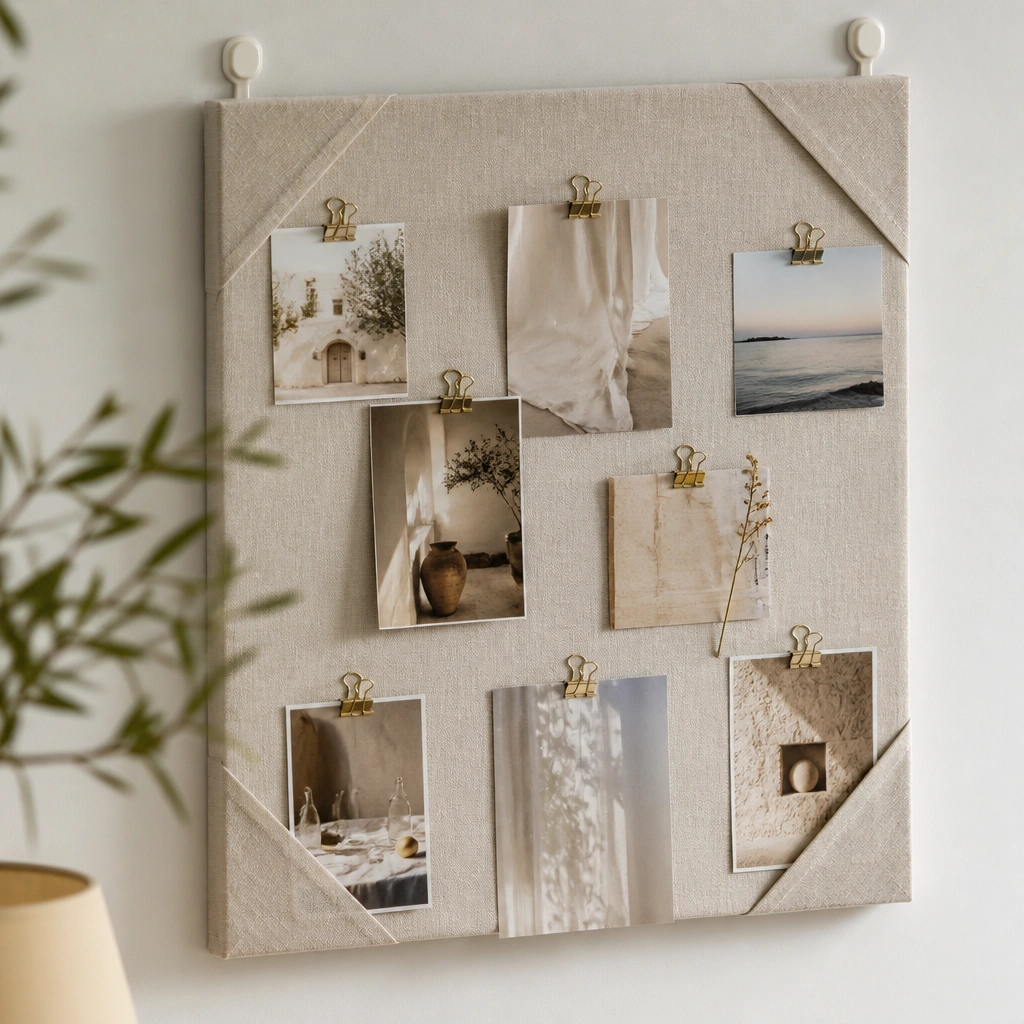
Fabric boards look cozy and hide the “DIY” vibe because the texture blends with home decor. Clip corners let you replace one section (like “spring styling”) without tearing paper. Choose neutral fabric (cream, light gray, or sand) so your photos pop without competing.
Use a tension rod setup or removable adhesive hooks, and attach fabric with clips around a thin wooden frame for zero wall damage.
4. Kitchen-to-Living Color Map Board (One Wall, Two Zones)
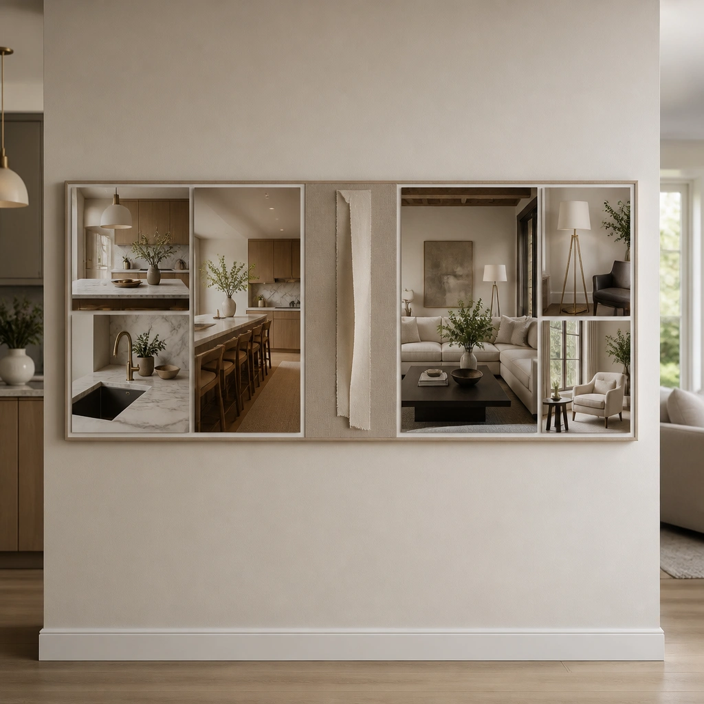
If your apartment flow is open-concept, split your board into two zones: kitchen and living. Add a “transition strip” across the middle showing one repeat color (like sage + oak or black + white). This helps you avoid buying decor that clashes between rooms.
Good to knowPick one repeat material for both zones (wood tone, black metal, or white ceramic) and feature it in at least 3 photos.
5. Under-Desk Desktop Vision Board (Mini Stand Layout)
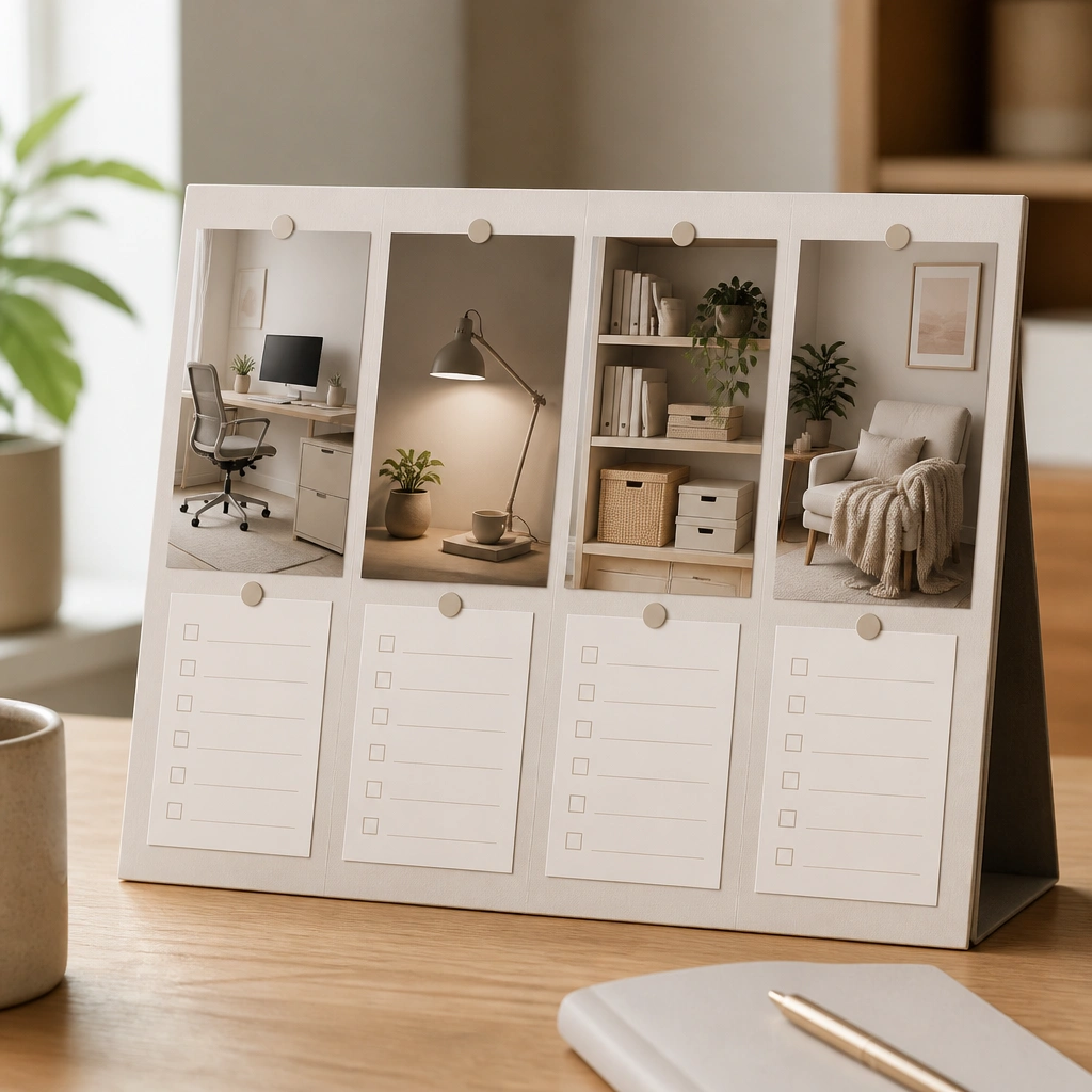
For micro-apartments, a mini board keeps your intentions close to where you act daily. Use one hero photo per category so you don’t get decision fatigue. Add tiny checklist cards (e.g., “cable clips,” “task lamp,” “desk tray”) under each image.
Good to knowPrint photos at 4x6 and mount them on cardstock so the board looks intentional instead of paper-flimsy.
6. Window Sill Vision Board with Tape-Backed Print Cards
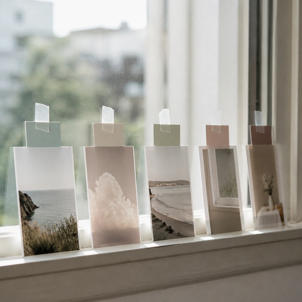
This works when wall space is limited but natural light is abundant. Tape-backed cards let you rearrange quickly, and the daylight enhances warm tones like terracotta, honey, and creamy whites. Keep the layout linear so it doesn’t look chaotic in a narrow space.
Use clear photo corners or removable tape, and lightly cover the print edges with matte tape to reduce glare.
7. Bedside Headboard Vision Board with “Before/After” Cards
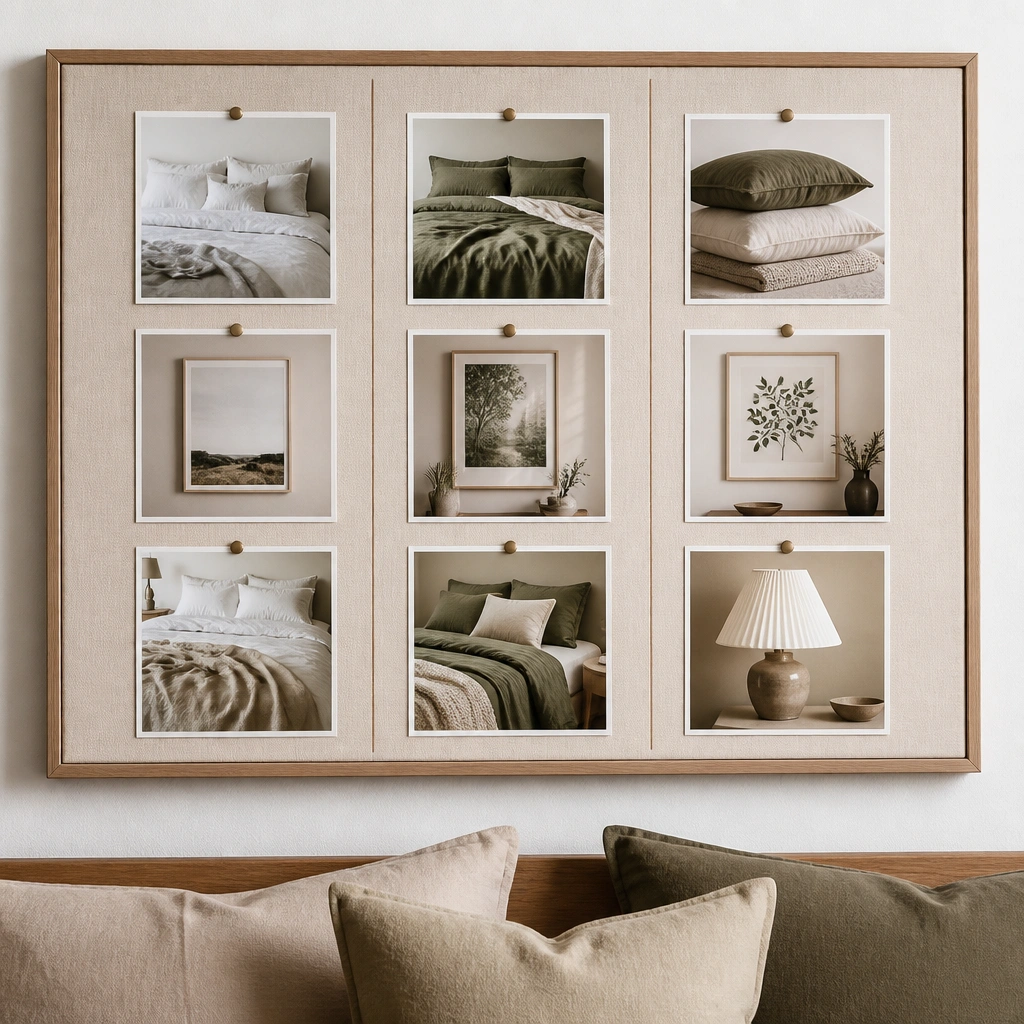
Small bedrooms benefit from before/after thinking because you can plan what changes first (bedding, lighting, wall art scale). Keep the “must buy” column to 3 items max so it doesn’t become a wish list dump. Choose one image for each: color, texture, and lighting temperature.
When you pick photos, match the lighting vibe — warm vs cool — so your board doesn’t accidentally clash with your bulbs.
8. Fridge-Magnet Vision Board for Studio Apartments
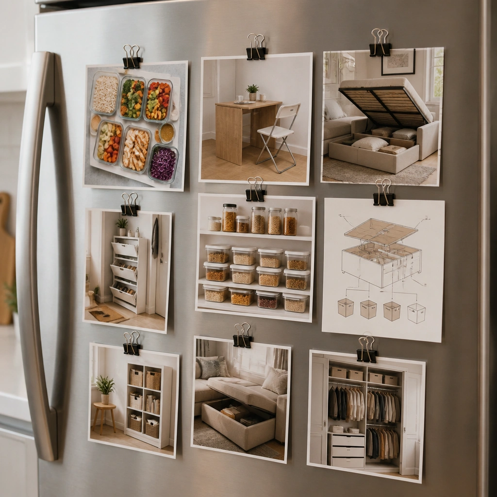
Studios often treat the kitchen area as the center of life, so a fridge board becomes a practical planning tool. Use binder clips so you can swap photos while keeping them flat. Add a tiny “shopping checklist” strip at the bottom so you can act immediately.
Good to knowCreate a magnet-friendly backing: print photos on cardstock, then glue a thin magnet sheet to the back.
9. Hallway Narrow Strip Vision Board (Vertical Scrolling Layout)
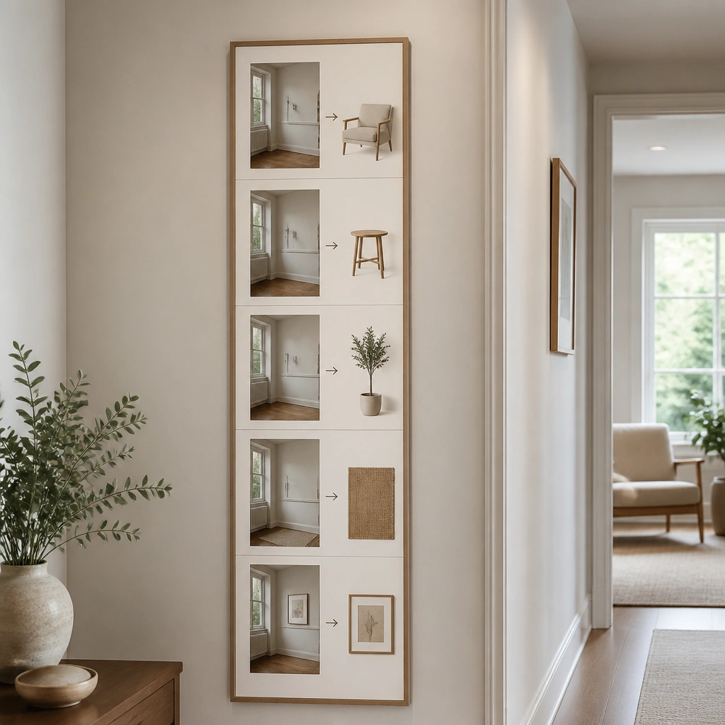
In hallways, a vertical “scroll” layout feels natural because your body moves that way. Use arrows and simple placement sketches to show where an entry bench, mirror, or shoe storage should go. This is one of the best ways to plan small-space circulation.
Good to knowMeasure your walkway width and include one photo with a scale reference (like a person silhouette) to keep furniture sizing realistic.
10. Corner Shelf Vision Board on a Floating Tray
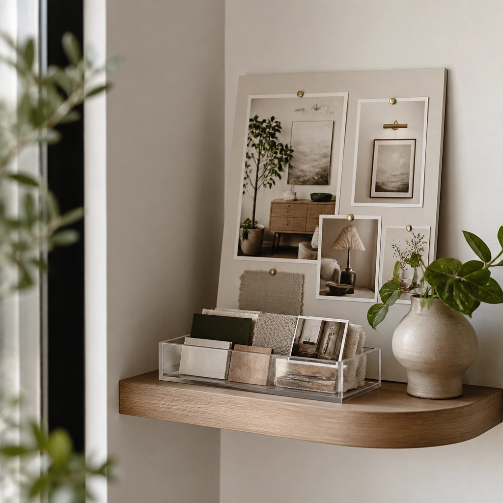
Corners are tricky — they’re visible but hard to decorate. This layout turns the corner into a planning station by placing your vision board right where you’ll style. Use one “plant” photo, one “light” photo, and one “texture” photo so your items repeat visually.
Keep the shelf styling to a 3-item rule: one plant, one vertical element (lamp or tall art), and one texture (woven basket or ceramic).
11. Corkboard with Color-Coded Pin Clusters (No Mess Layout)
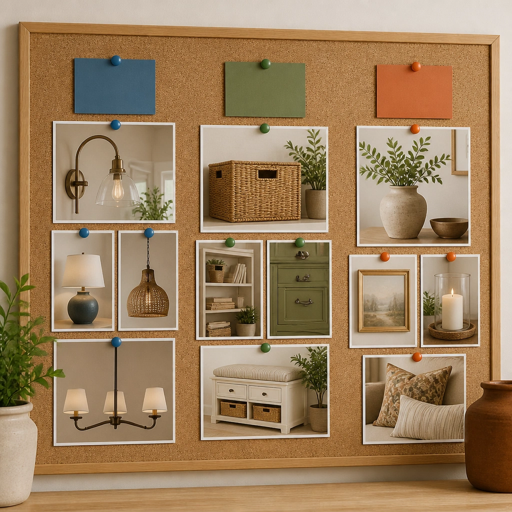
Instead of scattering pins, group them into clusters with a single caption. Color-coded pins help you remember what each photo represents while you shop. This is especially useful in small spaces where every purchase must earn its spot.
Assign just 3 categories and use only those pin colors — your board will stay organized even after you add new images.
12. Magnetic Dry-Erase Overlay for “Swap Weekly” Updates
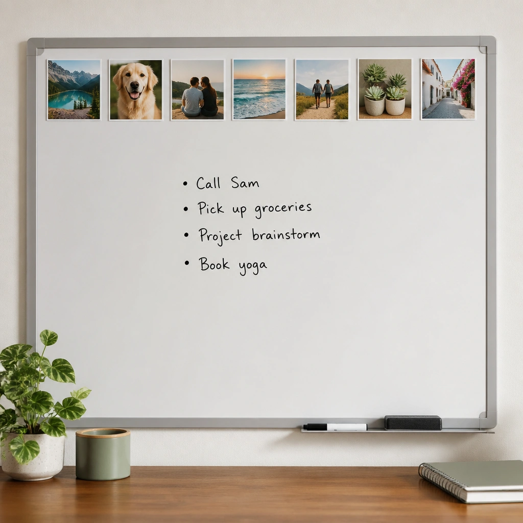
A dry-erase overlay makes your vision board interactive. Put photos along the top like a “mood header,” then write weekly actions in the center (e.g., “order blackout curtains,” “search sofa dimensions”). This keeps your board from becoming static clutter.
Good to knowUse a thin marker color system: one color for purchases, one for measurements, one for styling dates.