1. Marble + Soft Linen Mood Board (Neutral Spa Luxe)
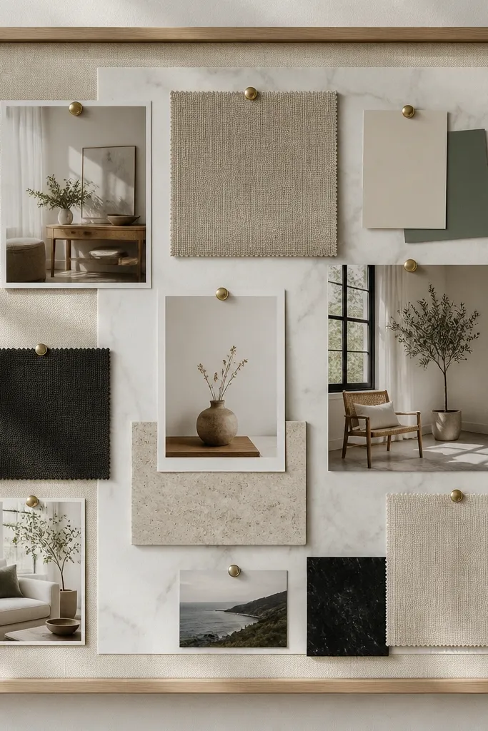
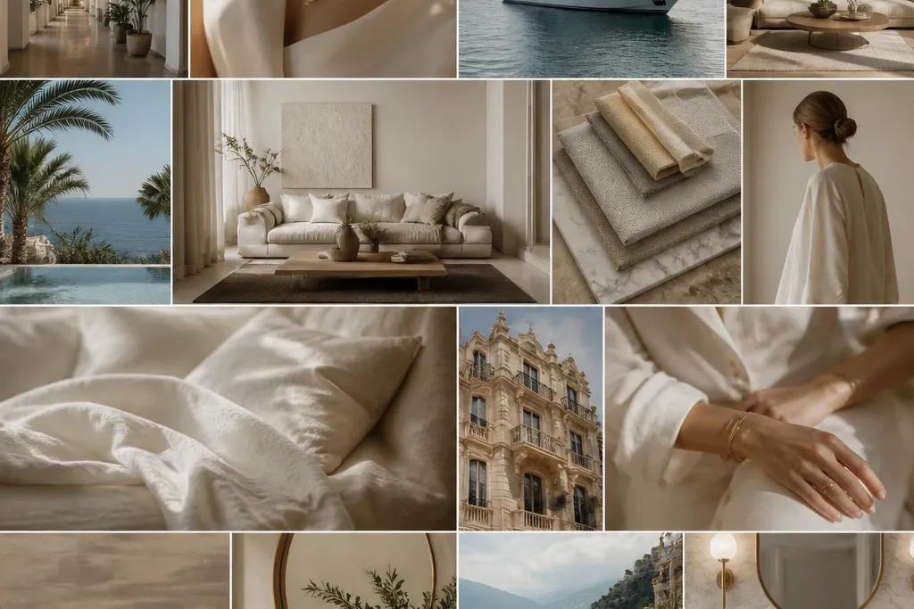
Start with a stretched linen fabric backing so your photos look softer and more expensive than paper. Add a marble-effect printed sheet behind the main collage area, then layer on black serif label cards for instant editorial energy. Use a limited palette — ivory, warm gray, and black — so everything reads cohesive.
Print your marble background on matte photo paper to reduce glare, then seal labels with a clear matte craft spray so ink doesn’t smudge.
2. Black Lacquer Frame Grid (Gallery-Wall Vision)
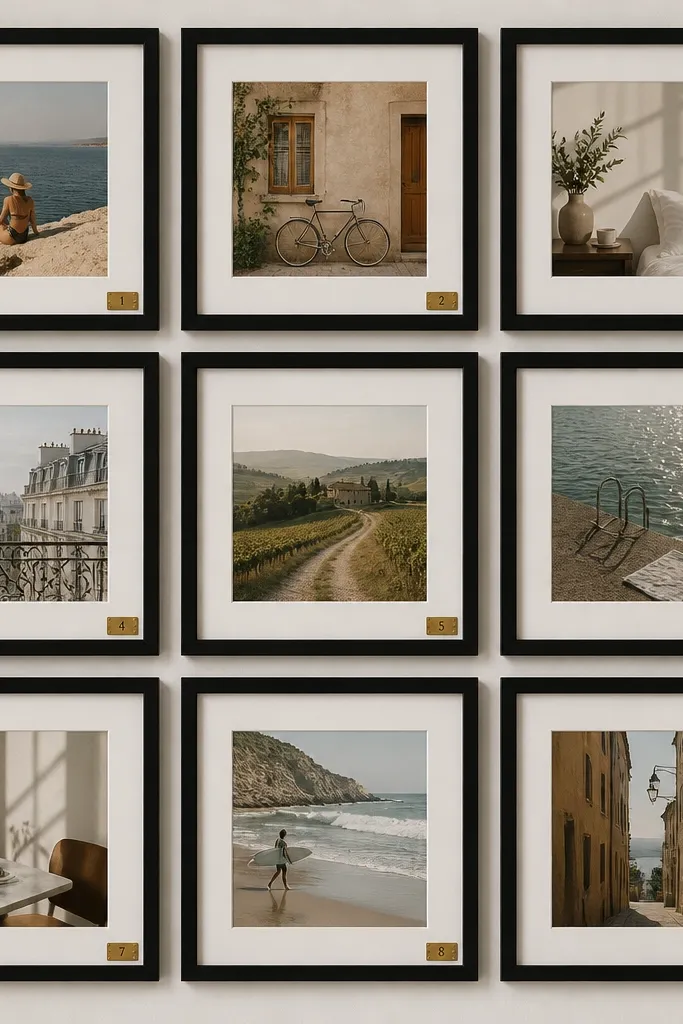
This is high-end because it’s uniform. Use a matching set of slim black frames (same width) and treat each frame like a “chapter” — one for home, one for wellness, one for career. Add gold foil number stickers to create a designer rhythm and make the board feel curated.
Choose one frame size and commit — mix only photo sizes, not frame styles. Keep spacing consistent (about 1-2 cm) for that luxury look.
3. Acrylic + Micro-Shadow Boxes (Sculpted 3D Luxe)
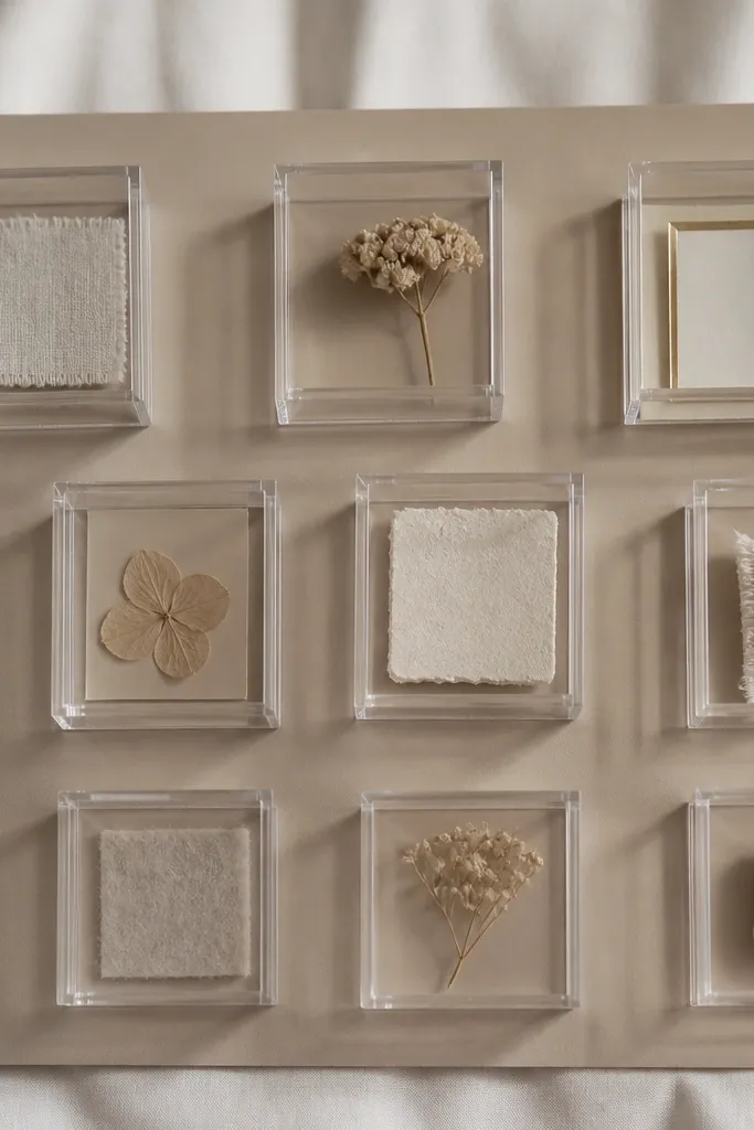
3D elements instantly elevate vision boards because they cast real depth. Use small acrylic shadow boxes (or clear acrylic pockets) and insert tactile pieces — linen swatches, a scent card, a pressed leaf, or a miniature tile sample. The taupe backing keeps everything warm and boutique.
Lightly heat-bend thin card stock behind items so they sit at a slight angle, creating natural “display” depth without glue mess.
4. Gold Leaf Tape Dividers (Architectural Layout)
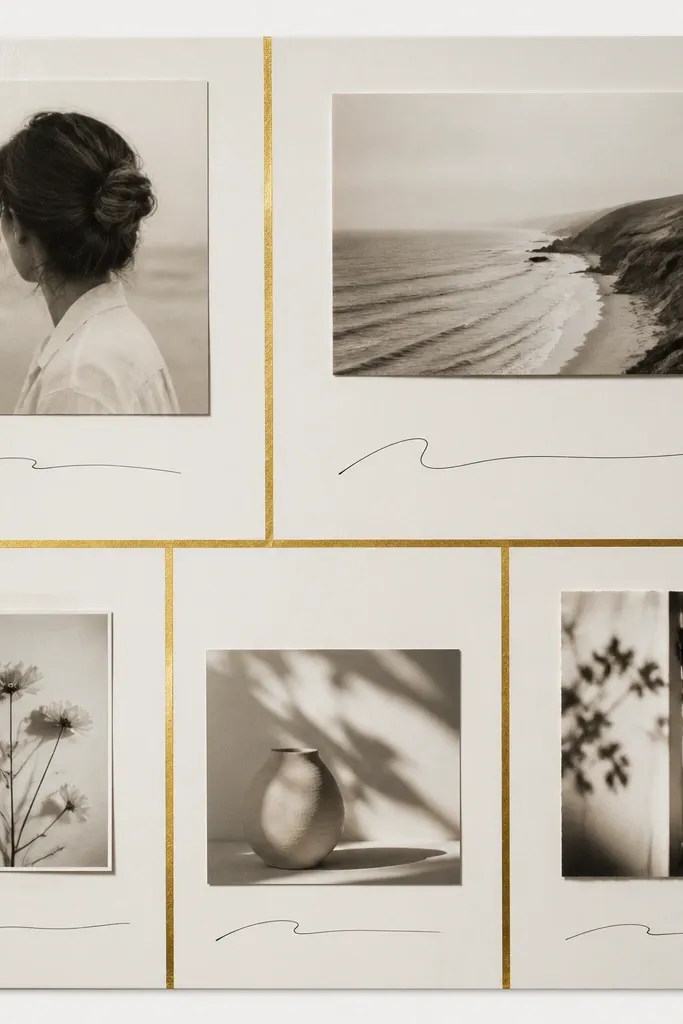
Think of this as an interior design plan. Use gold leaf tape as your dividers instead of random tape scraps — it creates structure and makes your board look like it belongs in a showroom. Keep each section focused: one color story, one theme, one small set of images.
Good to knowLay down tape lines first, then place photos within the “architectural” blocks. That order prevents overstuffing and keeps the lines straight.
5. Dark Walnut + Leather Swatch Sidebar (Men’s-Style Luxe)
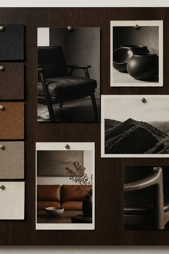
Leather swatches read instantly high-end, especially when you repeat them in a controlled way. Make a sidebar using 6-10 tiny swatches (cognac, espresso, and caramel) and pair with warm monochrome photos. Add minimal typography on off-white label cards for a tailored, editorial vibe.
Use fabric-safe double-sided tape for swatches, not hot glue — it keeps edges clean and won’t warp the board.
6. Soft Blush + Dried Flower Corner (Boutique Spa Dreams)
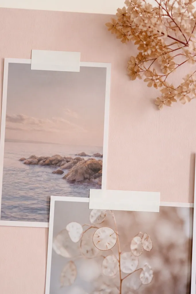
This looks luxe because it’s restrained. Choose one dried flower corner (one cluster, not scattered everywhere) and anchor it with a few matching pastel images. Use blush, ivory, and muted rose tones, then add tiny label stickers so the board feels styled instead of accidental.
Press flowers for 24-48 hours between book pages, then place them under a thin clear sheet or lamination strip to prevent crumbling.
7. Monochrome Film Strip Timeline (Cinematic Luxury)
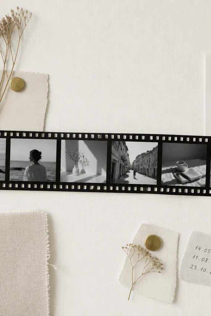
Luxury feels cinematic when you build a timeline. Create a film strip across the board and add 8-12 black-and-white images that represent “before to after” — routines, outfits, rooms, travel style. Keep it monochrome and add dates like milestones to make your goals feel like a story.
Good to knowUse matte black photo corners or printable film strip overlays so the photos don’t look like random cutouts.
8. Chalkboard Matte Planner Board (Modern Luxe Office)
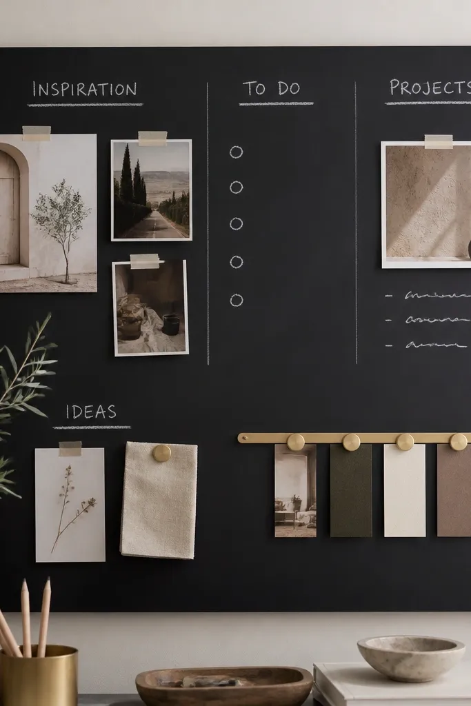
A chalkboard surface looks sleek and expensive because it’s matte and clean. Use white chalk for category headings, then pin photos with gold magnets or clips for a refined contrast. This is perfect if you love updating your board weekly without re-gluing.
Spray a light matte clear coat over finished chalk writing to help it last longer and resist smudging.
9. Wallpaper Backdrop + Coordinated Cutouts (Designer Room Echo)
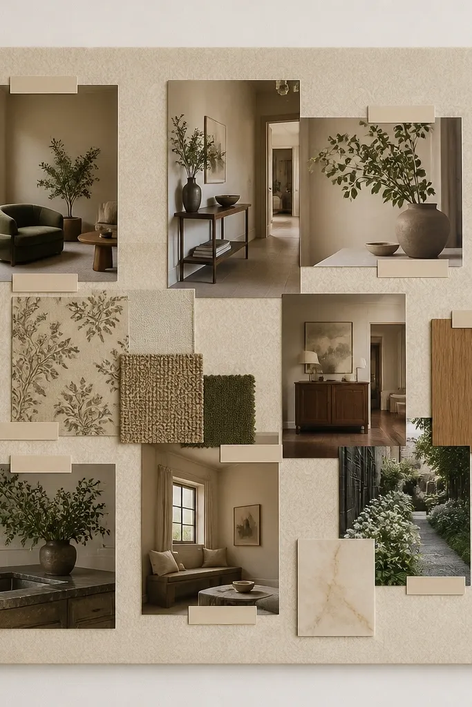
Wallpaper makes the board feel like interior decor, not a craft project. Pick one subtle pattern (linen texture, micro-dot, or faint damask) and keep your photos coordinated by color temperature. Trim edges cleanly so the wallpaper reads intentional, like a designer accent wall.
Good to knowUse a craft knife and metal ruler to cut wallpaper edges crisp, then seal the surface with a decoupage medium to prevent peeling.
10. Iridescent Holo Highlights + Clear Labels (Tech-Luxe Trend)
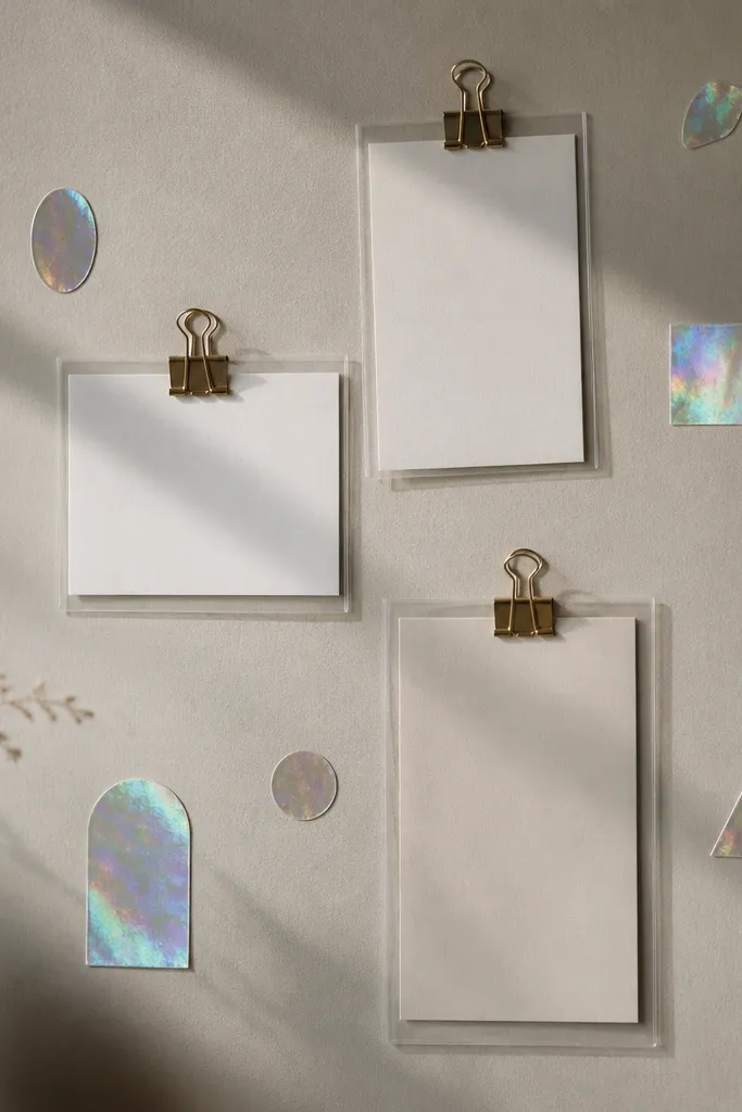
Holo accents can look luxury when you use them sparingly. Keep the base neutral and use holo only for key emphasis — like a goal title, a single icon, or a “next milestone” tag. Clear label cards add a modern retail feel and help your board look intentional.
Limit holo to 5% of the board area. If everything sparkles, nothing looks premium.
11. Frame Within a Frame (Oversized Matting Effect)
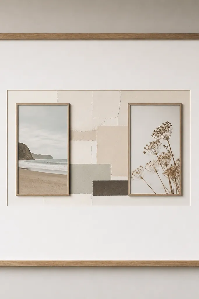
Matting is a pro trick used in art framing and it instantly upgrades the look. Use a large white mat border (or printed mat template) around your collage so photos breathe. Add one or two smaller frames inside to create hierarchy — the board reads like a gallery piece.
Leave at least 2 inches of “mat” space around the collage so the layout doesn’t feel cramped.