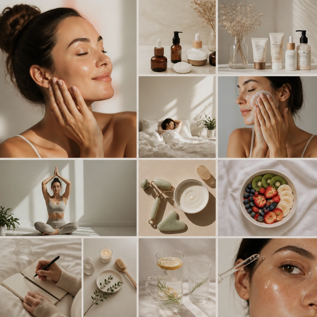
1. Milky Glass Glow Board (Creamy Neutrals + Soft Highlights)
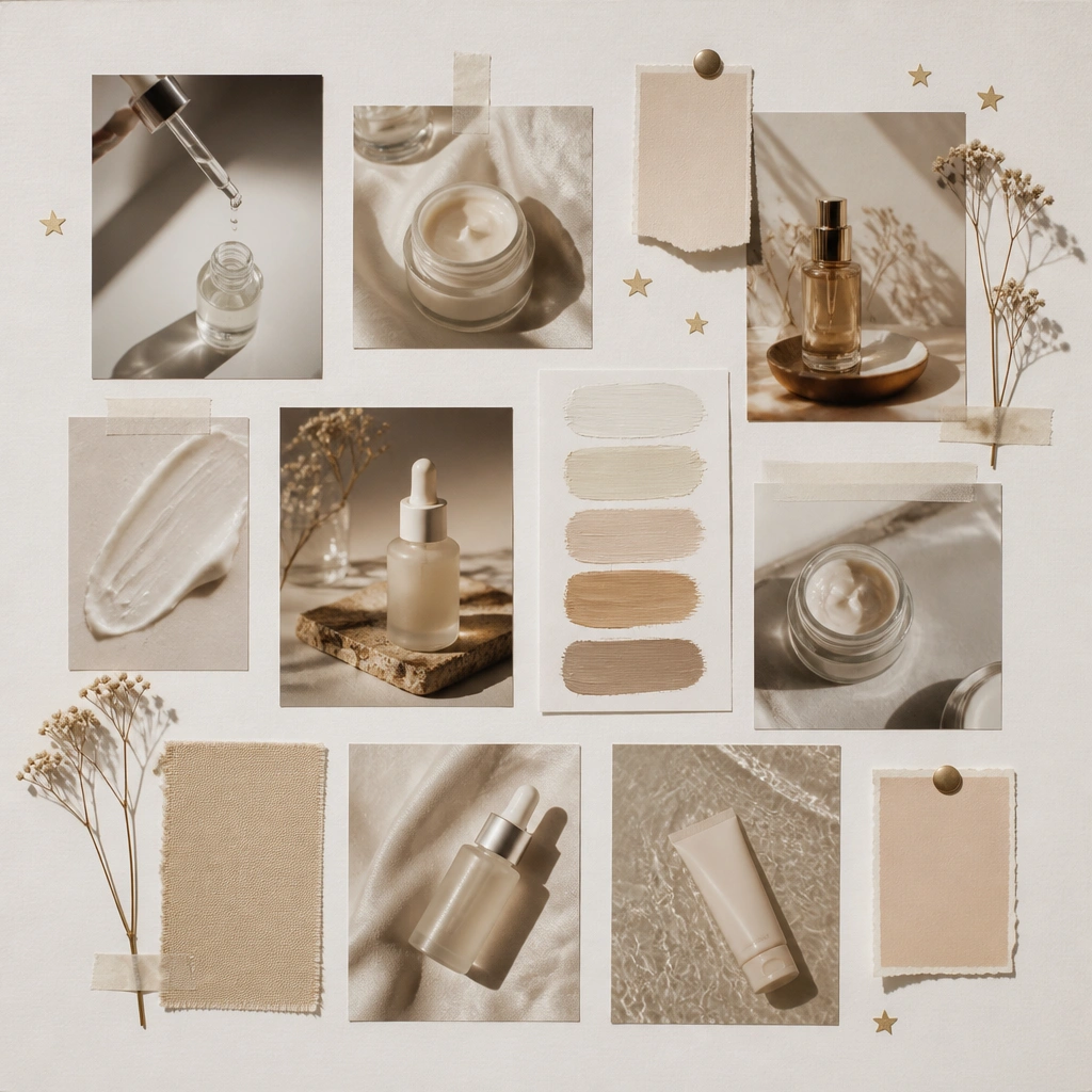
This look mimics “clean, hydrated glow” using warm whites, oat-beige, and pearl accents. Add small gold foil shapes around the top third to frame your key goal photo (like hydrated skin or dewy texture). It reads calm and expensive without being busy.
Print your product photos at the same width, then add a 1-2 mm white border around each to keep everything looking cohesive.
2. Redness-Calm Collage (Cool Lavender + Green Balancing)
Use lavender and sage/green accents to visually represent “soothing” and “balancing.” Place a calming product photo in the center and surround it with smaller images of ingredients (like aloe, centella, or ceramides) to turn your goals into a story. The acetate overlay adds a gentle, spa-like effect.
Good to knowIf you have redness goals, dedicate one section to “barrier support” and include only hydrating/soothing items there.
3. Bright-Tone Flashcards (High-Contrast Yellow + Clean Lines)
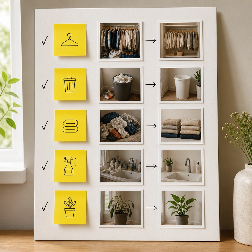
This design turns glow-up into a system by using flashcard-like blocks for your steps. The yellow pops help you remember “brightening” goals, while black icons (sun, droplet, moon) keep the board readable. It’s perfect if your routine needs structure.
Write one micro-goal per card: “AM: SPF + vitamin C” and “PM: gentle cleanse + moisturizer.” Keep it short so you’ll actually follow it.
4. Night Routine Moonglow (Navy + Star Sparkle Theme)
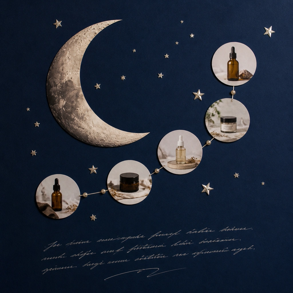
A navy base instantly signals “night mode,” which helps you separate AM vs PM visually. Use moon and star accents to highlight treatment steps like exfoliating or retinoid nights, then pair them with ultra-hydration photos around the edges. The contrast makes everything easier to find quickly.
Good to knowCreate two columns: “Tonight (do)” and “Skip if sensitive.” Even a simple icon list reduces decision fatigue.
5. Dewy Hydration Waterfall (Blue Gradients + Droplet Cutouts)
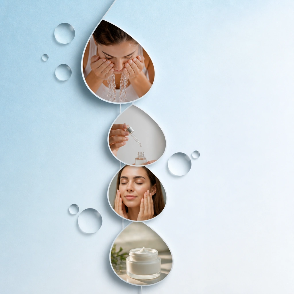
Hydration boards look best with watery blues and layered droplet shapes. Arrange photos from cleanse to moisturizer in a vertical flow so your eye follows the routine. Add thin white connector lines to make it feel like a “water journey,” not random clipping.
Good to knowUse one main blue shade and limit other colors to white and silver so the board stays airy.
6. Ingredient Map Collage (Clear Labels + Transparent Tape Borders)
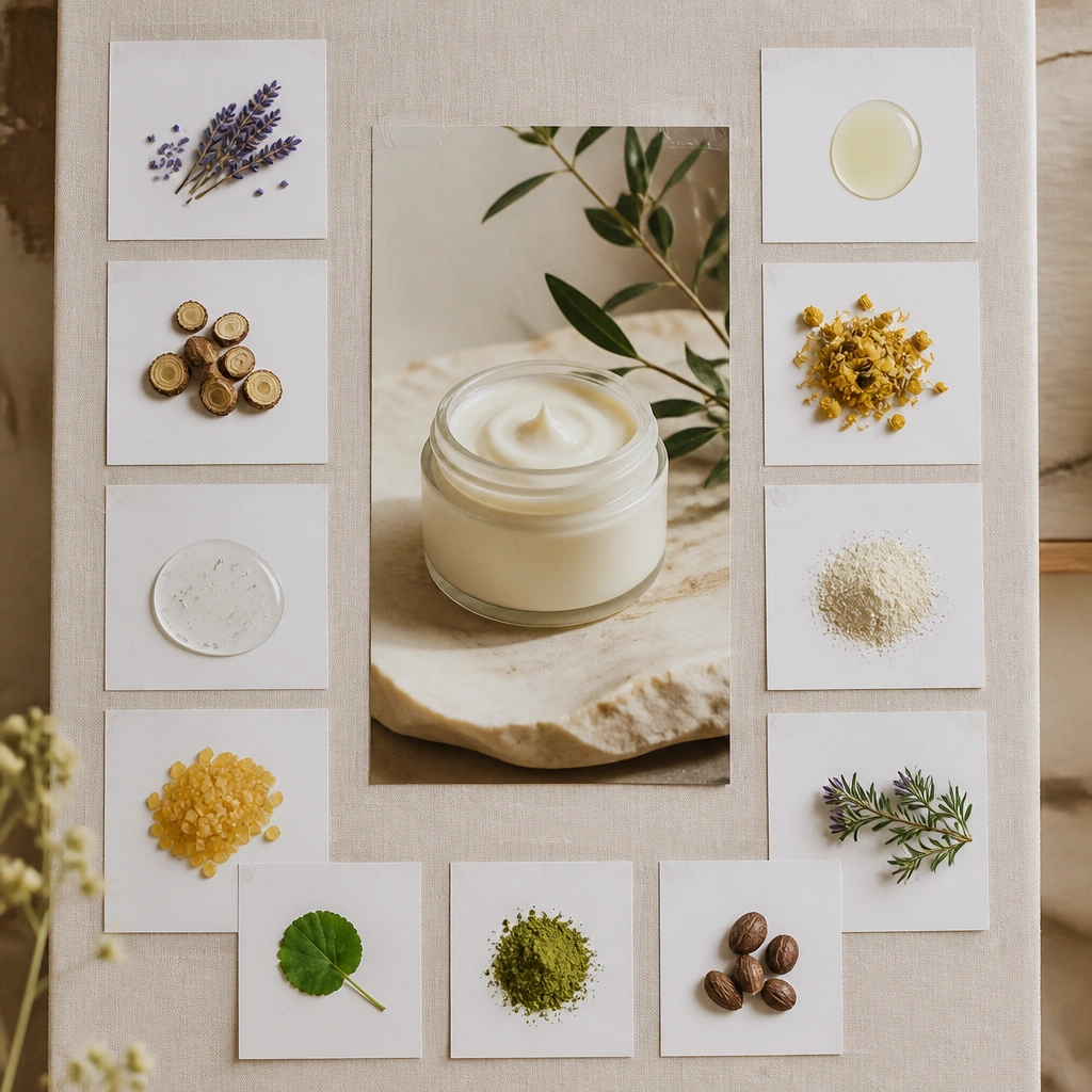
This idea is great if you love learning and want your vision board to guide choices. Print ingredient cards (like niacinamide, hyaluronic acid, ceramides) and attach them with clear tape borders for a “museum label” vibe. It helps your future self understand why each step matters.
Good to knowKeep ingredient cards grouped by function: brightening, barrier, or soothing. Your board becomes a quick reference, not just decoration.
7. Clean Girl Minimal Glow (White Space + One Accent Color)
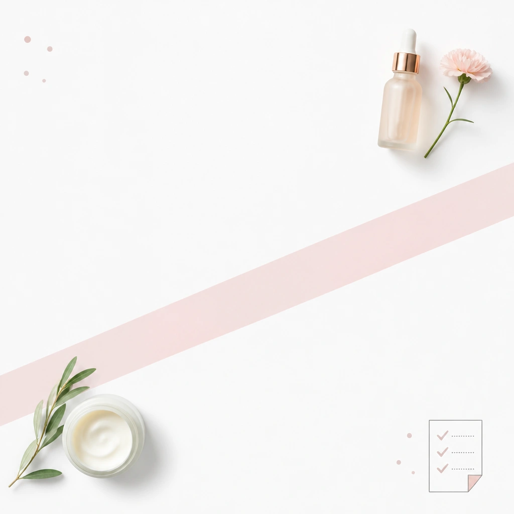
Minimal boards feel aesthetic because they prioritize spacing. Choose one accent color (soft pink, sage, or champagne) and use it sparingly across labels, stickers, and handwritten goals. Place your “hero” product photo largest in the center and keep everything else tiny.
Use a ruler when placing photos so edges line up. Minimal glow boards look intentional when the spacing is precise.
8. Spa Appointment Moodboard (Terracotta + Linen Texture)
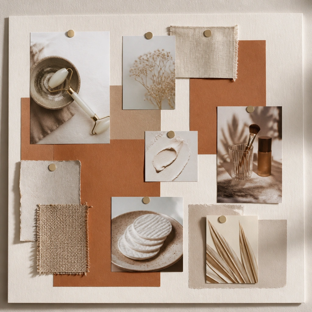
Warm terracotta and linen textures create that “spa at home” feeling. Add tool photos (cotton rounds, face masks, gentle cleansing brushes) to reinforce the ritual aspect of skincare. This layout is ideal for consistency because it makes skincare feel like an event, not a chore.
Good to knowAdd one recurring date note (example: “Sunday night mask”) so you’re planning your skincare rhythm upfront.
9. Sunscreen Priority Corner (Sun Icon + Clear Film Look)
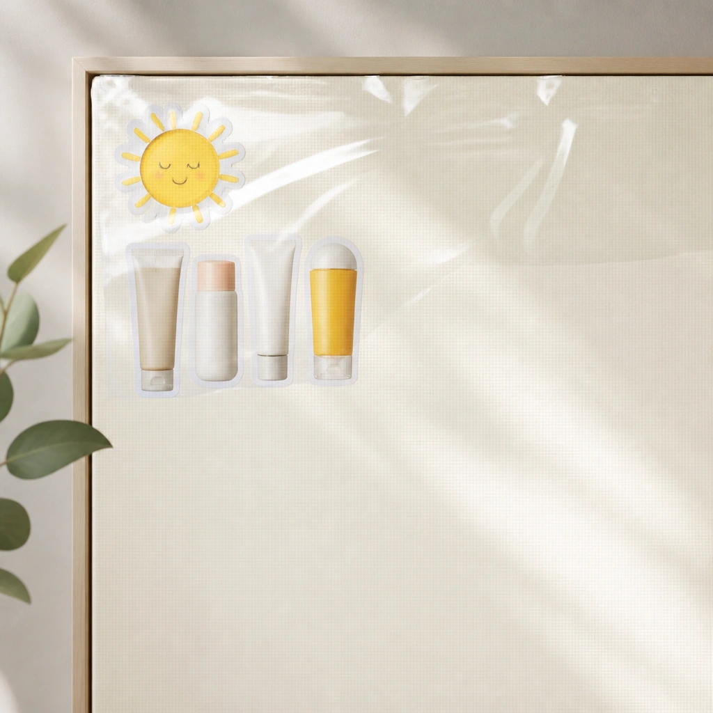
If your glow-up stalls, it’s often SPF inconsistency. This design dedicates a visible “priority corner” so sunscreen is never forgotten. Use glossy acetate or clear craft film behind the sunscreen photos to make the section look like it’s catching light.
Write a simple reminder under the sunscreen photos: “Reapply after 2-3 hours if outdoors.” Keep it small so it won’t feel preachy.
10. Before/After Storyboard (Polaroid Frames + Progress Dates)
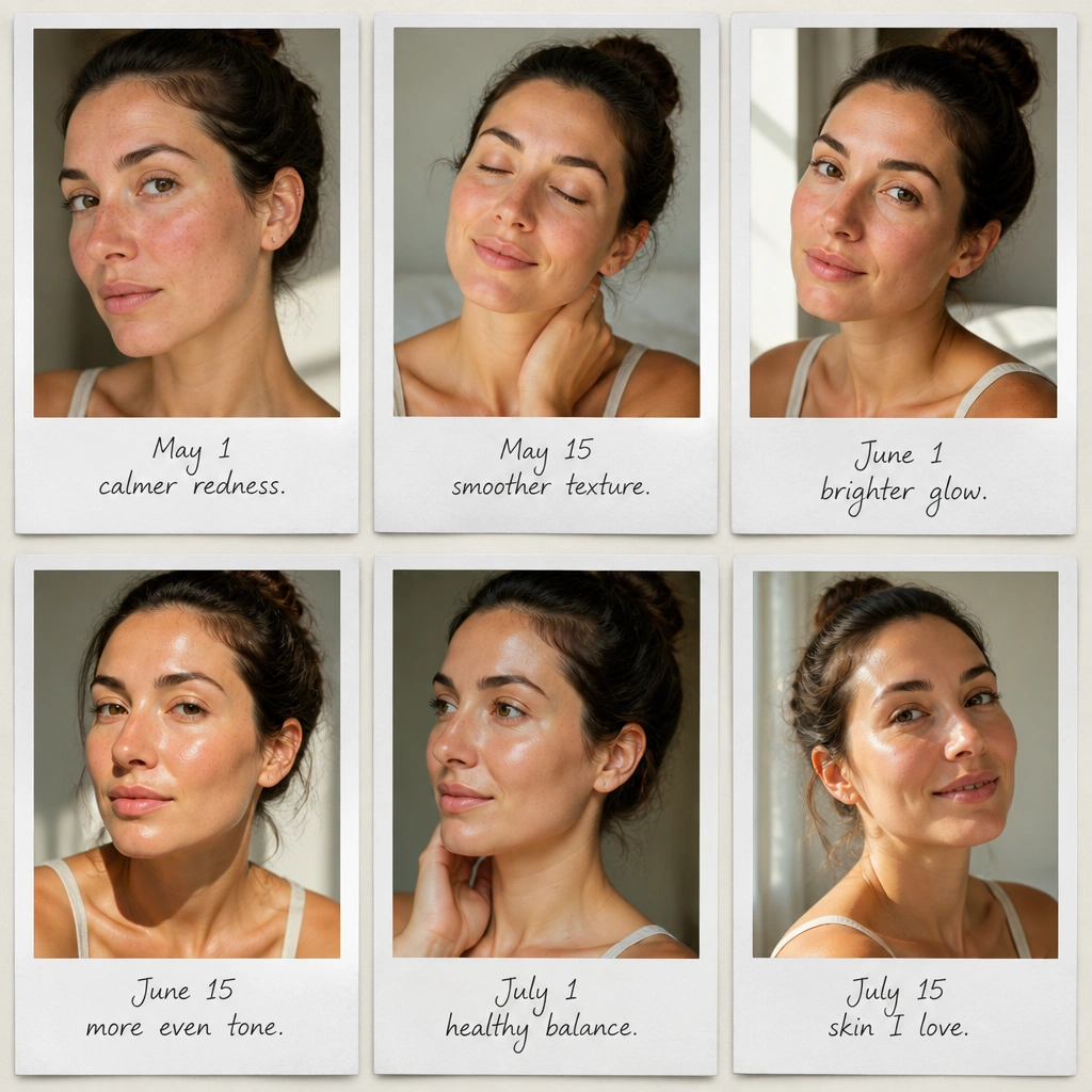
A progress storyboard makes your glow-up feel measurable. Use Polaroid frames to keep the aesthetic consistent, and add dates so you can compare at realistic intervals. This is especially motivating for routines that take time (like barrier repair and tone brightening).
Take photos in the same spot and lighting every 2-4 weeks. Your board will be accurate, not just hopeful.