1. The “8.5x11 Doesn’t Fit” Border Fix
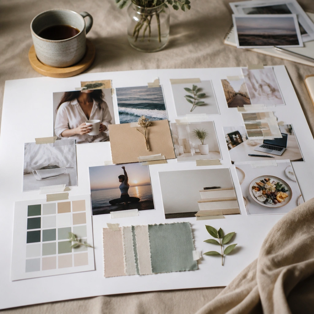
A lot of beginner boards fail because the first print is too big for the backing. The fix is to plan a consistent border so photos don’t get cropped or overlap. Use a white (or neutral) mat border on the outside to make everything look designed.
Good to knowBefore printing, measure your board’s usable area and print a test photo at 8x10 or 4x6, then trim to fit with a paper trimmer.
2. The Focal-Point Photo That Anchors the Whole Board
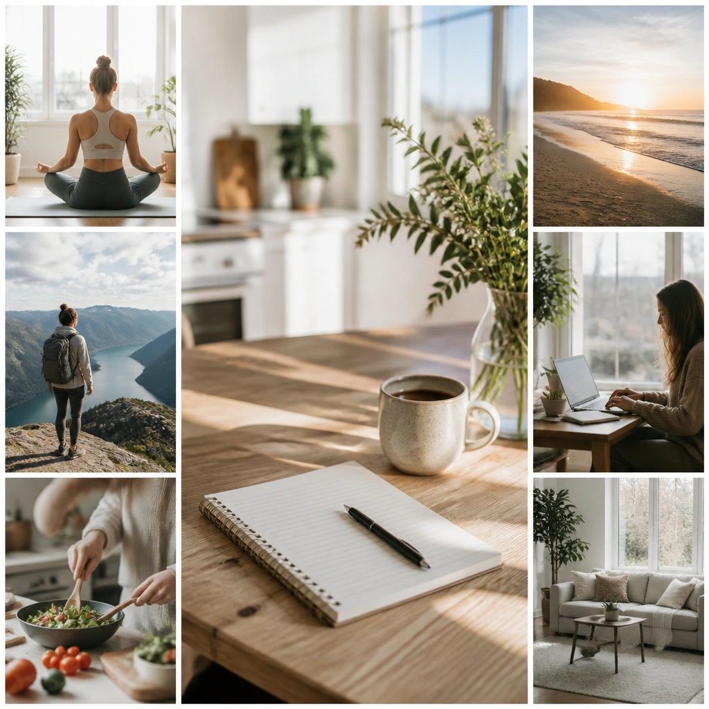
When everything is the same size, your brain can’t find the “main message.” A focal point photo — usually the biggest image — gives your board a clear center. Choose one photo that represents your top priority, then build smaller supporting images around it.
Good to knowPick one “main goal” image and make it 1.5-2x larger than the rest; keep it centered or aligned to one side for a tidy look.
3. The “Too Many Fonts” Headline Rule
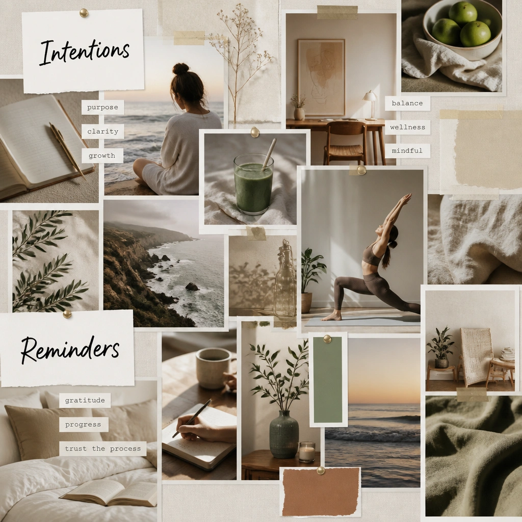
Beginners often add lots of different fonts, stickers, and doodles, which makes the board visually noisy. A clean approach uses one headline style plus one supporting label style. It also helps when you want to read your goals quickly from across the room.
Limit yourself to two label formats: one big headline (short phrase) and one small sub-label (one action).
4. Grids That Stop the “Clump of Pictures” Problem
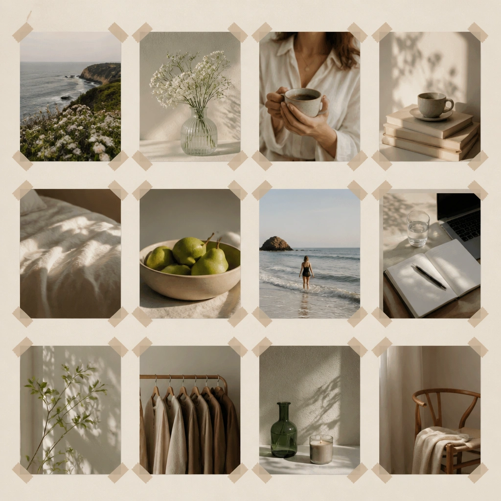
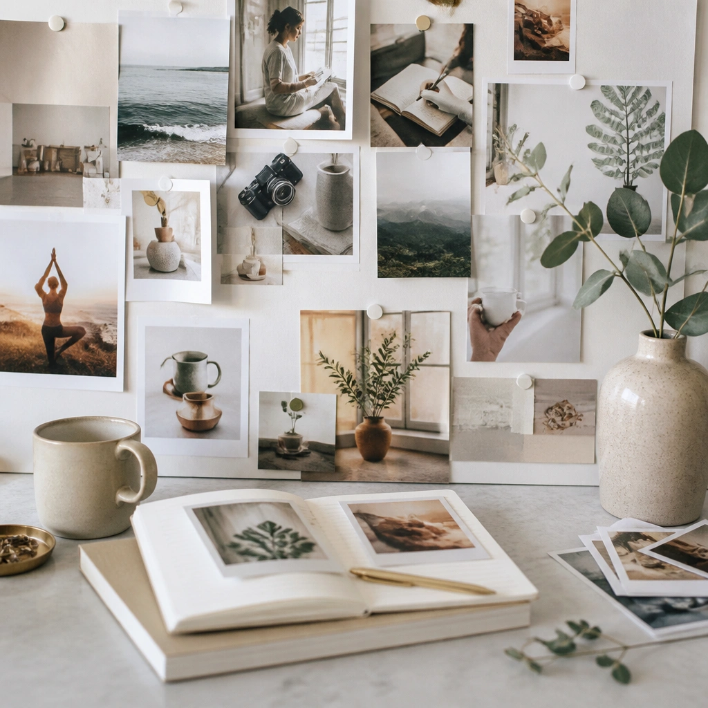
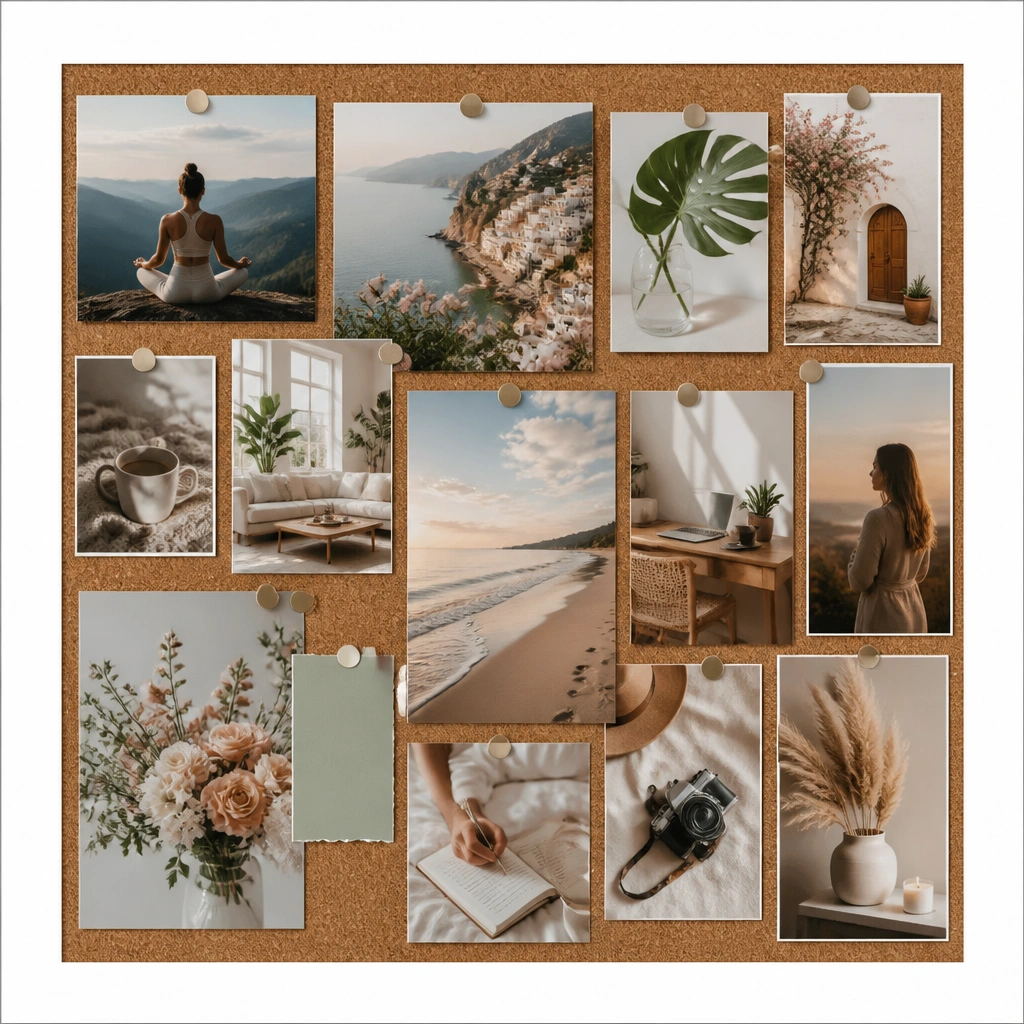
Clumping happens when photos are placed randomly without spacing. A simple grid layout makes your board feel organized and calm. Even if you don’t draw the grid, you can mimic it using consistent gaps and aligning edges.
Good to knowUse a ruler to keep 1/4-inch spacing between items; align top edges in each row before you glue.
5. Action-First Captions (Not Just Dreamy Words)
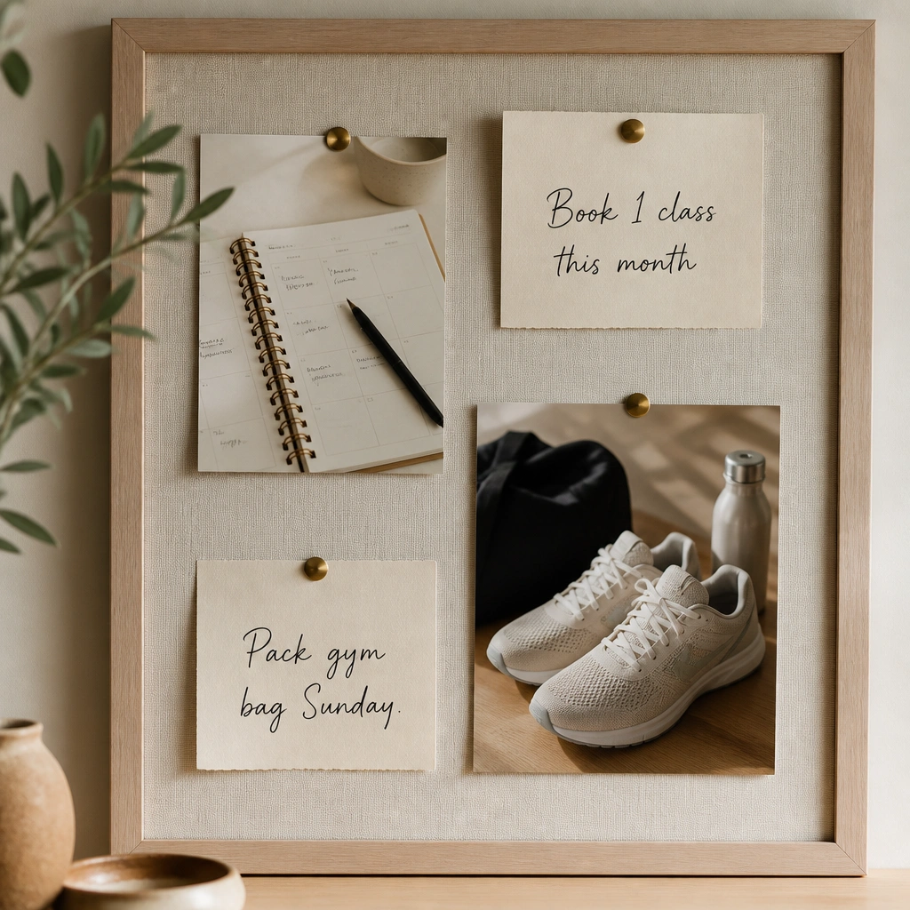
Pretty images without a next step can turn your board into decoration. Add action-first captions that tell you what you’ll do this month, not just what you want someday. This keeps your vision board motivating and usable.
Good to knowWrite captions in the format: “This week I will…” or “Next month I will…” and keep them to 3-6 words.
6. The “Mixed Orientation Chaos” Fix
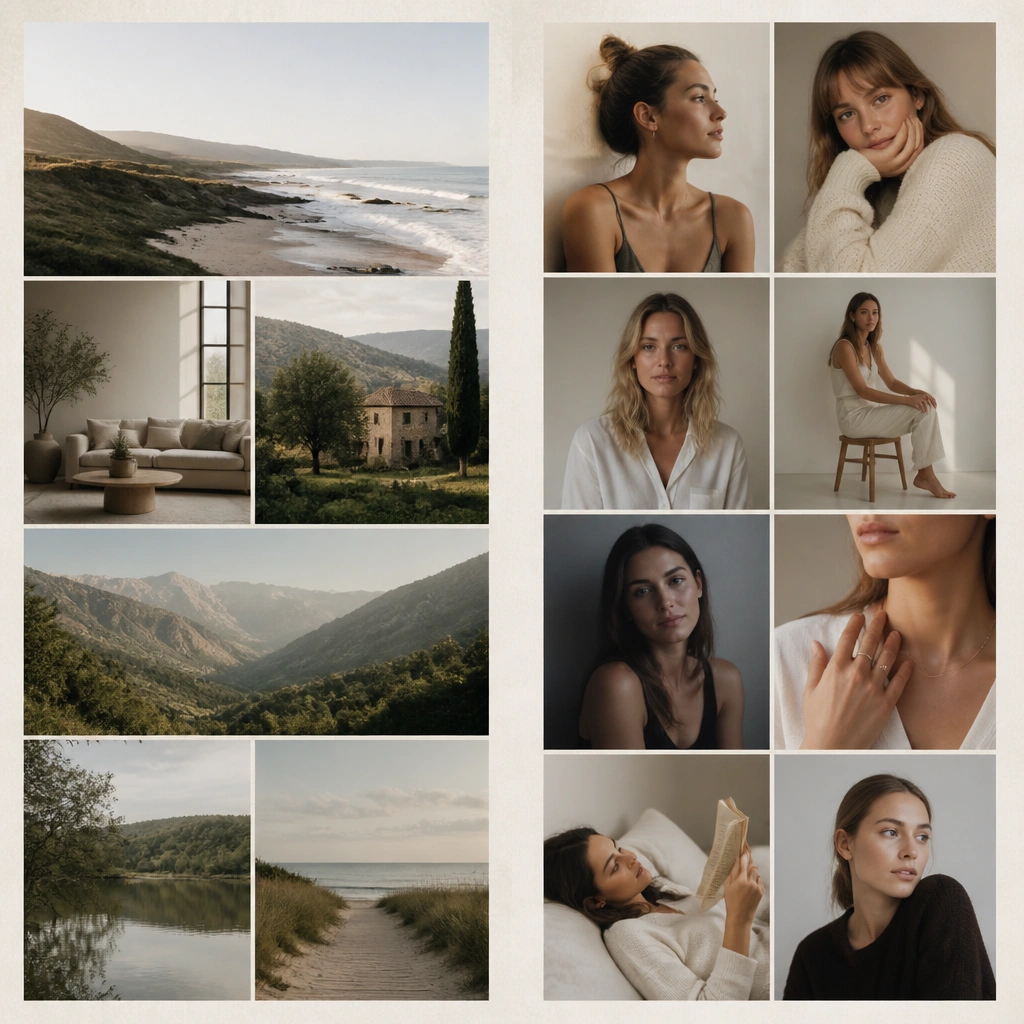
Mixing portrait and landscape pictures with no plan often makes the board look lopsided. The fix is to group orientations: landscapes together, portraits together. You can still vary sizes, but the overall flow stays intentional.
Good to knowSort your prints first into portrait and landscape stacks, then place one orientation group at a time.
7. Matte vs Glossy: The “Why Everything Looks Off” Solution
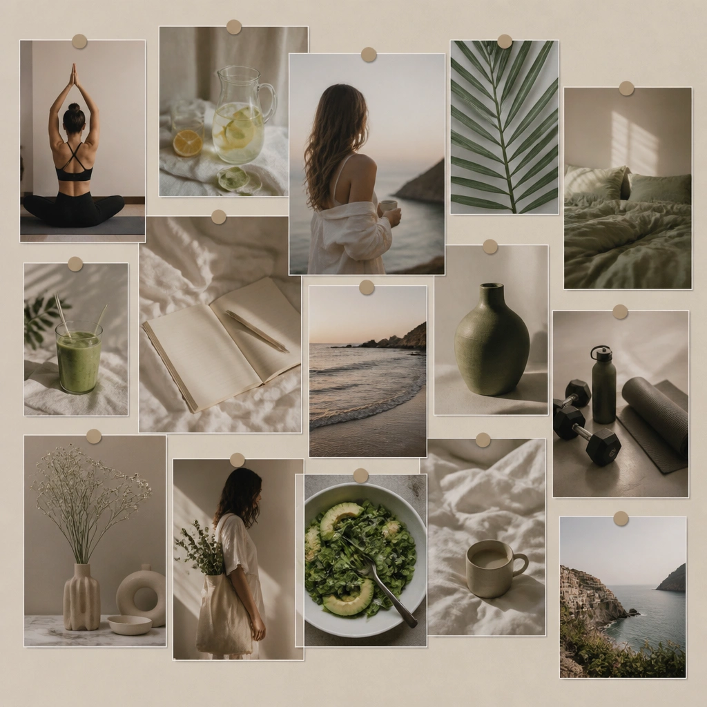
Glossy prints can reflect light and make some images look washed out next to matte photos. Consistency makes your board look curated. If you’re printing at home, choose matte photo paper or use a matte laminate so everything matches.
If you have mixed finishes, cover the whole photo set with a matte clear sheet or choose matte paper for reprints.
8. The “Laminate Bubbles” Prevention Method
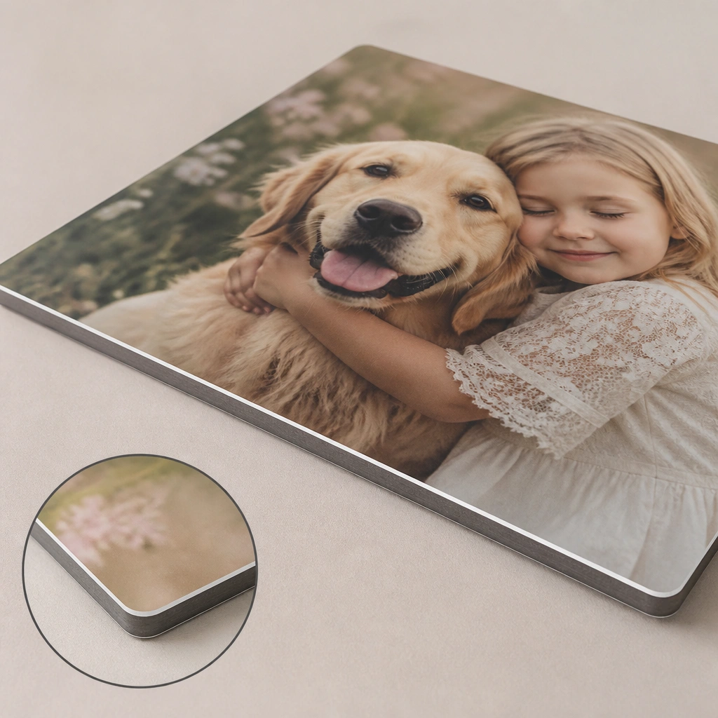
Beginner laminating often creates bubbles, wrinkles, or cloudy edges that ruin the look. The trick is to trim close to the image and press from the center outward. Corners should be rounded or trimmed to reduce peeling.
Good to knowUse a clear laminating sheet, remove dust first, and press slowly from the middle to the edges with a credit card.
9. Color-Coded Goal Sections That Make It Easy to Scan
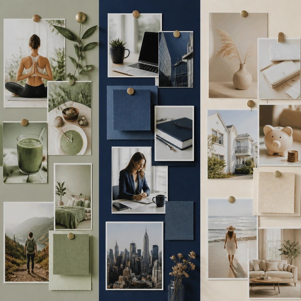
If your board mixes every theme without separation, you’ll stop looking at it. Color-coding creates quick mental categories. It also helps you balance your board so one goal doesn’t visually overpower the rest.
Good to knowPick 3 accent colors and only use those colors for section labels, tape, or small stickers.
10. The “Low-Quality Image” Swap for Sharp, Printable Photos
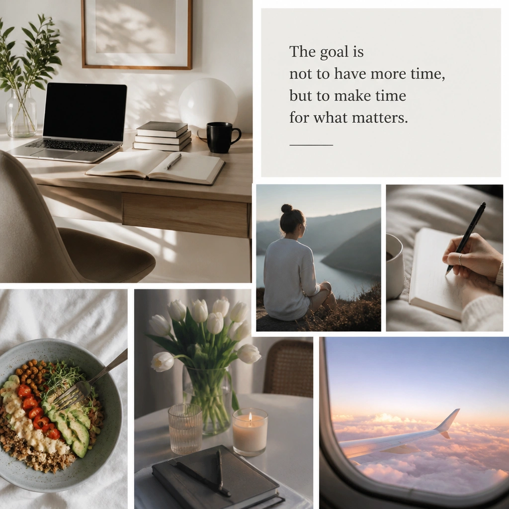
Blurry pictures look unfinished and can make even a pretty board feel messy. Use high-resolution images or screenshots that are clear when printed. If you’re working from Pinterest, save images in a size that matches your print dimensions.
Good to knowZoom to 100% on your print preview and re-download any image that looks pixelated.
11. The “No Space to Breathe” Spacing Rescue
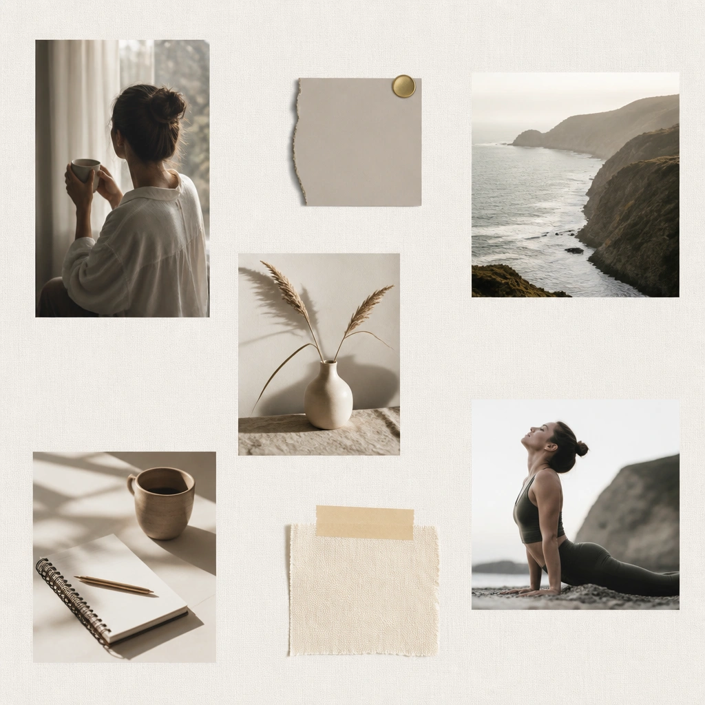
Too many items crammed onto a board can make it feel overwhelming, so you don’t revisit it. Negative space improves readability and makes your main images stand out. Think of your board like a moodboard for your goals — not a scrapbook dump.
Good to knowPlace 60% of your images first, then step back and add only 1-2 more clusters in the empty areas.
12. The “One-Year Goal” Mistake: Turn It Into Quarterly Prompts
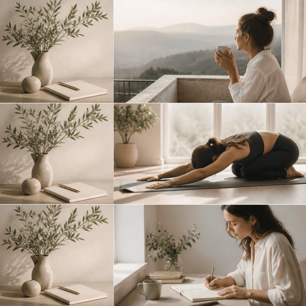
Beginners often pin a goal image that’s too far away, like “move in 12 months,” without showing what you’ll do sooner. Quarterly prompts make your board feel active and current. You can keep the dream image, but add near-term action photos for each quarter.
Good to knowAdd three small labels: Q1, Q2, Q3 — then match each one to a realistic next step.