1. Washi-Tape Micro-Frames Around Your Date
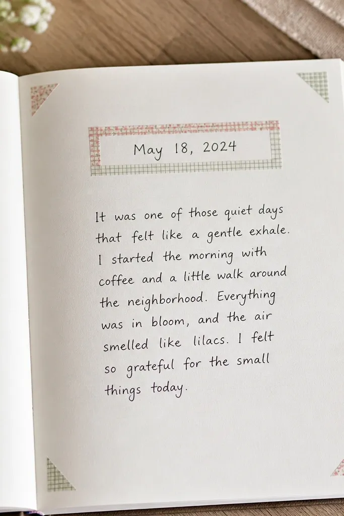
Use two complementary washi tapes — one solid or subtle dot, one with a micro pattern. Leave a consistent margin so the tape frames look intentional, not accidental. This works because the tape creates structure while your pen does the “design,” keeping the page flat and readable.
Good to knowMeasure your frame width once with your ruler, then reuse the same tape layout for every weekly spread.
2. One-Sheet Soft Collage with Torn Edges
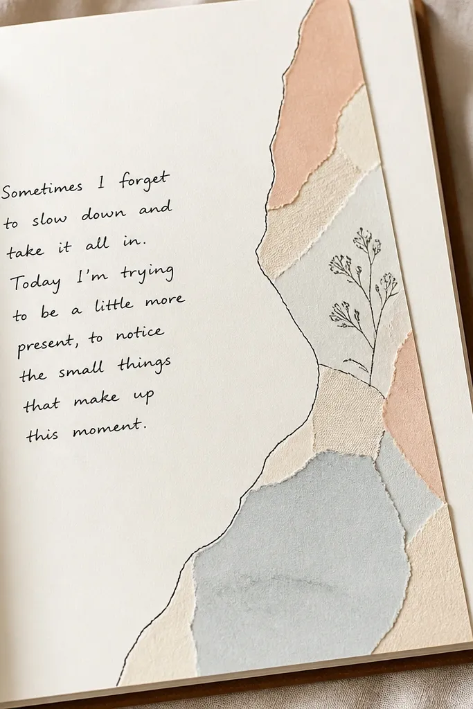
Cut one collage “band” from scrapbook paper or old book pages — keep the shapes simple (triangles or rectangles), then tear the edges for a natural border. Add a light wash of diluted ink or watercolor over the collage to unify the colors. The torn edge trick reads expensive while staying quick.
Good to knowBefore gluing everything, place the torn pieces dry and photograph it — if it looks balanced in the photo, it’ll look balanced on the page.
3. Pastel Label System for a Clean Weekly Spread
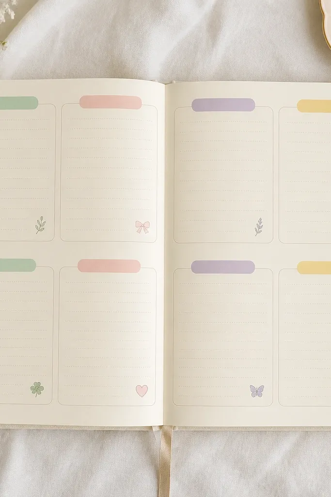
Create a simple grid using a pencil and ruler, then add colored labels using highlighter tape or sticky label paper. Keep icons consistent — small hearts, stars, or tiny checkmarks — so the page feels cohesive. This beats overcomplicated “all-day activities” art because the structure does most of the design work.
Use one pen for writing and one fine-liner color for labels and icons to avoid color overload.
4. Ink-Dipped Corner Doodles (No Full Page Art)
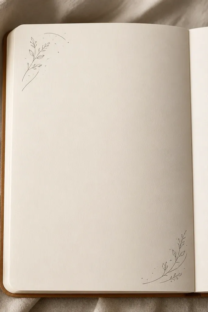
Dip a brush pen or fine brush into diluted ink and tap lightly to create controlled splatters. Then add 2-3 doodle elements per corner — leaves, arcs, or small stars. The corners frame your writing without covering it, which is why this looks aesthetic even when your handwriting isn’t perfect.
Good to knowPractice the ink tap on scrap paper first — aim for 3-5 tiny dots, not a cloud.
5. Sticker + Washi Balance Rule (1 Sticker Per Block)
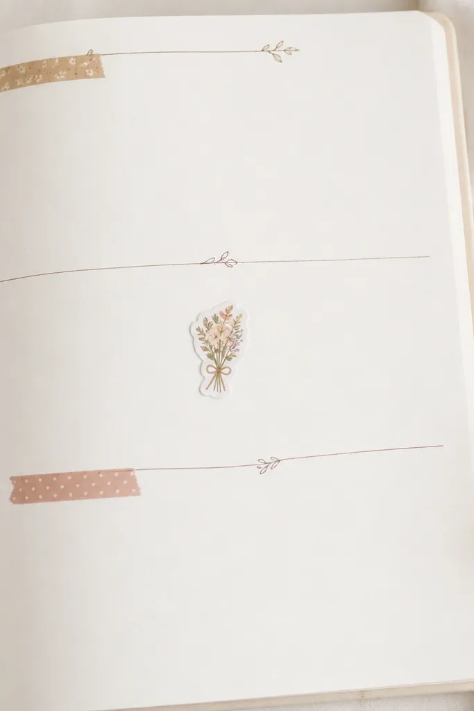
Pick one focal sticker and treat it like a headline, not confetti. Surround it with thin washi tape bars or a simple underline, and keep the rest of the block mostly blank for your notes. This prevents the “overdecorated” look that happens with multiple layered stickers.
If you add a sticker, remove one other embellishment — the page will instantly look more curated.
6. Book-Page Background with Minimal Overlay Text
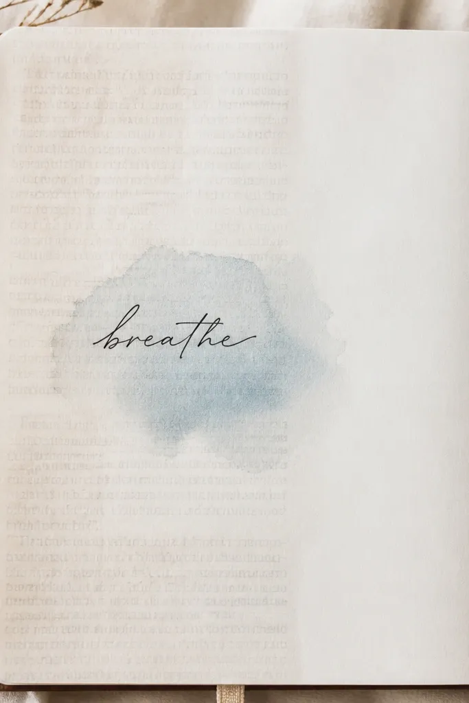
Lightly glue or decoupage a thin layer of book paper so the printed text shows through. Then write one clear title or mood phrase in a darker pen for contrast. The background gives texture so your page looks designed even with very little drawing.
Use a glue stick or thin Mod Podge and press from the center outward to avoid bubbles.
7. Simple “Timeline Strip” for Daily Notes
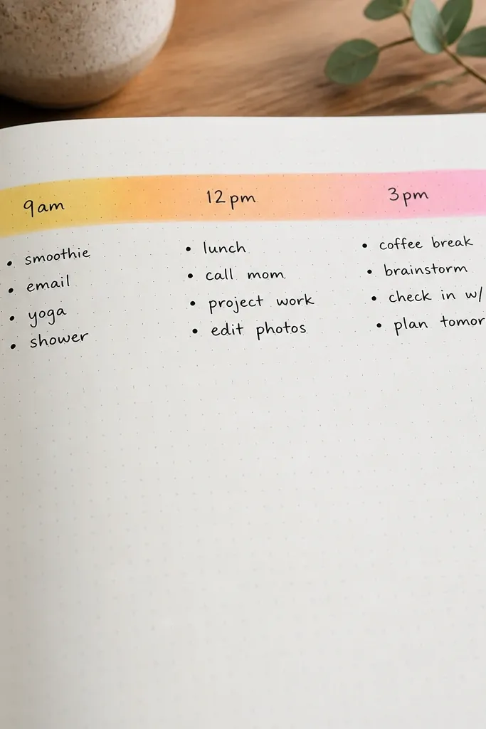
Draw a single timeline strip across the page, then cluster notes underneath each time. Add a gentle gradient using highlighter blending (light yellow to peach) so it looks soft, not neon. This is a great alternative to complicated “step-by-step” planners because it keeps your day readable.
Good to knowKeep your time labels short — 2-3 per day — so you don’t spend hours formatting.
8. Dry-Brush Watercolor Title Bar
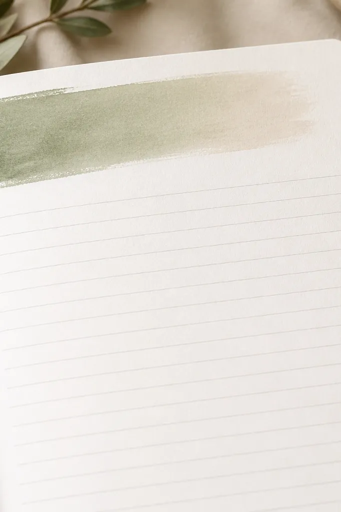
Paint only a title bar, not the whole background. Use a dry-brush technique — load the brush, blot until it’s almost dry, then sweep across the paper. Add your title in pen once the bar is fully dry to prevent feathering. This gives “aesthetic diary” energy without the risk of smudges across your writing.
Dry time matters — wait 10-15 minutes (or fully dry to the touch) before writing on top.
9. Ruler-Guided Margin Icons (The “Gallery Wall” Look)
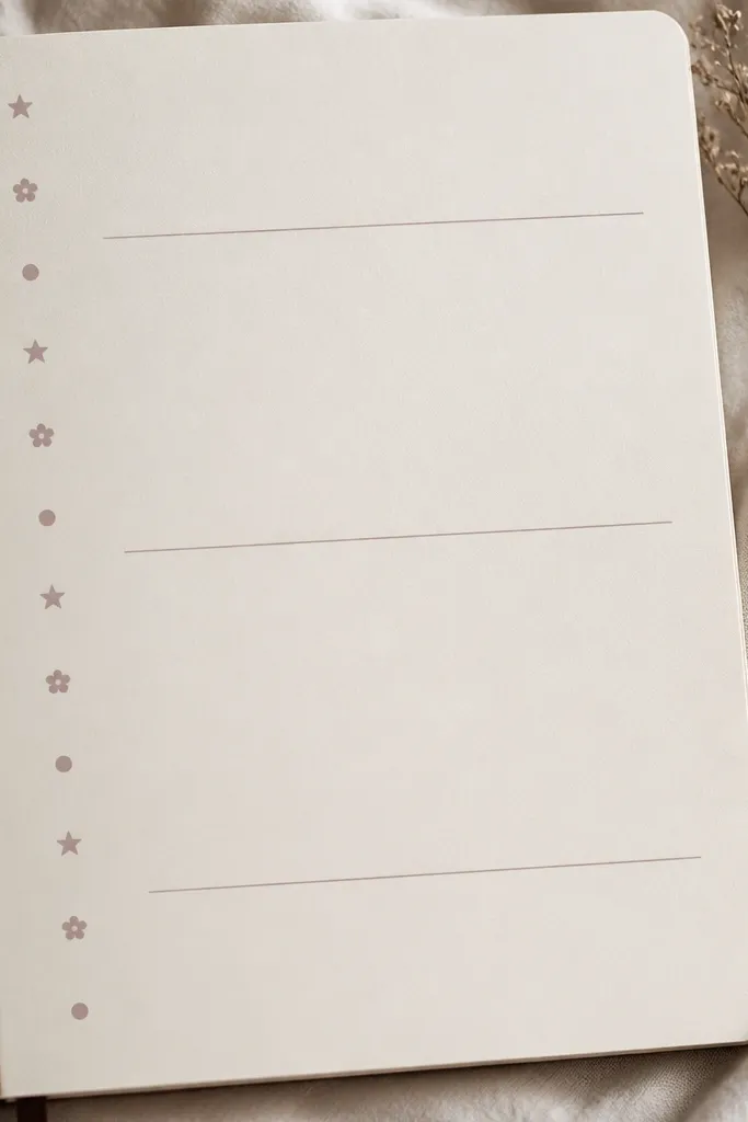
Use a ruler to mark evenly spaced points along the margin, then add tiny icons at each point. Keep them monochrome (gray or black) so the page reads cohesive. This mimics gallery signage without needing a full layout overhaul.
Make a mini icon set and reuse it — the repetition is what makes it look intentional.