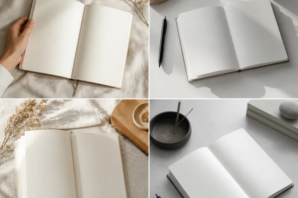
1. 3-Zone Daily Layout with Thin Header Line
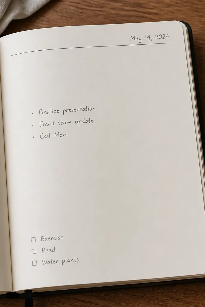
Divide the page into three zones using a single thin line: header (top 15%), content (middle 70%), and a small action box (bottom 15%). Use gray ink or pencil for most text so the page feels airy. This style works especially well with lined or dotted journals because alignment becomes automatic.
Good to knowDraw the line first, then write only 3 bullets max. If you need more, split it onto the next page.
2. One-Accent Washi Tape Corner Frame
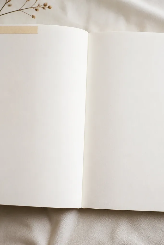
Create a “frame” using a single washi corner rather than covering the page. Choose a neutral tone (cream, taupe, or pale gray) so your handwriting stays the hero. The corner adds direction for the eye while keeping the layout modern and uncluttered.
Tear the washi edges by hand for a softer look, then press firmly with a bone folder or clean fingernail.
3. Dotted Grid Habit Tracker with Micro-Icons
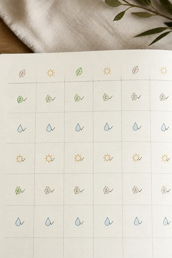
Use your journal’s dotted grid to build a habit tracker without measuring. Stick to one icon set and one ink color (like muted olive or slate blue). Micro-icons keep it cute without turning into a full illustration.
Make a key in the margin using 3 icons only, then reuse them all week to keep the page cohesive.
4. Monochrome Mood Bar + Date Stamp
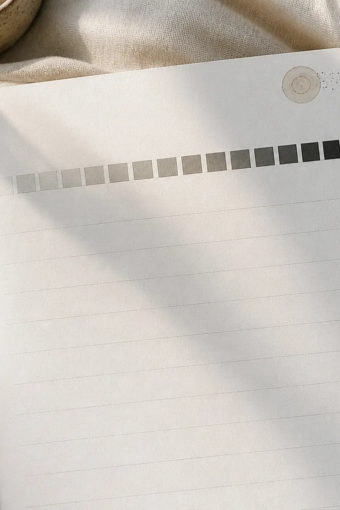
A mood bar is a modern minimalist diary idea because it replaces paragraphs with a visual scale. Use 5 shades of one color (light gray to near-black) using pencil shading or layered marker tones. Add a date stamp (even a simple ink dot) to anchor the layout.
Good to knowBefore you start, test your 5 shade steps on scrap paper so the bar looks smooth, not blotchy.
5. Negative-Space Quote Block with Side Rule
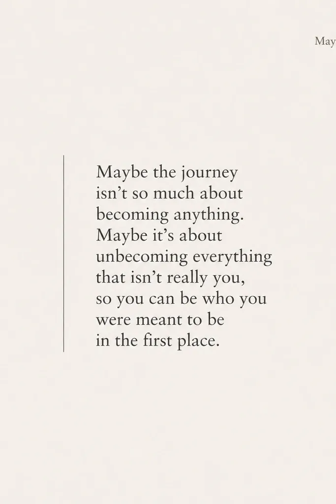
Pick one short sentence and give it breathing room. Add a single thin side rule (straight pencil line or thin liner) to give structure without decoration. Keep the font size consistent and let the rest of the page stay empty — that emptiness is the design.
Use a ruler to draw the vertical line, then write the quote slightly above center for a balanced look.
6. Monthly Theme Swatch Strip (3 Colors Max)
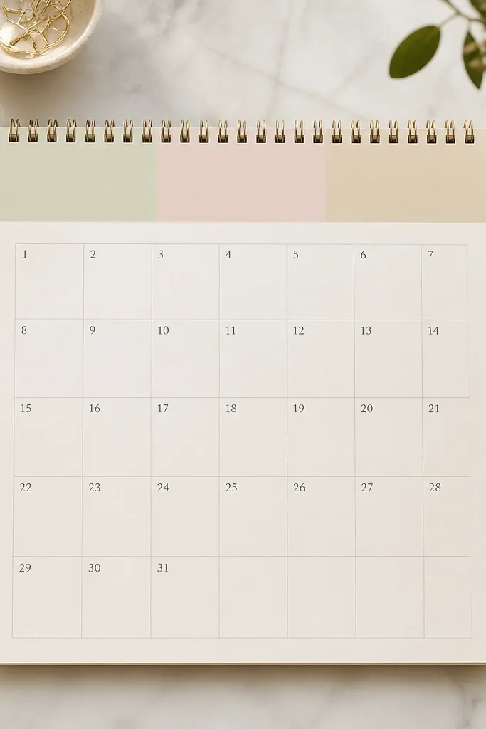
A swatch strip instantly makes your diary feel curated. Limit yourself to 3 colors so the whole month matches your “theme” without extra work. Use washable markers, watercolor pans, or brushed acrylic in thin layers for a modern matte finish.
Write the palette name in the margin (example: “sage / blush / beige”) so you can reuse it in future months.
7. Checklist Columns with Alternating Line Weights
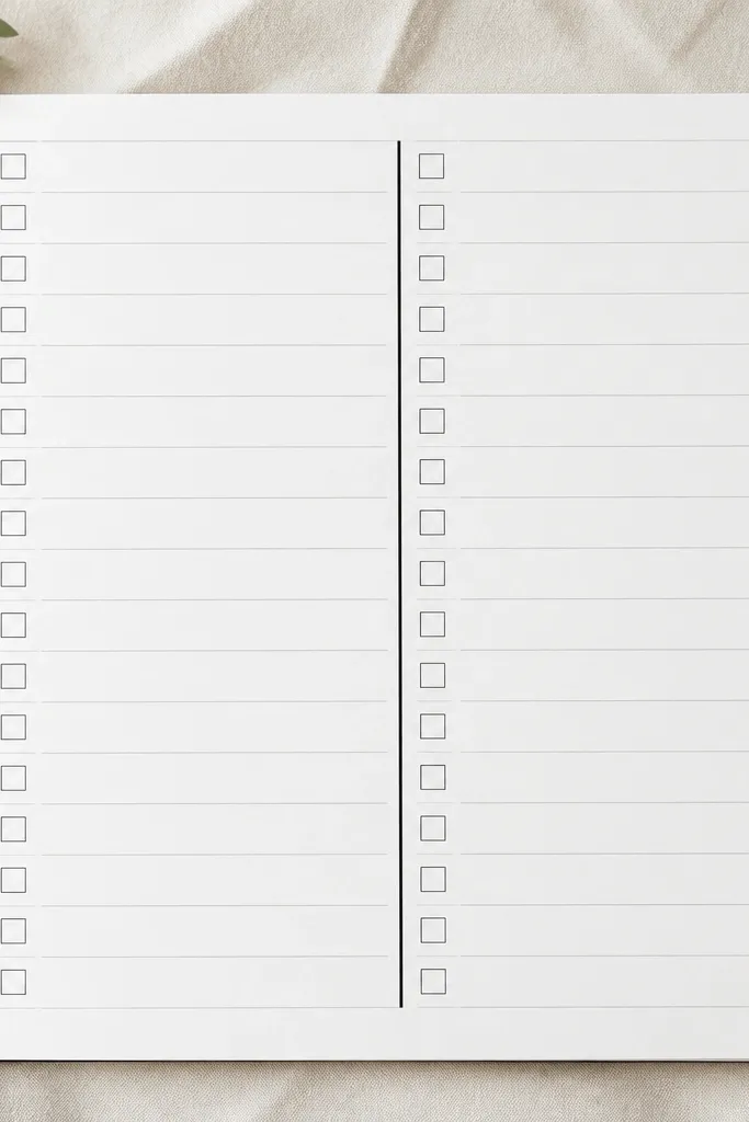
Switch line weight to create hierarchy without adding icons. Use one thicker border line to separate sections, then thin lines for the smaller structure. This makes the spread feel graphic and modern while still being functional for daily use.
Keep tasks short (under 5 words). Long sentences break the minimalist look fast.
8. Photo-Sized Sticker + Caption in One Line
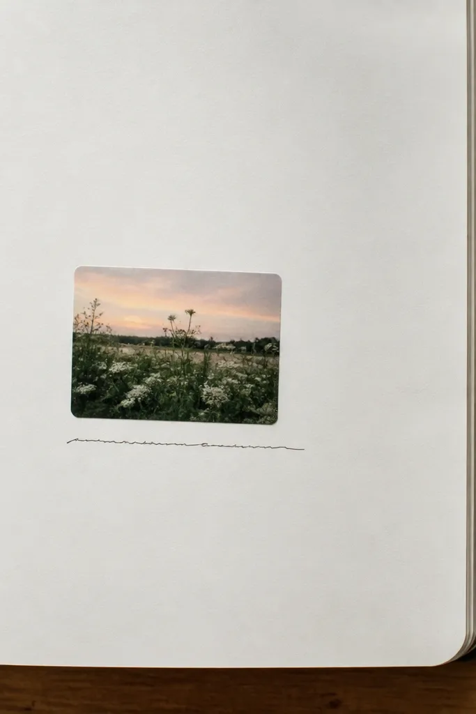
If you like personality, use one photo-sized element instead of multiple decorations. Choose a matte sticker (not glossy) so it blends with paper texture. Keep the caption to one line and use a single font style to maintain a calm, minimalist vibe.
Good to knowOutline the sticker lightly with a pencil to help it look integrated, not pasted-on.
9. Thin-Tape “Timeline” Across the Middle
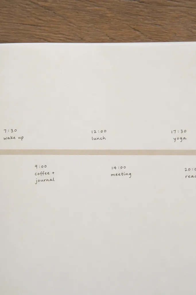
A timeline line helps you log events without paragraphs. Use thin tape (like masking tape or narrow washi) so it reads as a line, not a decoration. Pair it with short phrases to keep the page airy and modern.
Good to knowWrite times in a consistent format (like 9:00, 1:30, 7:00) so the spacing stays tidy.
10. Grid-Based Weekly Review with Margin Notes
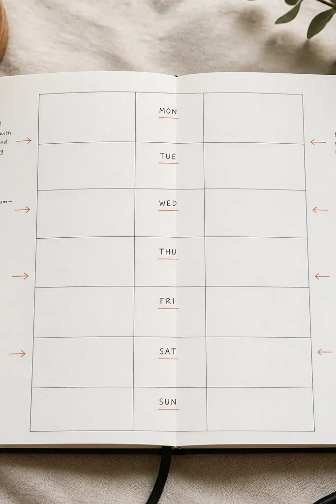
Use a grid to make weekly reflection fast: center boxes for prompts and margins for quick answers. Margin notes feel modern because they’re “supporting details,” not competing with the main content. Keep arrows minimal — one or two per page.
Good to knowChoose 4 review prompts max (wins, lesson, gratitude, next week). More prompts will crowd the grid.
11. Minimal Watercolor Wash Background (Half-Page)
A light half-page wash adds softness while keeping the page modern minimalist. Use diluted watercolor or watercolor brush pens, then stop before it looks “painted over.” The contrast between washed and blank areas creates structure even with minimal text.
Let the wash fully dry, then write with a fine liner to avoid feathering.