1. Washi Tape Border + “Today” Date Strip
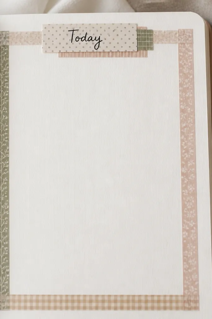
Create a border using 3-4 washi tape widths, slightly overlapping at the corners so the frame looks intentional. Add a date strip at the top using one solid-color tape under a patterned tape for contrast. This works because the tape edges create a built-in layout grid, making writing feel neatly contained.
Press tape down firmly with a clean fingertip so it won’t lift at the corners. If your tape is textured, write after taping so your pen doesn’t snag.
2. Pressed Flower Corner Cluster
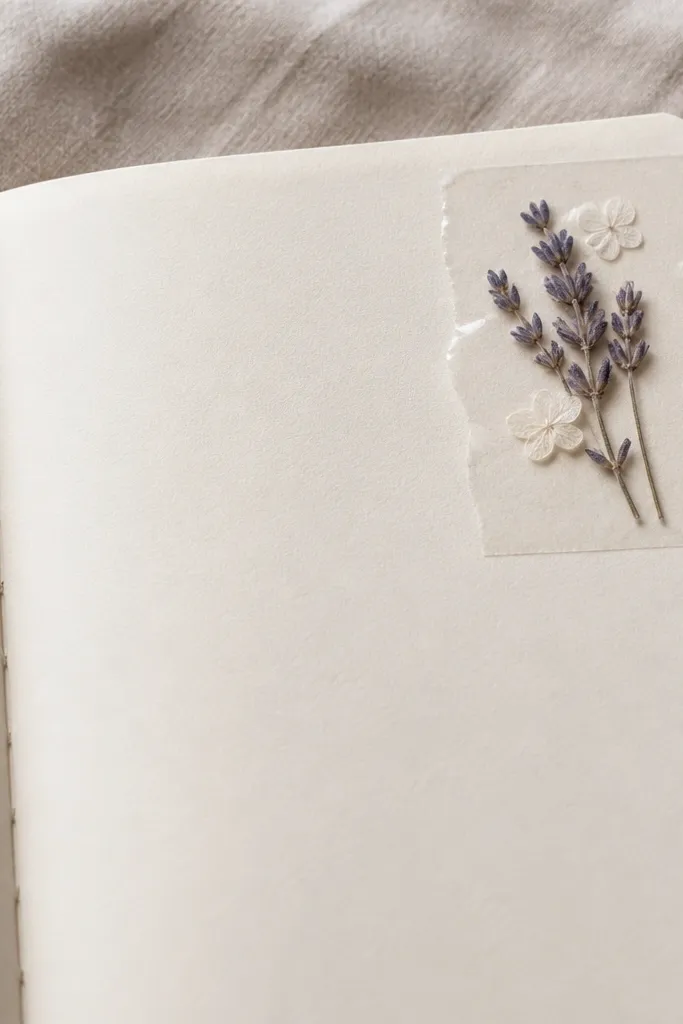
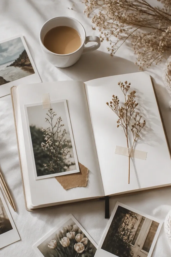
Place 2-4 pressed petals in a corner and secure them with a clear matte tape or thin archival tape so they don’t curl. Keep the journaling light around the cluster to emphasize the natural textures. Choose flat, fully dried flowers for a crisp look and less warping.
Use tweezers to position petals, then tape only the edges. If your flowers aren’t fully dry, heat them gently with a book press for a few more days.
3. Collage Moodboard Header (Cut + Layer)
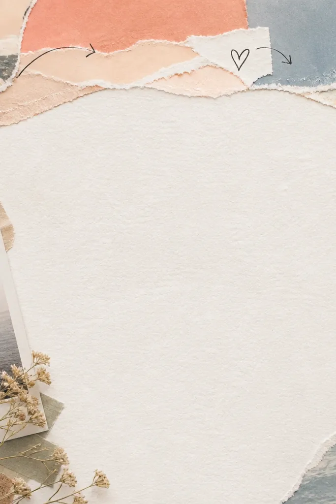
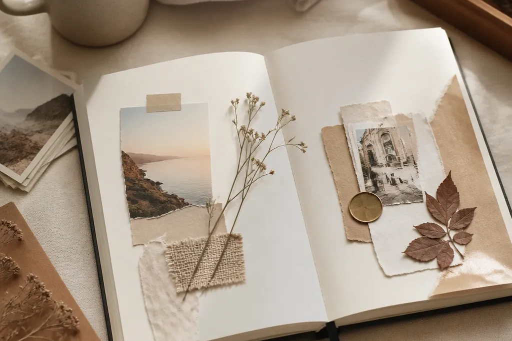
Tear small pieces of paper (or old receipts, packaging, or magazine pages) and layer them into a header that covers about one-third of the width. Add a title like “Moodboard” in a contrasting color using a fine-tip marker. Collage headers look cohesive because the layered shapes create depth even with minimal drawing.
Good to knowTear edges for a softer aesthetic and glue with a thin glue stick so the page doesn’t buckle. Keep the color palette to 3 shades for a calm vibe.
4. Star Chart Habit Tracker with Dot Grid
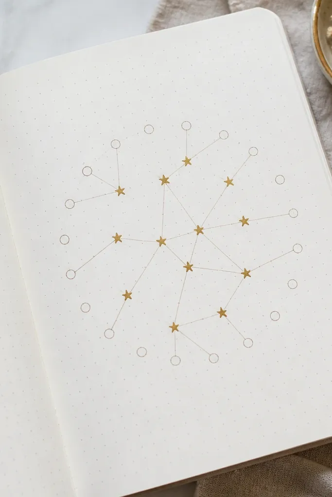
Draw a dot-grid (or use a printable guide) and map habits as “constellations” where each day is a dot. When you complete a habit, fill that dot with gold or yellow gel pen. The star-chart look feels aesthetic because it turns routine tracking into a visual reward system.
Use a light pencil to place dots first, then go over with a 0.3 or 0.5 fineliner. Keep habits to 2-3 so the constellation doesn’t get crowded.
5. Gel Pen Ombre Background Behind Text
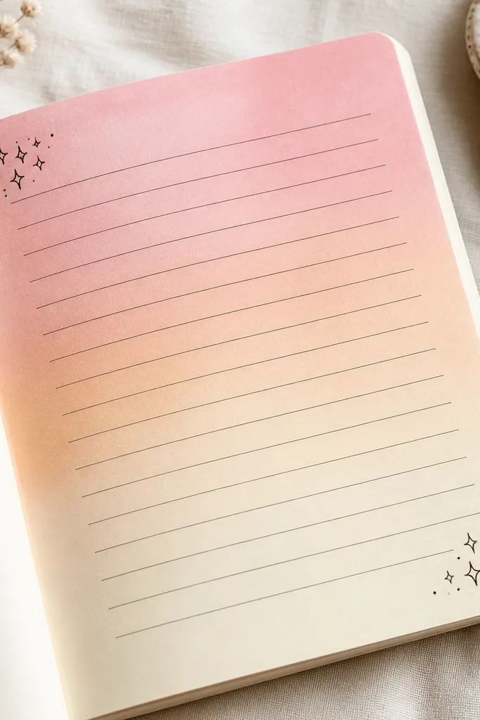
Create an ombre rectangle using gel pens or watered watercolor brushes, then let it dry fully. Write your main entry on top in black fineliner so the contrast stays readable. Ombre backgrounds look dreamy because they add color atmosphere without needing lots of drawing.
Test your gel pen on scrap paper first — some bleed. For best readability, keep the ombre lighter behind the lines and darker only near the edges.
6. Photo Strip + Caption Lines (Instant Scrapbook)
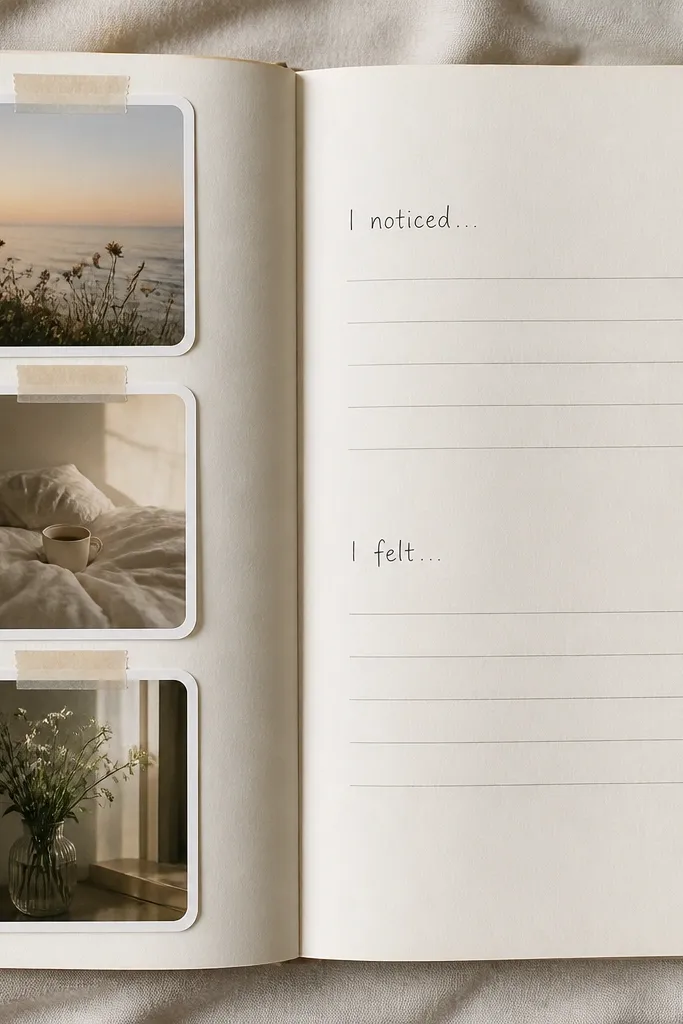
Print 2-3 small photos (or use phone-photo strips) and tape them vertically with slightly offset edges for a scrapbook feel. Add caption lines beside them so the writing flows from the visuals. This layout works because photos anchor the memory while the captions keep the page meaningful.
Good to knowUse photo-safe tape (or washi tape) and avoid covering photo faces with thick adhesive. Leave a tiny gap between prints so the page breathes.
7. Monochrome Doodles + Single Color Accent
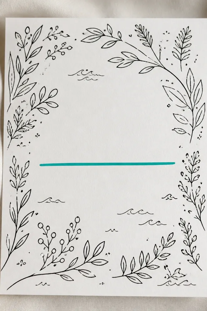
Pick one main writing color (black or dark gray) and keep doodles in the same tone. Then choose one accent color to highlight a key sentence with an underline, box, or small sticker dot. Monochrome with one accent looks intentional and modern because your eye knows where to land.
Limit accents to one per page — if you highlight everything, it stops feeling curated. Use a ruler for clean underline straightness.
8. Interactive Pocket Page with Receipts or Notes
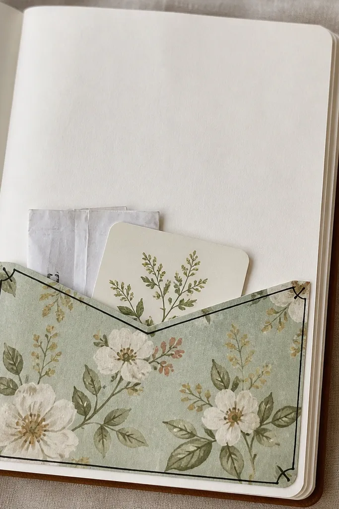
Make a simple pocket by folding a rectangle of decorative paper and gluing only the sides and bottom. Tuck in receipts, a pressed ticket stub, or a handwritten mini note. Pocket pages feel aesthetic because they add dimension and invite you to revisit what you saved.
Use thicker paper for the pocket so it doesn’t crease as you open it. If your diary pages are thin, reinforce the pocket with a second layer of plain paper behind the decorative layer.
9. Weekend Split Layout: Left Brain / Right Heart
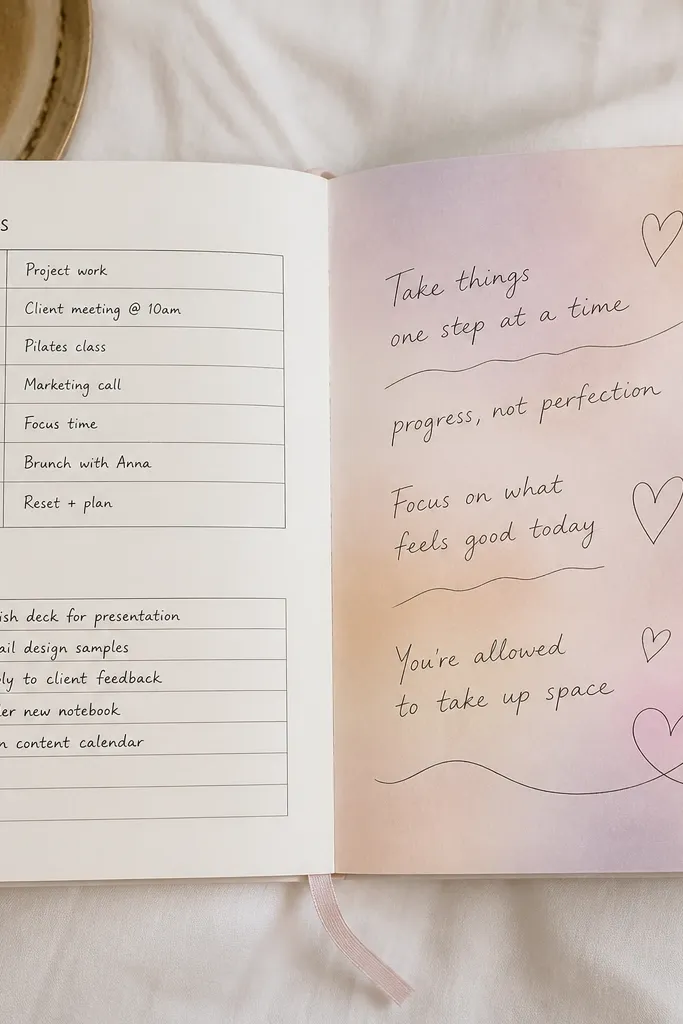
Draw a vertical divider and style each half differently: structured boxes on one side, flowing notes on the other. Use two textures — like straight underline bars for the left and wavy underline bars for the right. This layout looks aesthetic because it visually matches what you’re writing, reducing the feeling of “one-size-fits-all” journaling.
Choose two pen widths: a fine tip for the structured side and a brush pen or thicker marker for the emotional side. Keep the divider line consistent to make the split look crisp.
10. Color-Block Weekly Summary with Tiny Icons
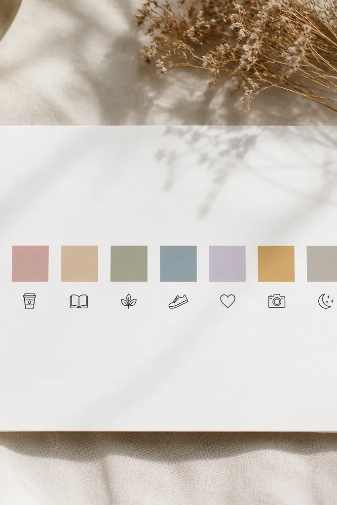
Assign each day a muted color block (use colored pencils, markers, or washi strips) and pair it with one tiny icon representing the highlight. Write a single-word caption under each block to keep it minimalist. Color blocks feel cohesive and aesthetic because they create a visual rhythm across the entire week.
Use the same icon style (same line thickness) so the page looks designed, not random. If you’re using markers, let them dry fully before closing the diary to prevent transfer.