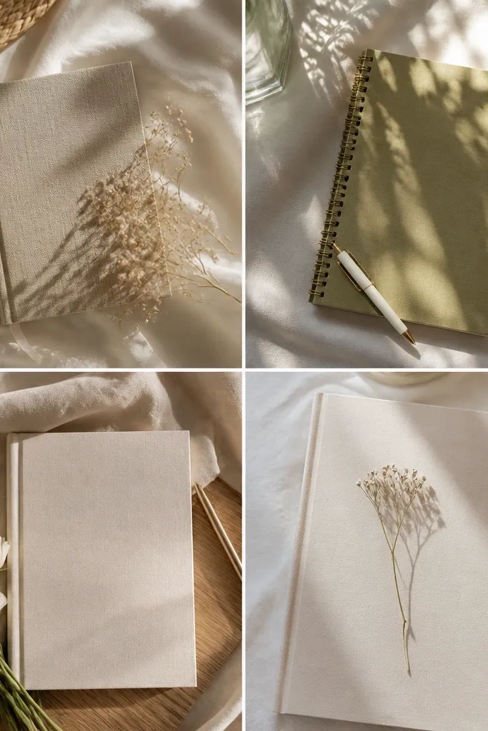
1. Washi Tape Frame + Center Title Block
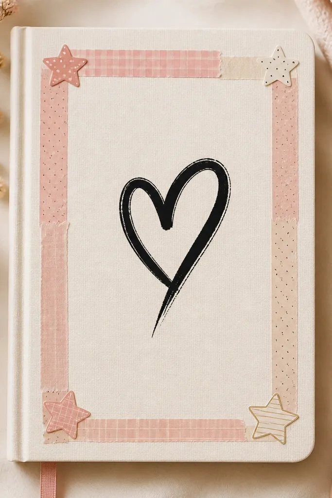
Taping a frame first gives you instant structure, so your title looks intentional even if your lettering is simple. Blush + cream stays soft for an aesthetic diary, and adding tiny star stickers makes the corners feel “finished” instead of empty.
Measure your diary cover width, then leave a 1 cm margin inside the tape so the page doesn’t look cramped when you open it.
2. Pressed Flower Corner with Soft Wash Background
A pressed flower corner feels delicate and elevated, especially when the rest of the page stays minimal. Use a very light watercolor wash (sage + beige) so the flower is the focal point, and choose gray ink to keep it calm and cohesive.
Seal the flower with a tiny dab of clear matte glue around the edges only, not over the center of the petals.
3. Polaroid-Style Photo Strip Title Banner
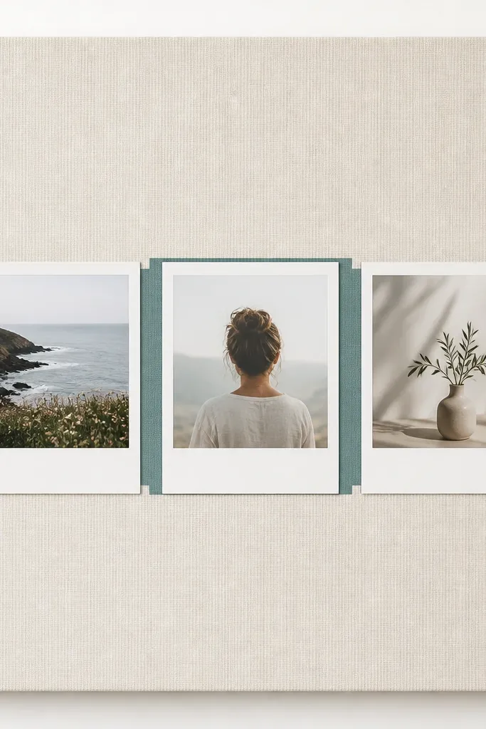
A photo strip instantly adds personality, and the white Polaroid borders make everything look curated. The title banner behind the middle card gives you a clean focal area without covering the whole page.
Print images in grayscale or sepia and keep the banner color to one muted tone so the page doesn’t look busy.
4. Minimal Line-Art Border + Name in Bubble Letters
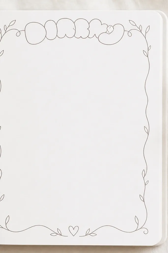
Line-art borders are beginner-friendly and look expensive because they rely on shape and spacing, not heavy color. Bubble letters at the top add a playful contrast to the delicate border, and a single tiny doodle keeps it balanced.
Good to knowDraw the border first lightly with a pencil, then trace with a 0.3 or 0.5 black fineliner for crisp lines.
5. Book Spine-Inspired Vertical Header
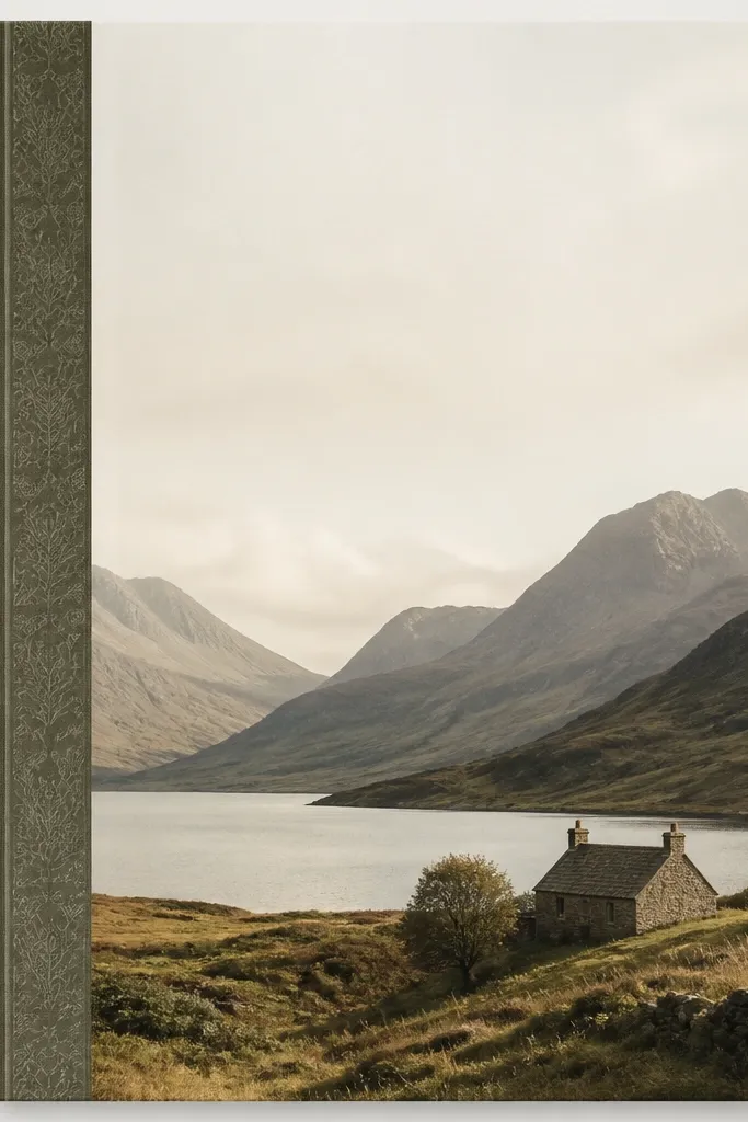
This layout mimics a book spine, which makes your diary feel like a collectible journal. A narrow patterned strip (like tiny dots or micro florals) adds texture, while the vertical label keeps the composition interesting even when the page is mostly blank.
Good to knowUse a ruler to keep the spine strip perfectly straight — it’s the difference between “cute” and “clean.”
6. Galaxy Wash + Starry Dot Title
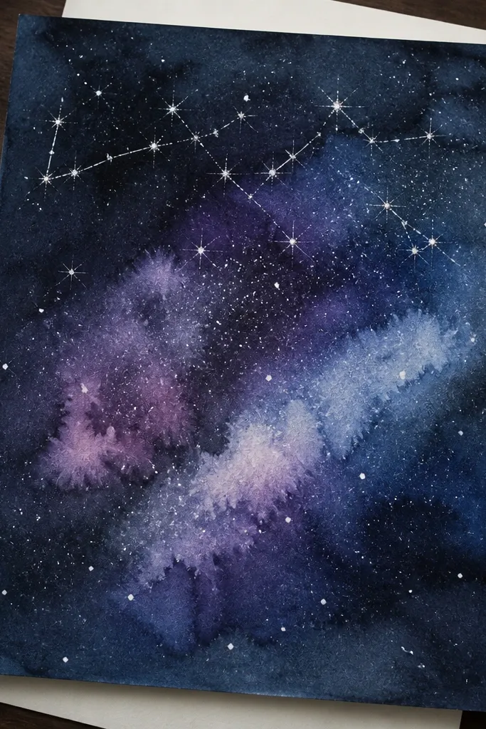
Galaxy backgrounds are dramatic and totally aesthetic, and the star dots make the page feel alive. Keep your title bright (white or silver gel pen) so it pops against the dark wash, and add a couple of constellation lines for a cohesive theme.
Sprinkle white paint using a toothbrush — hold it farther back for finer “star” specks.
7. Fabric Swatch Pocket + Tag Label
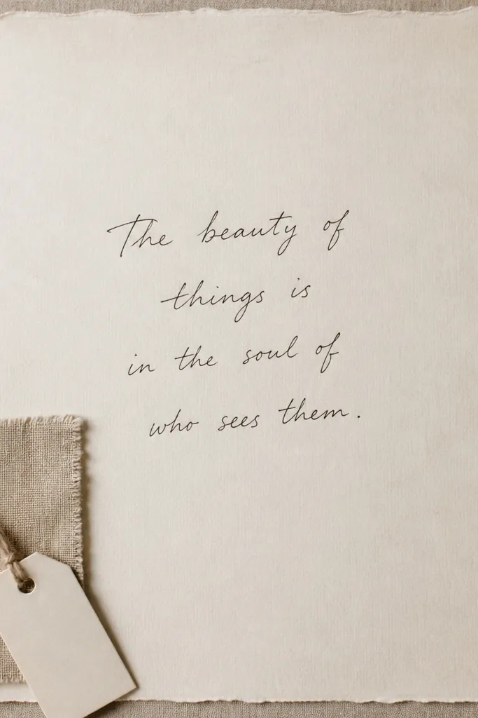
A fabric pocket adds tactile texture that paper-only pages can’t match. Choose one fabric swatch (cotton gingham or soft linen-look) and keep the rest simple: a quote or short promise in the center makes it feel personal and curated.
Good to knowUse double-sided tape to attach the pocket edges first, then stitch or glue only the corners for a cleaner finish.
8. Gradient Wash Background with Sticker Anchors
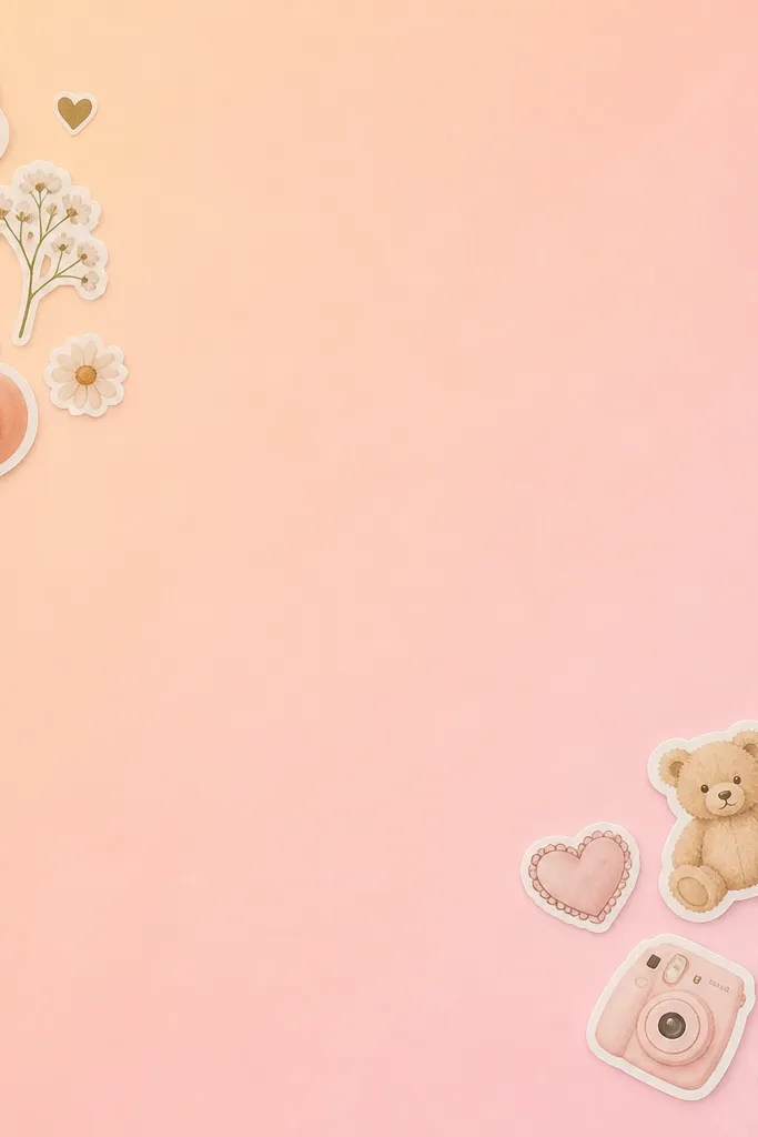
Gradients are an easy way to make “blank paper” look designed. Peach-to-pink feels warm and diary-friendly, and sticker clusters work best when they mirror each other (same size, opposite corners) for balance.
Let the gradient dry fully before writing — wet watercolor can blur ink and ruin the crisp look.
9. Stamped Botanical Corner + Green Ink Date Line
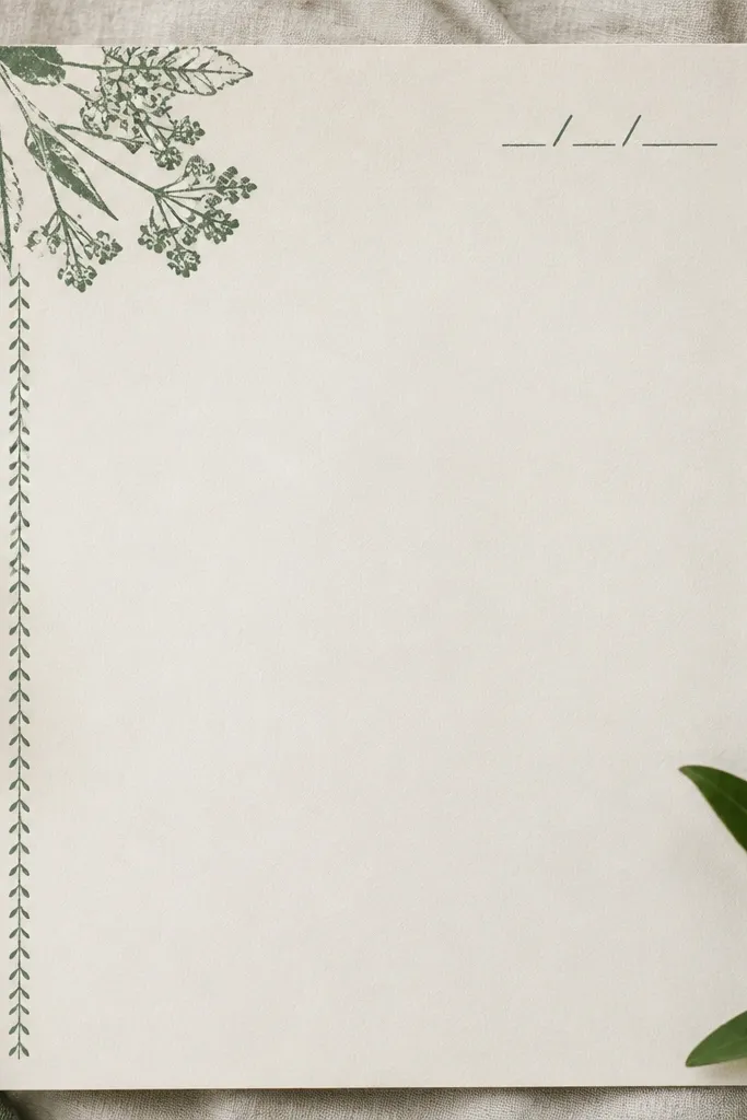
Botanical stamping looks artsy without needing advanced drawing. Use muted green ink so the stamp feels vintage and calm, and pair it with a simple date line to keep the page functional (you’ll actually use it).
Good to knowTest your stamp on scrap paper first — botanical stamps often need a second light press for crisp edges.
10. Color-Blocked Title with Cut Paper Shapes
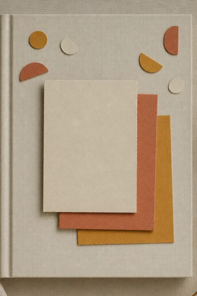
Cut paper color blocks give you a bold, modern aesthetic even with basic handwriting. Layering rectangles creates depth, while rounded shapes keep it from feeling too sharp or harsh.
Use a craft knife + cutting mat for clean edges, and keep the shapes to 2-3 colors max so it stays cohesive.
11. Clear Tape “Window” Over Watercolor Quotes
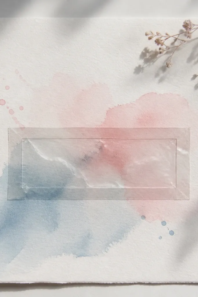
A tape window protects your quote and makes it look glossy and intentional. The contrast of soft watercolor with clear tape shine is super aesthetic, and it also helps prevent smudging when you write nearby.
Trim tape edges with scissors and press firmly with a card to avoid bubbles.