1. Faux Polaroid Memory Corner (with caption strip)
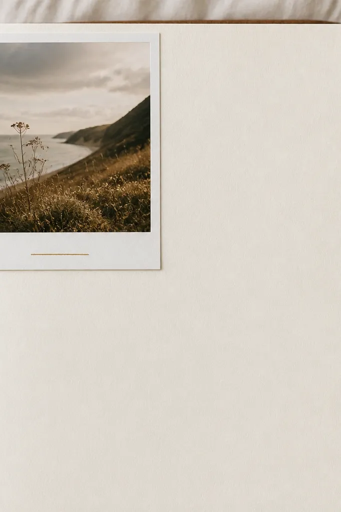
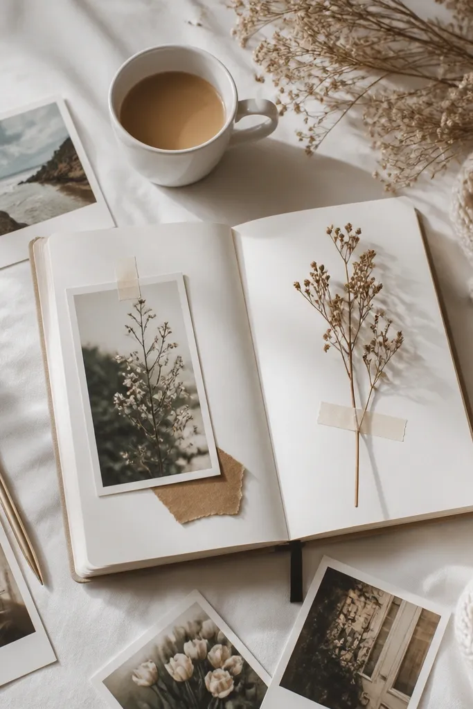
Print or print-and-trace a small photo (even a phone screenshot) and add a thick “Polaroid” border using off-white paper or cardstock. Place it in one corner and keep the rest of the page mostly blank, then add one short caption line. The expensive look comes from the photo-like framing and negative space, not from lots of stickers.
Use a 2.5 cm white border around the photo and keep captions to one sentence max for that editor-style calm.
2. Gold Gel “Thread” Header on Kraft Paper
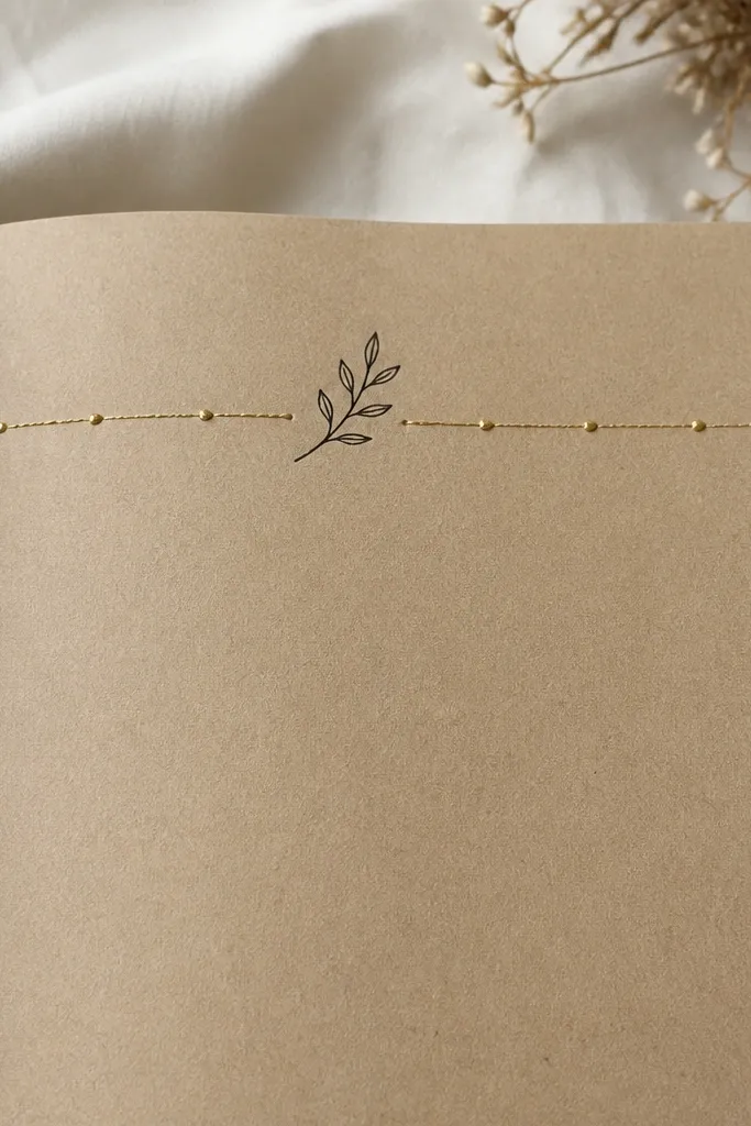
Write your date or theme in black ink on kraft paper, then draw a thin gold gel line above it like a thread. Add 5-7 small gold dots along the line to mimic stitching. Kraft + gold reads instantly luxe because it’s high-contrast and tactile, like packaging.
Before writing, lightly pencil the header line so your gold “thread” stays perfectly straight.
3. Minimal Timeline Strip with Washi Frame
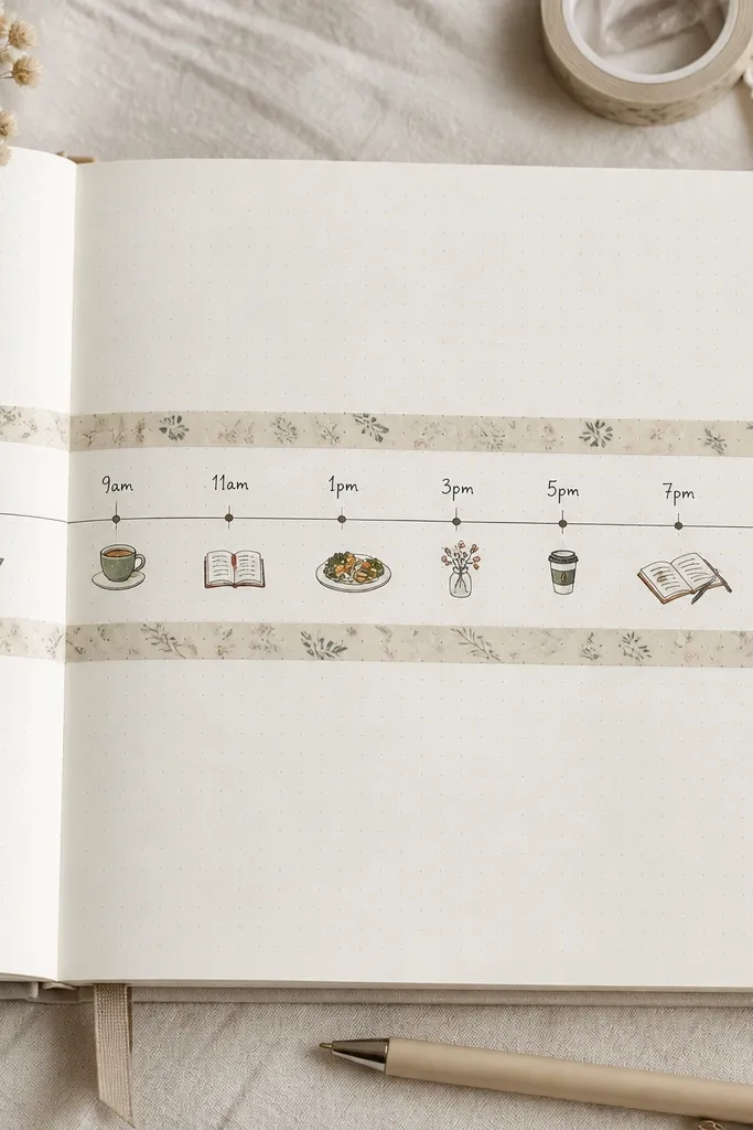
Make one single row timeline: times on the left, 1-2 word notes on the right, and connect each with tiny dots. Frame the timeline with a narrow wash tape strip (like beige, cream, or subtle gray pattern). This looks expensive because it’s structured like stationery design, not scattered like a scrapbook.
Good to knowStick to one wash tape design and one font style for a consistent, premium vibe.
4. Watercolor Wash Background + Crisp Black Notes
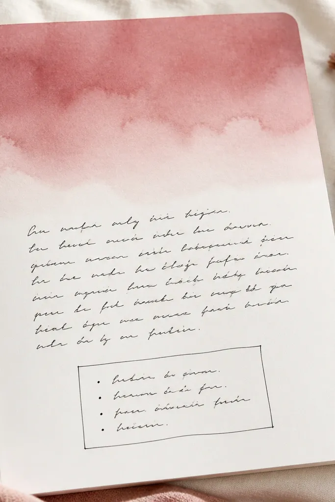
Lightly paint a watercolor wash (dusty rose, terracotta, or sage) so it fades naturally. Once dry, write your notes in crisp black pen and keep the writing to defined blocks (one paragraph or a short list). The contrast between soft color and sharp text creates that “expensive print” look.
Use watercolor paper or glue thin watercolor paper onto your page for smoother blending.
5. Label-Style Section Headers (like boutique packaging)
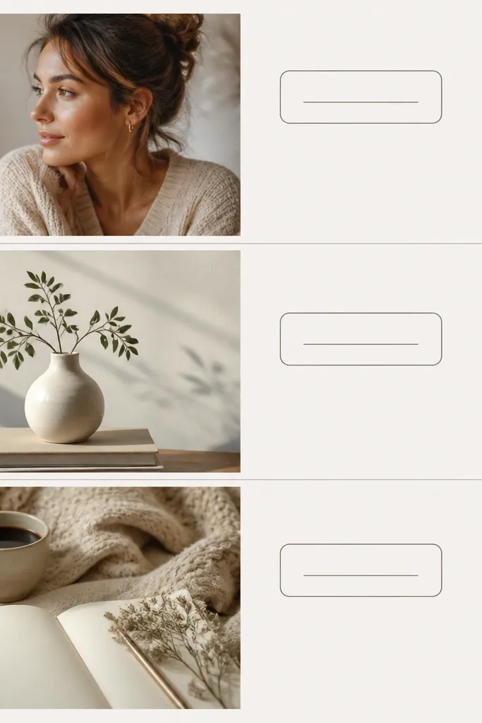
Create 3 section headers using small rounded rectangles made from a strip of thin cardstock. Write one word per label (e.g., “Today,” “Grateful,” “Plan”) in uppercase with a fine black pen. Inside each section, write short lines with consistent spacing. This works because packaging-style labels look intentional and designed.
Good to knowMake your labels all the same width and height so the page feels professionally laid out.
6. Pressed Leaf + Transparent Tape Bookmark Accent
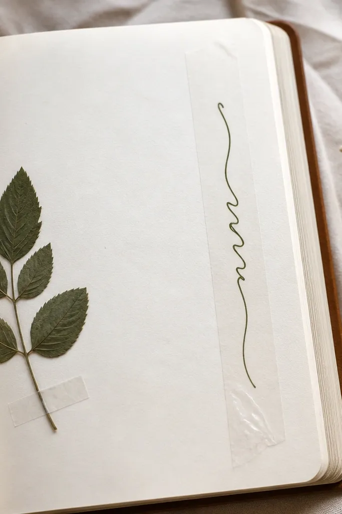
Press a small leaf (or use a flat dried flower petal) and place it where you’d normally add a sticker. Secure it with a small square of clear tape so it looks embedded. Add a vertical clear-tape strip along the margin with a single handwritten word. The tactile botanical element looks high-end without needing many decorations.
Seal the leaf lightly with a tiny dab of matte medium or mod podge (on the tape only) to prevent curling.
7. Monochrome Grid + One Accent Color Dot

Draw a faint grid (light gray pencil or ruler lines) so your writing has structure. Keep all text in black/charcoal and use one accent color dot (emerald, cobalt, or terracotta) next to the most important line. Luxury layouts often use restraint, and the single accent feels curated like a design poster.
Choose one accent color and never use it more than 1-3 times per page.
8. Tape-Backed “Gallery Frame” for a Quote
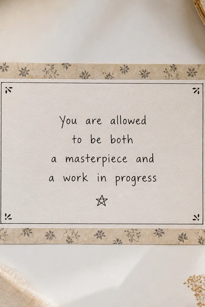
Write a short quote (3-6 lines) and build a frame around it using two washi tape widths: a broader outer border and a thinner inner line. Add corner tick marks (like a camera viewfinder) in pencil or gold gel. This makes the quote look like it belongs on a gallery wall, not a notebook page.
Use tape only on the edges; leave the middle clean so the text stays crisp.
9. Matte Black Washi + Tiny Gold Corner Accents
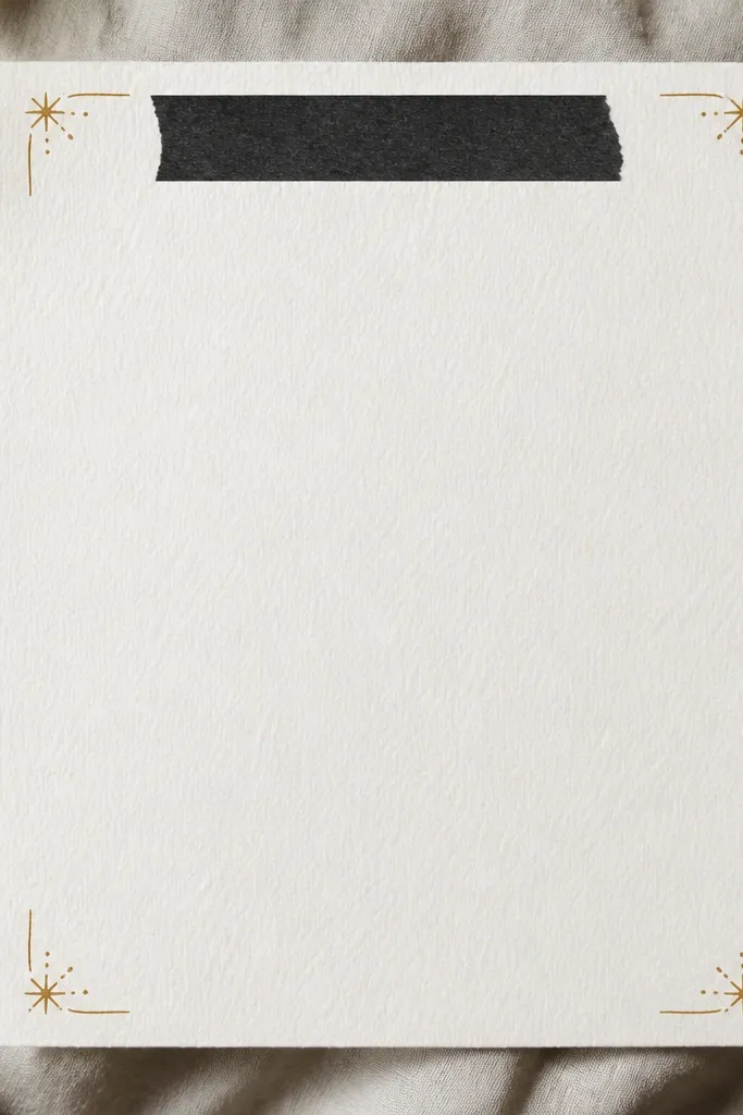
Add one matte black washi strip near the top (or bottom) and keep everything else minimal. Write your main text in white gel pen or very light gray so it pops. Finish with small gold gel corner marks. This combination reads “expensive editorial” because black + gold is classic and the page has strong contrast.
Test your pen on scrap paper first — white gel pen can vary by paper thickness.
10. Coffee-Ring Vignette Background + Clean Bullet List
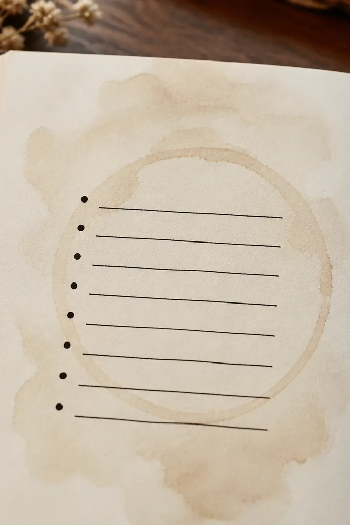
Brew coffee or black tea, then dab a tiny amount with a cotton swab to create a soft ring stain. Let it dry fully, then write a clean bullet list on top with consistent line spacing. The vintage stain makes the page look like an antique letter, while the crisp bullets keep it modern and intentional.
Good to knowUse a paper towel to blot right after dabbing so the ring stays subtle, not messy.
11. Wax Seal Effect using Tape + Gold Dot Center
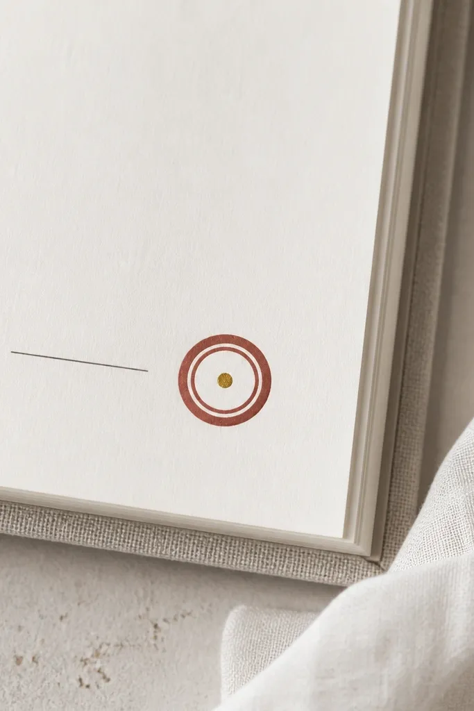
Create a seal look by layering two circles of washi tape (one slightly larger outer ring) and pressing them down firmly. In the center, add a gold gel dot (or a tiny gold sticker). Pair it with a short date line in neat handwriting. It feels fancy because wax seals are instantly associated with invitations and letters.
Cut circles with a craft punch or use a lid as a template for perfect symmetry.
12. Accordion Cut-Out Page Insert (minimal but dimensional)
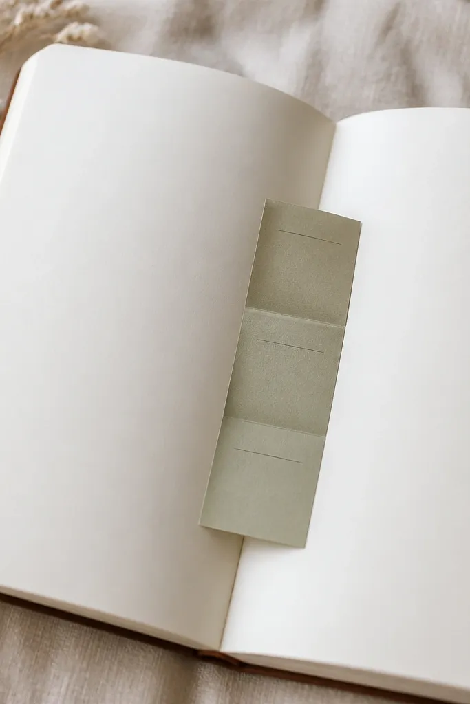
Cut a strip of colored cardstock and fold it accordion-style into 3-4 panels. Glue or tape it into your diary so it opens slightly like a hidden note. Keep panel text short and aligned. The dimensional insert looks expensive because it adds structure and “product” feel, not extra clutter.
Good to knowUse thin cardstock so the insert doesn’t bulk up when you close the diary.