1. Warm Neutral Mood Board with Linen Texture Dominance
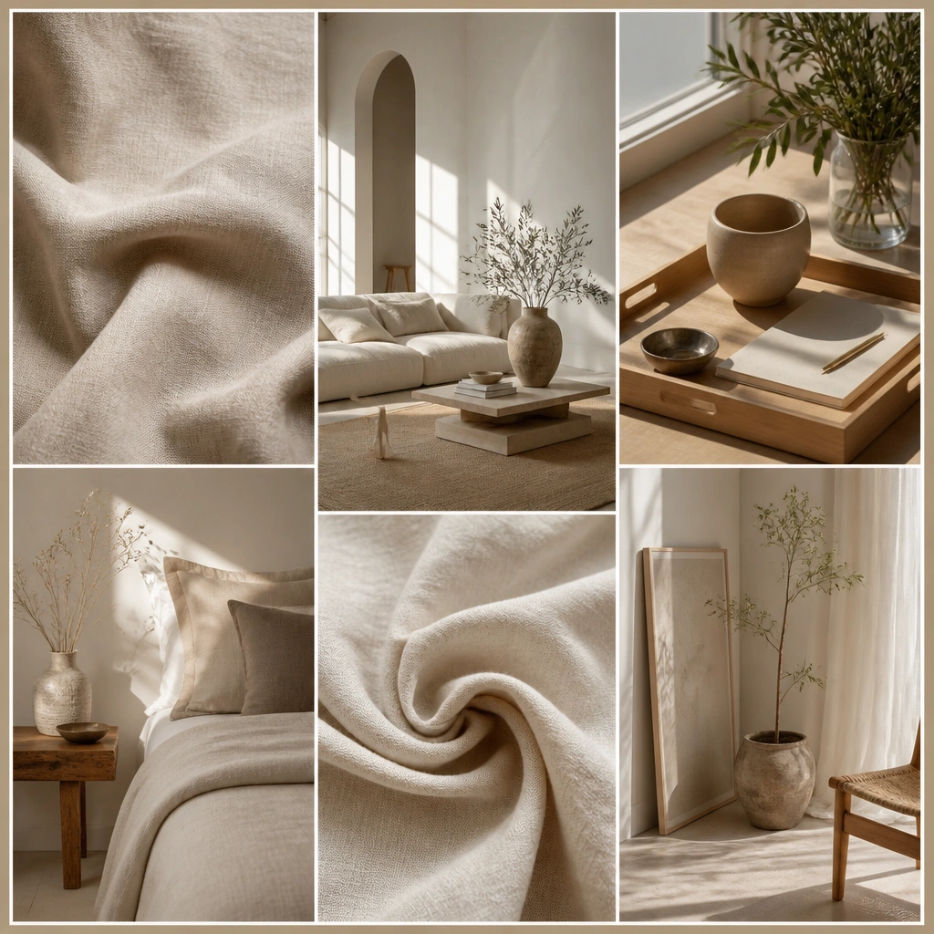
This look works because linen textures visually “anchor” warm neutrals. Pair close-up fabric photos with wider room shots so the board reads cozy and lived-in, not flat. Stick to cream, camel, oat, and warm taupe for consistency.
Good to knowAdd one physical swatch photo: snap linen fabric next to your computer or window light, then pin it as your texture reference.
2. Black-and-Brass Minimalist Board with Strong Geometry
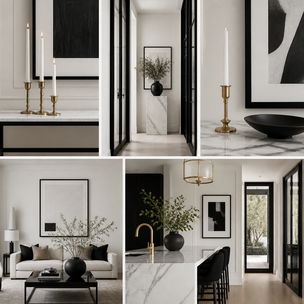
Minimalist boards feel expensive when you repeat geometry. Use tall, vertical images (frames, vases, cabinet handles) and keep the palette to black, white, and a small amount of brushed brass. Marble and ceramic highlights add depth without adding clutter.
Good to knowUse a single border color (matte black or warm white) so every image feels like part of the same design system.
3. Moody Library Aesthetic with Deep Greens and Aged Paper
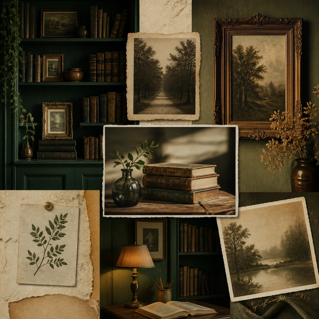
This aesthetic is all about contrast — deep greens against aged paper tones. Add photos of book spines, leather-like textures, and warm bulbs to create that “late-night reading” mood. Look for images with grainy textures and slow lighting.
Good to knowPrint one photo on kraft paper or use brown kraft cardstock as a background layer behind your images for an instant aged effect.
4. Scandi Calm Board with Light Wood and White Space
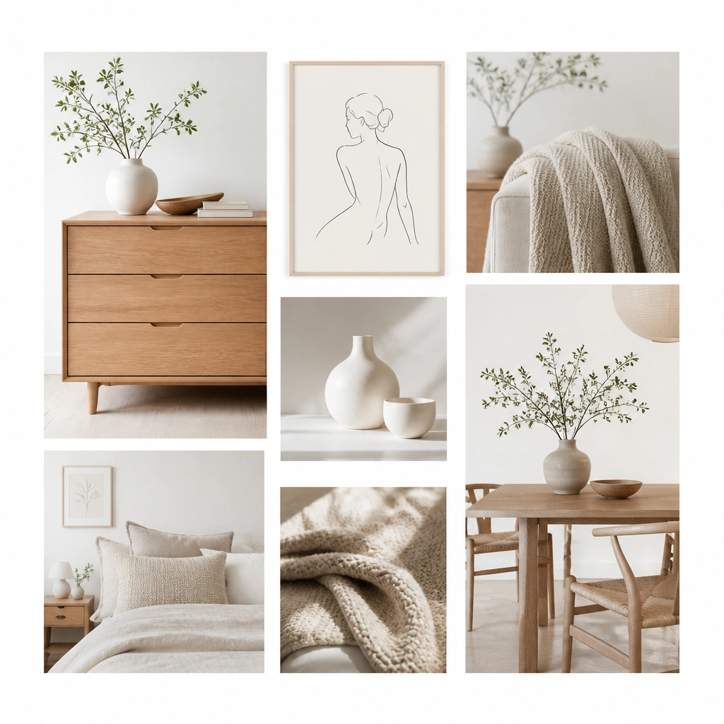
Scandi calm looks airy because there’s breathing room. Choose images with light wood, soft whites, and muted grays, then prioritize compositions with clear negative space. Your board should feel like it has sunlight even on a cloudy day.
Good to knowLeave 20-30% empty space on your board — even if it means fewer images — to keep the vibe consistent.
5. Coastal Cottage Board with Blue-White Stripes and Rattan
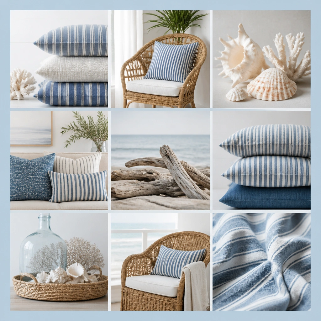
Coastal cottage works when you repeat stripes and natural texture. Pair blue-white pattern photos with rattan or woven basket images so the board feels both fresh and handmade. Add small warm sand tones to keep it from looking too cold.
Good to knowUse a “pattern cap” — pick one pattern (stripes) and let everything else be solid textures.
6. Japandi Zen Board with Stone Textures and Minimal Layout
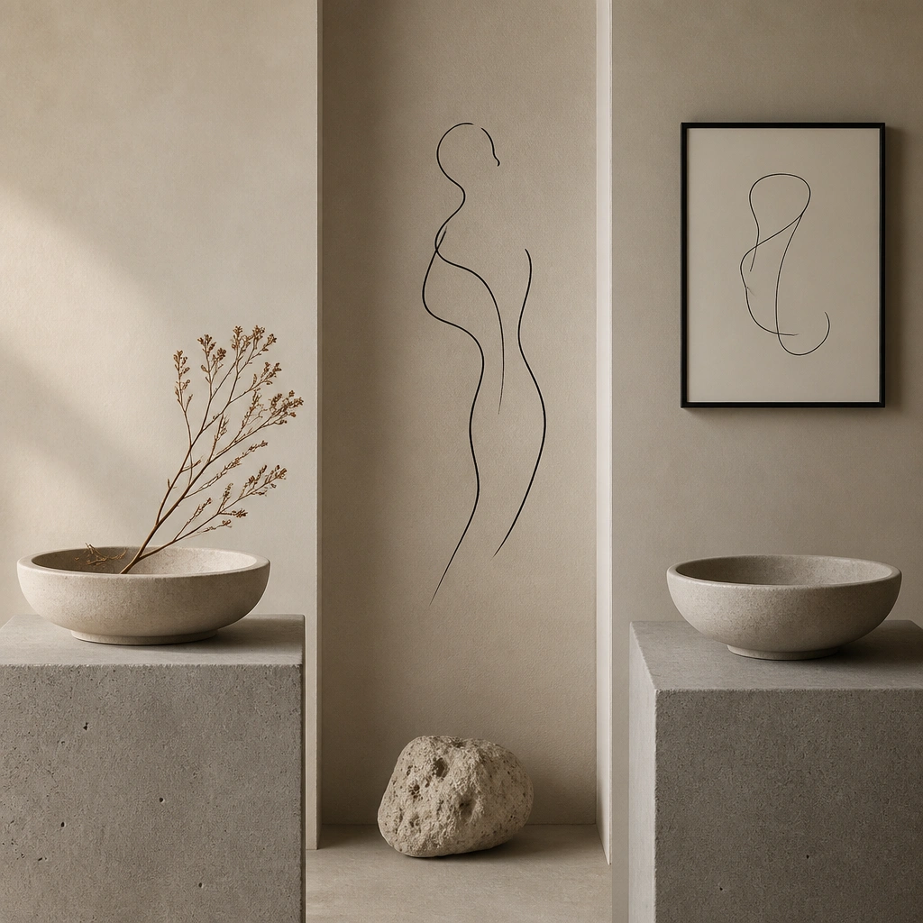
Japandi blends warmth and restraint. Look for stone, concrete, and matte ceramics paired with light wood and neutral fabric. Keep the layout quiet: fewer images, more consistent spacing, and limited accent colors (black or deep charcoal).
Add one small black-and-white illustration (like a plant line drawing) to create that signature Japandi contrast.
7. French Country Board with Toile Prints and Warm Florals
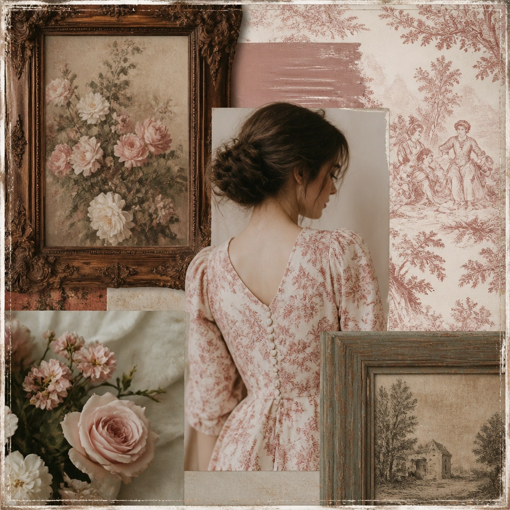
French country reads charming when you balance pattern with soft color. Include toile or damask-style images, then add warm florals (lavender, rose, muted sunflower). Choose photos with gentle lighting and slightly faded tones for authenticity.
Good to knowLimit yourself to two pattern types: one toile/damask and one floral, so the board stays cohesive.
8. Modern Boho Board with Terracotta, Macramé, and Clay Tones
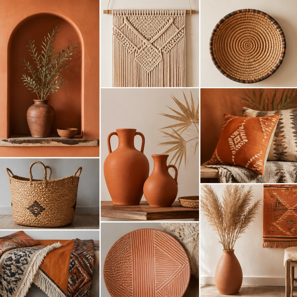
Modern boho is intentional — it’s not random color chaos. Use terracotta as your main anchor, then add cream, camel, and a muted earthy green. Include close-ups of weave and knots so the board communicates texture, not just color.
Good to knowAdd one “texture hero” photo (macramé close-up) and surround it with complementary materials like woven baskets.
9. Artful Gallery Wall Board with Color Pops and Frame Variety
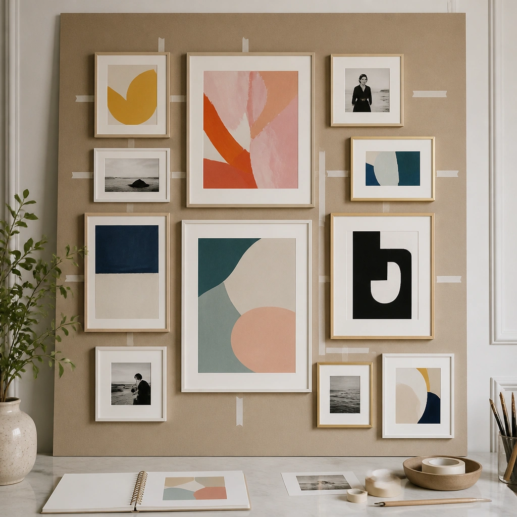
If your aesthetic includes art, your board should show how pieces relate. Include multiple frame widths (thin black, thick wood, white frames) and mix subject types (prints, photos, sketches). Add color pops sparingly so the wall feels curated.
Pin one “layout image” of a gallery wall, then copy the frame spacing style onto your own board grid.
10. Black-and-White Photo Board with One Accent Color Rule
This is a high-impact trick for aesthetic clarity. When most images are black-and-white, your eye locks onto the accent color and you instantly understand your style direction. Choose one accent (red, sage, cobalt, or mustard) and let it appear in at least 3 images to confirm the pattern.
Good to knowCircle the accent color in each relevant image (even digitally) so you remember it when shopping.
11. Texture Collage Board with Fabric Swatches and DIY Materials
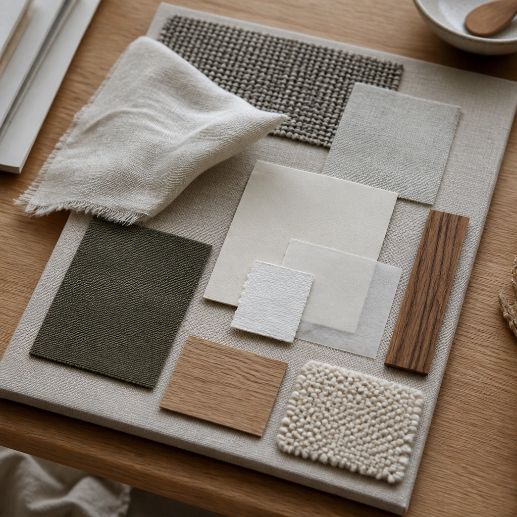
A DIY materials board makes your aesthetic actionable. Photograph swatches in natural light and include a few “finish” samples like matte paint chips or wood grain. This helps you match textures when you’re buying blankets, curtains, or wall decor.
Good to knowUse the same camera angle for every swatch photo — it makes your board look intentionally curated.