1. Thrift Frame + Single-Color Print Strip
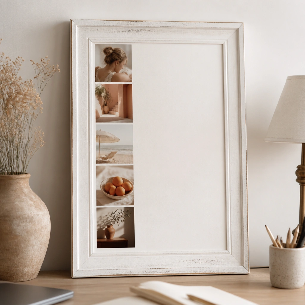
Grab a thrifted frame and keep everything in one color family so the board looks curated. Print 6-10 images, then crop them into a consistent strip width so they align like a gallery display. The white space around the images is what makes it feel expensive, even when the prints are budget.
Use a paper trimmer to cut every image to the same width and leave at least 1 inch of margin inside the frame.
2. Brown Kraft Paper Background + Gold Accents
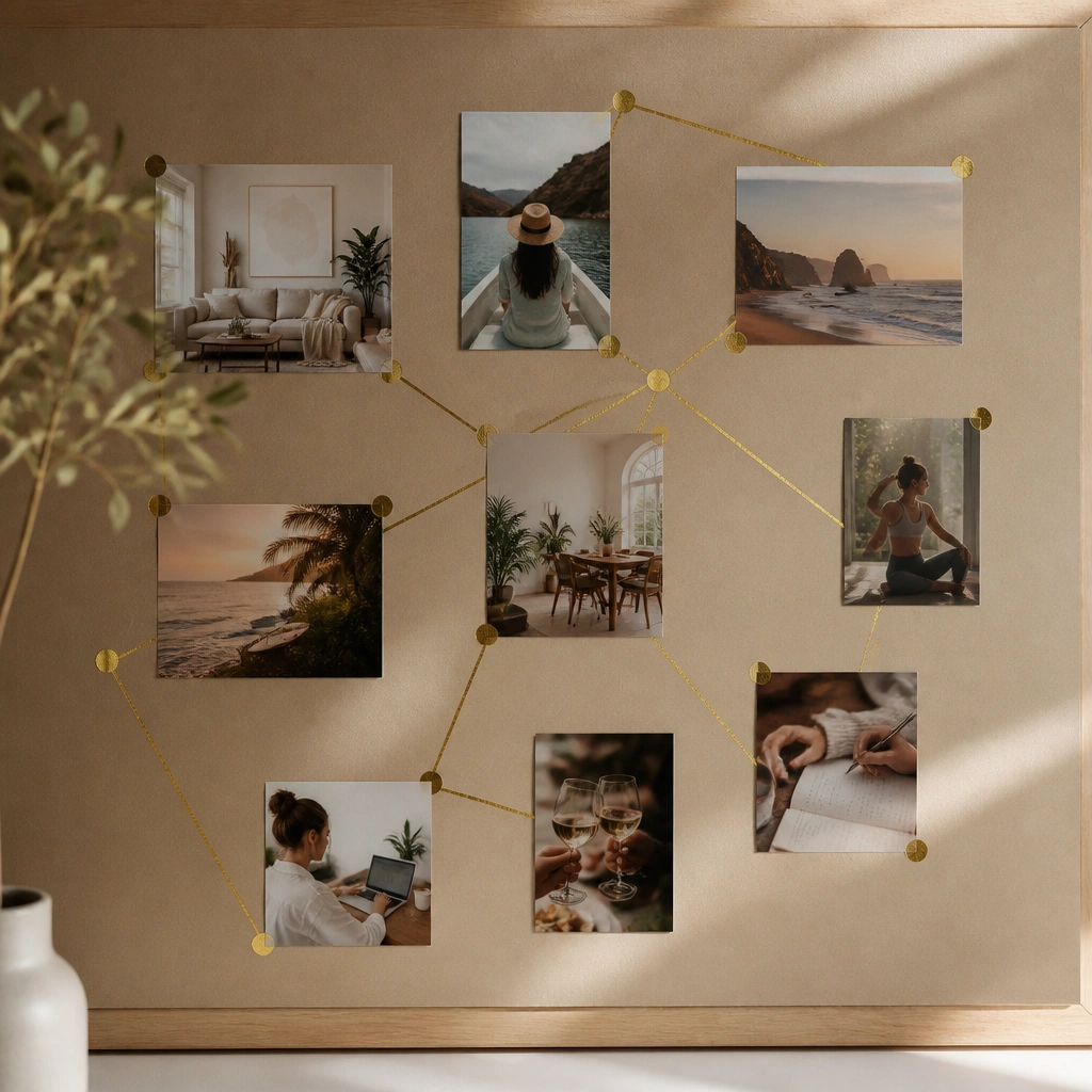
Kraft paper gives instant texture and a “high-end” neutral base. Add gold accents sparingly — think thin tape lines, corner labels, or tiny dot stickers next to key images. This combo hides uneven edges and makes clippings look intentional instead of messy.
Good to knowSeal kraft paper with a light matte spray so it doesn’t shed fibers when you move the board.
3. Wallpaper Accent Backdrop with Minimal Photos
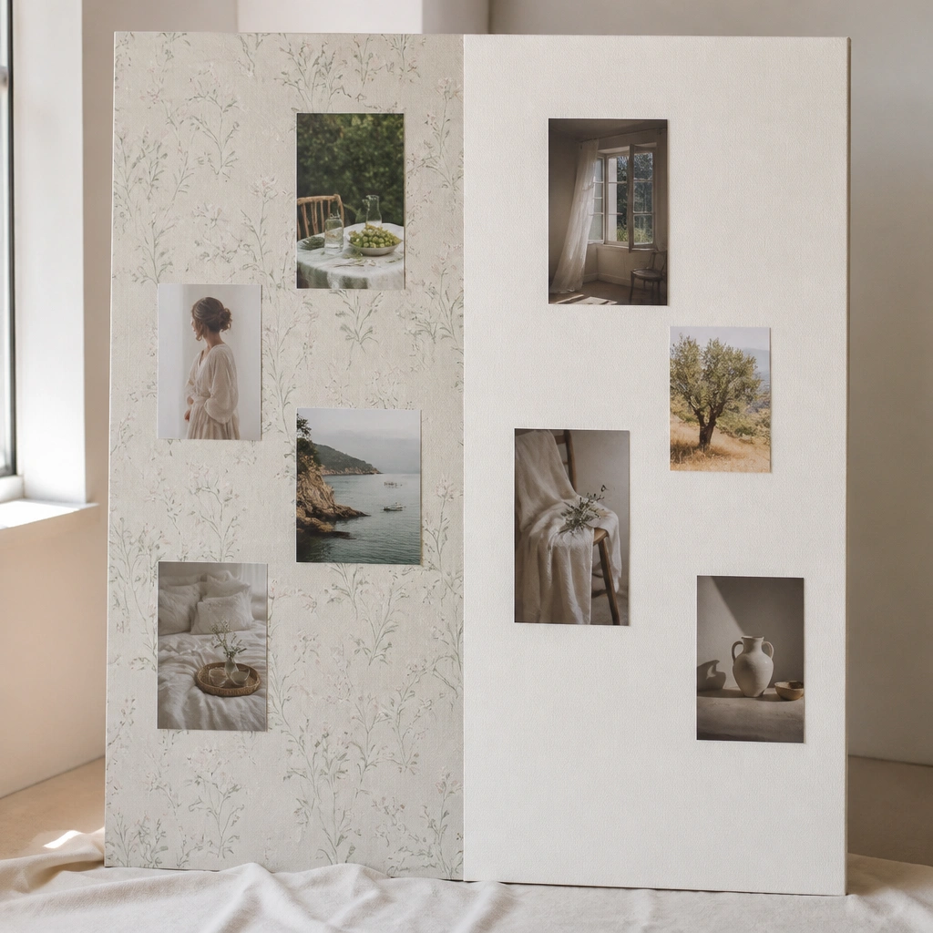
Use a small roll of peel-and-stick wallpaper (or a leftover sample) as a single accent area. Keep the rest plain and place only a few high-impact images. The contrast makes the board look styled like interior design mood boards.
Pick one wallpaper pattern with a muted palette (sage, beige, dusty rose) and limit to 1-2 images per theme.
4. Book Page Collage with Typed Goal Labels
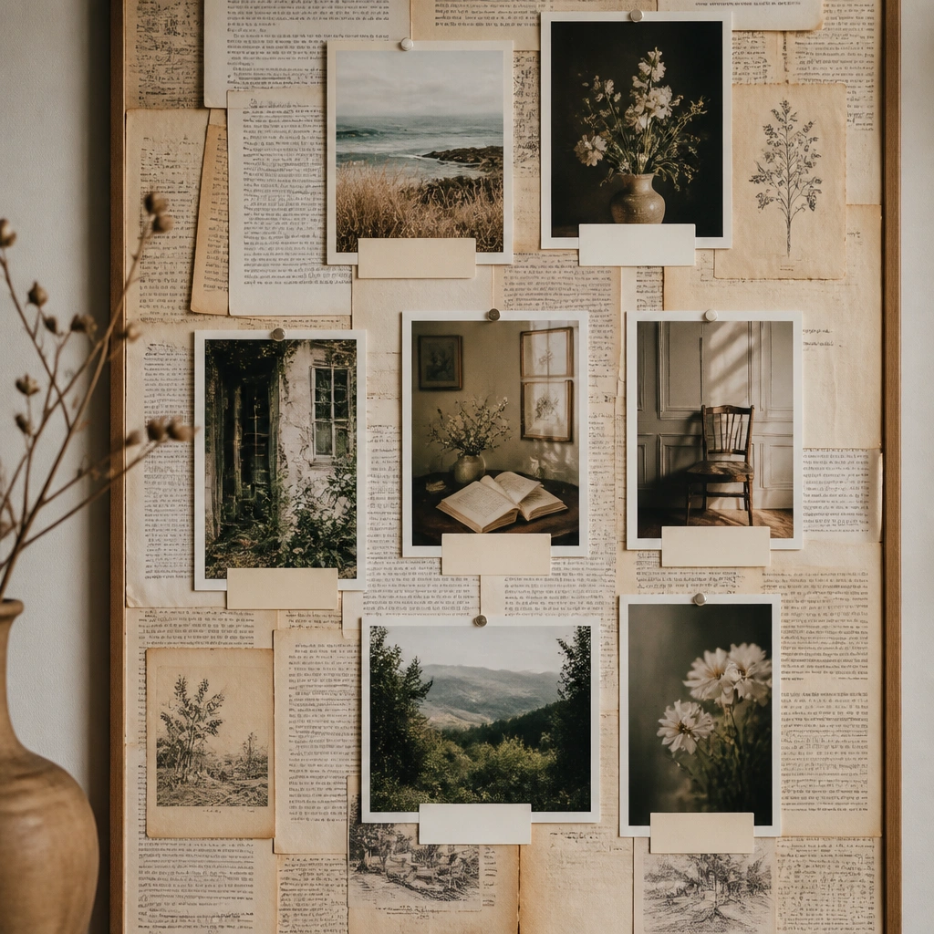
Cover your base with printed book pages (or pages from an old paperback). Add photos with a slight overlap so edges don’t need to be perfect. Under each photo, glue a short typed label like “Budget travel fund” or “Morning routine,” aligned consistently for a chic look.
Use a simple sans-serif font and keep labels to 2-4 words so the board stays clean.
5. Magazine Clipping “Magazine Spread” Layout
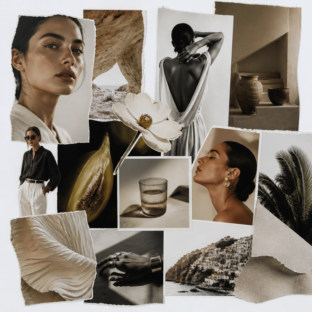
Cut clippings from current magazines and arrange them like a spread: one large hero image, two medium images, then smaller supporting pieces. Add a bold headline strip using the magazine’s own typography. This works because magazine pages already have built-in color harmony.
Good to knowChoose one magazine for the whole board so the fonts and color palette match.
6. Photo Corner Tabs (No Glue Mess)
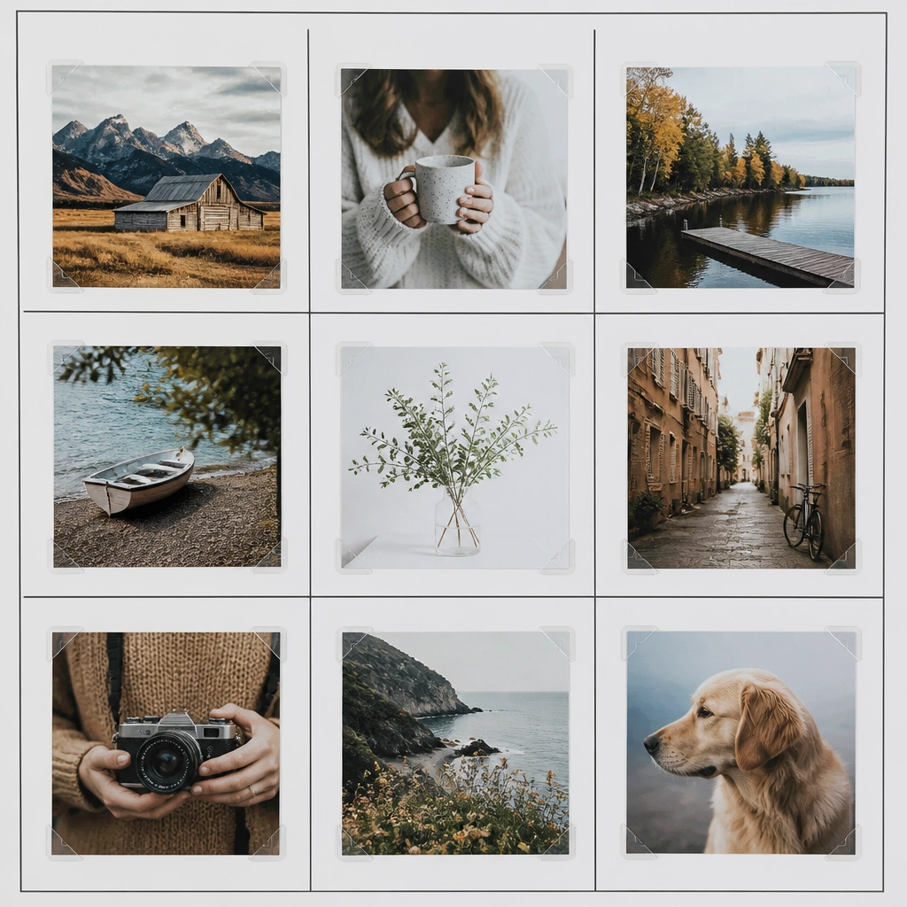
Corner tabs let you reposition photos without tearing them or leaving glue residue. Pair with dividers: use thin black paper strips or thin marker lines to create sections (Home, Career, Health). The clean structure makes it look like a professional layout, even if the photos are free downloads.
Outline your sections first with a ruler so everything stays aligned before you place tabs.
7. Washi Tape “Frame Within a Frame”
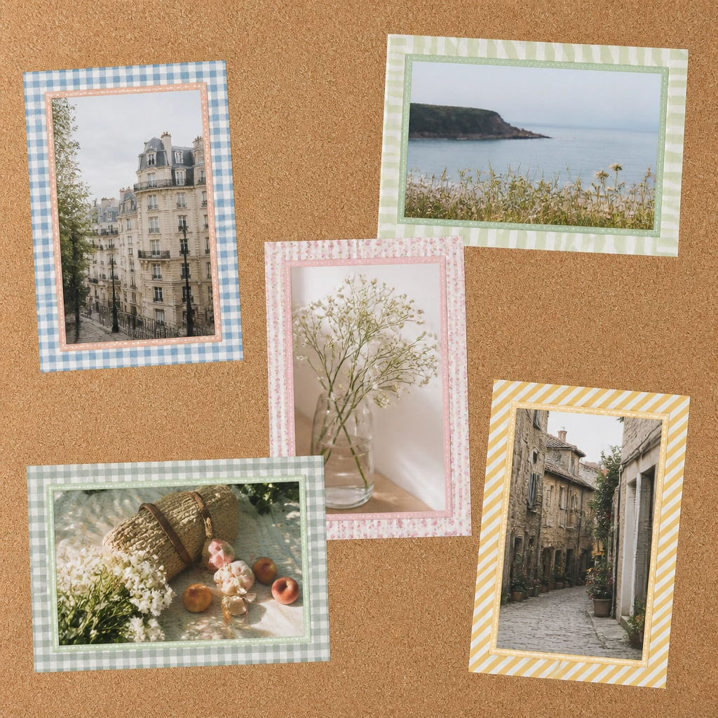
Washi tape creates a “frame” effect that reads polished. Use two tape styles: one solid neutral and one subtle pattern. Place photos slightly tilted but keep the tape borders straight so it still feels curated, not chaotic.
Press tape edges with a fingernail to prevent lifting, especially on cork texture.
8. Monochrome Printables + Black Mat Paper
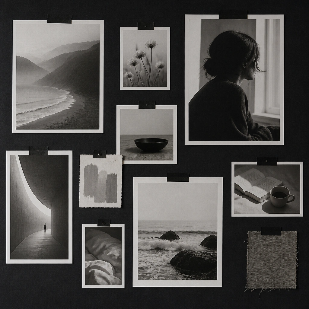
Black mat paper instantly upgrades cheap prints. Print your images in grayscale (or use black-and-white magazine clippings), then mount them with thin white strips like mini mats. This gives a gallery feel and helps low-resolution images look intentional.
Good to knowIf prints look fuzzy, print at “best quality” and avoid stretching them when you glue.
9. Cricut-Style Look with Paper Cutout Headings
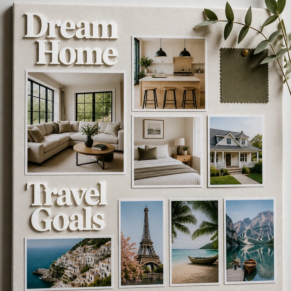
You can get the “Cricut vinyl” vibe without vinyl. Cut headings from thick cardstock using scissors or a craft knife, then layer them with a slightly offset shadow layer in a neutral color. Place headings above photo clusters to create a high-end structure.
Keep headings to one font style and repeat the same alignment (center or left) across the whole board.
10. Clear Contact Paper Overlays for Glossy Depth
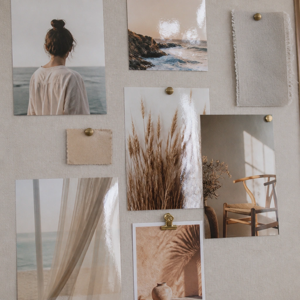
Clear contact paper (the shelf liner kind) can make selected photos look “laminated,” adding depth and a more premium finish. Apply it smoothly over a photo area, trimming edges cleanly. Use it on 2-3 hero images so the board doesn’t get bulky.
Good to knowUse a plastic card to smooth bubbles from the center outward.
11. Neutral Grid Lines with Printed Icons
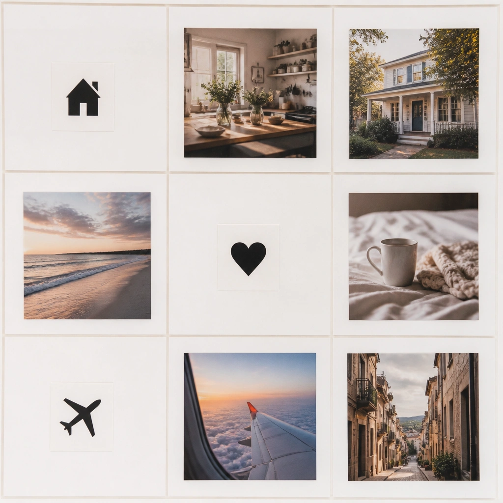
A simple grid makes the whole board look intentional, even with budget imagery. Draw or print a grid using light pencil, then place photos within grid cells. Add small printed icons as “bullet points” for each theme — it reads like a styled planner page.
Good to knowUse one icon set style (all outline or all filled) so it looks consistent.
12. Fabric Scrap Background + Photo Layering
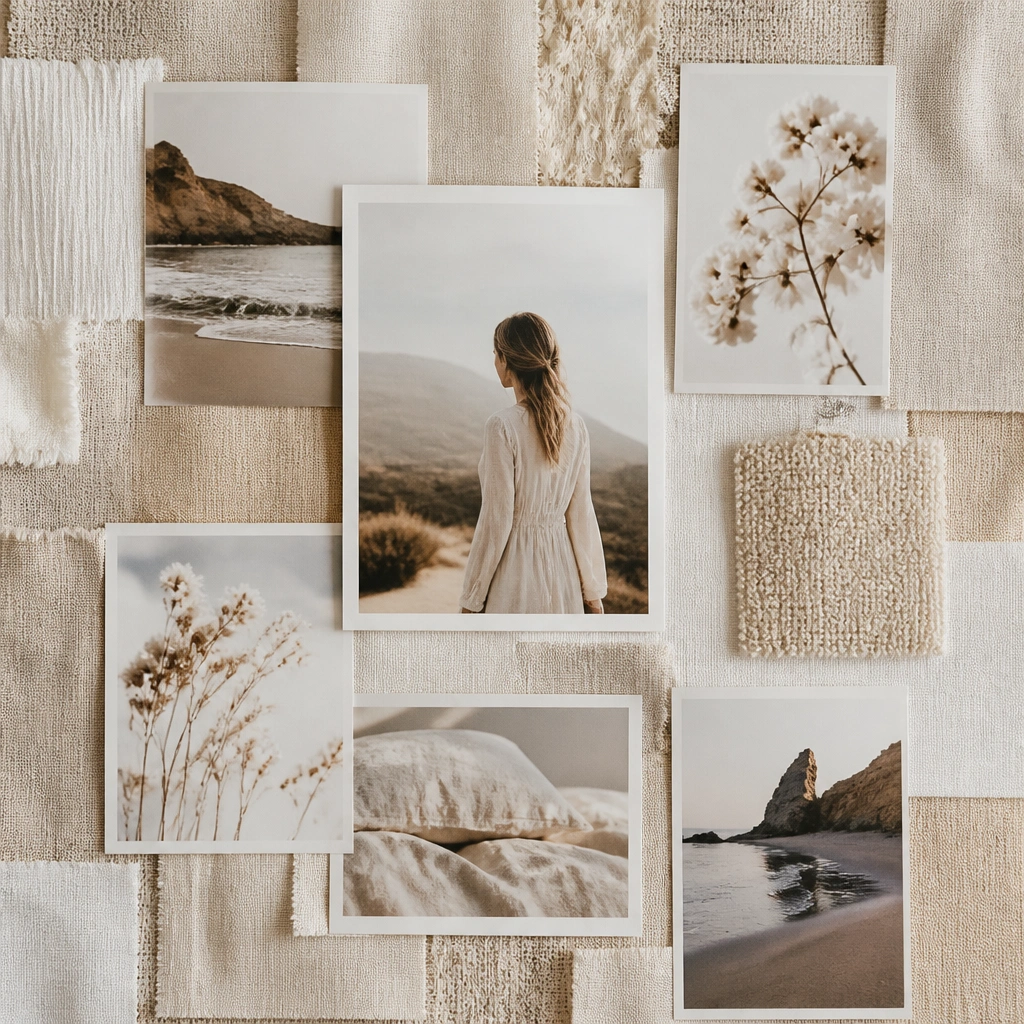
Fabric scraps add texture that paper alone can’t. Cover your base with a patchwork of small pieces in a tight palette (cream, oatmeal, sand). Then layer photos on top and secure with glue dots or a thin adhesive strip so edges look clean.
Trim fabric edges flush before gluing so the board stays flat.