
1. Cork board with photo pushpins + color-coded goals
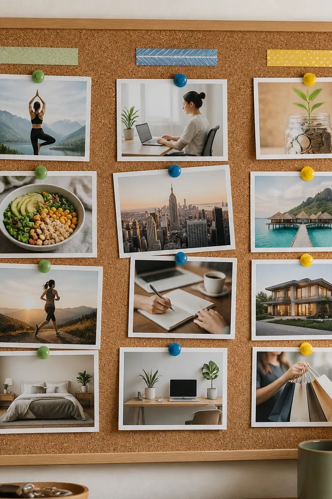
This style works because cork naturally holds weight and lets you swap images without damaging paper. Use matte photo prints so pinholes don’t glare, and keep your labels in one consistent font style so the board reads quickly from across the room. Color-coded pushpins help you spot which goal category you’re working on in seconds.
Good to knowDo a “6-foot readability check” — stand where you’ll see it most and make sure the category labels are visible without squinting.
2. Framed printable collage (one sheet) for a clean, modern look
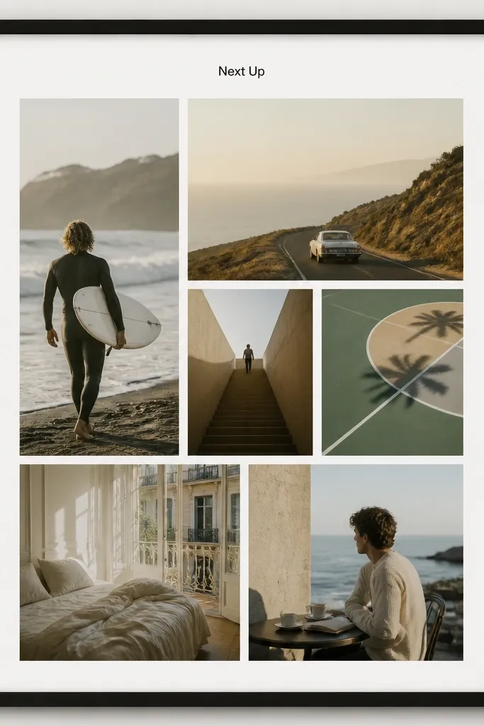
If you want your board to look like décor, a framed single-sheet print wins. Keep the design on cardstock so it doesn’t warp, and use print settings that increase contrast for text. The thick margins prevent images from bleeding into each other, so your goals stay readable.
Good to knowPrint on 110 lb cardstock and use a frame with a thin spacer (mat) so the paper doesn’t touch the glass.
3. Canvas board collage sealed with a soft matte finish
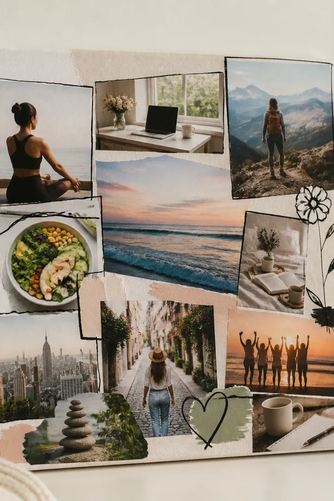
Canvas collage looks best when you treat it like mixed media, not just glue-and-go. Layer photos slightly offset for depth, then seal with a soft matte medium so your images don’t look glossy or cheap under daylight. The texture also hides tiny imperfections from cutting.
Good to knowSeal in thin coats — let each coat dry fully before the next, so photos don’t wrinkle.
4. Magnetic board with mini photo magnets and weekly swaps
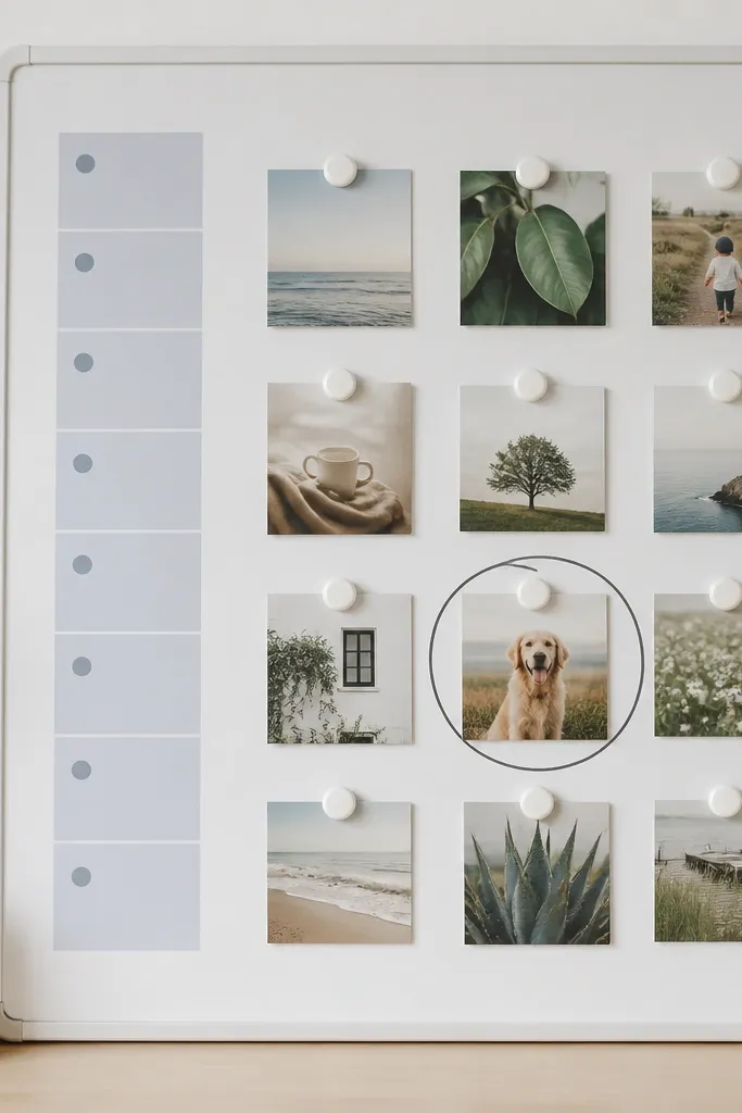
Magnets are a game changer if your goals shift. You can rearrange without tearing paper, and the surface stays clean because you’re not constantly handling glue. Use photo squares with rounded corners so they look cohesive and less “crafty” while still being fun.
Good to knowMake magnet backs uniform size (same thickness) so everything sits flat and doesn’t tilt.
5. Foam board vision board with clear sleeve pockets (swap system)
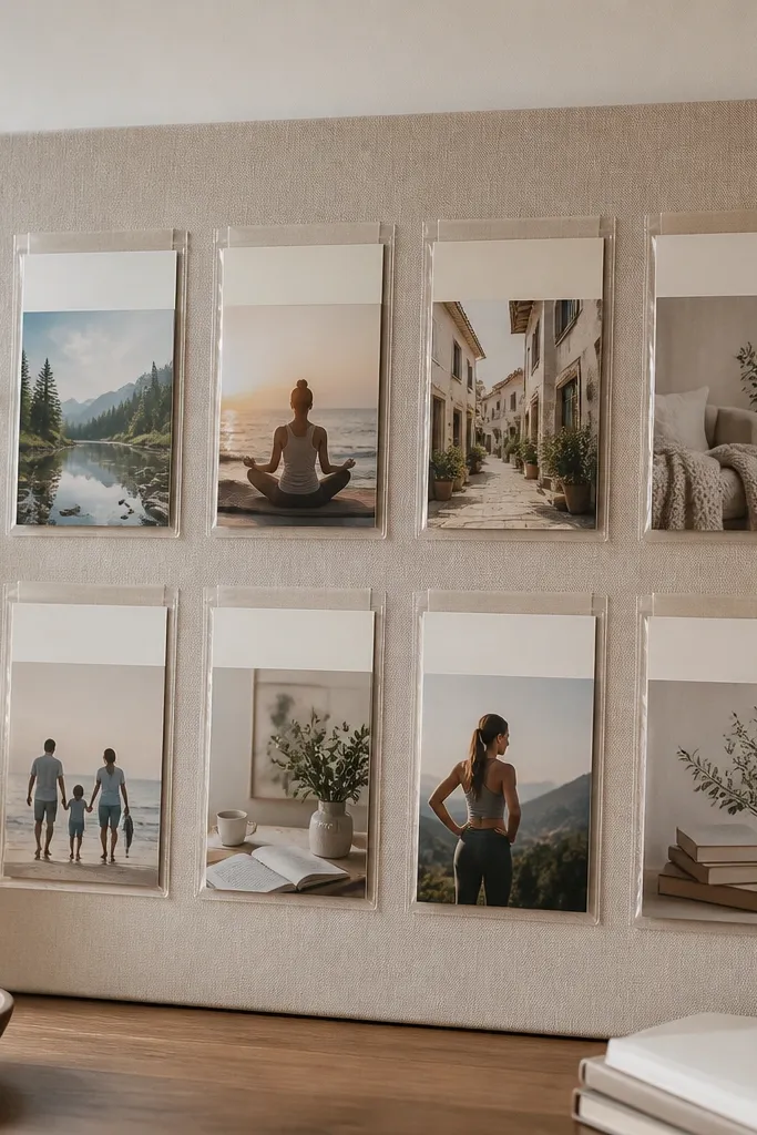
This is the best “worth it” option for beginners because it’s forgiving and changeable. Clear pockets protect prints from fingerprints, and the header strips add structure without needing a complicated design program. Foam board is light, so it’s easy to mount and reposition.
Punch a tiny hole in each card and use a binder ring to keep your card set aligned when swapping.
6. Dry-erase vision board with taped printables for fast updates
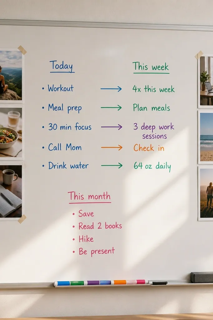
This works when you’re actively planning and want the board to evolve. Taped printables give you the inspiration images, while the dry-erase area becomes your action log. It’s also the easiest way to keep the board from going stale because you can rewrite weekly.
Use color markers for time blocks — one color for daily, another for weekly, so your brain can scan instantly.
7. Shadow box vision board with layered depth and labels
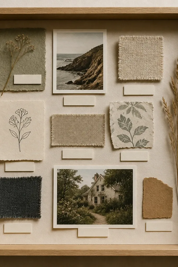
Shadow boxes feel “premium” because the depth makes everything look intentional. Add one or two physical elements (a fabric swatch, a ticket stub, a paint chip) to make it more personal than a flat collage. Use raised layers sparingly so the box stays readable and doesn’t look cluttered.
Good to knowKeep labels short and outcome-based (e.g., “Run 10 minutes” not “Running journey”) for clarity.
8. Washi-tape grid vision board on a pegboard base
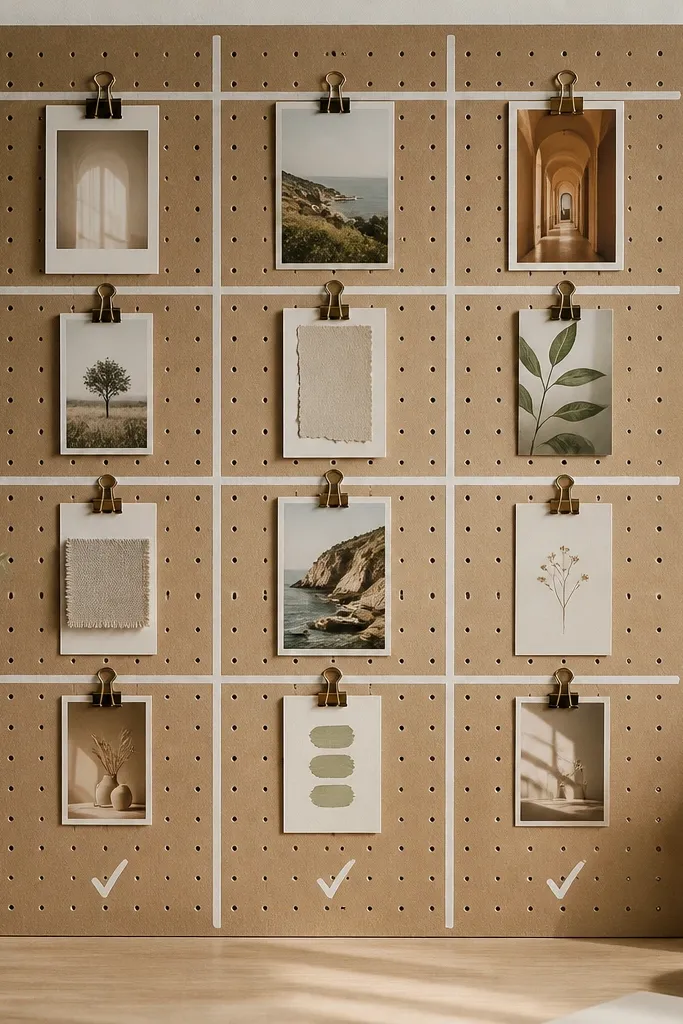
Pegboard + washi tape makes a super flexible, picture-perfect layout. The clips let you swap images without tearing paper, and the grid lines keep your collage from looking random. Choose one neutral tape color (white or cream) so the photos remain the focus.
Pin your “must-do” goals at eye level (roughly 57-60 inches from the floor) to reduce “out of sight” drift.
9. Polaroid-style vision board with consistent borders and captions
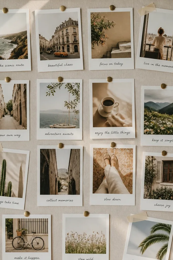
Polaroid-style boards feel friendly and motivating because they look like memories. Consistent borders create visual order, even when you vary the photo angles. Add short captions that describe the feeling or action you want, not just the end result.
Use a single pen for captions (gel pen works well) so every card looks cohesive.
10. “One theme per row” vision board for clarity (health, work, money, home)

This layout solves the biggest vision board problem — too many mixed themes. By dedicating rows to categories, you reduce decision fatigue when you glance at the board. The colored bands and icons act like a legend so you can scan fast.
Good to knowLimit each row to 5-7 images so your board stays readable instead of turning into a collage blur.