1. Scrapbook Chaos to Clean Grid (8x10 Frame Makeover)
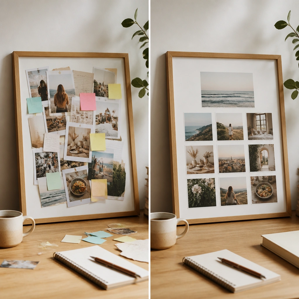
The before board looks like everything got taped wherever it fit, so nothing gets attention. In the after version, each goal photo sits inside a consistent square, using white cardstock as spacing so your eyes can scan fast. Use a frame or backing board so the layout stays flat and intentional, which is the biggest visual upgrade for DIY boards.
Good to knowCut white cardstock squares with a paper trimmer (same size) before you glue anything. Lay them out dry first, then tape only the corners so you can adjust.
2. Sticky Notes to “One-Theme” Color Blocking
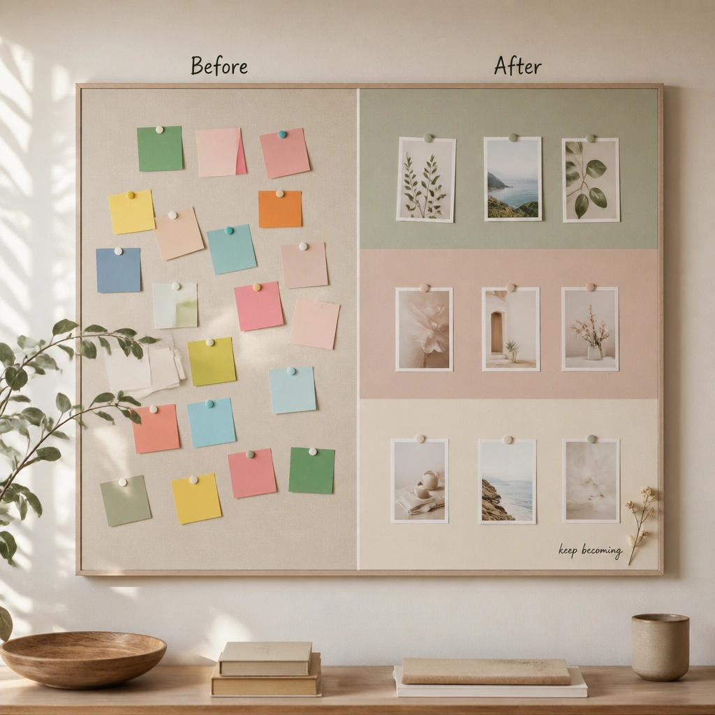
When sticky notes compete in every color, your vision board becomes visual noise. The after version uses three color bands so everything feels cohesive while still showing multiple goals. Color blocking works because it creates boundaries — your brain reads the board as organized, not chaotic.
Good to knowChoose one palette (3 colors max). Paint or cover the backing with those colors, then only place photos that naturally match at least one band.
3. Dull Black Poster to Warm “Paper + Linen” Look
Dark boards can make printed photos look flat, especially if your images are colorful. Wrapping the backing in linen instantly adds warmth and texture, making photos pop without needing heavy editing. Gold thumbtacks and jute string add a handmade feel that looks expensive but costs little.
Wrap the board with fabric using a staple gun, then trim the edges clean with fabric scissors. Pin photos instead of gluing so you can swap them later.
4. Random Photos to “Top Row = Now, Bottom Row = Later”
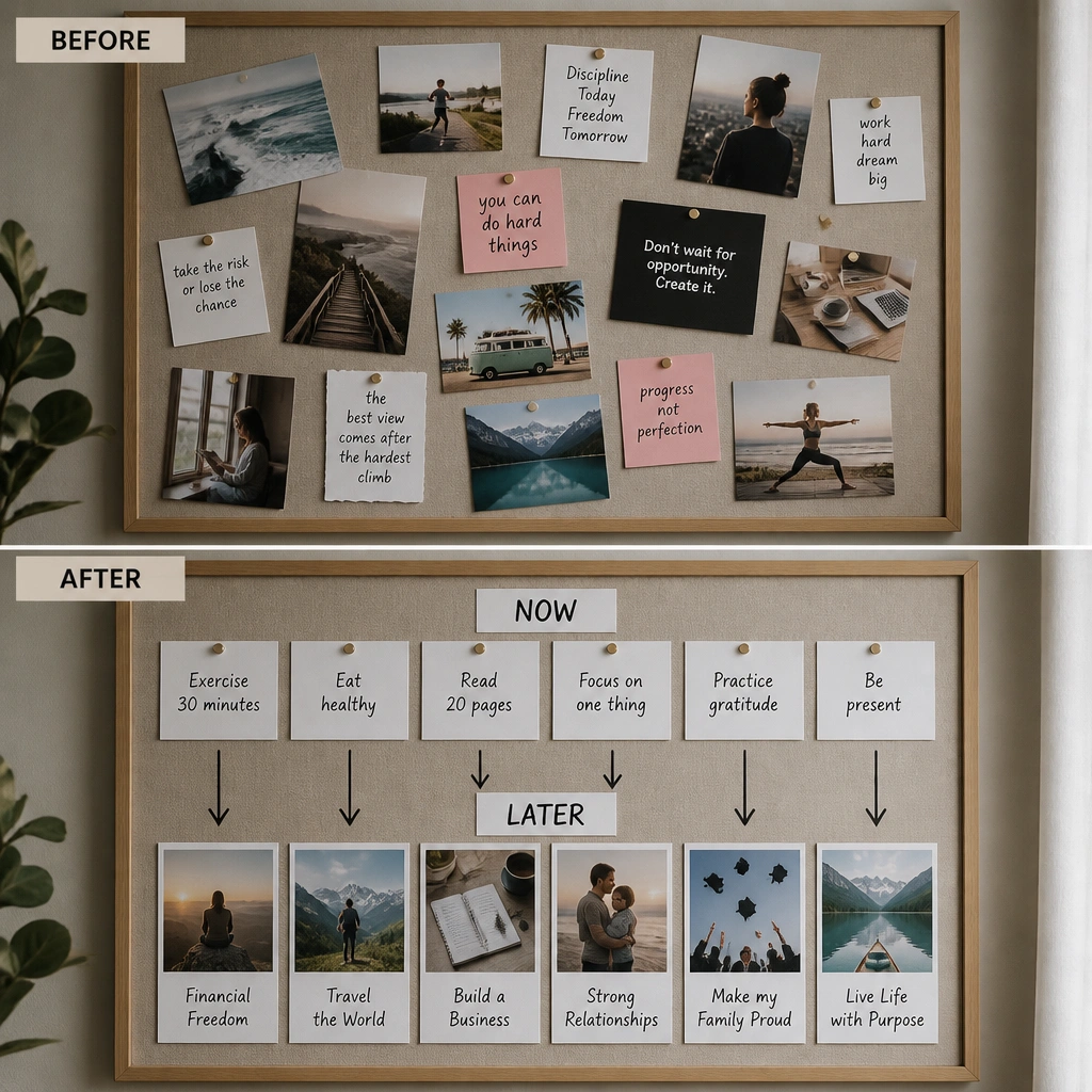
Random placement makes it harder to remember what to do today. The after board creates a simple timeline: top equals immediate actions, bottom equals future milestones. This transformation works because it turns a collage into a decision tool — you know where to look first.
Good to knowPick 3 “Now” items and 3 “Later” items. Write the labels in the same font style so the layout feels intentional.
5. No Labels to “Mini Captions” That Make Goals Actionable
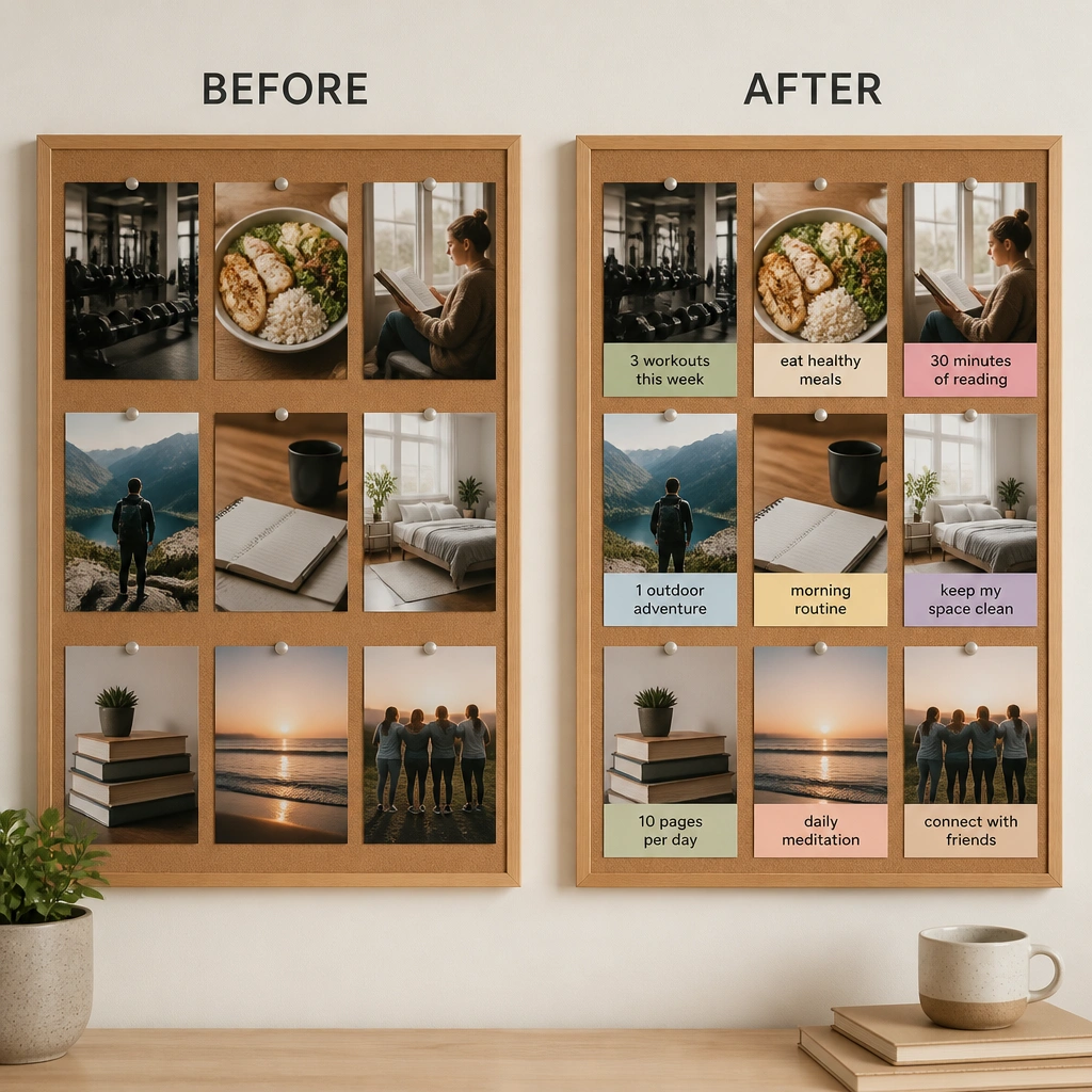
Photos alone can feel dreamy but vague. Adding mini captions changes the board from inspiration to instructions — you’re telling your brain what the goal means in real life. Use short phrases, not full paragraphs, so the board stays readable from across the room.
Good to knowWrite captions that start with a verb: “Plan,” “Practice,” “Apply,” “Save.” Keep them under 4 words if possible.
6. Bargain Sticker Mess to “Matte Photo + Minimal Stickers”
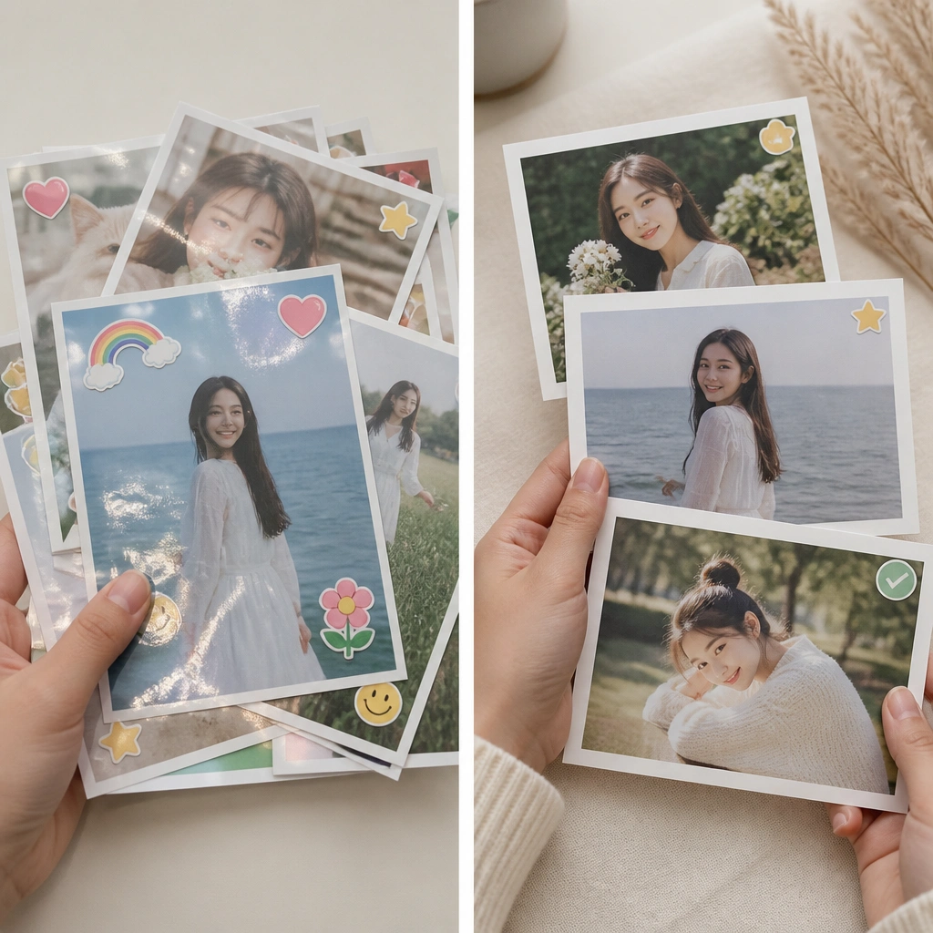
Glossy stickers can clash with printed photos and make the board look crowded. The after version switches to matte prints and uses stickers sparingly as visual punctuation. Matte surfaces reduce glare, which makes the board easier to read during morning routines.
Good to knowPrint at home on matte photo paper or use a matte photo service. Place stickers only in corners or along edges so they don’t cover faces or key details.
7. Tape-Only to “Frame Within a Frame” Layering
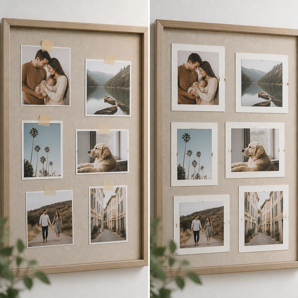
Taped photos look flat and temporary. The after layout adds depth by mounting photos on layered cardstock mats, creating a clean “frame within a frame” effect. This makes the board look curated and helps photos stand out without needing extra decorations.
Cut cardstock mats 1/2 inch larger than each photo. Use double-sided tape on the back edges only so the photo stays centered.
8. Plain Wall Board to “Magnetic Swaps” System
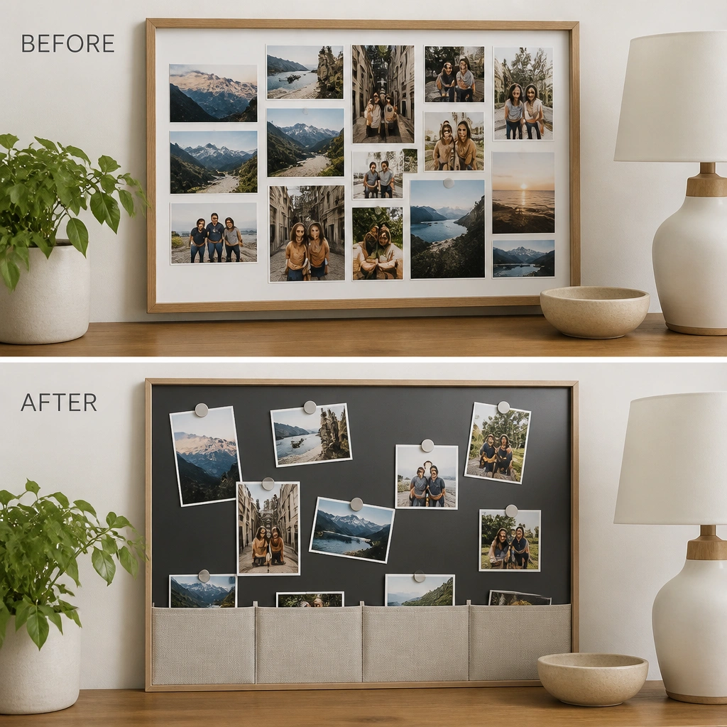
Glued boards are hard to update, so motivation fades when your goals change. The magnetic system lets you swap photos without peeling and tearing. A labeled pocket row keeps you from losing old printouts and makes the board feel like a living project.
Good to knowUse a magnetic sheet (for metal boards) or self-adhesive magnetic strips. Mount photos with small magnets at the corners for easy removal.
9. Overcrowded Quotes to “One Quote Rule”
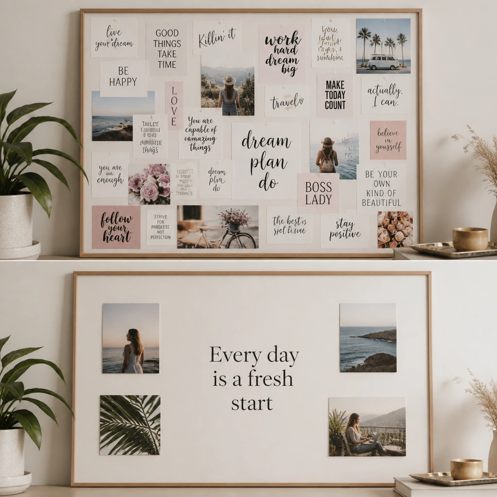
Too many quotes compete with your goals and make the board hard to scan. The after transformation uses one main quote in a strong font and removes the rest. Breathing space is the secret — it makes your eyes land on the most important message.
Good to knowPick one quote, then delete the rest. Leave at least 1 inch of empty space around the main text.
10. Mismatched Fonts to a “Single Font Pair” Look
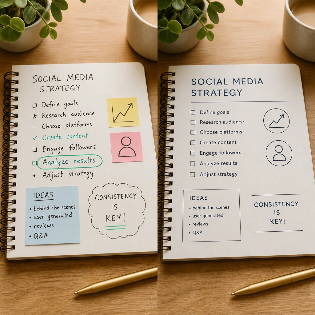
When fonts change constantly, the board feels like random notes instead of a plan. The after version uses two font styles: one for headers and one for captions. Consistent typography makes the board look intentional even if the images are different themes.
Use a free template in Canva or a font app: choose one header font and one caption font. Print caption strips so everything lines up neatly.
11. No “Action Corner” to a Weekly Checklist Panel
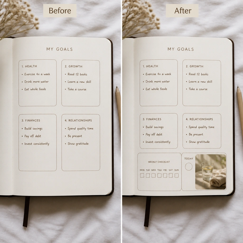
A vision board can be passive unless you connect it to your weekly routine. The after transformation adds an action corner that turns inspiration into a checkable habit. This helps you actually use the board, not just look at it once.
Good to knowCreate a small checklist box with erasable marker on laminated paper. Update it every week so the board stays relevant.
12. Glare Problem Fix: Lamination + Matte Overlays
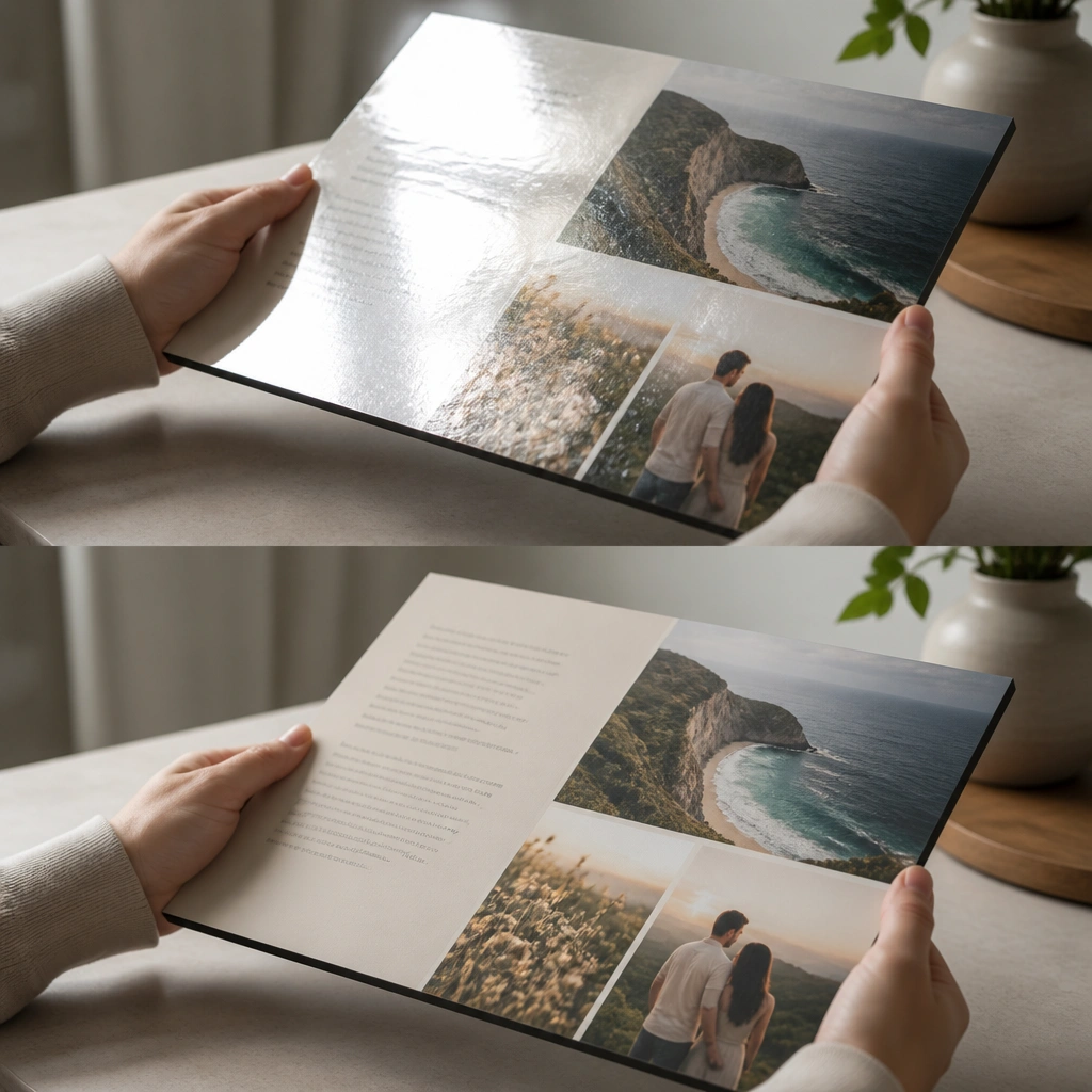
Glare is a real issue for vision boards photographed for inspiration or viewed at certain times of day. The after version uses matte laminate or matte overlay sheets to reduce shine while keeping colors bright. A smoother surface also makes the DIY look cleaner, especially with layered paper edges.
Good to knowIf you laminate, use matte pouches and trim carefully. Avoid packing tape over seams — it can lift and create bubbles.