1. Winter Constellation Margin Pages
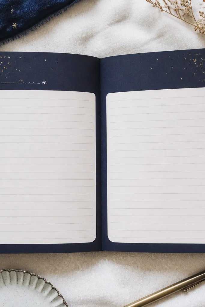
Paint or tape a thin navy frame around the page, then add small constellation dots using a gold paint pen or metallic gel pen. Finish with 1-2 “snow trails” made from clear washi tape cut into short, diagonal pieces. The contrast of navy + gold makes handwriting look sharper and feels cozy without being heavy.
Before you start writing, dot 20-30 stars first so you don’t rush the layout — then fill the rest with your usual journaling.
2. Spring Washi Tape Watercolor Clouds
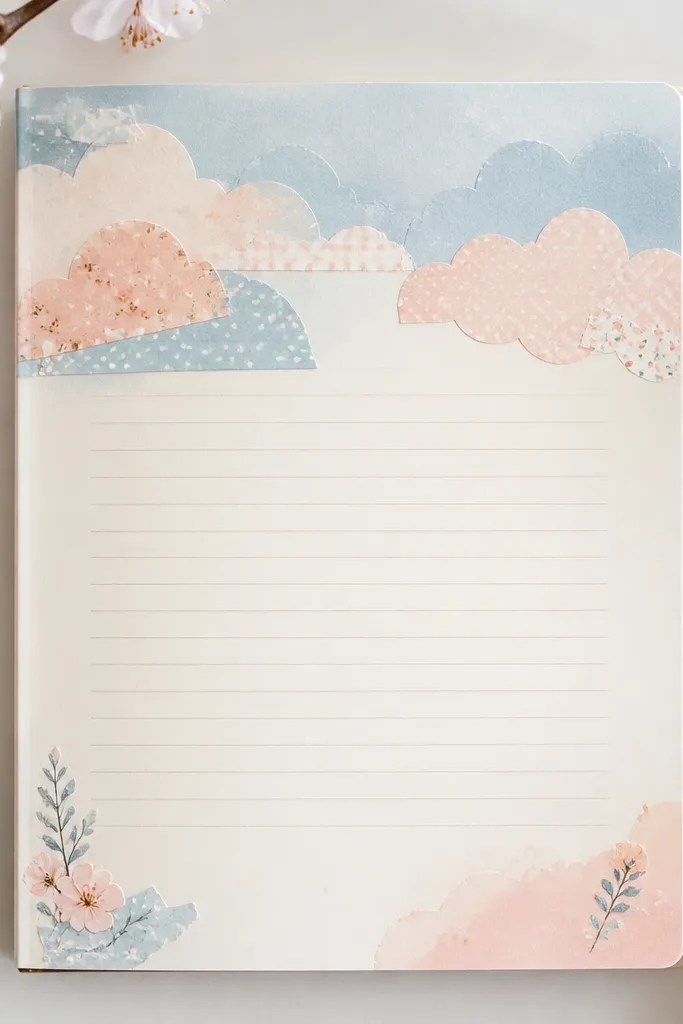
Tear or cut washi tape into cloud-ish shapes and layer 2-3 tones (sky blue, blush, mint). Add a faint watercolor wash behind the cloud cluster using a diluted ink pad or a very light watercolor sponge. This creates movement at the top while your writing stays clean in the middle.
Good to knowUse a scrap sheet to test how diluted your ink is — you want “see-through” color, not blotchy saturation.
3. Summer Citrus Sticky Note Frames
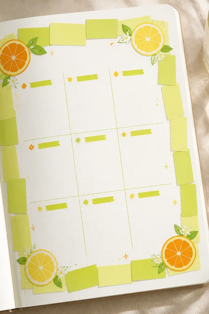
Use sticky notes as a temporary frame: choose one bold citrus color (lime, tangerine, or sunny yellow) and place it around your journaling block. Add tiny doodles — half a lemon, a few orange slices, or a simple sunburst — in each corner. The sticky note color instantly signals summer and makes your page structure obvious.
Good to knowPick one citrus color per month so your diary reads like a consistent “theme,” not random decoration.
4. Autumn Leaf-Pressed Bookmarks
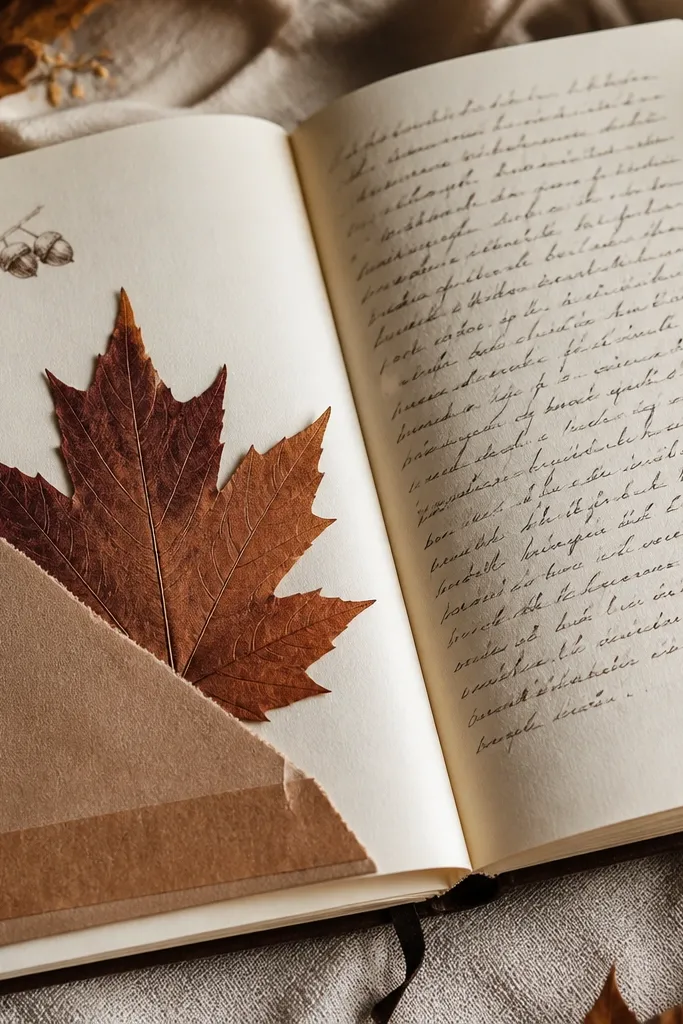
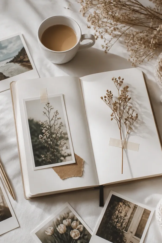
Press a leaf (from a safe, clean source) between parchment paper and a book for 1-2 weeks, then glue it lightly with archival glue or a tiny dot of glue stick along the stem area. Add a warm strip of kraft paper as a “pocket” layer so the leaf feels intentionally displayed. Pair with a caramel-brown pen and simple acorn doodles for a grounded, fall vibe.
Seal the leaf with a thin layer of matte clear gel medium if you want extra durability.
5. Month-at-a-Glance Photo Corner (Any Season)
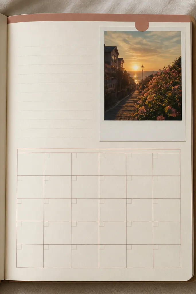
Pick one small photo per month and place it in the top-right corner like a “memory anchor.” Add a border strip in a seasonal color (cool gray for winter, soft teal for spring, warm coral for summer, burnt orange for autumn). Write a simple month-at-a-glance grid under it so the photo and plan work together.
Good to knowUse the same photo size every month (like 2x3 inches) so your diary layout stays cohesive year round.
6. Monochrome Texture Pages (Black, Cream, Silver)
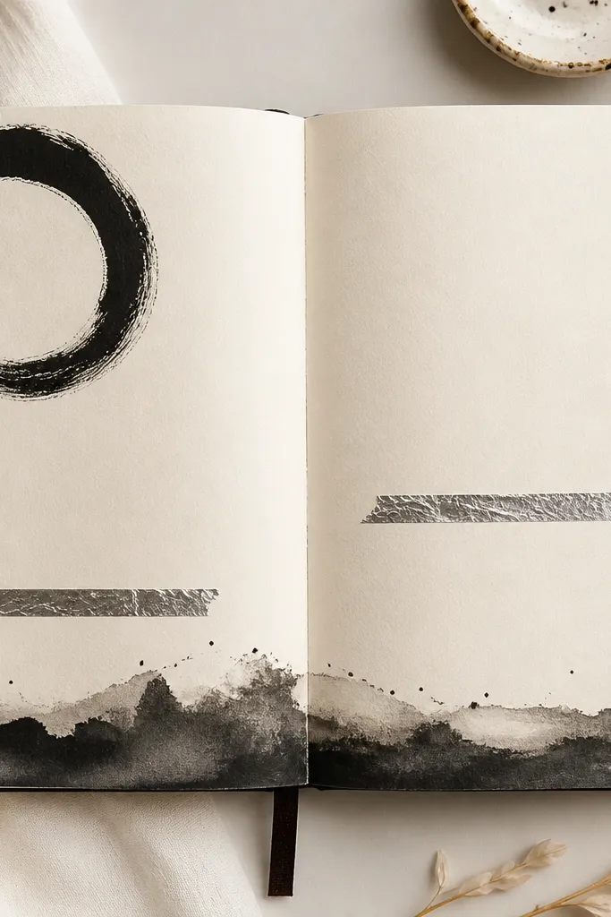
For any season that feels “too busy,” go monochrome: use cream cardstock pages or paste a cream paper layer, then add a black ink wash along the bottom edge. Finish with thin silver foil tape lines — one horizontal and one vertical — to frame your title. This look keeps your diary elegant even when your handwriting gets messy.
If your ink bleeds, let your page dry flat under a book for 10 minutes before adding tape.
7. Seasonal Color Date Tabs
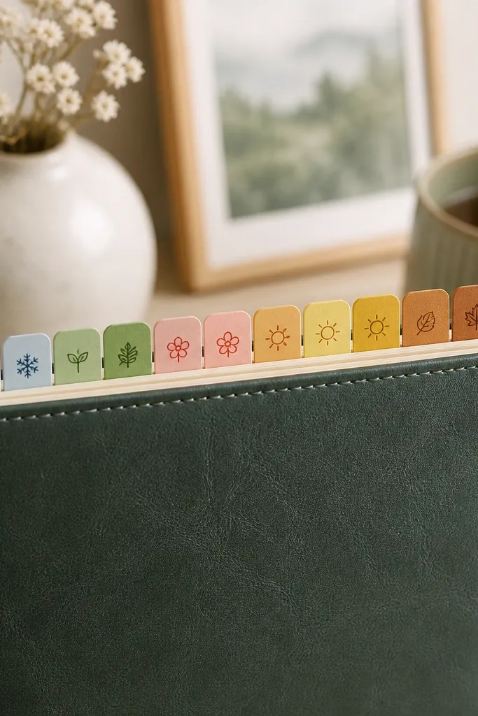
Create date tabs for weekly entries: cut strips of colored paper and fold a small backing so the tab sticks up. Use one color palette per season, then keep icons consistent (snowflake for winter, flower for spring, sun for summer, leaf for autumn). Tabs make it easy to flip back and keep your diary looking organized.
Pre-write the next 4 weeks of dates on tabs in one sitting so you’re never starting from blank.
8. Recipe-Style Journaling Boxes with Doodles
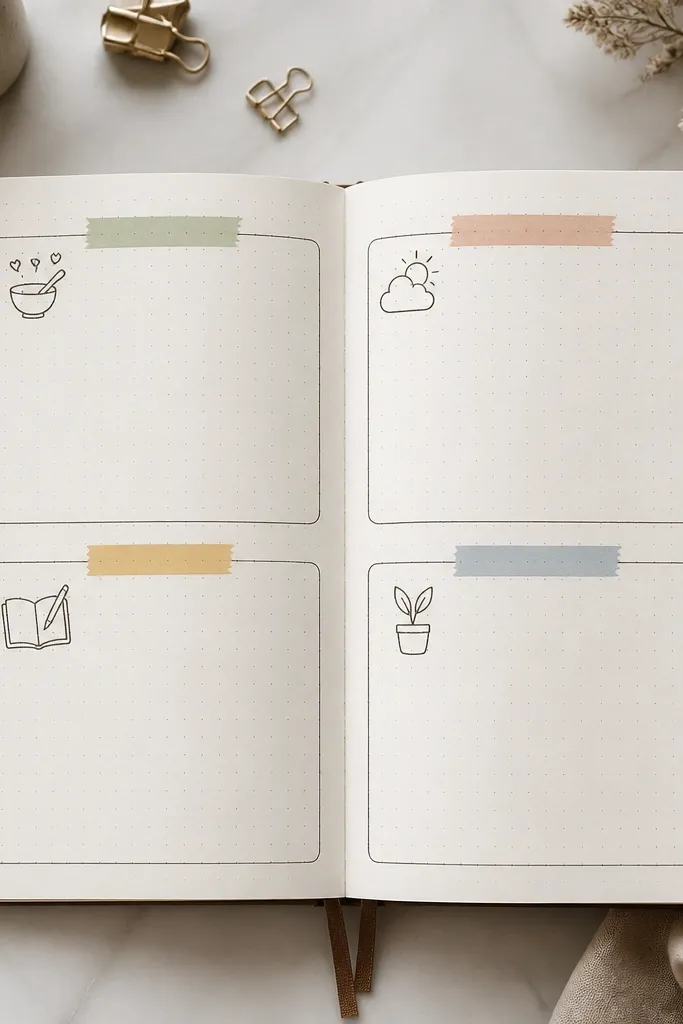
Turn journaling into a repeatable structure: draw 3-4 boxes using a fine liner, then separate them with thin tape dividers. Add one seasonal doodle per box corner (tiny berries, a sprig, a sun, or a leaf). The “recipe” format keeps entries consistent, and the doodles make each season feel distinct.
Good to knowUse one pen for outlines (black) and one pen for headings (season color) to keep it crisp.
9. Shimmer Night Sky Wash in September-December
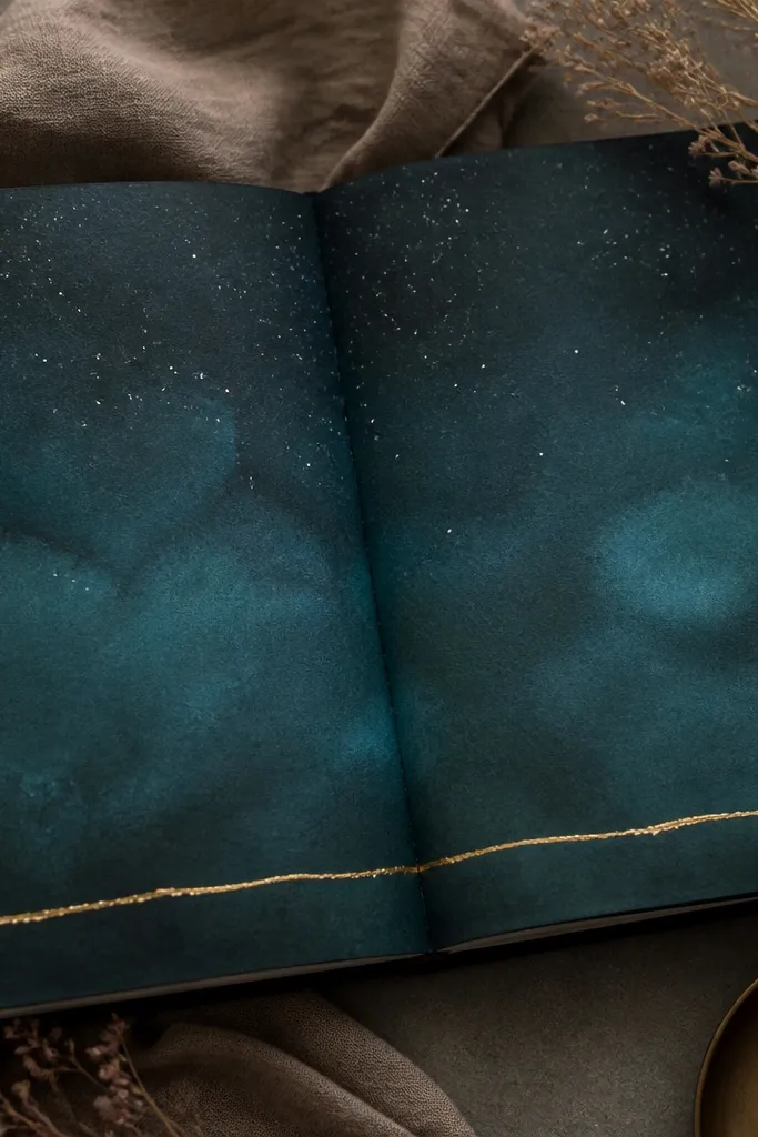
Blend dark teal and deep blue watercolor or ink to create a night-sky gradient. Add white gel pen dots for stars and a very thin gold foil tape line to ground the writing. This look feels “late year” without limiting you to one holiday theme.
Make the gradient lighter near the writing area so your text stays readable.
10. Spring Floral Corner Collage
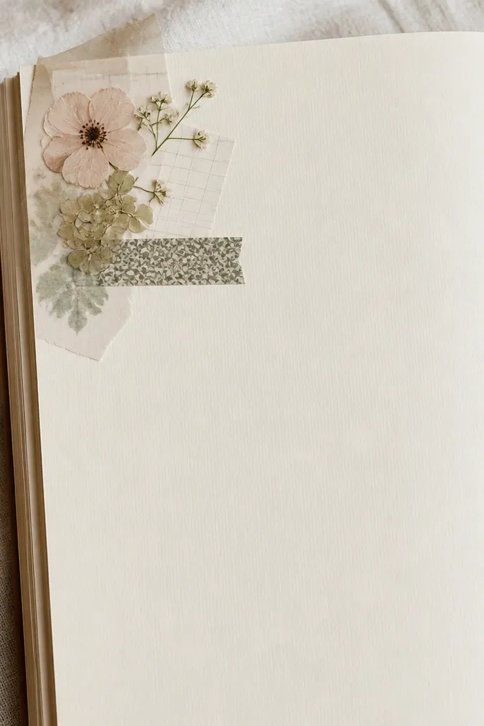
Cut small flowers from scrapbook paper or printables and arrange them like a corner bouquet. Layer 1 patterned washi strip behind them and add a thin vellum piece over one flower for softness. The collage sits in one corner so your handwriting area stays uncluttered.
Good to knowUse a glue stick for paper layers and a tiny dot of gel medium for vellum so it doesn’t wrinkle.
11. Summer Tide Line Underlines
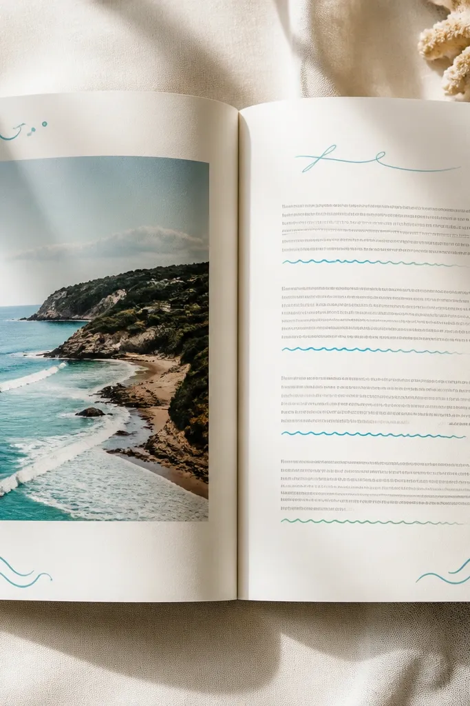
Draw wavy lines beneath sections of your writing using a brush pen in two ocean tones. Add small wave doodles at the far right margin to repeat the theme without adding clutter. This creates a “tide” effect that matches summer energy while staying super functional.
Limit yourself to 2 underline colors so the page looks intentional, not chaotic.
12. Autumn Kraft Paper + Inked Edges

Paste kraft paper as your base layer, then ink the edges with a dark brown pad for a “finished” look. Center your title in black brush pen and add one small leaf stamp or doodle in each bottom corner. Kraft paper brings instant fall warmth and makes ink look richer.
Trim kraft paper to the exact page size with a craft knife and ruler so it doesn’t bunch.