1. Washi Tape Corner Frame + Two-Line Mood
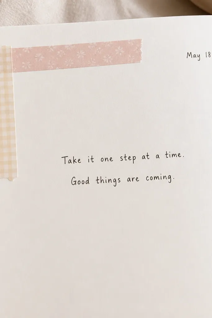
Use two washi tapes that match your mood palette (blush + cream or sage + ivory). The corner frame tricks your eye into reading the page as “finished” even with minimal writing.
Good to knowKeep the writing to two lines and match your pen color to one of the tape colors for instant cohesion.
2. Faux Polaroid Photo Box with Sticker Highlights
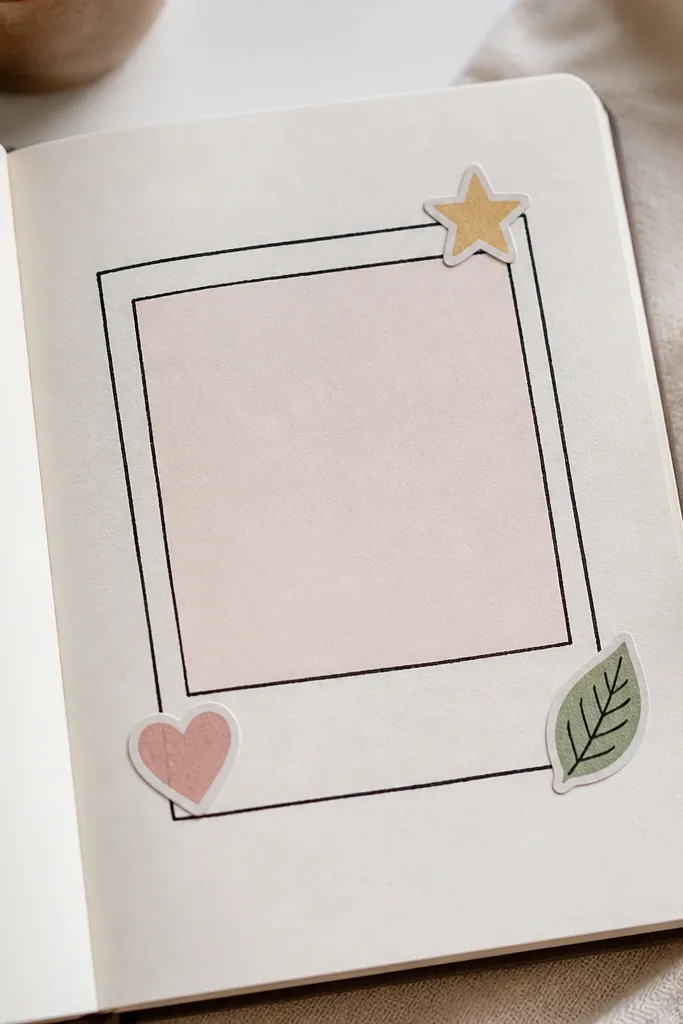
Draw a rectangle and add a thicker “polaroid” border with a slight offset effect. Leave the inside mostly blank so your diary still feels airy, while stickers add personality.
Good to knowWrite the date on the bottom border of the polaroid frame for a clean, photo-like finish.
3. Torn Paper Border + Minimal Date Stamp
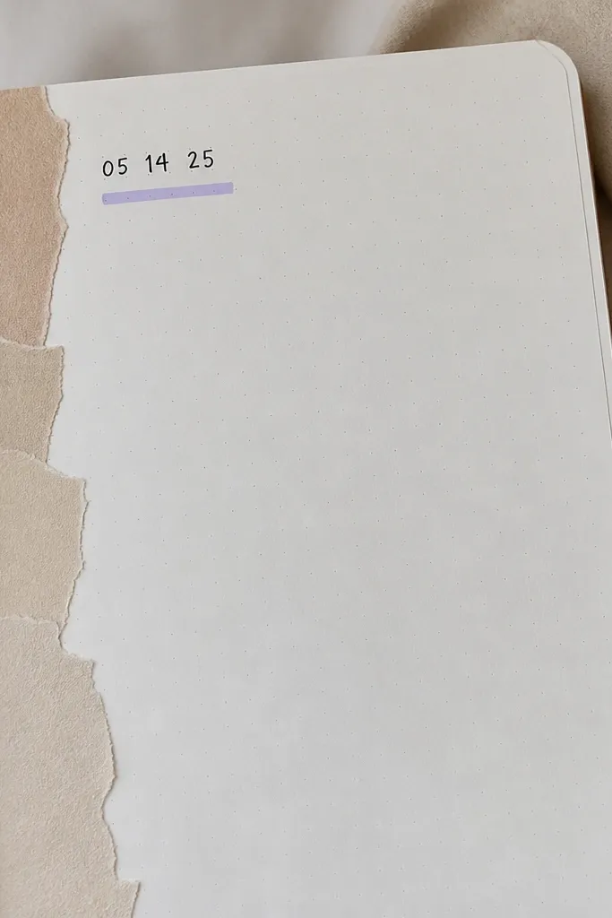
Torn paper edges create texture without needing fancy art supplies. Stick it along one edge (top or left) so the rest of the page stays uncluttered.
Use a glue stick on the back of the paper only at the edges to avoid wrinkling thin notebook pages.
4. Starry Sky Header with One Tiny Quote
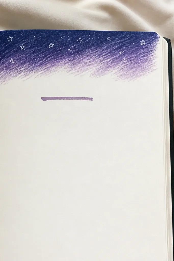
A quick “sky” header sets the vibe fast. Add 5-10 tiny white dots/stars and keep the text to one quote line so it doesn’t feel busy.
Use a white gel pen for stars — it pops even on darker paper and dries quickly.
5. Coffee Ring Doodle + Track One Feeling
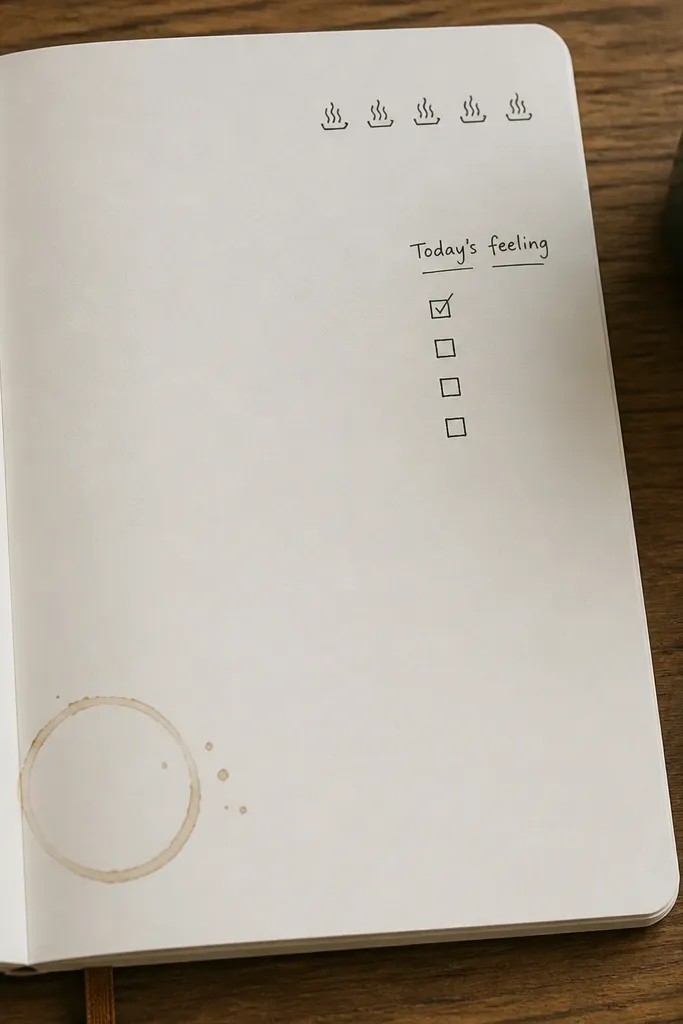
Coffee ring doodles look cozy and take under 2 minutes. Pair it with a single micro-tracker (one checklist) so the page has function and aesthetic together.
Good to knowDraw the ring shape first, then write the feeling right next to it to anchor the layout.
6. Diagonal Washi Tape Divider + Bullet Notes
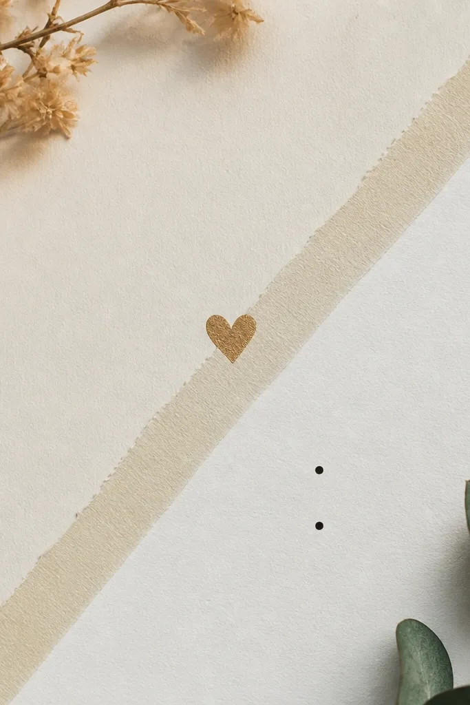
A diagonal tape divider gives you instant sections without drawing lines. Keep each section to two bullets so it stays quick and clean.
Use one marker color for bullets and a second color only for the section headings.
7. Floral Sticker Cluster + Handwritten Date Halo
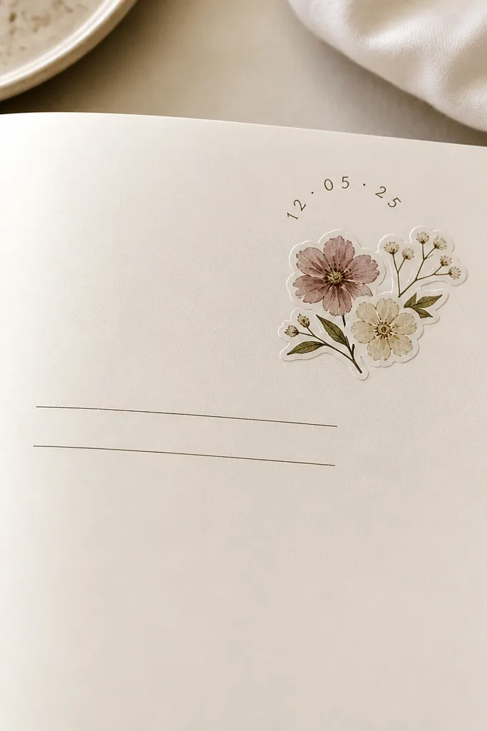
Sticker clusters add dimension immediately. Writing the date in an arc creates a halo effect that looks curated, not random.
Good to knowIf your date is long, use numerals only (e.g., 06/26) so the arc stays neat.
8. Pastel Gradient Background Swoosh + One Sentence
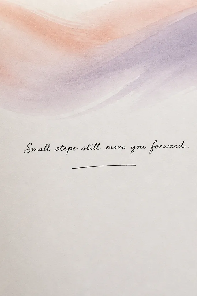
A single gradient swoosh gives “designed” vibes without filling the whole page. Keep everything else minimal so the swoosh becomes the hero.
Use light pressure with markers and build the color in two passes to avoid streaks.
9. Checklist Box with Tiny Icon Key
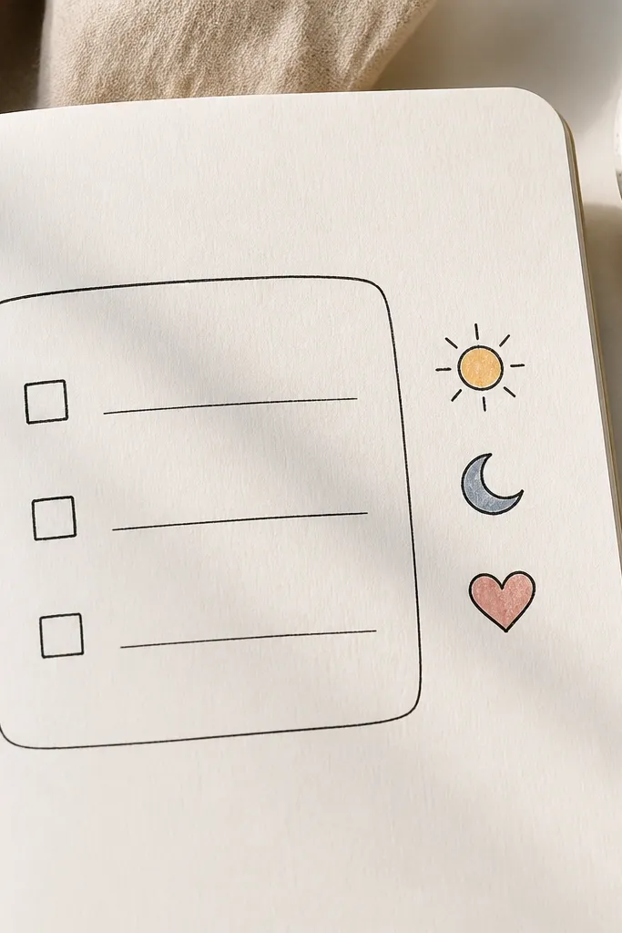
Rounded boxes look softer and more aesthetic than straight rectangles. A tiny icon key makes the page feel themed even when the content is simple.
Good to knowLimit to three checklist items — it keeps the layout balanced and quick.
10. Ribbon Bow Washi + “What I Loved” Micro-List
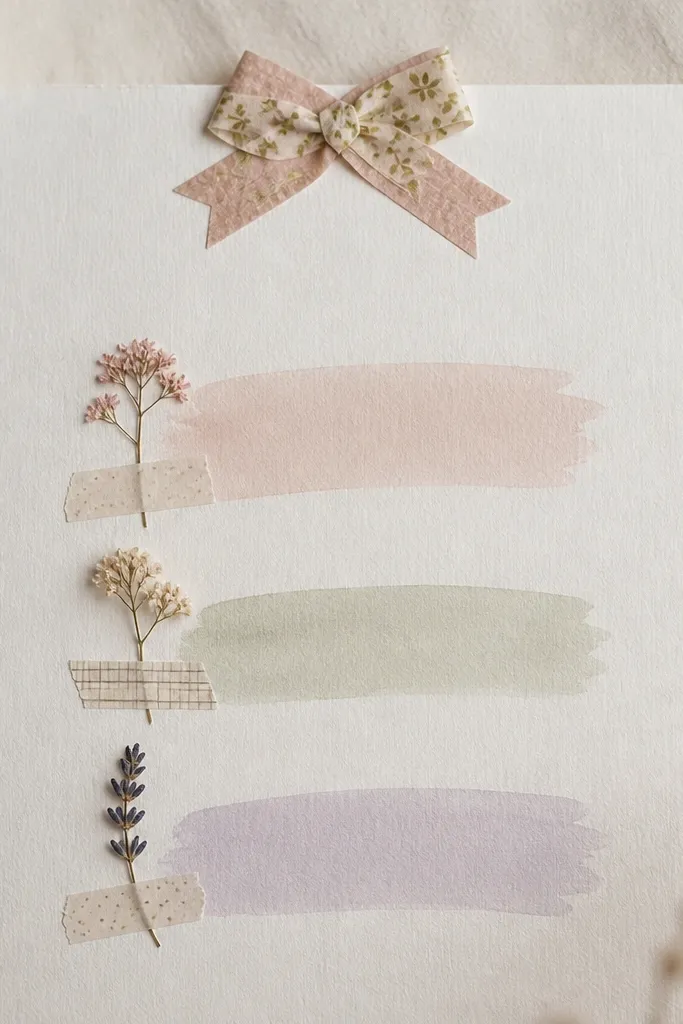
Layered tape mimics a ribbon bow with almost no drawing. A micro-list format keeps the page functional while still looking styled.
Good to knowWrite the title first, then place the list under it so your eye goes title → items.
11. Geometric Frame with Two Color Blocks
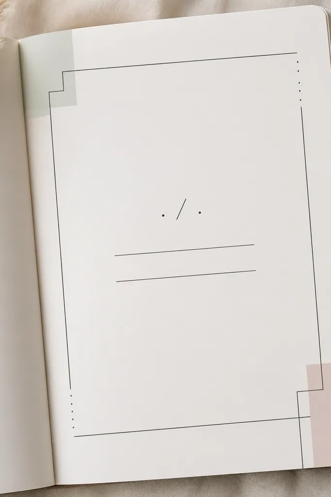
Geometric frames make pages look modern and intentional. Two pastel blocks in corners add color without overwhelming the handwriting.
Good to knowKeep lines thin with a fine pen so the frame feels delicate, not heavy.