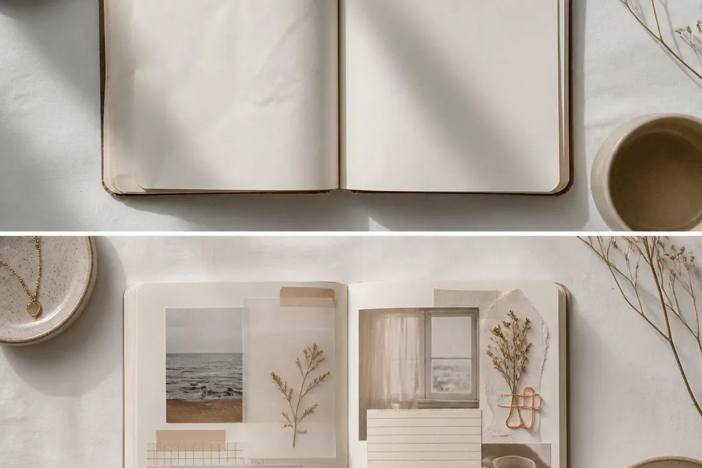
1. The 3-Color Reset (My Pages Stopped Fighting Each Other)
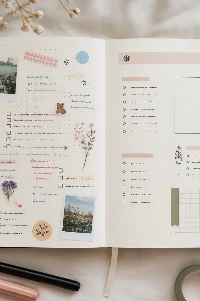
Before, I used whatever pen color I grabbed, so the spread looked energetic but chaotic. After, I limited myself to black for all writing, blush for small highlights, and sage for icons and one underline per section. The limited palette made the typography and spacing look designed.
Good to knowPick your 2 base tones (ex: black + cream) and one accent (ex: sage). For the next spread, only use that accent color for icons, arrows, or one underline per block.
2. Sticker Cluster Swap (From Random to Intentional)
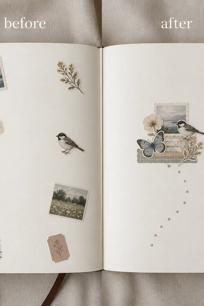
My old approach was “decorate everywhere,” which made the page feel loud. The after version puts all stickers in one anchor zone under the header, then repeats one micro-detail (like a tiny star or dot) elsewhere for balance. That one change made the layout look intentional without removing the fun.
Choose one anchor spot (under the title or beside the date). Place 70% of your stickers there, then repeat one tiny icon 1-2 more times around your text.
3. Grid Lines That Make Everything Look Neat (Even Messy Notes)
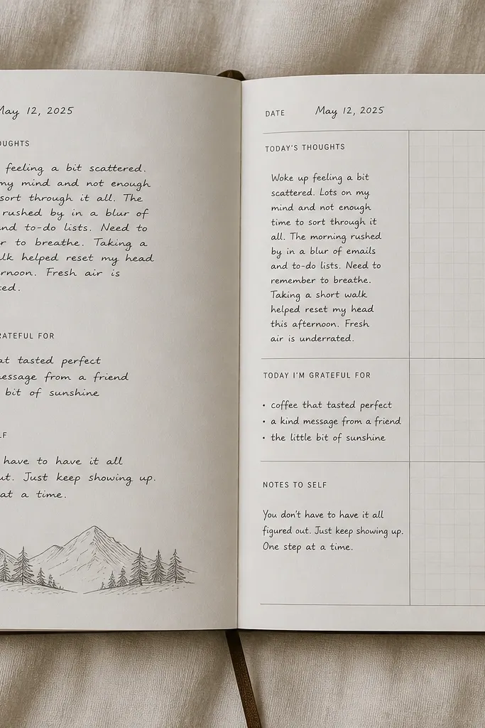
I thought grid lines would feel “school-ish,” but the light, thin separators made my writing easier to scan. After, every entry sat in its own mini box, so even if my handwriting was uneven, the page still looked polished. The best part was that future spreads took less time because the structure was already there.
Good to knowDraw a 3-section layout (top header + two content boxes) using very light pencil, then go over only the dividers with a thin black pen.
4. Frame the Page Like a Photo (One Border, Many Styles)
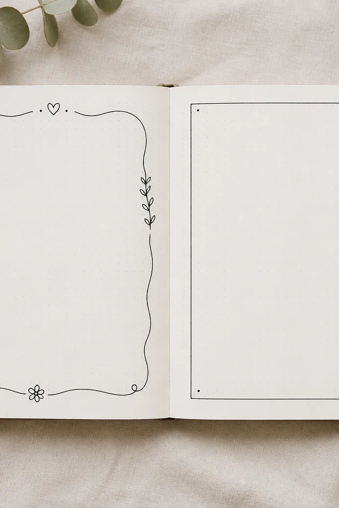
I used doodles as borders before, but they competed with my text and made the margin feel cluttered. The after page uses a single clean frame with consistent thickness, plus tiny corner dots that act like “design punctuation.” It instantly makes the spread feel like a curated snapshot.
Use one border only: a thin rectangle or rounded rectangle. Add 2-4 tiny corner details max, so the frame supports your writing instead of stealing attention.
5. Washi Tape Path (Turn Blank Space Into a Design Feature)
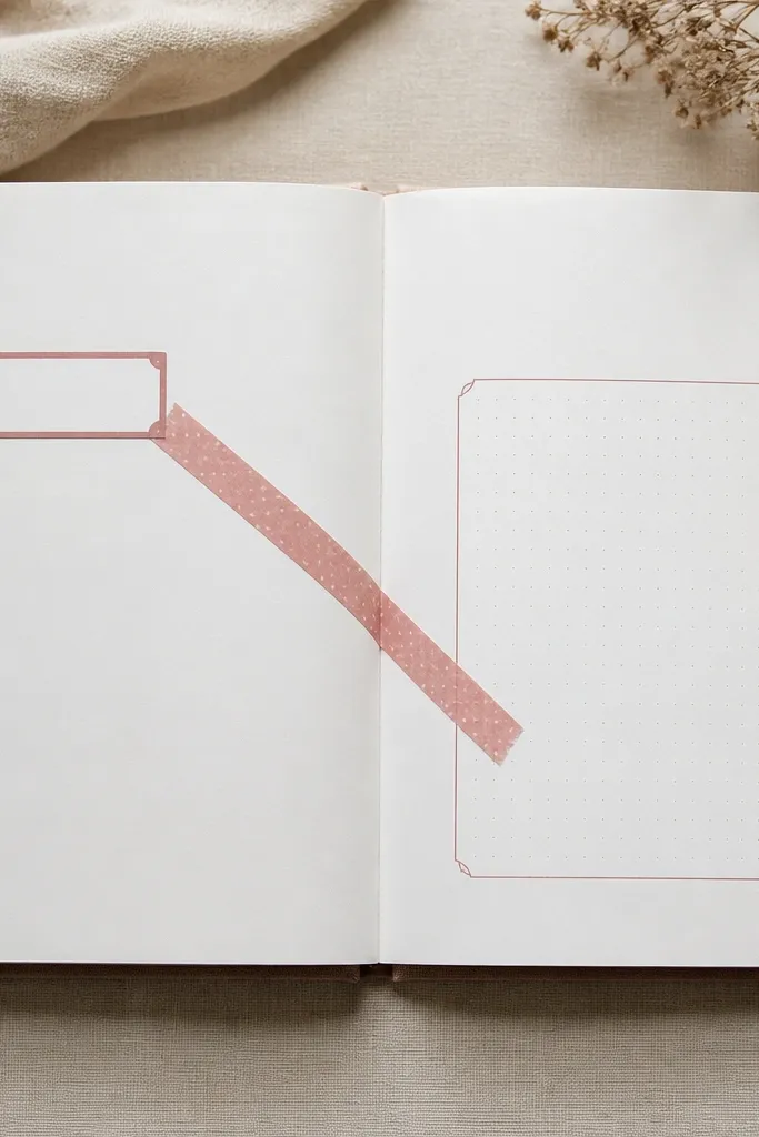
Blank space used to make me overfill, because I didn’t know what to do with it. After, I used one washi tape path to guide the eye — title to date to the main paragraph. Because the tape color matched my accent, it tied everything together without adding more stickers.
Pick one diagonal or vertical tape path. Keep it to one strip and let your writing sit right next to it, so the tape feels like structure, not decoration.
6. Swatch Corner for Color Stories (Aesthetic + Practical)
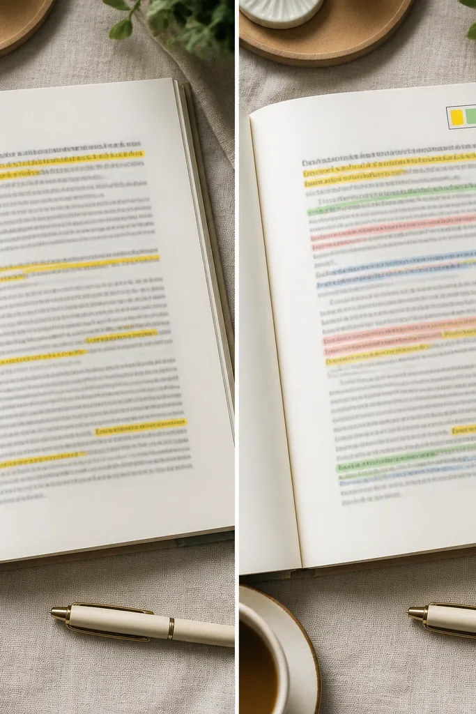
I was tracking moods and themes, but my color choices had no rhyme or reason. After, I added a “swatch corner” — four tiny color blocks that match the highlights I used in that spread. It made my diary look more artful and also helped me stay consistent without thinking too hard.
Before you start writing, pick 4 colors and make a 1-inch swatch box in the corner. Use those colors only for that spread’s highlights and icons.
7. Tactile Fabric Strip Divider (Soft Look, Big Impact)
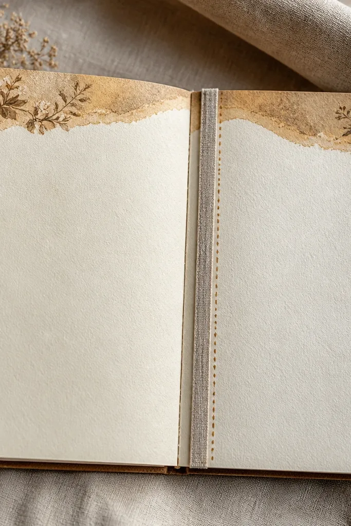
Paper dividers were flat, and my spreads looked a little too “printout.” After, I added a thin fabric strip as a divider between sections. The texture made the page feel cozy and intentional, especially with warm neutrals (cream paper, taupe tape, black ink).
Use a thin strip (3-6 mm). Glue only the center and press edges lightly, then add 5-8 tiny dot marks next to it to blend it into your design.
8. Hand-Lettered Title Shadow (Instant Polished Look)
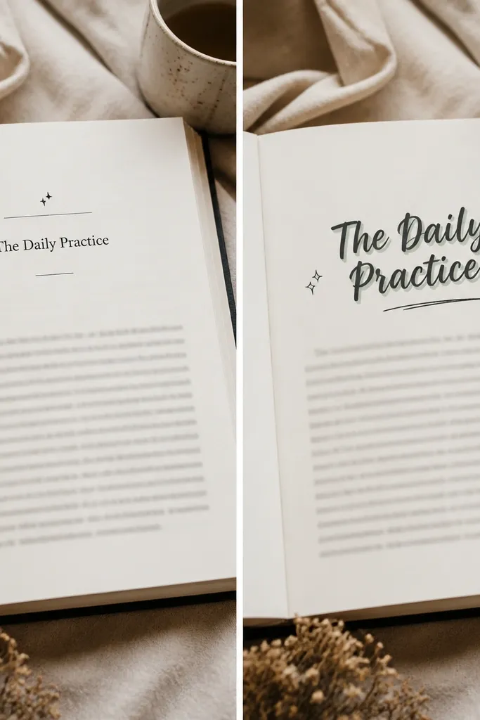
My titles looked like placeholders before, so everything felt less finished. After, I hand-lettered the title and added a shadow by offsetting the same letters in a muted accent (like sage or dusty rose). The contrast made the page look like a real layout, not just notes.
Good to knowWrite your title in black first. Then redo the same letters again with the accent color, offset by 1-2 mm down or to the side, and keep the shadow thinner.
9. “One Doodle Rule” to Stop Overdecorating
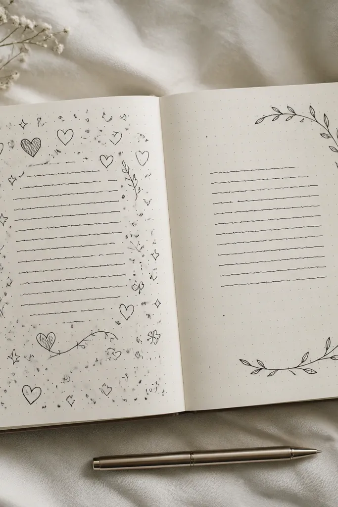
I used to decorate until the page felt cute but messy. The after spread uses one main doodle framing a single content block, then leaves the rest clean. This kept the personality but removed the visual noise, so my handwriting became the focus again.
Pick one doodle theme (vine, clouds, waves). Place it around one section only, and use tiny dot repeats (same size) to connect it to the rest of the page.
10. Before/After Date Stamp Upgrade (Consistent Headers)
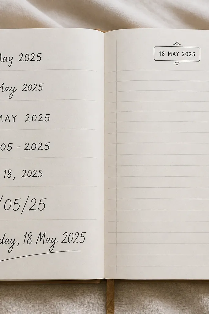
Different date styles made my diary feel like different people made it. After, I standardized the date header: same box shape, same font size, same placement. The consistent header made every spread look like part of the same aesthetic collection.
Good to knowCreate one header template: rounded rectangle + uppercase date line. Copy it for every spread for a week, then you can customize the inside content.