1. The 3-Color Header System (No More Random Vibes)
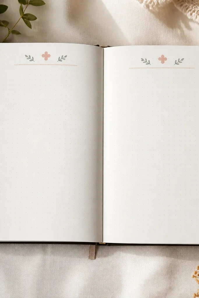
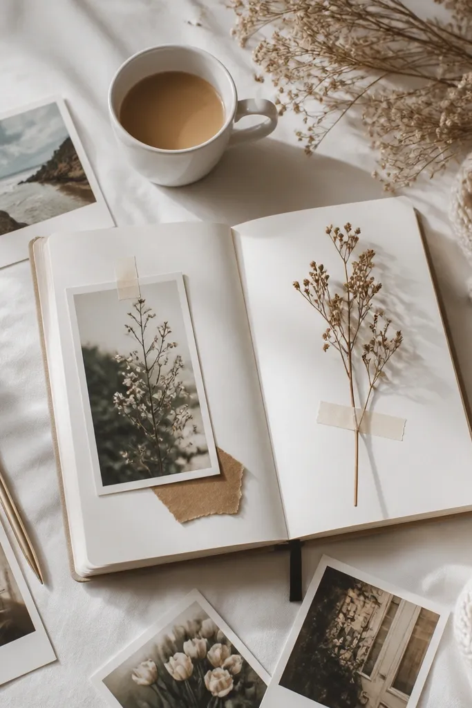
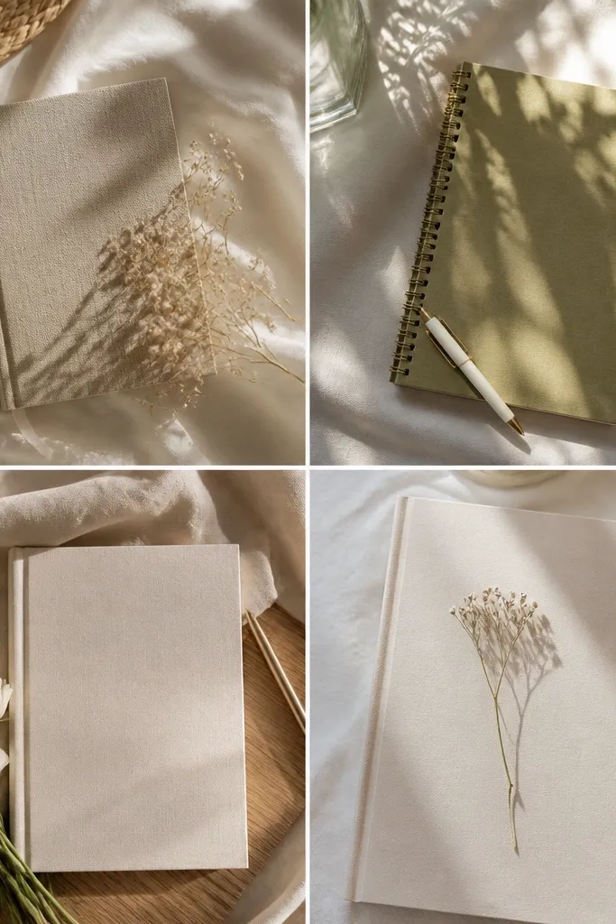
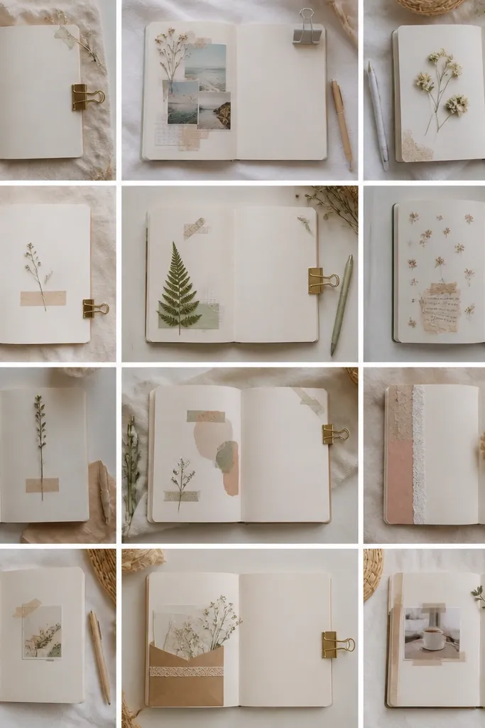
This look works because your eye always knows where to land — the header becomes the anchor. Use one color for text, one for decorative marks (icons, tiny lines), and one as a soft highlight so everything feels intentional even when you write freely.
Good to knowBefore you decorate, write your title in the text color, then add a single icon and underline using the accent colors only.
2. Tape-Frame Journaling (Crisp Edges Without Over-Sticking)
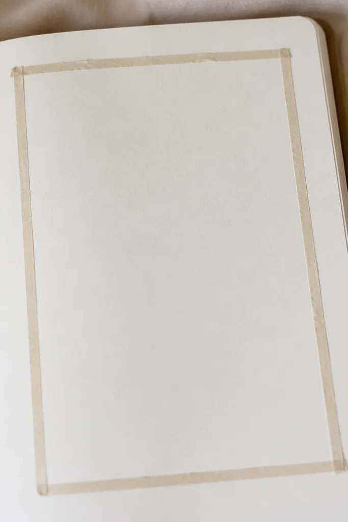
A tape frame gives you “designed” structure without drawing borders. It also prevents you from covering your handwriting later because the frame visually tells you where the content should live.
Use short tape strips for corners — press them down gently and smooth with your fingertip from the center outward.
3. Polaroid-Style Photo Corner With a Caption Strip
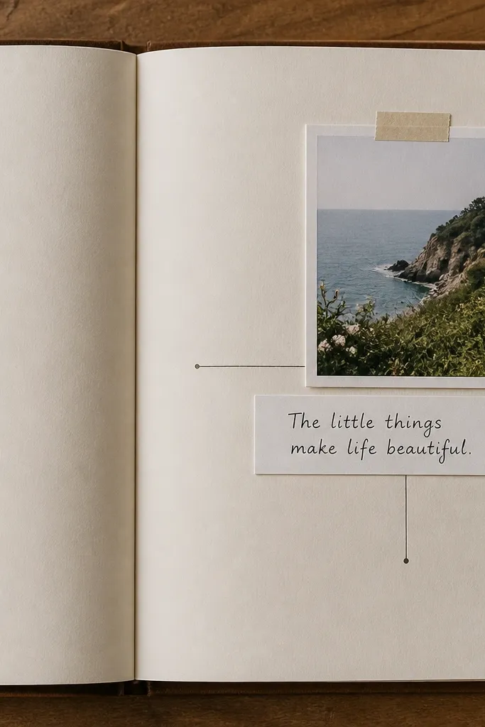
The mistake most people make is gluing photos flat and then trying to decorate around them. Instead, leave a clear caption strip so the page has a built-in reading path: photo → caption → text block.
Cut a caption strip that’s the same width as your photo, then write the date on the strip before you add any other stickers.
4. Bullet Points That Don’t Look Like Homework
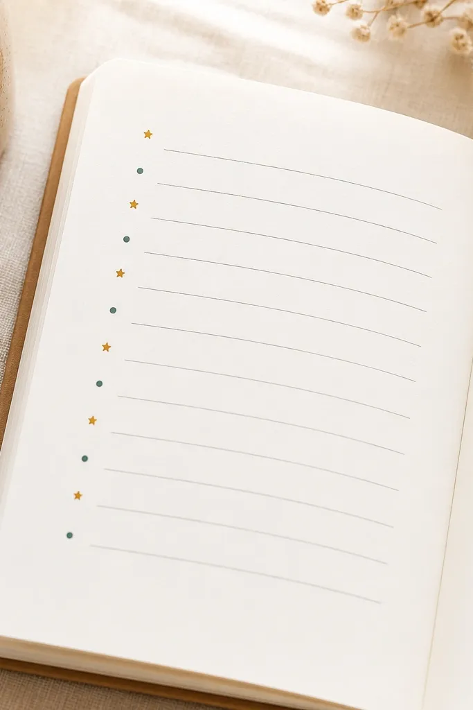
If your bullets are all the same shape and you underline everything, the page can feel chaotic fast. Keep bullets simple and vary only the bullet marker color or shape — not the whole style.
Good to knowChoose one bullet shape (like dots) and use two colors max for markers, then keep the font and line spacing consistent.
5. Sticker Placement Rule: One Corner + One Margin Accent
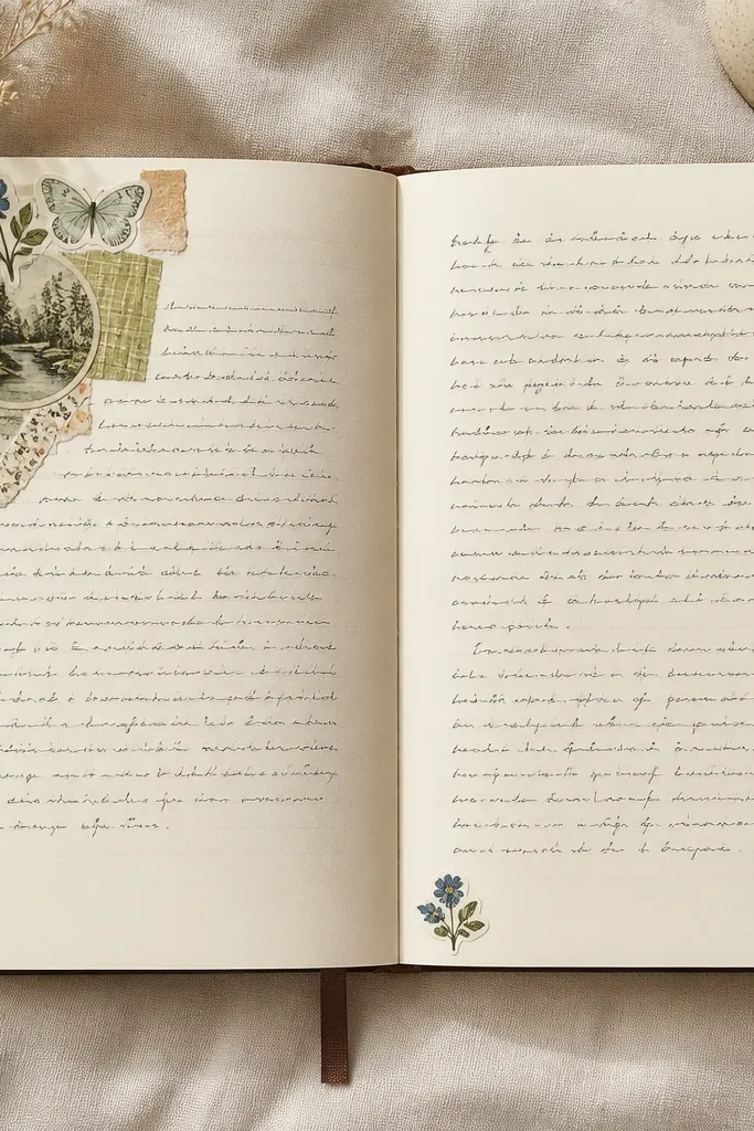
Sticker sprawl is one of the most common diary aesthetic mistakes — it flattens the page and makes your handwriting look less important. Corner clusters add personality, while a margin accent keeps balance without competing with your text.
Do a quick dry layout: place stickers on the page without glue, then remove anything that lands in the writing area.
6. The “Soft Wash” Background With Watercolor Pastels
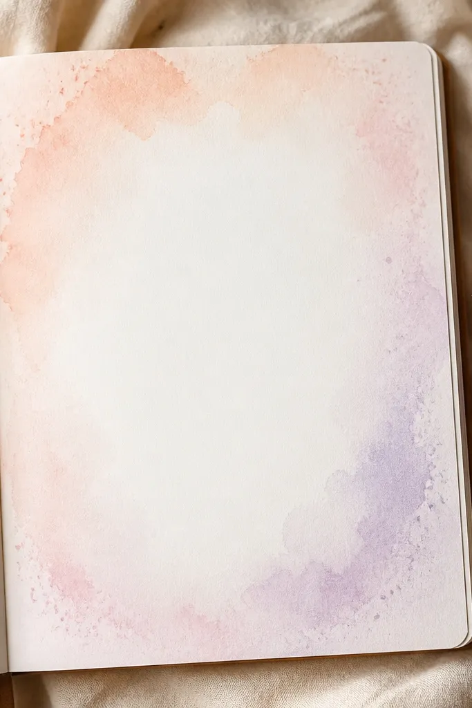
Your pages look more aesthetic when your color is layered, not layered on top of everything. A soft wash behind text creates depth and prevents the page from feeling blank, while still keeping readability.
Good to knowTest on scrap paper first — use water lightly and leave a clean center band for your handwriting.
7. Dry-Erase Planning Overlay (For Weekly Themes)
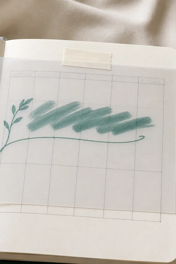
If you waste pages because your plans change, this solves that. Acetate overlays let you update your theme or goals without rewriting everything, keeping your “aesthetic” consistent across weeks.
Tape the acetate with washi so it’s removable — write with a dry-erase marker and wipe with a soft cloth.
8. Handwriting Emphasis With One Highlight Color
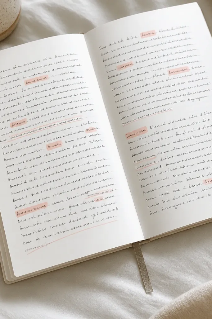
The mistake I made was highlighting everything, which makes the page look busy and reduces contrast. One highlight color used sparingly creates a focal point and makes your journaling feel curated.
Highlight only 3-5 key words per page, and underline just one sentence to tie it together.
9. Edge Doodles That Frame the Writing (Not Fill the Page)
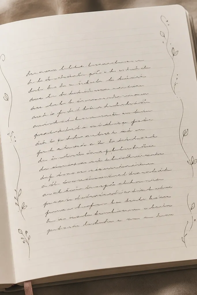
Doodles look best when they frame your content instead of covering it. Margin doodles also help you keep consistent spacing, which is the difference between “pretty” and “overdone.”
Pick one doodle motif (like leaves) and repeat it in small sizes along both edges.
10. Date Stamp + Mini Checklist Layout
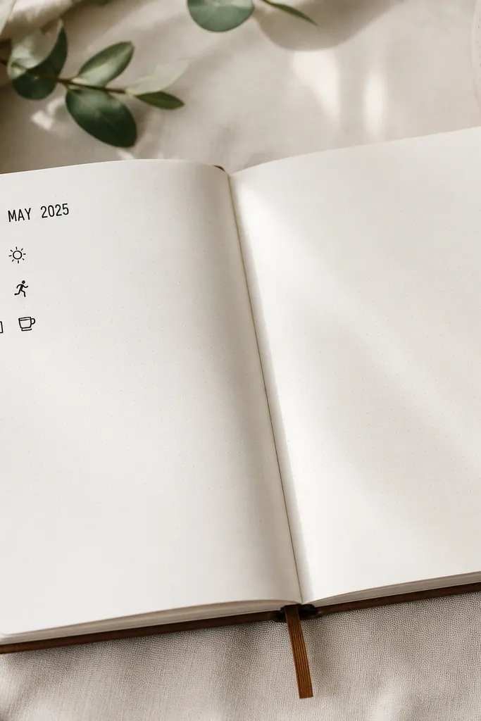
This layout is aesthetic because it’s predictable: date → list → short notes. The checklist keeps your page functional and stops you from over-decorating since the structure already fills the space.
Good to knowLimit your checklist to three items so the page stays airy; add icons only for the first item.