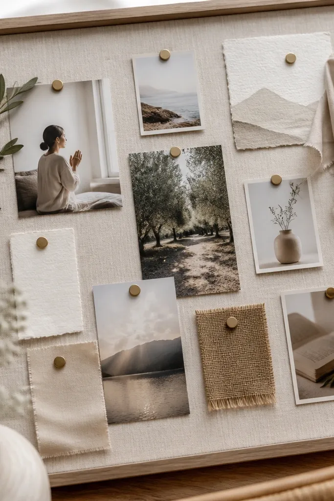
1. Matte Linen Backdrop + Gold Clip Grid
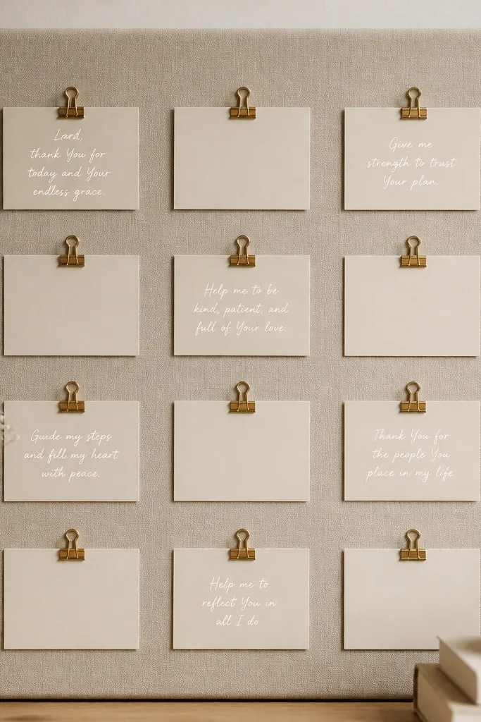
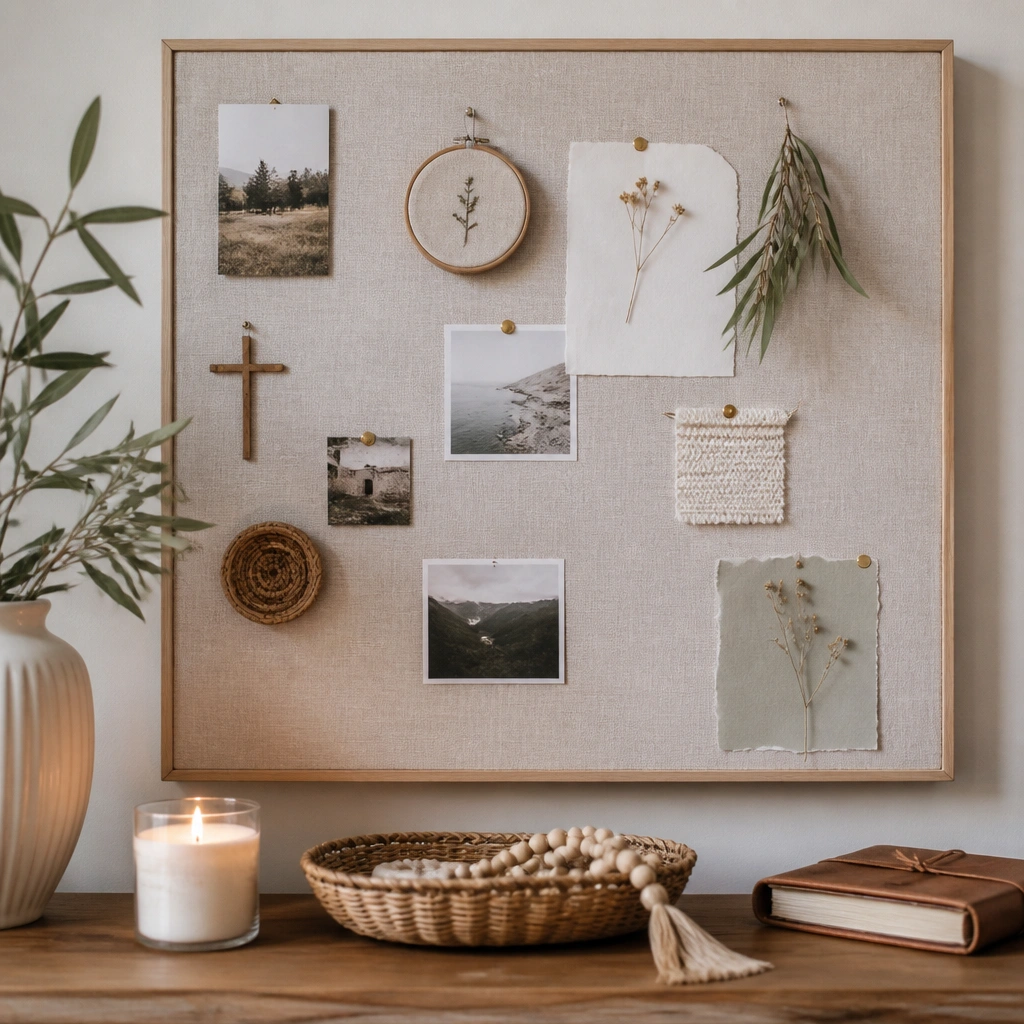
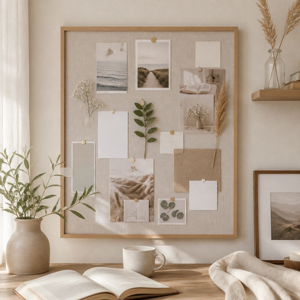
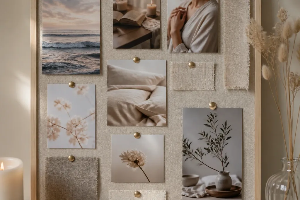
Wrap a foam board or backing panel with matte linen (or linen-look fabric) so the surface absorbs light instead of reflecting it. Add a straight grid of small gold clips — the uniform spacing reads “designed,” not “random.” Use cream or ivory cards and thin gold gel pen accents for that expensive look.
Good to knowMeasure clip spacing with painter’s tape before you clip anything. Keep all card widths the same for instant polish.
2. Whitewashed Wood Frame + Vellum Pocket Columns
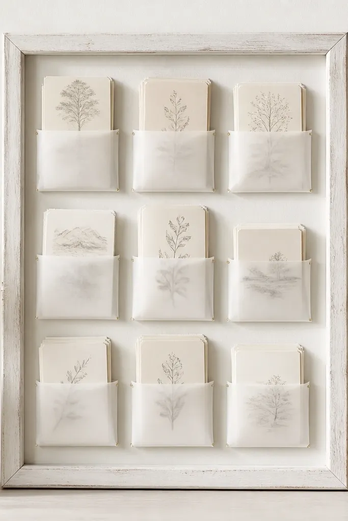
A whitewashed wood frame instantly upgrades the vibe because wood tones photograph warm and styled. Use pre-made clear acrylic or PVC pocket sheets, then layer vellum behind the cards so text looks softened and layered. Stick to two font colors: black ink + muted sage or blush accents.
Print prayer cards on 100-120 gsm paper, then slide them into vellum so the edges don’t look bulky.
3. Black Cork + Blush Ribbon Tie-Ins
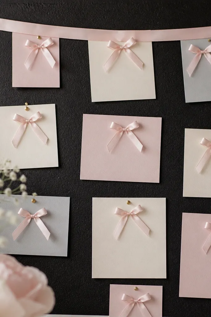
Black cork makes everything look intentional because it removes the “office board” association. Pin cards with slim tacks, then add blush ribbon tie-ins to cover the pin points. The ribbon adds a luxe texture and helps the design feel like a styled board, not a bulletin board.
Use satin ribbon and heat-seal the cut ends so they don’t fray — it reads more expensive.
4. Cream Foam Board + Faux Marbled Paper Overlay
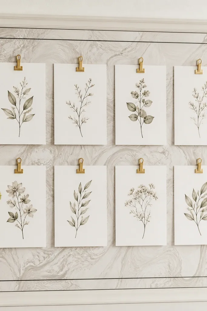
You don’t need real marble — use marbled scrapbook paper or printable faux marble vinyl to create a premium background. Overlay a thin black border (contact paper or vinyl) to define sections. Keep card design consistent: same paper size, same margin, and one accent color like muted gold.
Good to knowBurnish the marbled overlay edges with a plastic ruler to prevent bubbles that make it look homemade.
5. Neutral Grid + Polaroid-Style Prayer Photo Frames
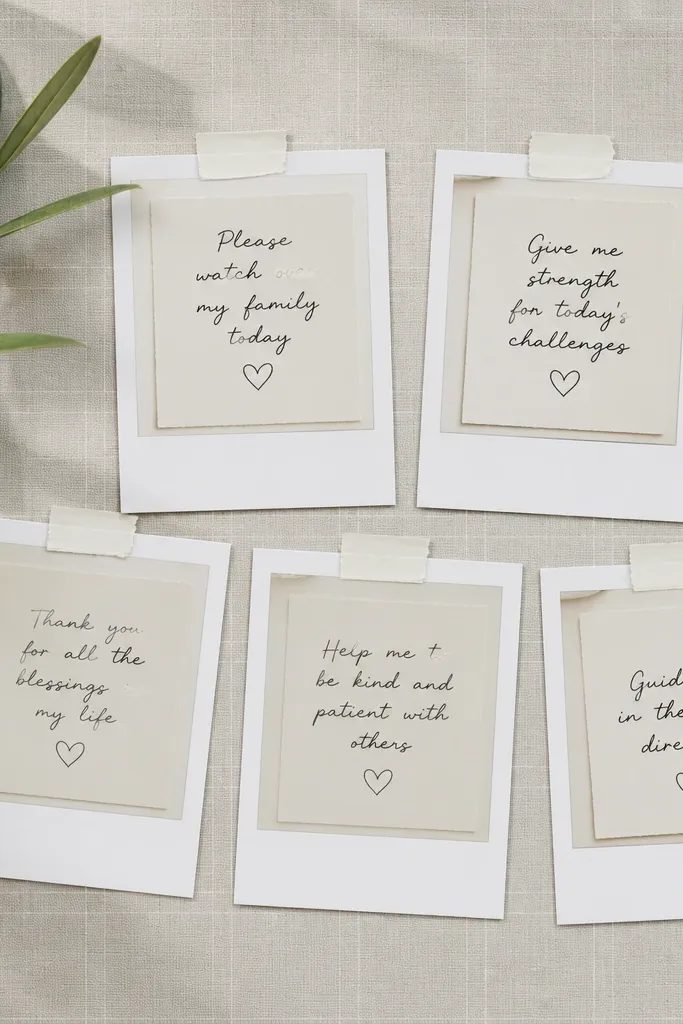
Polaroid-style frames make the board feel curated because they mimic a photo gallery. Use a neutral board and add a faint grid (light pencil lines or printed grid paper) for structure. Place each “photo” at the same height and keep the tape edges crisp for that high-end look.
Use double-sided tape on the back of the frames so the front stays flat and tidy.
6. Acrylic Sleeve Board + Minimal Black Clips
Clear acrylic sleeves look expensive because they protect paper and add shine like a display case. Underlay with textured paper (linen, kraft, or subtle speckle) so it doesn’t look blank. Minimal black clips create contrast against the clear layer without visual clutter.
Good to knowAvoid fingerprints on acrylic by wiping with a microfiber cloth before showing it.
7. Kraft Paper Back + White Gel Pen “Prayer Labels”
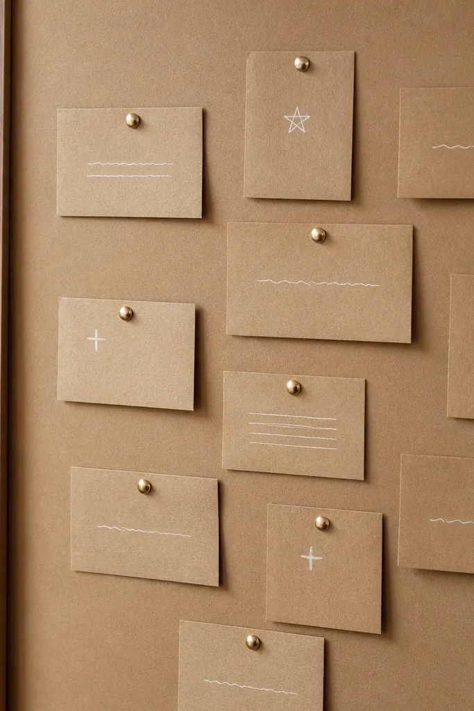
Kraft paper is naturally warm and “design-y” when paired with sharp typography. Cover the board with kraft paper, then add small label cards with white gel pen — it pops against the brown and looks intentional. Use gold tacks sparingly so the board stays airy.
Good to knowWrite labels on cardstock, not thin paper, so the ink doesn’t bleed.
8. Soft Sage Felt + Layered Scripture Cards
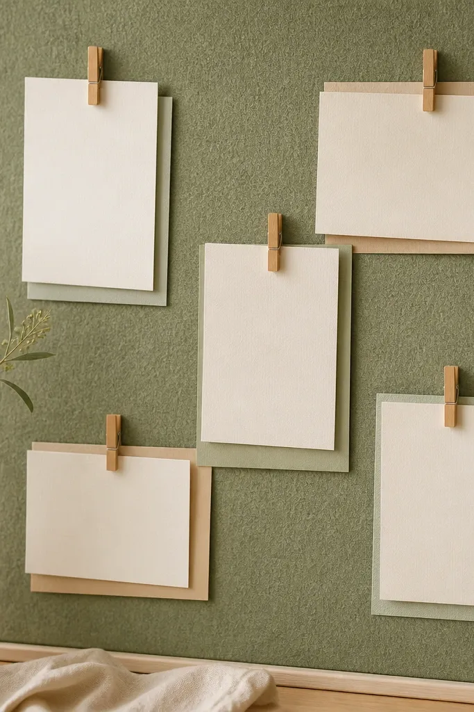
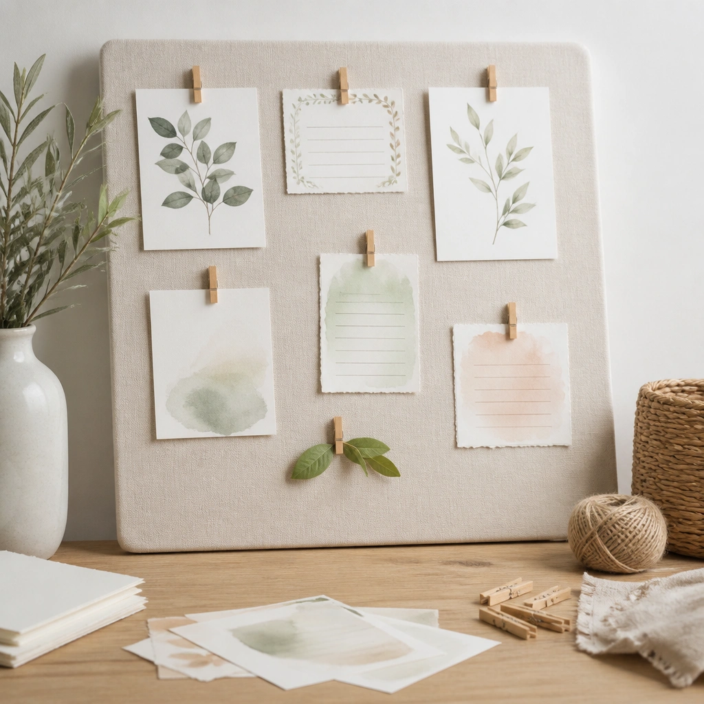
Felt creates a soft, high-end texture and hides imperfections in the backing. Layer cards by using a slightly larger matte backing sheet (cream or oatmeal) under each scripture card. Wooden clothespins add a natural luxury feel when they’re all the same color and size.
Stick to one felt shade (sage, moss, or oat) — multiple greens make it look messy.
9. Sleek White Board + Gold Pushpins + Corner Frames
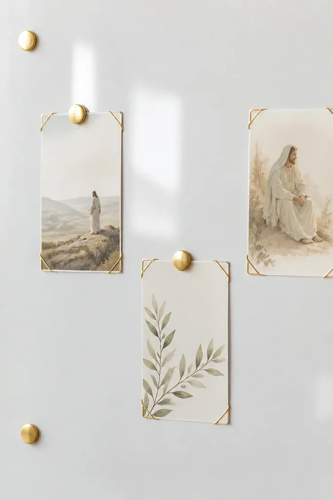
A clean white board plus gold pushpins looks instantly elevated because the contrast is crisp. Use corner frames (or corner tape) so the center of cards stays visible and flat. Negative space is the secret: fewer cards, more breathing room, and consistent spacing.
Good to knowLimit yourself to 8-12 cards so the board doesn’t turn into a collage.
10. Vintage Book Page Back + Washi Tape Sections
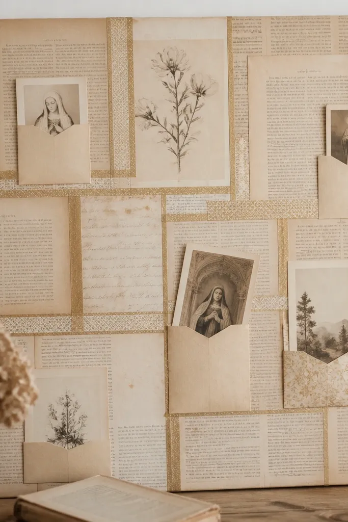
Vintage book pages give instant “heirloom” texture, which reads expensive when you keep the rest minimal. Use thin washi tape lines to create sections (daily, weekly, gratitude) without thick borders. Tuck cards into paper tabs so they look like they belong in a system.
Choose washi tape with a solid or micro-pattern print — chunky designs fight the vintage look.
11. Ceramic Tile Board + Ribbon-Loop Prayer Holds
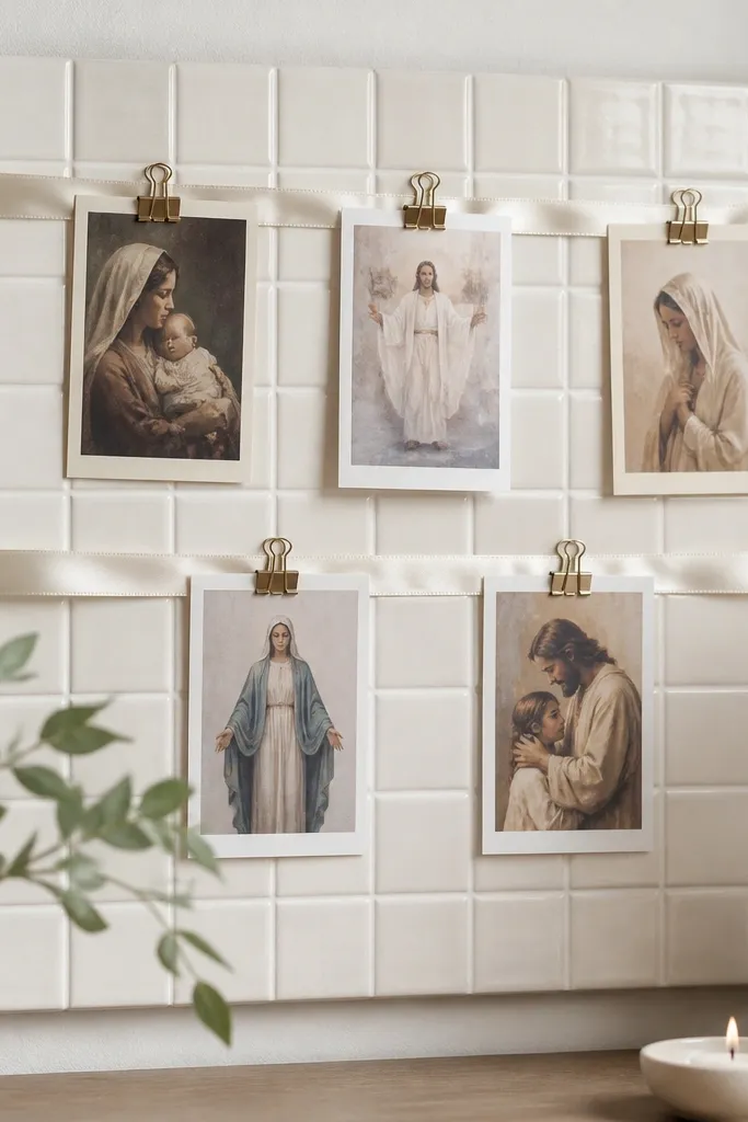
Tile texture adds “store-bought” structure because it’s naturally patterned and durable. Use off-white or pale cream tile pieces so the board stays bright. Ribbon loops soften the look and make it feel like a styled devotional display.
Hot-glue ribbon loops under the card area so the clip hardware stays hidden.